Rational modernism · 1956–1981 · Eastern Europe
Polish Cold War Neon (PRL Neonisation)
Also known as Neonizacja (neonisation), PRL neon, Warsaw neon, Neony PRL
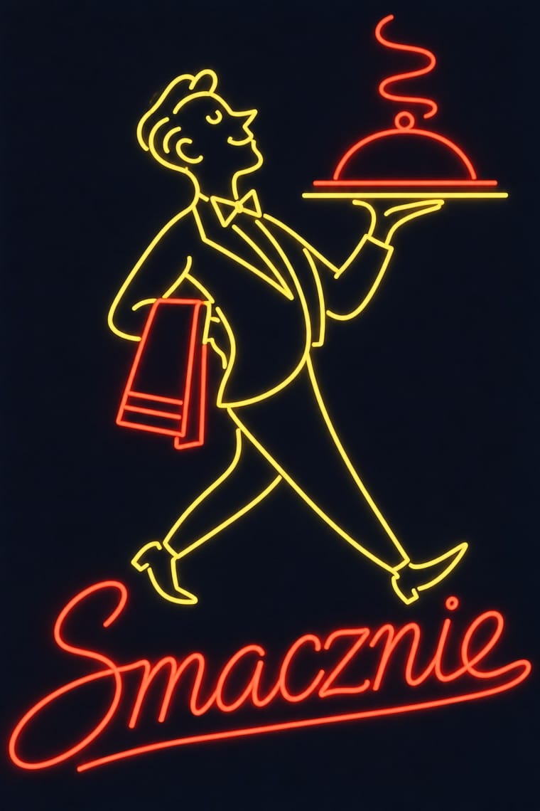
The neon of People's Poland: after the 1956 thaw a state firm, Reklama, and a planned 'neonisation' set out to make war-ruined Warsaw a European capital of neon. Architects and poster artists drew single openwork signs for shops, cafés, cinemas and stations: artist-drawn script and block capitals bent from thin glass tube, wry line figures such as Jan Mucharski's volleyball player, and one or two gas colours, often chosen by trade, against the night and the new facades. Mass production in the 1970s, energy cuts and martial law from 1981 ended its golden age.
Make something in this styleGet advice in this styleMix it with another style
Use it with care
Draw new names and figures rather than copying surviving signs: Siatkarka is a registered monument by a named designer, the Neon Muzeum restores and relights others in situ, and wordmarks such as Społem, Cepelia and Jubiler are still in use; and remember that these lights advertised the modern city for a one-party state, often over shops whose shelves were empty.
01
How it works
- Draw the name as one continuous line of light: an artist-designed script so fine it reads as ornament on the facade, and plain block capitals for a rooftop sign that must carry from afar.
- Add one wry figure drawn as a single outline (a volleyball player in mid-serve, a winking cow, a steaming coffee pot) and animate it with a few switched sequences, as Siatkarka's ball drops down the facade.
- Light each sign in one or two gas colours, and let the colour hint at the trade, as planners often did: red for the butcher, green for the greengrocer, purple for the jeweller, white or blue for public buildings. Give complex figures yellow and red and simple signs blue or purple, and keep blue off rooftops and restaurants.
- Mount letters and figures on an open frame instead of a lit box, so the sign stays light against the building by day and seems to hang in the dark sky at night.
- Plan signs for a whole building or street and fit each to its architecture and its neighbours: one emblem per roof or facade, not a crowd competing for the eye, and on a historic street only white, pale blue or pale purple, so the whole street matches.
Warsaw and, as part of the same policy, many other Polish cities, among them Lublin. In 1956 the state founded the advertising enterprise Reklama for Warsaw and the surrounding voivodeships (renamed Stołeczne Przedsiębiorstwo Instalacji Reklam Świetlnych in 1972), joined at the end of the 1950s by the cooperatives Lumen and Spójnia; a plan of 'neonisation' announced at the end of the 1950s was to make war-ruined Warsaw a European capital of neon, and its designs were commissioned from architects and graphic artists, some linked to the Polish School of Posters. Warsaw's first neon dates from 1926, and between the wars the city had nearly 70, among them animated narrative signs such as a four-phase cognac bottle tipping to fill a glass and a late-1930s tobacco sign on Plac Teatralny by Zygmunt Stępiński, later co-author of the Marszałkowska scheme (Culture.pl): a local precedent for the animated figures of the post-war signs. The start date therefore marks the post-1956 programme of the thaw, not the arrival of neon. The golden years were the late 1950s and 1960s; the 1970s brought mass production and plainer block letters, the signs were the first lights cut in the energy shortages of the mid-1970s, and under martial law (December 1981 to July 1983) they were often switched off. After 1989 many were left to rust or scrapped.
02
Its design choices
From Stylogeny’s vocabulary of design choices: defining choices make the style, characteristic ones are usual, occasional ones turn up now and then.
- Layout & composition
- Space & hierarchy
- Typography
- Surface & texture
- Medium & production
- Tone & intent
- Avoids
- Horror vacui, Collage & layering, Framed panels, Straight photography, Abundant decoration, Painterly brushwork, Gradients, Chrome & 3D render
Palette
#0d1120#ff3b30#ffc83d#3ee08f#5b9dff#f6f1e4
Typefaces
Artist-drawn script bent from thin glass tube, often a letterform invented for the one sign and composed so finely that it read more as ornament than as ordinary writing (Zieliński and Tarwacka)
Block capitals for rooftop signs, and in the 1970s heavy block letters filled or backlit with tube
Signature wordmarks that outlived their shops as 'soc-logos'
Społem, Cepelia, Jubiler
Known for
Siatkarka (the volleyball player)
Jan Mucharski, designed 1960 and installed 1961 on the roof of the socialist-realist house at Plac Konstytucji 5 (MDM), Warsaw, over a sports shop: a woman in red striking a ball, animated in 16 sequences so that the ball falls down the facade, originally with the lost inscriptions 'MHD' and 'Sport' and a green line along the facade; relit on 19 May 2006 after a restoration initiated by Paulina Ołowska and the Fundacja Galerii Foksal, and entered in the Masovian register of movable monuments in March 2025 (B-799)
The neonisation scheme for ul. Marszałkowska, Warsaw, drawn up in 1960 by the architects Eleonora Sekrecka and Zygmunt Stępiński
Lumen cooperative, 'Przez oszczędzanie w PKO do mieszkania' (Through saving at PKO to a flat, 1960), ul. Bracka 11/13, Warsaw
rooftop lettering, coins falling from the top floor into a PKO savings book, and neon outlines round the windows of the whole block
The 'Dancing' sign with a star and musical notes (1962), Nowy Świat 3, Warsaw
Café 'Mozaika' (1971), ul. Puławska 35, Warsaw, by Maksymilian Krzyżanowski, Zbigniew Labes and Tadeusz Rogowski, known as the 'grupa neoniarzy', the remnant of a neonisation of Puławska left unfinished for lack of money
Lettering signs that became 'soc-logos' still in use, such as 'Społem', 'Cepelia' and 'Jubiler', and figurative signs such as 'Moda Polska' with six flying swallows and 'Ruch' with a man holding a newspaper (the soc-logos after Zieliński and Tarwacka; the figurative signs after Sural, Culture.pl)
The blue script sign of the Kosmos cinema, Lublin, which hung on the building for some fifty years, was saved when the cinema was to be demolished and, restored by Adam Brus, has been shown on the Galeria Labirynt since 2013
Neon Muzeum, Warsaw (begun in 2005 when Ilona Karwińska rescued the 'Berlin' sign from ul. Marszałkowska; opened 19 May 2012 at the Soho…
…Factory by Karwińska and David Hill; in the Palace of Culture and Science since 2025): the rooftop coffee pot and steaming cup of the café 'Jaś i Małgosia', signs from the restaurants 'Szanghaj' and 'Ambasador' and the Sezam department store, and restorations in situ of the Syrenka on ul. Grójecka and Cepelia's four-metre red cockerel, returned to ul. Grzybowska 37
03
Make something in this style
Say what you need, and Stylogeny’s image studio draws it from Polish Cold War Neon (PRL Neonisation)’s design choices and checks it against them. It takes about a minute, and you get a link to share.
04
Where it comes from, and what it’s close to
Before it
The style it grew out of, and the styles it borrowed from.

After it
The styles that grew out of it.
No later style in the atlas grew out of it yet.
Alike in its design choices
Styles that make many of the same choices, related or not, besides those above.

05
Sources
- Agnieszka Sural, 'Warszawskie neony', Culture.pl (16 May 2014), on Warsaw's first neon (1926) and its nearly 70 interwar signs, among them animated narrative ones (the four-phase Cognac Montbel Marteau bottle at Zgoda and Szpitalna, the late-1930s Herbewo sign on Plac Teatralny by Zygmunt Stępiński), the founding of Reklama in 1956 and its renaming in 1972, the Lumen and Spójnia cooperatives, the 'neonisation' plan of the late 1950s, the Marszałkowska scheme by Sekrecka and Stępiński (1960), 'Dancing' (1962), Mozaika (1971), the Lumen PKO sign (1960), Jaś i Małgosia, the artist-drawn script letters (quoting Zieliński and Tarwacka), the 1970s turn to mass production and block letters, signs for goods that could not be bought (meat shops with no meat on sale), the other well-known PRL signs listed by Sural (Ruch with a man holding a newspaper, Moda Polska with six swallows, the winking milk-bar cow, Łucznik's alternating needles), the mid-1970s energy shortages, martial law and 1989 as the start of the end, and the Reklama design archive given to the Museum of Modern Art in Warsaw in 2011: https://culture.pl/pl/artykul/warszawskie-neony
- Wikipedia (pl): 'Siatkarka (neon)' (https://pl.wikipedia.org/wiki/Siatkarka_(neon)), for Mucharski's design (1960), its installation (1961), the 16-sequence animation, the 2006 restoration and the 2025 register entry B-799, citing Gazeta Wyborcza (29 March 2025) and K. Mordyński, MDM. Marszałkowska Dzielnica Marzeń (2025)
- Kim Willsher, 'Warsaw's Neon Museum sparks revival of interest in cold war signs and aesthetic', The Guardian (6 April 2026), on neonisation from 1956 with the Reklama company, signs by Polish poster school designers including Jan Mucharski and Tadeusz Rogowski, lights often turned off under martial law (December 1981 to July 1983), the restored red cockerel and Syrenka, and David Hill's remark that a popular sign design 'would be replicated, and suddenly it was a logo': https://www.theguardian.com/world/2026/apr/06/warsaw-neon-museum-revival-interest-cold-war-signs-aesthetic
- Neon Muzeum, 'O Muzeum' (https://www.neonmuzeum.org/o-muzeum), on the 'great neonisation' projects of the Eastern Bloc, a permanent collection of about a hundred signs often designed by artists and graphic designers of the Polish School of Posters, and Cepelia's red cockerel on ul. Grzybowska 37; and '100 Years of Neon in Warsaw' (https://www.neonmuzeum.org/blog/100-years-of-neon-in-warsaw)
- Wikipedia (pl): 'Neon Muzeum' (https://pl.wikipedia.org/wiki/Neon_Muzeum) and Wikipedia: 'Neon Museum, Warsaw' (https://en.wikipedia.org/wiki/Neon_Museum,_Warsaw), for the 'Berlin' sign (2005), the opening on 19 May 2012, the move to the Palace of Culture and Science in 2025 and the signs in the collection
- Agnieszka Chęć-Małyszek, 'Neon signs in urban space, yesterday and today. A case study based on Lublin', Teka Komisji Architektury, Urbanistyki i Studiów Krajobrazowych 18/1 (2022), pp. 34–47, doi:10.35784/teka.3326 (https://ph.pollub.pl/index.php/teka/article/view/3326), used for the design rules (colour by trade, block letters on roofs and finer letters on facades, openwork structure, fitting each sign to the building and its neighbours), the colour rules of the neonisation era (yellow and red for complex shapes, blue or purple for simple ones, blue avoided on rooftops and in gastronomy, white, light blue and light purple on historic buildings), the thaw as the moment neon returned to the streets, and the Lublin signs; its general history contains slips (it dates Warsaw's first neon to 1929), so dates follow Culture.pl
- Jarosław Zieliński and Izabella Tarwacka, Neony. Ulotny ornament warszawskiej nocy (cited via Culture.pl)
- Ilona Karwińska, Polish Cold War Neon (MBP / Thames & Hudson, 2011; ISBN 978-1935613350) and Neon Revolution: Eastern Bloc Electro-Graphic Design (Neon Muzeum; ISBN 978-1-5272-1560-3), listed at https://www.neonmuzeum.org/publikacje
How Stylogeny researches and checks a style: where the facts come from.