Pictorial & machine age · 1945–present · Northern Europe, Global / networked
Moomin Graphics (Tove Jansson's Pen-Drawn World and its Licensed Afterlife)
Also known as Moomin style, Tove Jansson illustration, Mumintrollen graphics, Muumi
The pen-and-ink world of Tove Jansson's Moomin books (1945-1977) and newspaper strip (1947-1975): round, white, snouted trolls drawn in a sure, fine black line, small against hatched forests, seas and night skies, in strips of framed panels with hand-lettered balloons. Her drawings are small and mostly black ink on white paper, with a second, full-colour gouache mode in three picture books. Since 1990 Arabia's mugs and other licensed goods adapt single drawings onto white grounds with one or two soft flat colours, turning one artist's hand into a living graphic system.
Make something in this style Get advice in this style Mix it with another style
Use it with care
The Moomin characters, names and drawings are protected and licensed by the Jansson family's company; use the drawing approach (fine ink line, round figures, hatched landscape, one or two soft colours) rather than copying the characters or implying an official Moomin product.
01
How it works
- Draw the characters as round, soft-cornered white bodies closed by one sure, fine black ink line, with almost no interior modelling, so they read at a glance against any ground.
- Build the world around them in the same pen: hatch forests, sea, rain and night skies with dense fine lines and texture, and keep figures small against large weather and landscape when the mood turns lonely or uncanny.
- Work in black ink on white paper at close to printed size, and let the white of the page stand for snow, sky and the bodies of the trolls; in the picture books (1952, 1960, 1977) switch to full gouache and watercolour colour, with whole pages of saturated hue.
- Tell the newspaper story in a row of ruled panels with hand-lettered balloons, gentle and wry rather than shouting, and turn the satire on guests, fashions and high society rather than on the powerful.
- Frame chapters with small vignettes, flower wreaths and maps of the valley rather than heavy borders, and leave generous white around them.
- When the drawings leave the book, build the design from Jansson's own drawings, one figure or scene on a white ground with one or two soft flat colours, keeping her line rather than redrawing the characters in a new style.
Helsinki: Tove Jansson (1914-2001), who drew for the Swedish-language satirical magazine Garm from 1929 until it closed in 1953, published the first Moomin book in 1945 (Småtrollen och den stora översvämningen, The Moomins and the Great Flood). The Moomin comic strip first ran in 1947 in the children's section of the Finnish paper Ny Tid and reached English readers in the London Evening News in 1954; Tove drew it alone until 1959, shared it with her brother Lars Jansson until 1961, and Lars carried it alone until it ended in 1975. Arabia has made Moomin tableware since the 1950s and the present mugs, designed by Tove Slotte on Kaj Franck's Teema shape, since 1990, from Tove and Lars Jansson's drawings; the Japanese-Dutch-Finnish anime Tanoshii Mūmin Ikka followed in 1990-91. The Jansson family keeps the rights, and Sophia Jansson, Lars's daughter, directs the characters' art.
02
Its design choices
From Stylogeny’s vocabulary of design choices: defining choices make the style, characteristic ones are usual, occasional ones turn up now and then.
- Layout & composition
- Space & hierarchy
- Colour
- Form & shape
- Surface & texture
- Medium & production
- Tone & intent
- Avoids
- Distortion & exaggeration, Angular & zigzag, Blackletter, Experimental & distorted, Agitational & persuasive, Technological & futurist, Fluorescent & neon, Gradients, Gloss & highlights, Halftone & Ben-Day dots, Straight photography, Photomontage, Abundant decoration
Palette
-
#f6f3ea -
#1d1d1b -
#4f7fae -
#a9c7a1 -
#d2483a -
#e6c26a
Typefaces
-
Hand-lettering in speech balloons and captions, the newspaper comic-strip tradition
-
Old-style book serif for the running text of the novels, the classic book-typography tradition
-
Hand-drawn titling on picture books, covers and licensed goods
Known for
-
Tove Jansson, The Moomins and the Great Flood (Småtrollen och den stora översvämningen, 1945), the first Moomin book; its ink-wash illustration of the round, turreted Moominhouse is the earliest known (Moomin Museum, Tampere)
-
Tove Jansson, Finn Family Moomintroll (1948), the book that made her famous, and Moominland Midwinter
1957
-
Tove Jansson, the first Moomin comic strip, in the children's section of Ny Tid (1947), held in the Moominvalley Collection of Tampere Art Museum
-
Tove Jansson, Moomin strip in the London Evening News (from 1954), reprinted in black and white by Drawn & Quarterly from 2006
-
Tove Jansson, picture books The Book about Moomin, Mymble and Little My (1952), Who Will Comfort Toffle? (1960) and The Dangerous Journey
1977
-
Tove Jansson, cover cartoons for Garm, including the October 1944 cover lampooning Hitler, and her illustrations for the Swedish editions of Tolkien's The Hobbit (1962) and Carroll's Alice's Adventures in Wonderland
-
Arabia Moomin mugs (from 1990), designed by Tove Slotte on Kaj Franck's Teema shape from Tove and Lars Jansson's drawings, three to five new designs a year
03
Make something in this style
Say what you need, and Stylogeny’s image studio draws it from Moomin Graphics (Tove Jansson's Pen-Drawn World and its Licensed Afterlife)’s design choices and checks it against them. It takes about a minute, and you get a link to share.
04
Where it comes from, and what it’s close to
Before it
The style it grew out of, and the styles it borrowed from.
Nothing earlier is recorded: in the atlas it is a starting point.
After it
The styles that grew out of it.
No later style in the atlas grew out of it yet.
Alike in its design choices
Styles that make many of the same choices, related or not, besides those above.
05
Often taken for
Moomin Graphics has no real works recorded yet, so these are its nearest styles by its choices alone, with the choices that tell them apart.
-
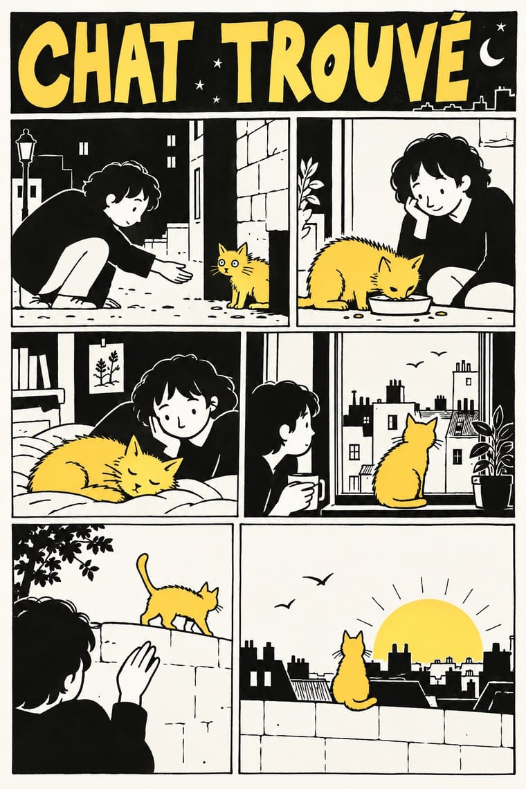
L'Association and French Alternative Comics
L'Association and French Alternative Comics is one of Moomin Graphics’s nearest styles by choices; no real work of either fits the other better.
Choices that tell Moomin Graphics and L'Association and French Alternative Comics apart Choice Moomin Graphics L'Association and French Alternative Comics Rounded & pill defining — Distortion & exaggeration avoids characteristic Full polychrome occasional avoids Flat occasional defining Biomorphic curves characteristic — No shared descent in the atlas: they reached these choices separately.
-
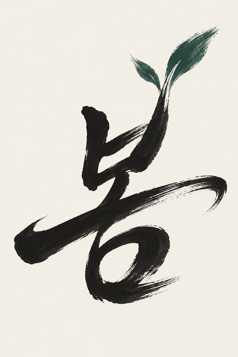
Korean Commercial Calligraphy (Kaelligeurapi)
Korean Commercial Calligraphy is one of Moomin Graphics’s nearest styles by choices; no real work of either fits the other better.
Choices that tell Moomin Graphics and Korean Commercial Calligraphy apart Choice Moomin Graphics Korean Commercial Calligraphy Rounded & pill defining — Brush & pen calligraphy — defining Comic & cartoon defining — Straight photography avoids occasional Sequential narrative defining — No shared descent in the atlas: they reached these choices separately.
-
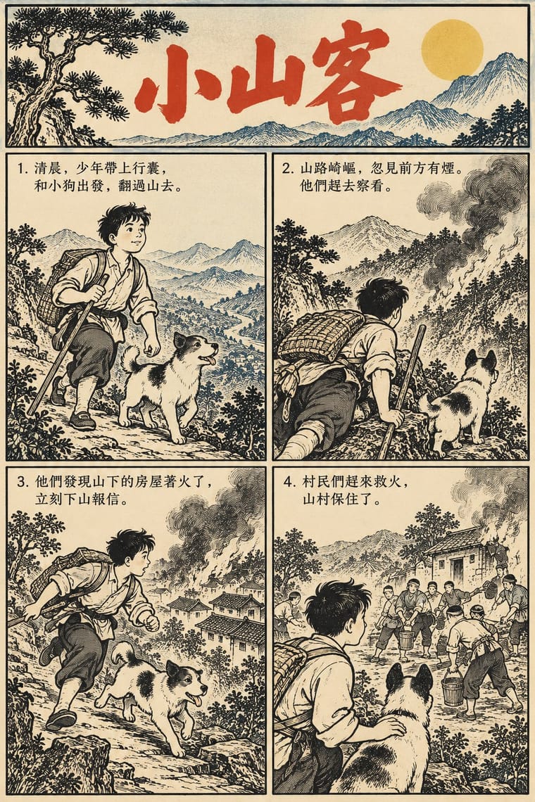
Lianhuanhua Picture-Story Books
Lianhuanhua Picture-Story Books is one of Moomin Graphics’s nearest styles by choices; no real work of either fits the other better.
Choices that tell Moomin Graphics and Lianhuanhua Picture-Story Books apart Choice Moomin Graphics Lianhuanhua Picture-Story Books Rounded & pill defining — Straight photography avoids occasional Limited spot colours characteristic — Measured density — characteristic Biomorphic curves characteristic — No shared descent in the atlas: they reached these choices separately.
-
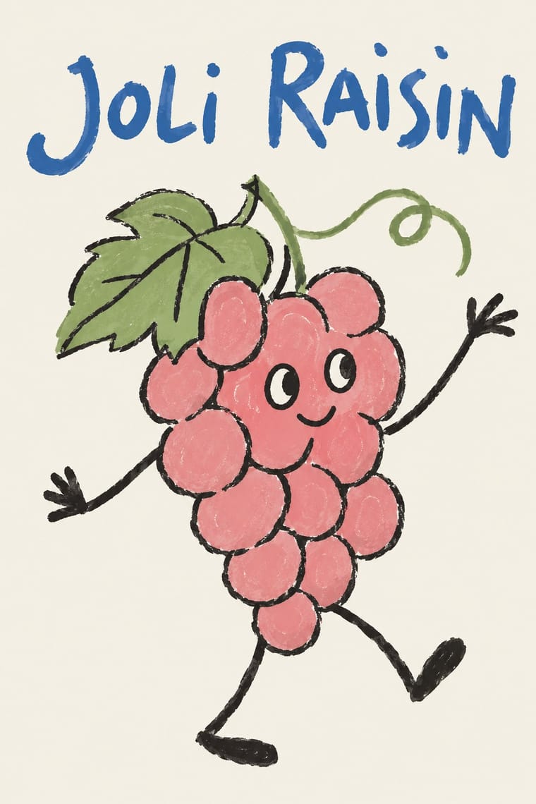
Natural Wine Label Art
Natural Wine Label Art is one of Moomin Graphics’s nearest styles by choices; no real work of either fits the other better.
Choices that tell Moomin Graphics and Natural Wine Label Art apart Choice Moomin Graphics Natural Wine Label Art Rounded & pill defining — Fluorescent & neon avoids occasional Sequential narrative defining — Distortion & exaggeration avoids occasional Naturalistic depiction occasional avoids No shared descent in the atlas: they reached these choices separately.
— means the choice isn’t among the style’s recorded choices. Critics recorded each work’s choices with the styles’ descriptions in view, so this shows whether the descriptions hold together, not proof that they are right.
06
Combine it with
Styles Moomin Graphics (Tove Jansson's Pen-Drawn World and its Licensed Afterlife) pairs well with or plays against, from the research. Each is worked out as a combination: which style gives the type, the colours and the forms.
- Simplicissimus Satirical Style (Munich) Contrasts · Jansson drew political satire for the Finland-Swedish magazine Garm in the broad European satirical-magazine tradition that Simplicissimus led; Moomin keeps a sure pen line but drops the upward-aimed attack and the grotesque body for round, gentle figures.
- Scandinavian Functionalism Pairs well · The Teema mug is the meeting point: a plain functional Nordic shape carrying one warm hand drawing.
- Kawaii Design Contrasts · Its round, white characters sit near kawaii fancy goods, but they keep a hatched, melancholy world around them that kawaii fancy goods leave out.
- Ligne Claire (Franco-Belgian Clear Line) Contrasts · Both close figures in a clean contour, but the clear line refuses hatching and fills with flat colour, while Moomin hatches its landscapes and lives in black and white.
- Finnish Bold Print (Marimekko Modernism) Pairs well · The other Finnish everyday-design export: set a single Moomin line drawing beside a large flat Marimekko-style repeat for a Nordic home range.
07
Sources
- https://en.wikipedia.org/wiki/Tove_Jansson
- https://en.wikipedia.org/wiki/Moomins
- https://en.wikipedia.org/wiki/Moomin_mugs
- https://www.muumimuseo.fi/en/the-museum/moomin-collection/
- https://www.muumimuseo.fi/en/news/tove-janssons-first-illustration-of-the-moomin-house-is-the-highlight-of-the-moomin-museums-renewed-main-exhibition
- https://drawnandquarterly.com/books/moomin-book-one/
How Stylogeny researches and checks a style: where the facts come from.