Style combination · Contrasts
Ligne Claire × Moomin Graphics
Both close figures in a clean contour, but the clear line refuses hatching and fills with flat colour, while Moomin hatches its landscapes and lives in black and white.
01
What each style brings
Each part of the design comes from the style with the stronger say in it, and each style gives at least two.
Ligne Claire (Franco-Belgian Clear Line) Moomin Graphics (Tove Jansson's Pen-Drawn World and its Licensed Afterlife)
- Type from Ligne Claire
- Colour from Ligne Claire
- Form from Moomin Graphics
- Composition from Ligne Claire
- Surface from Moomin Graphics
-
02
The type
Open fonts standing in for each style’s own type, which is often hand-drawn or commercial.
Display · Ligne Claire
Pop
Londrina Solid, standing in for Bold hand-drawn capitals for titles (album titles under a small header naming the author and series: black on a coloured ground, THE BLUE LOTUS on red; yellow on a night sky, EXPLORERS ON THE MOON)
Text · Moomin Graphics
The pen-and-ink world of Tove Jansson's Moomin books (1945-1977) and newspaper strip (1947-1975): round, white, snouted trolls drawn in a sure, fine black line, small against hatched forests, seas and night skies, in strips of framed panels with hand-lettered balloons. Her drawings are small and mostly black ink on white paper, with a second, full-colour gouache mode in three picture books. Since 1990 Arabia's mugs and other licensed goods adapt single drawings onto white grounds with one or two soft flat colours, turning one artist's hand into a living graphic system.
Comic Neue; Moomin Graphics used Hand-lettering in speech balloons and captions, the newspaper comic-strip tradition and Old-style book serif for the running text of the novels, the classic book-typography tradition
03
The colours
The ground and leading colours come from Ligne Claire, with a counter-accent from Moomin Graphics. The ink reads on the ground at 4.5:1 or more.
Ligne Claire (Franco-Belgian Clear Line) Moomin Graphics (Tove Jansson's Pen-Drawn World and its Licensed Afterlife)
-
#fbf6e9ground · 36% -
#1a1a1aink · 14% -
#f0b73aaccent · 18% -
#d2483aaccent · 14% -
#e6c26aaccent · 10% -
#3b6fb6accent · 8%
As CSS
:root {
  --ground: #fbf6e9;
  --ink: #1a1a1a;
  --accent-1: #f0b73a;
  --accent-2: #d2483a;
  --accent-3: #e6c26a;
  --accent-4: #3b6fb6;
  --font-display: "Londrina Solid", cursive;
  --font-text: "Comic Neue", cursive;
}
Use it with care
Ligne Claire (Franco-Belgian Clear Line): Tintin and his companions and Blake and Mortimer are copyrighted characters whose rights are actively enforced (Hergé's by Tintinimaginatio, called Moulinsart until 2022), and Swarte, Floc'h and Meulen are working artists: draw your own characters, settings and lettering in the shared idiom, never ask an image model for these artists or characters by name, and never present a generated picture as theirs. The style's clarity does not neutralise its early content: Tintin in the Congo caricatures Congolese people as childlike in a colonial frame, and The Shooting Star, serialised in the German-controlled Le Soir in 1941–42, made its villain an antisemitic caricature of a Jewish financier (renamed in 1954). Simplify every character with the same economy as the lead, and never use exaggerated lips, noses, skin colour or dress as ethnic markers.
Moomin Graphics (Tove Jansson's Pen-Drawn World and its Licensed Afterlife): The Moomin characters, names and drawings are protected and licensed by the Jansson family's company; use the drawing approach (fine ink line, round figures, hatched landscape, one or two soft colours) rather than copying the characters or implying an official Moomin product.
04
The two styles
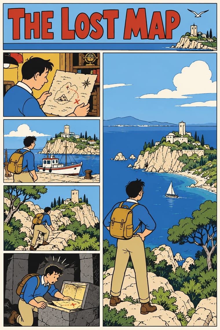
05
More combinations
With Ligne Claire
- Lianhuanhua Picture-Story Books Contrasts · Both tell stories in outlined drawings; lianhuanhua gives each pocket-sized page one framed black-ink picture with a caption and keeps colour for the cover, ligne claire fills tiered multi-panel pages with balloons and flat, bright colour, caricatural figures in realistic settings.
- Push Pin Style Contrasts · Push Pin also draws in outline and flat colour, but mixes revived Victorian and Art Nouveau display faces, ornament and distortion; switch to ligne claire for one disciplined line, no ornament and evenly legible scenes.
- Flat Design Pairs well · Flat, unshaded fields translate directly to screen; add ligne claire's even outline and documented settings to flat UI illustration for scenes with more narrative and character, keeping ligne claire's perspective, which flat design avoids.
- Googie & Atomic Age Pairs well · The 1980s revival's 'atomic style' (Swarte's 1977 name for the 1950s Marcinelle school of Spirou, above all Jijé's early work, which Ever Meulen and Yves Chaland remade, with Franquin among Chaland's models; its figures rounder and more dynamic than Hergé's static, schematic line) drew on the optimism and futurism of the 1950s; Googie's boomerangs, starbursts, atoms and roadside signs suit a clear-line street scene or poster, drawn with ligne claire's even contour.
- Pop Art Graphics Contrasts · Hergé admired Roy Lichtenstein, but pop art blows single comic panels up, with enlarged Ben-Day dots and irony; choose ligne claire when the picture should tell a story legibly across a page, in flat, dot-free colour, rather than comment on mass media.
- City Pop Illustration Pairs well · Eizin Suzuki drew his city-pop sleeves and FM Station covers in a ligne-claire manner likened to Hergé's, rendering gradation in solid lines; pair them for a sunlit resort or street scene drawn in clear line under a deep blue sky, keeping ligne claire's unshaded colour.
- Korean Webtoon Graphics Contrasts · Both tell stories in outlined character art; webtoon scrolls one vertical strip on a phone with painterly gradients and brushwork, ligne claire tiers framed panels on a printed page in flat, unshaded colour.
- Ukiyo-e Woodblock Prints Pairs well · Hergé absorbed Chinese and Japanese woodcuts while researching The Blue Lotus, some of his seascapes recall Hokusai and Hiroshige, and the style was also influenced by Japan's shin-hanga prints; borrow ukiyo-e's waves, skies and outlined flat colour for a clear-line landscape.
With Moomin Graphics
- Simplicissimus Satirical Style (Munich) Contrasts · Jansson drew political satire for the Finland-Swedish magazine Garm in the broad European satirical-magazine tradition that Simplicissimus led; Moomin keeps a sure pen line but drops the upward-aimed attack and the grotesque body for round, gentle figures.
- Scandinavian Functionalism Pairs well · The Teema mug is the meeting point: a plain functional Nordic shape carrying one warm hand drawing.
- Kawaii Design Contrasts · Its round, white characters sit near kawaii fancy goods, but they keep a hatched, melancholy world around them that kawaii fancy goods leave out.
- Finnish Bold Print (Marimekko Modernism) Pairs well · The other Finnish everyday-design export: set a single Moomin line drawing beside a large flat Marimekko-style repeat for a Nordic home range.