Style combination · Contrasts
Moomin Graphics × Simplicissimus Satirical Style
Jansson drew political satire for the Finland-Swedish magazine Garm in the broad European satirical-magazine tradition that Simplicissimus led; Moomin keeps a sure pen line but drops the upward-aimed attack and the grotesque body for round, gentle figures.
Mix them and make something Moomin Graphics Simplicissimus Satirical Style
01
What each style brings
Each part of the design comes from the style with the stronger say in it, and each style gives at least two.
Moomin Graphics (Tove Jansson's Pen-Drawn World and its Licensed Afterlife) Simplicissimus Satirical Style (Munich)
- Type from Simplicissimus Satirical Style
-
Moomin Graphics avoids blackletter: this is where the two pull against each other, which is the point of the contrast.
- Colour from Simplicissimus Satirical Style
- Form from Moomin Graphics
- Composition from Moomin Graphics
- Surface from Moomin Graphics
-
02
The type
Open fonts standing in for each style’s own type, which is often hand-drawn or commercial.
Display · Simplicissimus Satirical Style
Wow
UnifrakturMaguntia, standing in for Set Fraktur for the title centred above each drawing and for the parenthetical artist credit ('(Zeichnung von Rudolf Wilke)', '(Th. Th. Heine)')
Text · Moomin Graphics
The pen-and-ink world of Tove Jansson's Moomin books (1945-1977) and newspaper strip (1947-1975): round, white, snouted trolls drawn in a sure, fine black line, small against hatched forests, seas and night skies, in strips of framed panels with hand-lettered balloons. Her drawings are small and mostly black ink on white paper, with a second, full-colour gouache mode in three picture books. Since 1990 Arabia's mugs and other licensed goods adapt single drawings onto white grounds with one or two soft flat colours, turning one artist's hand into a living graphic system.
Comic Neue; Moomin Graphics used Hand-lettering in speech balloons and captions, the newspaper comic-strip tradition and Old-style book serif for the running text of the novels, the classic book-typography tradition
03
The colours
The ground and leading colours come from Simplicissimus Satirical Style, with a counter-accent from Moomin Graphics. The ink reads on the ground at 4.5:1 or more.
Moomin Graphics (Tove Jansson's Pen-Drawn World and its Licensed Afterlife) Simplicissimus Satirical Style (Munich)
-
#f0e6ccground · 36% -
#1b1a18ink · 14% -
#c4382caccent · 18% -
#d6a444accent · 14% -
#e6c26aaccent · 10% -
#c85d80accent · 8%
As CSS
:root {
  --ground: #f0e6cc;
  --ink: #1b1a18;
  --accent-1: #c4382c;
  --accent-2: #d6a444;
  --accent-3: #e6c26a;
  --accent-4: #c85d80;
  --font-display: "UnifrakturMaguntia", serif;
  --font-text: "Comic Neue", cursive;
}
Use it with care
Moomin Graphics (Tove Jansson's Pen-Drawn World and its Licensed Afterlife): The Moomin characters, names and drawings are protected and licensed by the Jansson family's company; use the drawing approach (fine ink line, round figures, hatched landscape, one or two soft colours) rather than copying the characters or implying an official Moomin product.
Simplicissimus Satirical Style (Munich): Its caricature works by types, and that cuts both ways. Some pages drew colonised Africans as caricatures even when the target was the colonisers (Heine's Kolonialmächte, 1904). From August 1914 the magazine backed the war and turned its satire on the enemy nations, including racist pictures of non-European and Russian troops, and in the Weimar years it still ran nationalist jokes against the Allied victors and France. After 1933 it followed the Nazi line, including antisemitic satire, while Heine, hated by the Nazis not least for his Jewish origin, was forced out and fled. Several of its canonical draughtsmen served the regime: Hitler made Thöny an honorary professor in 1938 and put him on the Gottbegnadeten list in 1944; Schilling, a fierce critic of the Nazis before 1933, became their propagandist; and in the last issue of September 1944 Gulbransson, Schilling and Thöny supplied propaganda drawings. Take the method of 1896–1914 and 1919–1933 (one framed drawing, flat tints, a spoken punchline) and aim it at power. Exaggerate the uniform, bearing and costume of the powerful, not ethnicity, religion, disability or the bodies of the powerless. The profiteer, the usurer and the octopus gripping its victims (Heine's Der Wucher, 1923) were also stock antisemitic codes in these years, so mark a profiteer by class (top hat, monocle, fur collar), never by ethnic features. Gulbransson (d. 1958), George Grosz (d. 1959) and Bruno Paul (d. 1968) are still in copyright in the EU, until the end of 2028, 2029 and 2038; Heine's work has been public domain there since 2019. Draw your own, do not present a new design as a Simplicissimus page, and do not use the bulldog as a mark.
04
The two styles
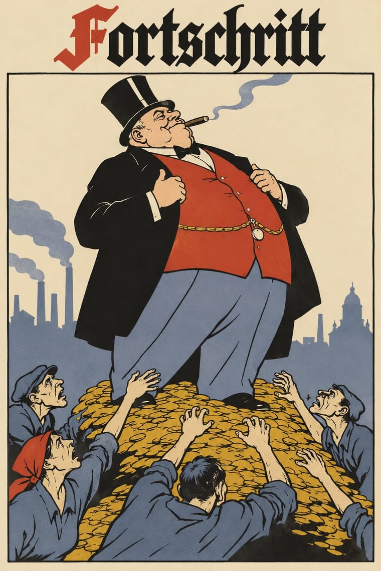
05
More combinations
With Moomin Graphics
- Scandinavian Functionalism Pairs well · The Teema mug is the meeting point: a plain functional Nordic shape carrying one warm hand drawing.
- Kawaii Design Contrasts · Its round, white characters sit near kawaii fancy goods, but they keep a hatched, melancholy world around them that kawaii fancy goods leave out.
- Ligne Claire (Franco-Belgian Clear Line) Contrasts · Both close figures in a clean contour, but the clear line refuses hatching and fills with flat colour, while Moomin hatches its landscapes and lives in black and white.
- Finnish Bold Print (Marimekko Modernism) Pairs well · The other Finnish everyday-design export: set a single Moomin line drawing beside a large flat Marimekko-style repeat for a Nordic home range.
With Simplicissimus Satirical Style
- Expressionist Woodcut Graphics Contrasts · Both distort the figure in protest, but Expressionist prints gouge it from the woodblock with angular, raw marks; Simplicissimus keeps a clean brush contour and flat tints, and adds a punchline.
- Art Nouveau Contrasts · The parent: Heine took over the Jugendstil idiom, but where Art Nouveau spends the whiplash line on flowers and idealised women, Simplicissimus spends it on a grotesque type and a caption. Choose it when the curve should mock rather than adorn.
- Japonisme Pairs well · Heine drew on Japanese woodcuts: add japonisme's cropped asymmetry and silhouetted figures against blank grounds to give a caricature more air and bite.
- Plakatstil / Sachplakat Pairs well · The NDB places Heine's posters at the start of the new poster style: borrow the Sachplakat's single object and bold block lettering for a satirical poster that keeps Simplicissimus's flat silhouette and red-on-black.
- Turkish Weekly Humour Magazines (Gırgır to Uykusuz) Contrasts · A later weekly humour magazine of the same satirical stance: Gırgır, Penguen and Uykusuz pack covers with speech balloons, comic strips and colour; Simplicissimus gives one framed drawing and one caption.
- Gothic Blackletter & Fraktur Tradition Pairs well · Set the title and the spoken caption in Fraktur, as the magazine did on almost every page, to anchor a caricature in German print culture around 1900.
- Mexican Popular Graphics (Posada) Contrasts · A contemporary in cheap satirical print around 1900 (Simplicissimus cost 10 pfennig an issue), but Posada's broadsheets pair a heavy relief cut with white-line hatching and shouting mixed display type above columns of verse, black on coloured paper; Simplicissimus gives one clean-contoured drawing with flat tints and a Fraktur caption.
- Dada Contrasts · George Grosz drew for Simplicissimus but in Berlin Dada turned satire into photomontage and typographic chaos; choose Simplicissimus for a drawn, legible joke, Dada for a cut-up assault.