Rational modernism · 1946–1990 · Central Europe
East German (DDR) Poster and Gebrauchsgrafik
Also known as DDR-Plakat, Plakatkunst der DDR, Weissensee school, Gebrauchsgrafik der DDR
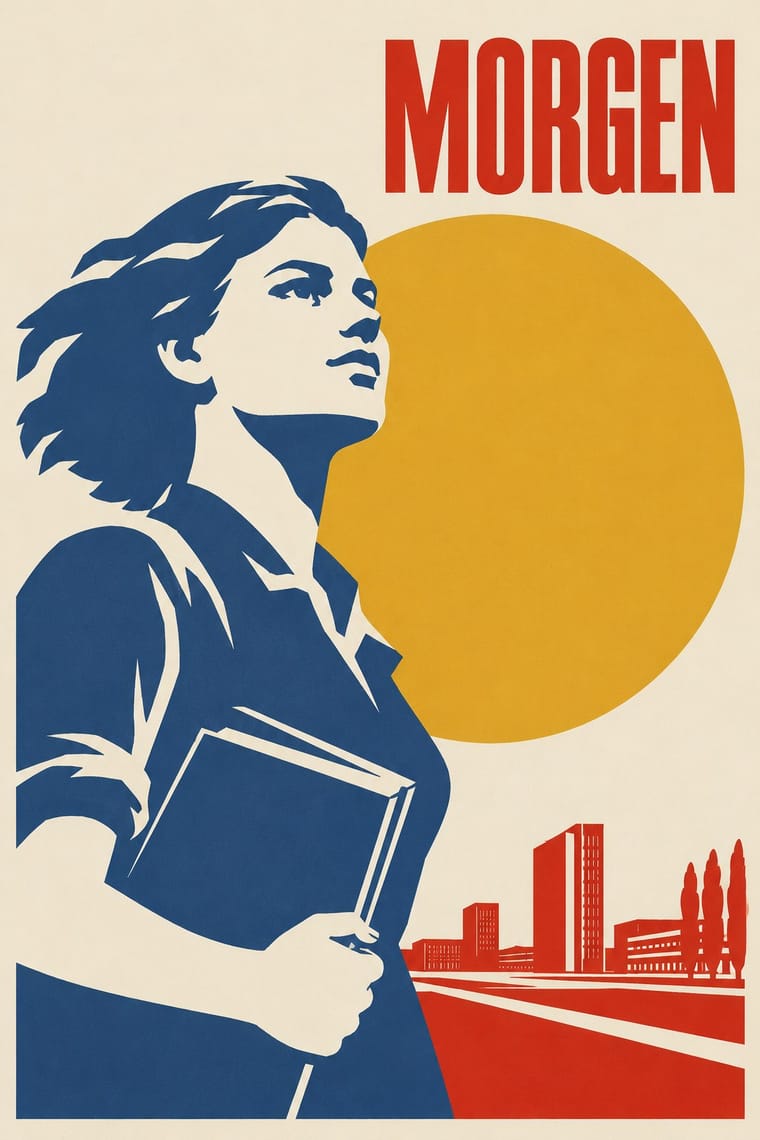
Poster and applied graphics (Gebrauchsgrafik) of the German Democratic Republic, made by named designers for theatre, film and exhibitions. The range took in graphics, collage, montage and later photography; the central tendency was a quiet typographic idiom: one focal image, few flat colours, plain sans or hand lettering. Unlike commercial plakatstil it was state-commissioned and authored, under Ministry of Culture oversight in a one-party state where it coexisted with propaganda.
Make something in this style Get advice in this style Mix it with another style
01
How it works
- Build each poster around one clear image, drawn or montaged, and let it carry the idea.
- Tend toward two or three flat inks on a plain ground, though the range also took in collage, montage and photography.
- Prefer plain sans or hand lettering over commercial advertising display type.
- Keep the tone sober and cultural: address theatre, film and exhibition audiences rather than shouting slogans.
- Sign the work as an individual designer's authored contribution within an institutional commission.
East Germany, centred on the Kunsthochschule Berlin-Weissensee (founded 1946)
02
Its design choices
From Stylogeny’s vocabulary of design choices: defining choices make the style, characteristic ones are usual, occasional ones turn up now and then.
- Layout & composition
- Space & hierarchy
- Typography
- Form & shape
- Surface & texture
- Imagery
- Medium & production
- Tone & intent
- Avoids
- Abundant decoration, Ornamented display, Fluorescent & neon, Gloss & highlights, Horror vacui, Naturalistic depiction
Palette
-
#efe9dc -
#1b1b1b -
#c8281e -
#2c4f7c -
#d9a62b
Typefaces
-
Neo-grotesque and humanist sans-serifs
-
Hand-lettered theatre and film titles
Known for
-
Klaus Wittkugel (1910-1985), poster designer, professor at Berlin-Weissensee from 1952, first chairman of the Graphic Artists' Section of the Verband Bildender Kuenstler
-
Klaus Wittkugel, poster for the film Das kalte Herz (1950)
a film-still portrait with plain title letters filled with stylised fir trees
-
Klaus Wittkugel, lettering for the Kino International, East Berlin
-
Werner Klemke, theatre and book graphics
-
Volker Pfueller, theatre posters
-
Robert Weyl, theatre posters
-
Dietrich Kaufmann, Salome poster for the Komische Oper Berlin
a tiny figure in a dark space with a red focal figure
-
Hajo Schueler, Salome poster
a comic-style, punk-influenced mask head, an outlier from the quiet tendency
03
Make something in this style
Say what you need, and Stylogeny’s image studio draws it from East German (DDR) Poster and Gebrauchsgrafik’s design choices and checks it against them. It takes about a minute, and you get a link to share.
04
Where it comes from, and what it’s close to
Before it
The style it grew out of, and the styles it borrowed from.
After it
The styles that grew out of it.
No later style in the atlas grew out of it yet.
Alike in its design choices
Styles that make many of the same choices, related or not, besides those above.

05
Often taken for
East German Poster and Gebrauchsgrafik has no real works recorded yet, so these are its nearest styles by its choices alone, with the choices that tell them apart.
-
American Mid-Century Modernism
American Mid-Century Modernism is one of East German Poster and Gebrauchsgrafik’s nearest styles by choices; no real work of either fits the other better.
Choices that tell East German Poster and Gebrauchsgrafik and American Mid-Century Modernism apart Choice East German Poster and Gebrauchsgrafik American Mid-Century Modernism Line illustration characteristic — Biomorphic curves — characteristic Ornament-free characteristic — Geometric primitives — characteristic Grotesque & neo-grotesque characteristic — Both descend from Bauhaus in the family tree.
-
Plakatstil / Sachplakat
Plakatstil / Sachplakat is one of East German Poster and Gebrauchsgrafik’s nearest styles by choices; no real work of either fits the other better.
Choices that tell East German Poster and Gebrauchsgrafik and Plakatstil apart Choice East German Poster and Gebrauchsgrafik Plakatstil Straight photography occasional avoids Dark ground — characteristic Collage & layering occasional avoids Flat vector illustration — characteristic Line illustration characteristic — No shared descent in the atlas: they reached these choices separately.
-
Bossa Nova Sleeve Modernism (César Villela and Elenco)
Bossa Nova Sleeve Modernism is one of East German Poster and Gebrauchsgrafik’s nearest styles by choices; no real work of either fits the other better.
Choices that tell East German Poster and Gebrauchsgrafik and Bossa Nova Sleeve Modernism apart Choice East German Poster and Gebrauchsgrafik Bossa Nova Sleeve Modernism Single focal point defining occasional Geometric primitives — defining Grotesque & neo-grotesque characteristic — Treated photography — defining Humanist sans characteristic — Both descend from Bauhaus in the family tree.
-
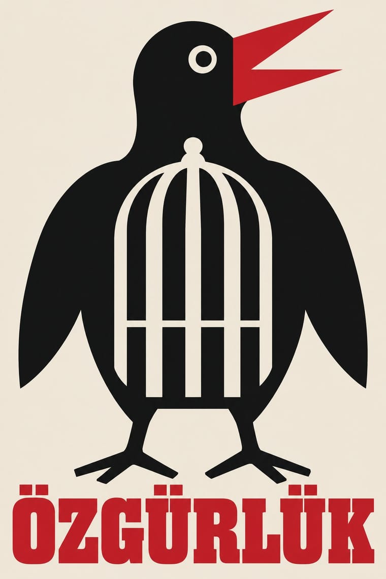
Turkish Modernist Poster & Graphic Design
Turkish Modernist Poster & Graphic Design is one of East German Poster and Gebrauchsgrafik’s nearest styles by choices; no real work of either fits the other better.
Choices that tell East German Poster and Gebrauchsgrafik and Turkish Modernist Poster apart Choice East German Poster and Gebrauchsgrafik Turkish Modernist Poster Painterly illustration occasional avoids Complementary clash — characteristic Ornament-free characteristic — Typography only — characteristic Humanist sans characteristic — No shared descent in the atlas: they reached these choices separately.
— means the choice isn’t among the style’s recorded choices. Critics recorded each work’s choices with the styles’ descriptions in view, so this shows whether the descriptions hold together, not proof that they are right.
06
Combine it with
Styles East German (DDR) Poster and Gebrauchsgrafik pairs well with or plays against, from the research. Each is worked out as a combination: which style gives the type, the colours and the forms.
- International Typographic Style Pairs well · Shares the rational sans and plain ground; add DDR hand-drawn imagery to warm a Swiss layout.
- Socialist Realist Propaganda Poster Contrasts · Heroic painted crowds and slogans against the quiet cultural poster of the same state.
- Polish Poster School Pairs well · Borrow its metaphorical single image while keeping the East German sober lettering.
07
Sources
- https://en.wikipedia.org/wiki/Klaus_Wittkugel
- https://www.dhm.de/archiv/magazine/plakate/theater/plakate_als_spiegel_des_theaterlebens.htm
- https://www.dhm.de/archiv/magazine/plakate/film/kopf_plakat.htm
- https://www.dwell.com/article/a-look-at-klaus-wittkugel-east-germanys-most-prolific-graphic-designer-88928095/6133588833897066496
How Stylogeny researches and checks a style: where the facts come from.