Digital native · 2021–present · North America, Global / networked
Biobrand (Organic Biotech CGI)
Also known as Biobrand aesthetic, Biobranding
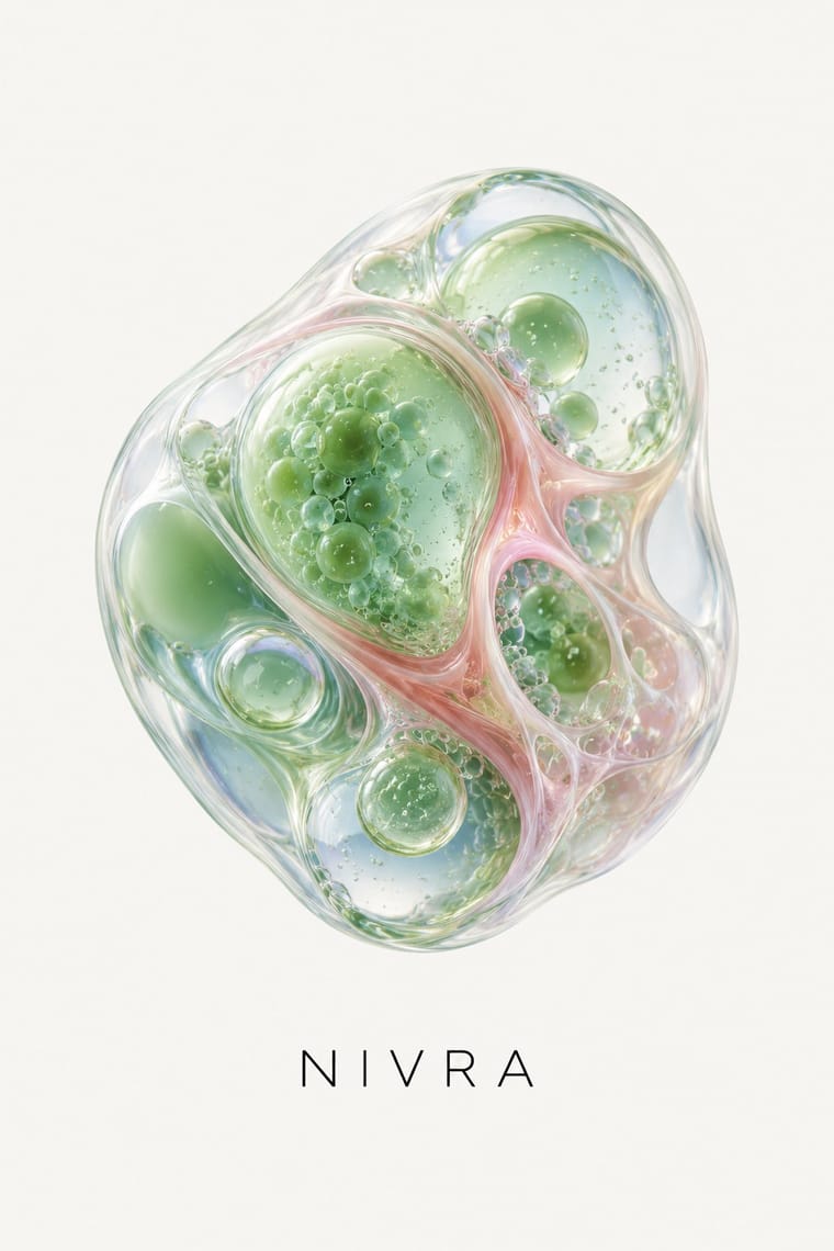
The visual language of biotech and biomaterial start-ups: rendered cells, coral-like structures, terrariums and mycelial growth become a single glossy product metaphor, set apart on a quiet ground beside restrained sans or serif information type. Kazior frames it as replacing the cold look of Silicon Valley tech minimalism with squishy, bodily, living forms.
Make something in this style Get advice in this style Mix it with another style
Use it with care
Do not let a beautiful organic render stand in for evidence: Kazior describes the idealisation of microbes as a speculative, profit-driven proposition and cautions against believing it will solve environmental problems; he also notes that biotech firms simplify complex science to persuade consumers and investors, and describes Seed's transparency as carefully crafted. Avoid green-nature or medical-efficacy implications you cannot substantiate.
01
How it works
- Render one intricate biological object, such as a cell, orb, coral or tissue, as the isolated hero of the surface.
- Surround the render with generous empty ground, white or black, so the organism reads as a precious specimen.
- Keep the interface and labels quiet: small, factual type in a restrained sans or serif, on flat fields.
- Animate growth, bubbling or unfurling slowly, so the product seems to be cultivated rather than manufactured.
- Pair lab-like information, such as ingredients, process and data, in layers beside the image.
A network of biotech brand identities and websites in US practice, named as a trend by John Kazior in AIGA Eye on Design on 2 June 2022 ('Tech minimalism is out: welcome to the squishy microbial world of the biobrand'), which discusses Geltor, Forager, Seed and Ginkgo Bioworks among others. Documented examples include &Walsh's Geltor identity (reported 30 September 2021), Libre's Forager identity (commissioned 2021) and Image Conscious Studios' Auregen launch (late 2023). The start year marks the earliest documented examples, not an invention.
02
Its design choices
From Stylogeny’s vocabulary of design choices: defining choices make the style, characteristic ones are usual, occasional ones turn up now and then.
- Layout & composition
- Space & hierarchy
- Form & shape
- Surface & texture
- Ornament
- Medium & production
- Tone & intent
- Avoids
- Abundant decoration, Horror vacui, Hard offset shadow, Ornamented display, Halftone & Ben-Day dots, Angular & zigzag
Palette
-
#f6f4ef -
#0d0f0f -
#8fb996 -
#e6a8a0 -
#5c8fa8 -
#c9b7e0
Typefaces
-
Louize (serif) and Basile Grotesque Pro, as reported in It's Nice That's coverage of the Geltor identity
2021
-
Small factual sans-serif labels under a serif product name, as on the Geltor HumaColl21 packaging
Known for
-
&Walsh, Geltor identity (reported 30 September 2021)
3D orbs holding botanical and marine-inspired worlds, product packaging and a restrained typographic system; Jessica Walsh creative director
-
Libre, Forager by Ecovative identity and website (identity commissioned 2021)
pattern, colour and typography system, with website animation of mycelial networks forming a sneaker as described by AIGA in 2022
-
Image Conscious Studios, Auregen identity and website (launched late 2023)
bioprinted-style scientific renders, organic cellular textures and fluid motion; the case-study text does not describe the ground, but the studio's image file shows a translucent form on black
03
Make something in this style
Say what you need, and Stylogeny’s image studio draws it from Biobrand (Organic Biotech CGI)’s design choices and checks it against them. It takes about a minute, and you get a link to share.
04
Where it comes from, and what it’s close to
Before it
The style it grew out of, and the styles it borrowed from.
Nothing earlier is recorded: in the atlas it is a starting point.
After it
The styles that grew out of it.
No later style in the atlas grew out of it yet.
Alike in its design choices
Styles that make many of the same choices, related or not, besides those above.
05
Often taken for
Biobrand has no real works recorded yet, so these are its nearest styles by its choices alone, with the choices that tell them apart.
-
Frutiger Aero
Frutiger Aero is one of Biobrand’s nearest styles by choices; no real work of either fits the other better.
Choices that tell Biobrand and Frutiger Aero apart Choice Biobrand Frutiger Aero Isolated object defining occasional Humanist sans — defining Generous white space defining occasional Analogous harmony — characteristic Dark ground characteristic — No shared descent in the atlas: they reached these choices separately.
-
Y2K Futurism
Y2K Futurism is one of Biobrand’s nearest styles by choices; no real work of either fits the other better.
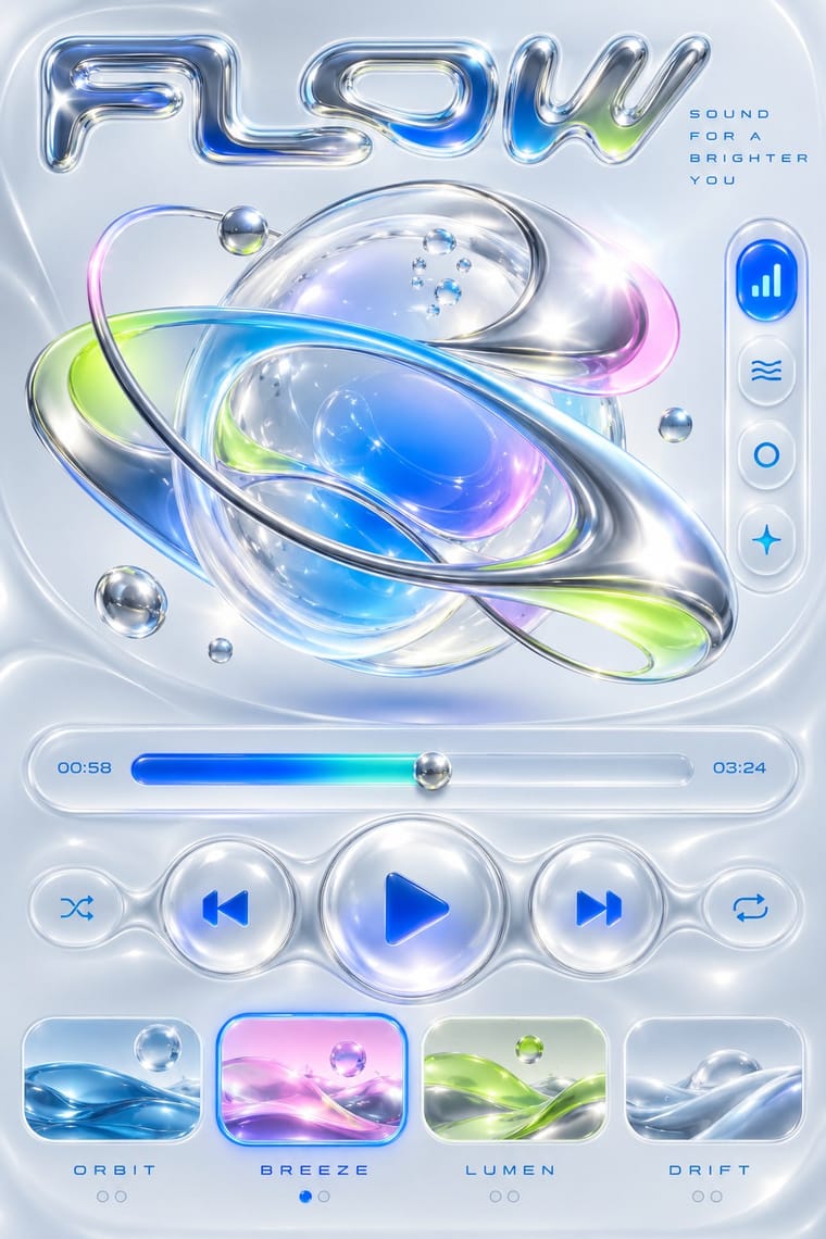
Choices that tell Biobrand and Y2K Futurism apart Choice Biobrand Y2K Futurism Humanist & Garalde serif characteristic avoids Chrome & 3D render occasional defining Generous white space defining — Iridescent & holographic — characteristic Dark ground characteristic — No shared descent in the atlas: they reached these choices separately.
-
Claymorphism & Soft 3D
Claymorphism & Soft 3D is one of Biobrand’s nearest styles by choices; no real work of either fits the other better.
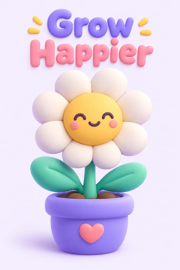
Choices that tell Biobrand and Claymorphism apart Choice Biobrand Claymorphism Biomorphic curves defining occasional Pastel — characteristic Dark ground characteristic — Full polychrome — characteristic Layered information characteristic — No shared descent in the atlas: they reached these choices separately.
-
Glassmorphism
Glassmorphism is one of Biobrand’s nearest styles by choices; no real work of either fits the other better.
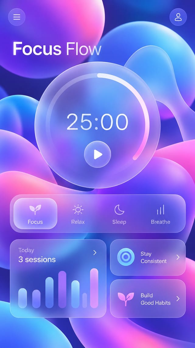
Choices that tell Biobrand and Glassmorphism apart Choice Biobrand Glassmorphism Isolated object defining — Analogous harmony — characteristic 3D render defining occasional Cards & bento tiles — characteristic Generous white space defining occasional No shared descent in the atlas: they reached these choices separately.
— means the choice isn’t among the style’s recorded choices. Critics recorded each work’s choices with the styles’ descriptions in view, so this shows whether the descriptions hold together, not proof that they are right.
06
Combine it with
Styles Biobrand (Organic Biotech CGI) pairs well with or plays against, from the research. Each is worked out as a combination: which style gives the type, the colours and the forms.
- Claymorphism & Soft 3D Contrasts · Both float soft 3D forms on pale grounds, but clay is opaque, cute and interface-bound, while the biobrand is translucent, intricate and biological; use clay for friendlier app icons.
- Generative-AI Image Aesthetic Contrasts · Generative images share the glossy gradient surface but lack a controlled product system; the biobrand fixes one authored render in a restrained layout.
- Data Humanism Contrasts · Data humanism draws organic forms by hand to encode real observations; the biobrand renders them as promotional objects. Borrow its honest encoding when a render risks overclaiming.
- DTC 'Blanding' / Millennial Minimalism Pairs well · The same airy white ground and quiet type, with photography replaced by a biological render; use blanding's calm packaging system to keep the render from overwhelming labels.
- Solarpunk Contrasts · Both pair nature with technology, but solarpunk paints a communal daylit landscape; the biobrand isolates one rendered organism as a product. Switch to solarpunk when the story is a shared future rather than a single item.
07
Sources
- John Kazior, 'Tech minimalism is out: welcome to the squishy microbial world of the biobrand', AIGA Eye on Design, 2 June 2022: https://eyeondesign.aiga.org/tech-minimalism-is-out-welcome-to-the-squishy-microbial-world-of-the-biobrand/
- &Walsh, Geltor case study: https://andwalsh.com/work/all/geltor/
- Ruby Boddington, It's Nice That, 30 September 2021: https://www.itsnicethat.com/news/andwalsh-geltor-graphic-design-300921
- Libre, Forager case study: https://libredesign.com/case-studies/forager/
- Image Conscious Studios, Auregen case study: https://www.icscreative.com/our-work/auregen/
How Stylogeny researches and checks a style: where the facts come from.