Style combination · Contrasts
Biobrand × Solarpunk
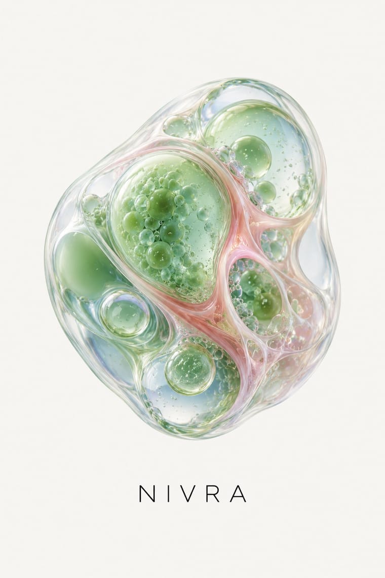
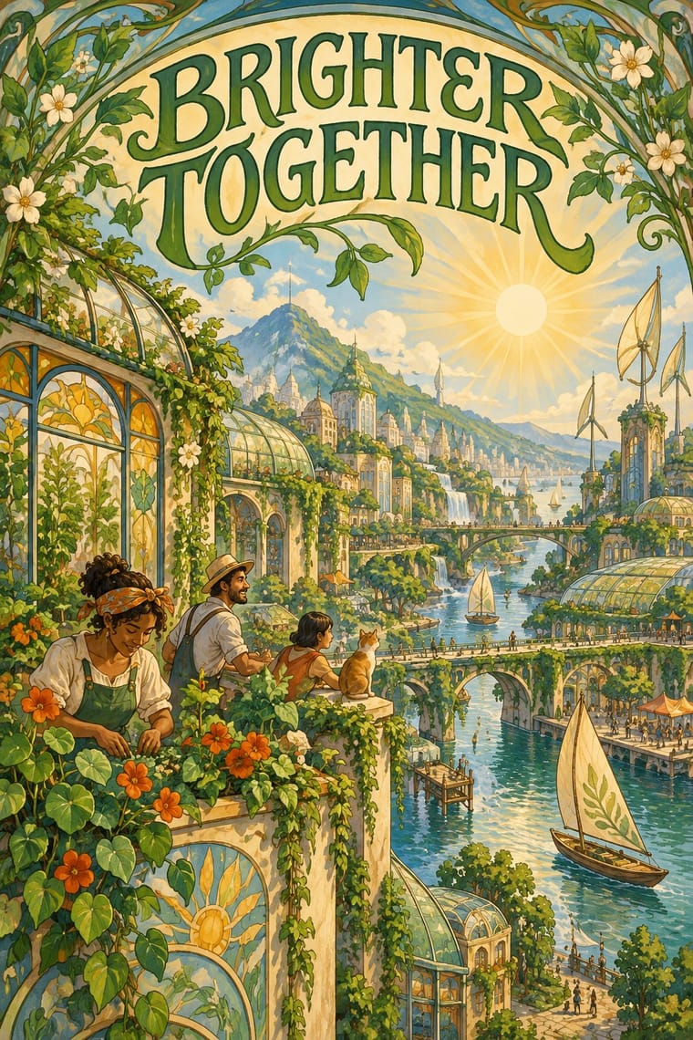
Both pair nature with technology, but solarpunk paints a communal daylit landscape; the biobrand isolates one rendered organism as a product. Switch to solarpunk when the story is a shared future rather than a single item.
01
What each style brings
Each part of the design comes from the style with the stronger say in it, and each style gives at least two.
Biobrand (Organic Biotech CGI) Solarpunk
- Type from Solarpunk
-
Biobrand avoids ornamented display: this is where the two pull against each other, which is the point of the contrast.
- Colour from Biobrand
- Form from Solarpunk
- Composition from Biobrand
- Surface from Biobrand
-
Solarpunk avoids gloss & highlights: this is where the two pull against each other, which is the point of the contrast.
02
The type
Open fonts standing in for each style’s own type, which is often hand-drawn or commercial.
Display · Solarpunk
Signal
Federant, standing in for Swash, Art Nouveau-flavoured upper- and lowercase display lettering, as in Solarpunk Magazine's orange masthead (Issue #14, 2024)
Text · Biobrand
The visual language of biotech and biomaterial start-ups: rendered cells, coral-like structures, terrariums and mycelial growth become a single glossy product metaphor, set apart on a quiet ground beside restrained sans or serif information type. Kazior frames it as replacing the cold look of Silicon Valley tech minimalism with squishy, bodily, living forms.
Inter; Biobrand used Louize (serif) and Basile Grotesque Pro, as reported in It's Nice That's coverage of the Geltor identity and Small factual sans-serif labels under a serif product name, as on the Geltor HumaColl21 packaging
03
The colours
The ground and leading colours come from Biobrand, with a counter-accent from Solarpunk. The ink reads on the ground at 4.5:1 or more.
Biobrand (Organic Biotech CGI) Solarpunk
-
#f6f4efground · 36% -
#0d0f0fink · 14% -
#5c8fa8accent · 18% -
#e8b445accent · 14% -
#e6a8a0accent · 10% -
#b8652faccent · 8%
As CSS
:root {
  --ground: #f6f4ef;
  --ink: #0d0f0f;
  --accent-1: #5c8fa8;
  --accent-2: #e8b445;
  --accent-3: #e6a8a0;
  --accent-4: #b8652f;
  --font-display: "Federant", sans-serif;
  --font-text: "Inter", sans-serif;
}
Use it with care
Biobrand (Organic Biotech CGI): Do not let a beautiful organic render stand in for evidence: Kazior describes the idealisation of microbes as a speculative, profit-driven proposition and cautions against believing it will solve environmental problems; he also notes that biotech firms simplify complex science to persuade consumers and investors, and describes Seed's transparency as carefully crafted. Avoid green-nature or medical-efficacy implications you cannot substantiate.
Solarpunk: Draw original worlds rather than pastiches of Studio Ghibli films or of living illustrators such as Likhain, Fei Fei Ruan or Stephen Lillie, and do not prompt an image model with their names. Do not use the look to greenwash: Adam Flynn calls luxury condos with a green roof that price out existing communities 'fake Solarpunk urbanism', so show shared, affordable infrastructure and ordinary people. When a scene borrows architecture, dress or symbols from a specific culture (Afrofuturist, Indigenous or other), keep their meanings and credit their makers.
04
The two styles
05
More combinations
With Biobrand
- Claymorphism & Soft 3D Contrasts · Both float soft 3D forms on pale grounds, but clay is opaque, cute and interface-bound, while the biobrand is translucent, intricate and biological; use clay for friendlier app icons.
- Generative-AI Image Aesthetic Contrasts · Generative images share the glossy gradient surface but lack a controlled product system; the biobrand fixes one authored render in a restrained layout.
- Data Humanism Contrasts · Data humanism draws organic forms by hand to encode real observations; the biobrand renders them as promotional objects. Borrow its honest encoding when a render risks overclaiming.
- DTC 'Blanding' / Millennial Minimalism Pairs well · The same airy white ground and quiet type, with photography replaced by a biological render; use blanding's calm packaging system to keep the render from overwhelming labels.
With Solarpunk
- Afrofuturist Design Pairs well · Wakanda is claimed by both: Afrofuturism brings ancestral glyphs, regal figures and cosmic dark grounds, solarpunk daylight, gardens and ordinary communities; join them with the symbols' meanings intact and Black artists credited.
- Frutiger Aero Contrasts · Both pair green nature with optimistic technology, but Aero renders it as glossy stock photography, bubbles and glass for a product; choose solarpunk for painted, handmade, lived-in places and shared infrastructure.
- Extinction Rebellion Graphics Contrasts · Both answer the climate crisis: XR shouts alarm in woodcut and flat spot colour; solarpunk paints the hopeful world after it. Pair them for campaigns that move from warning to vision.
- Synthwave / Outrun Contrasts · Synthwave's retro future is neon, chrome and night on an empty grid; solarpunk is daylit, green and crowded with people. Put them side by side to stage a fossil-fuelled nostalgia against a renewable future.
- Art Nouveau Pairs well · Olivia Louise built the look on 'updated Art Nouveau': borrow arched frames, whiplash vines and Mucha-style lettering for the veneer, but keep the painted vista and future infrastructure so it reads as a world to come rather than a period revival.
- Lo-fi Anime Aesthetic Pairs well · Both draw on Miyazaki and Ghibli-style painted backgrounds; lofi turns inward to one quiet room at dusk, solarpunk outward to a shared, sunlit city.
- Arts & Crafts Movement Pairs well · Both prize the artisan over the factory; wrap a solarpunk scene in a Morris-style foliage border or woodcut initial for zines, seed packets and printed manifestos.
- Cottagecore Pairs well · Add solarpunk's hopeful green futures to cottagecore's gardens for an eco-pastoral look.