Style combination · Contrasts
Biobrand × Data Humanism
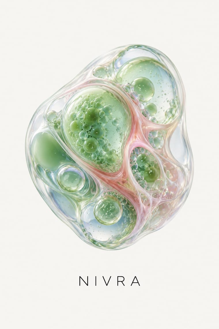
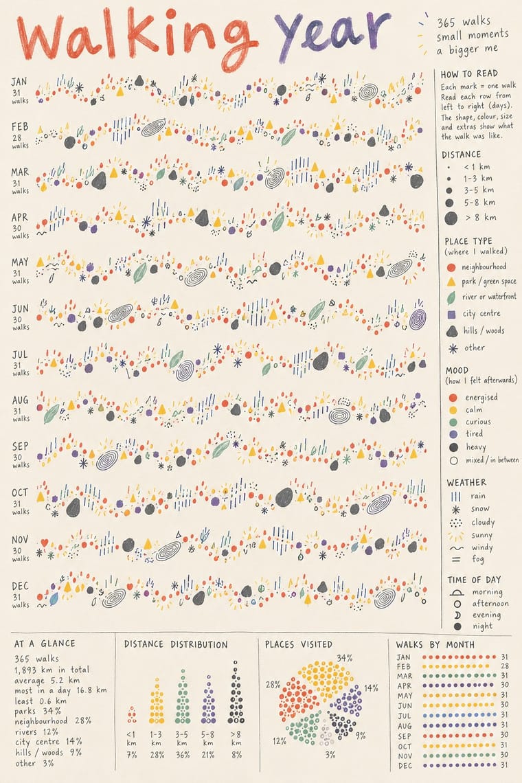
Data humanism draws organic forms by hand to encode real observations; the biobrand renders them as promotional objects. Borrow its honest encoding when a render risks overclaiming.
01
What each style brings
Each part of the design comes from the style with the stronger say in it, and each style gives at least two.
Biobrand (Organic Biotech CGI) Data Humanism
- Type from Data Humanism
- Colour from Data Humanism
- Form from Biobrand
- Composition from Biobrand
- Surface from Biobrand
-
Data Humanism avoids gloss & highlights: this is where the two pull against each other, which is the point of the contrast.
02
The type
Open fonts standing in for each style’s own type, which is often hand-drawn or commercial.
Display · Data Humanism
Home
Caveat, standing in for The designer's own handwriting in pen or pencil for titles, legends and annotations (the Dear Data postcards; the red handwritten script of Lupi's Print manifesto, 2017)
Text · Biobrand
The visual language of biotech and biomaterial start-ups: rendered cells, coral-like structures, terrariums and mycelial growth become a single glossy product metaphor, set apart on a quiet ground beside restrained sans or serif information type. Kazior frames it as replacing the cold look of Silicon Valley tech minimalism with squishy, bodily, living forms.
Inter; Biobrand used Louize (serif) and Basile Grotesque Pro, as reported in It's Nice That's coverage of the Geltor identity and Small factual sans-serif labels under a serif product name, as on the Geltor HumaColl21 packaging
03
The colours
The ground and leading colours come from Data Humanism, with a counter-accent from Biobrand. The ink reads on the ground at 4.5:1 or more.
Biobrand (Organic Biotech CGI) Data Humanism
-
#f7f3ecground · 36% -
#3a3a3aink · 14% -
#f2c14eaccent · 18% -
#5c8fa8accent · 14% -
#e0574aaccent · 10% -
#e6a8a0accent · 8%
As CSS
:root {
  --ground: #f7f3ec;
  --ink: #3a3a3a;
  --accent-1: #f2c14e;
  --accent-2: #5c8fa8;
  --accent-3: #e0574a;
  --accent-4: #e6a8a0;
  --font-display: "Caveat", cursive;
  --font-text: "Inter", sans-serif;
}
Use it with care
Biobrand (Organic Biotech CGI): Do not let a beautiful organic render stand in for evidence: Kazior describes the idealisation of microbes as a speculative, profit-driven proposition and cautions against believing it will solve environmental problems; he also notes that biotech firms simplify complex science to persuade consumers and investors, and describes Seed's transparency as carefully crafted. Avoid green-nature or medical-efficacy implications you cannot substantiate.
Data Humanism: Data portraits are usually drawn from real people's lives (health, moods, relationships, locations): get consent and anonymise before publishing other people's personal data. Because the custom encodings cannot be read at a glance, give a plain-text summary and the key alongside the drawing for readers who use screen readers or are in a hurry.
04
The two styles
05
More combinations
With Biobrand
- Claymorphism & Soft 3D Contrasts · Both float soft 3D forms on pale grounds, but clay is opaque, cute and interface-bound, while the biobrand is translucent, intricate and biological; use clay for friendlier app icons.
- Generative-AI Image Aesthetic Contrasts · Generative images share the glossy gradient surface but lack a controlled product system; the biobrand fixes one authored render in a restrained layout.
- DTC 'Blanding' / Millennial Minimalism Pairs well · The same airy white ground and quiet type, with photography replaced by a biological render; use blanding's calm packaging system to keep the render from overwhelming labels.
- Solarpunk Contrasts · Both pair nature with technology, but solarpunk paints a communal daylit landscape; the biobrand isolates one rendered organism as a product. Switch to solarpunk when the story is a shared future rather than a single item.
With Data Humanism
- Isotype Pictorial Statistics Contrasts · Isotype fixes one standard sign per thing and counts by repeating it so anyone can read the chart; data humanism invents a new code for each dataset and asks for slow reading. Choose Isotype for public information, data humanism for portraits of particular lives.
- Corporate Memphis Contrasts · Both aim to feel warm and human, but Corporate Memphis draws generic faceless figures for mood, while data humanism draws the specific data of specific people. Replace stock warmth with a drawing of real data when a brand needs sincerity.
- Generative & Dynamic Identities Pairs well · Let a generative system draw personal data portraits from people's own answers, as What Counts did, but give the code a hand-drawn grammar and a legend so the output reads as made by people.
- Dark Tech Minimalism Contrasts · The dark dashboard shows a few clean metrics at a glance; data humanism draws the messy, qualitative data a dashboard leaves out. Put one hand-drawn data portrait beside the KPIs to show the people behind the numbers.
- Risograph & Indie Print Culture Pairs well · Print hand-drawn data drawings in two or three riso spot inks for zines and postcards, so each ink becomes one data category and the grain matches the hand.
- Sketchnoting and Graphic Recording Pairs well · Both keep the human hand visible in explanatory drawing; sketchnoting adds live speed and containers.
- Newsroom Data Graphics & Scrollytelling Contrasts · Newsroom graphics use chart types readers already know, labelled directly so they can be read at a glance; data humanism invents a new hand-drawn code for each dataset and asks for slow reading. Use the newsroom chart for the finding, a hand-drawn data portrait for the people behind it.
- Mithila (Madhubani) Painting Pairs well · Both treat hand-drawn hatching, dots and repeated small marks as content; a kachni-style legend or border can give a hand-drawn chart a South Asian line vocabulary, provided a Mithila painter is commissioned for it.