Pictorial & machine age · 2005–present · Northern Europe, Global / networked
Nordic Noir Book Cover
Also known as Scandi-noir cover, Scandinavian crime cover template
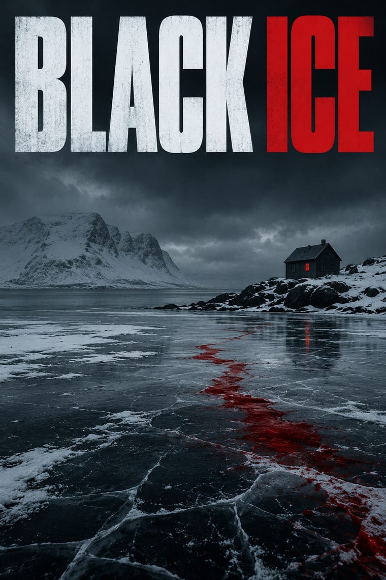
A series-branding template for translated Nordic crime fiction: one large cold photograph of snow, forest, water or a lit window under a dark sky, tinted or colour-graded, with a single saturated accent colour, usually blood red, and bold sans-serif capitals in fixed positions. The book-series template and the landscape-as-menace image distinguish it from other cold, dark sleeve styles.
Make something in this style Get advice in this style Mix it with another style
01
How it works
- Fill the cover with one bleak landscape or night photograph in which something is faintly wrong.
- Hold the palette to a dark, desaturated ground and one saturated accent, typically red, that survives at thumbnail size.
- Set title and author in bold sans-serif capitals in fixed positions so the series reads as a brand.
- Hint at a crime with a single small object or trace, such as an axe, a swing or a lit window, rather than showing violence.
- Leave open sky or dark ground around the title so it holds the image at the size of an online listing.
Scandinavian and Anglophone crime-fiction publishing, as Nordic crime novels were exported in translation after Stieg Larsson's Millennium trilogy (Swedish editions 2005-07, English from 2008); the English term 'Nordic noir' is credited to UCL's Scandinavian department and was popularised by British media.
02
Its design choices
From Stylogeny’s vocabulary of design choices: defining choices make the style, characteristic ones are usual, occasional ones turn up now and then.
- Layout & composition
- Space & hierarchy
- Typography
- Surface & texture
- Ornament
- Medium & production
- Tone & intent
- Avoids
- Abundant decoration, Floral & vegetal, Horror vacui, Pastel, Full polychrome, Fluorescent & neon, Script, Ornamented display, Eclectic mixing, Central symmetry, Comic & cartoon, Playful & witty
Palette
-
#0e1218 -
#2b3440 -
#8fa3b3 -
#e8ecef -
#b3171d
Typefaces
-
Bold grotesque sans-serif capitals
-
Scratched or distressed hand-lettered titles
minority variant
Known for
-
Jar City (Arnaldur Indridason)
UK covers with snow, red and a swing, and the 'A Reykjavik Murder Mystery' series branding (by 2009), discussed on the Digital Cover blog (2013)
-
Jar City (Arnaldur Indridason)
2006 US edition, a man and a house in black and white, a non-series contrast case (Digital Cover blog, 2013)
-
Millennium trilogy (Stieg Larsson), 2005-07
the commercial driver of the translation boom; its cover designs are not documented here
03
Make something in this style
Say what you need, and Stylogeny’s image studio draws it from Nordic Noir Book Cover’s design choices and checks it against them. It takes about a minute, and you get a link to share.
04
Where it comes from, and what it’s close to
Before it
The style it grew out of, and the styles it borrowed from.
Nothing earlier is recorded: in the atlas it is a starting point.
After it
The styles that grew out of it.
No later style in the atlas grew out of it yet.
Alike in its design choices
Styles that make many of the same choices, related or not, besides those above.
- Post-Punk Record Sleeve (Stiff, Factory, 4AD) 58% alike
-
-
-
-
-
05
Often taken for
Nordic Noir Book Cover has no real works recorded yet, so these are its nearest styles by its choices alone, with the choices that tell them apart.
-
Post-Punk Record Sleeve (Stiff, Factory, 4AD)
Post-Punk Record Sleeve is one of Nordic Noir Book Cover’s nearest styles by choices; no real work of either fits the other better.
Choices that tell Nordic Noir Book Cover and Post-Punk Record Sleeve apart Choice Nordic Noir Book Cover Post-Punk Record Sleeve Condensed display characteristic — Found & vernacular imagery — defining Desktop publishing characteristic — Pastel avoids occasional Flat fields — characteristic No shared descent in the atlas: they reached these choices separately.
-
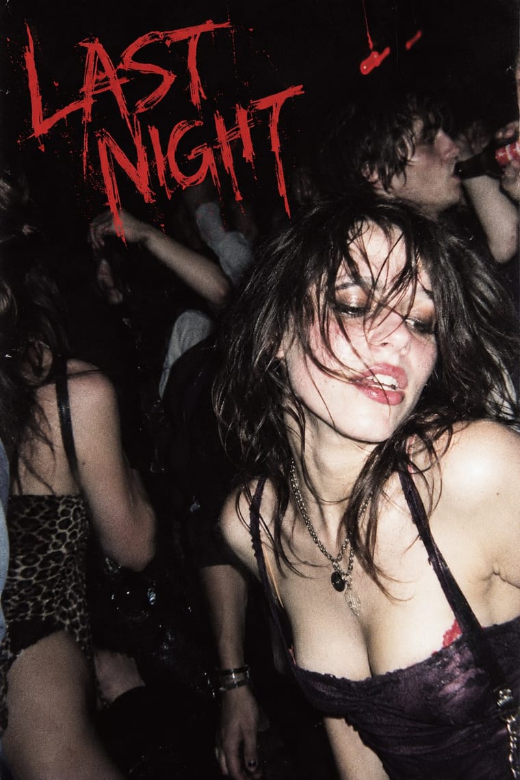
Indie Sleaze
Indie Sleaze is one of Nordic Noir Book Cover’s nearest styles by choices; no real work of either fits the other better.
Choices that tell Nordic Noir Book Cover and Indie Sleaze apart Choice Nordic Noir Book Cover Indie Sleaze All caps defining — Found & vernacular imagery — characteristic Generous white space occasional avoids Sequential narrative — characteristic Limited spot colours defining occasional No shared descent in the atlas: they reached these choices separately.
-
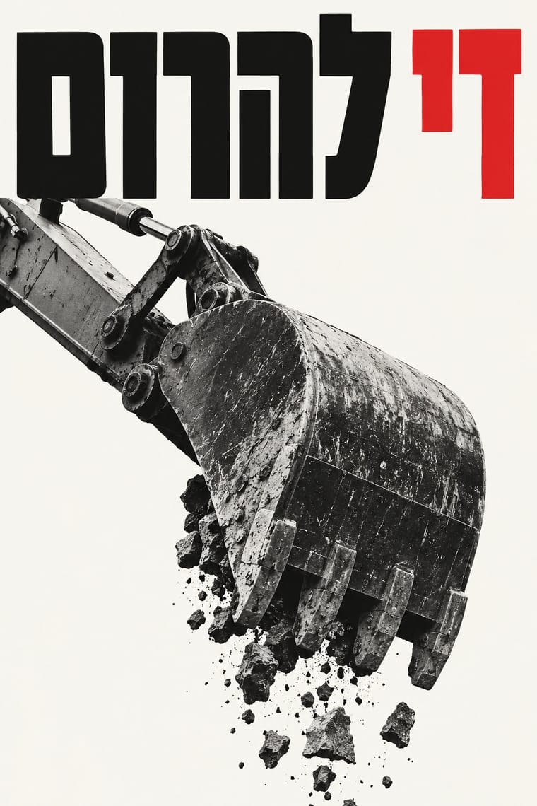
Israeli Political Poster (Tartakover to Lemel)
Israeli Political Poster is one of Nordic Noir Book Cover’s nearest styles by choices; no real work of either fits the other better.
Choices that tell Nordic Noir Book Cover and Israeli Political Poster apart Choice Nordic Noir Book Cover Israeli Political Poster Dark ground defining — Central symmetry avoids occasional All caps defining — Eclectic mixing avoids occasional Desktop publishing characteristic — No shared descent in the atlas: they reached these choices separately.
-
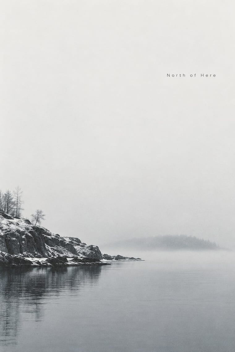
ECM Sleeve Aesthetic (Munich)
ECM Sleeve Aesthetic is one of Nordic Noir Book Cover’s nearest styles by choices; no real work of either fits the other better.
Choices that tell Nordic Noir Book Cover and ECM Sleeve Aesthetic apart Choice Nordic Noir Book Cover ECM Sleeve Aesthetic Condensed display characteristic avoids Monochrome — defining Limited spot colours defining — Pastel avoids occasional Complementary clash occasional avoids No shared descent in the atlas: they reached these choices separately.
— means the choice isn’t among the style’s recorded choices. Critics recorded each work’s choices with the styles’ descriptions in view, so this shows whether the descriptions hold together, not proof that they are right.
06
Combine it with
Styles Nordic Noir Book Cover pairs well with or plays against, from the research. Each is worked out as a combination: which style gives the type, the colours and the forms.
- Scandinavian Functionalism Contrasts · Functionalism's warm light and clarity turned cold and ominous; keep the restraint, invert the mood.
- Penguin Paperback Design (Three Bands to the Marber Grid) Contrasts · Rational typographic series grid versus landscape-as-menace photography; borrow its fixed title and author positions.
07
Sources
- Nordic noir, Wikipedia (term credited to UCL's Scandinavian department; popularised by British media)
- Digital Cover blog, 'Nordic Noir: Jar City by Arnaldur Indridason' (2013), https://digitalcover.wordpress.com/2013/05/03/nordic-noir-jar-city-by-arnaldur-indridason/
- Public Books, 'Who Killed Nordic Noir?', https://www.publicbooks.org/who-killed-nordic-noir/ (mentions only the genre's lurid covers on airport racks)
- Millennium (novel series), Wikipedia (Swedish publication 2005-07, English from 2008)
How Stylogeny researches and checks a style: where the facts come from.