Rational modernism · 1934–1958 · North America
Brodovitch Editorial Design (Harper's Bazaar)
Also known as Brodovitch style, Harper's Bazaar 1934–58 layout, Design Laboratory school
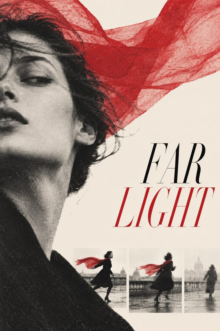
A magazine-spread idiom in which the photograph is treated as a cinematic sequence: bled, unexpectedly cropped, grainy and blurred images set against generous white space, a Didone masthead and an expressive second colour that varied by issue. Improvised rather than gridded, it made the fashion magazine an art-directed object and shaped a generation of photographers.
Make something in this style Get advice in this style Mix it with another style
01
How it works
- Bleed photographs off the page and crop them where the eye does not expect.
- Sequence images across the spread like film stills, letting blur and grain stay in.
- Treat white space as an active shape and pit tiny captions against large images.
- Use a single second colour expressively instead of a full palette.
- Set elegant high-contrast type sparingly, as a counterweight to the picture.
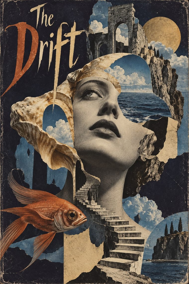
- Break the photograph with surrealist devices such as torn edges and isolated body parts.
New York: Alexey Brodovitch, a Russian émigré who worked in Paris as a poster and stage designer, art director of Harper's Bazaar under editor Carmel Snow (1934–1958) and teacher at the Design Laboratory (begun at the Philadelphia museum school in the 1930s, later held in New York)
02
Its design choices
From Stylogeny’s vocabulary of design choices: defining choices make the style, characteristic ones are usual, occasional ones turn up now and then.
- Layout & composition
- Space & hierarchy
- Colour
- Surface & texture
- Medium & production
- Tone & intent
- Avoids
- Abundant decoration, Horror vacui, Central symmetry, Ornamented display, Eclectic mixing, Modular grid
Palette
-
#f4efe6 -
#111111 -
#d3202f -
#e8b4b8
Typefaces
-
Didot
Bazaar masthead and display
-
Al-Bro
Brodovitch, 1949
Known for
-
Harper's Bazaar
art direction 1934–1958
-
Brodovitch, Ballet (1945)
about 104 blurred, grainy photographs of ballet performances taken 1935–37
-
Portfolio magazine
1949, three issues
-
Design Laboratory (1930s–)
students included Richard Avedon, Irving Penn and Lillian Bassman; Robert Frank studied with Brodovitch
-
Le Bal Banal poster competition, first prize
Paris, 1924
03
Make something in this style
Say what you need, and Stylogeny’s image studio draws it from Brodovitch Editorial Design (Harper's Bazaar)’s design choices and checks it against them. It takes about a minute, and you get a link to share.
04
Where it comes from, and what it’s close to
Before it
The style it grew out of, and the styles it borrowed from.
After it
The styles that grew out of it.
No later style in the atlas grew out of it yet.
Alike in its design choices
Styles that make many of the same choices, related or not, besides those above.
-
-
- Post-Punk Record Sleeve (Stiff, Factory, 4AD) 54% alike
-
-
- Contemporary Chinese Book Design ('Most Beautiful Books of China') 50% alike
05
Often taken for
Brodovitch Editorial Design has no real works recorded yet, so these are its nearest styles by its choices alone, with the choices that tell them apart.
-
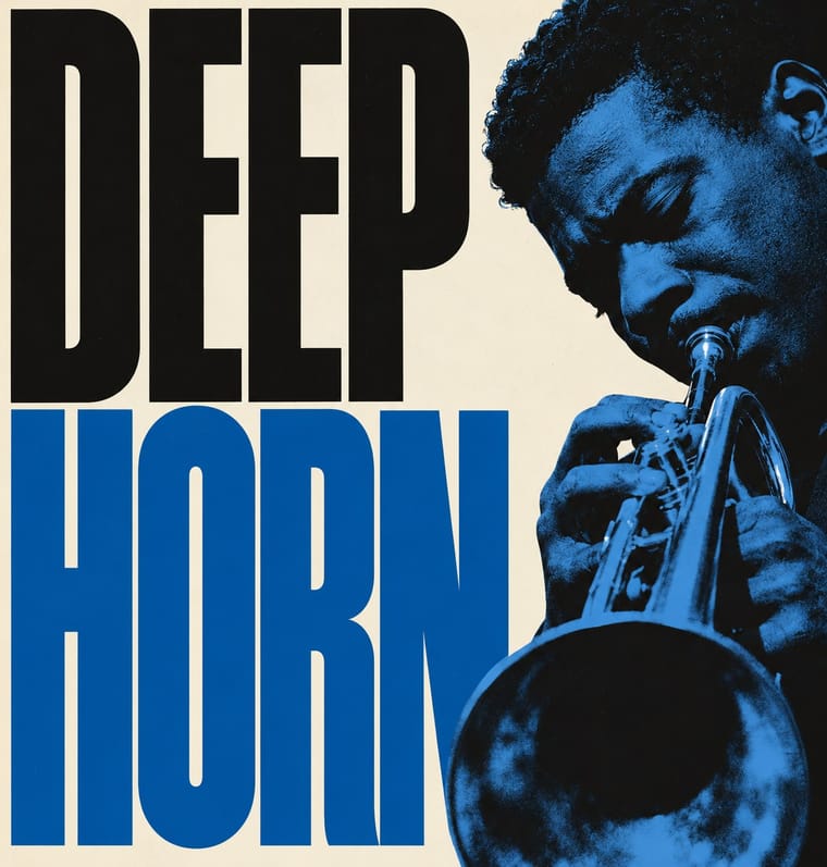
Blue Note Jazz Sleeve Modernism
Blue Note Jazz Sleeve Modernism is one of Brodovitch Editorial Design’s nearest styles by choices; no real work of either fits the other better.
Choices that tell Brodovitch Editorial Design and Blue Note Jazz Sleeve Modernism apart Choice Brodovitch Editorial Design Blue Note Jazz Sleeve Modernism Generous white space defining occasional Grotesque & neo-grotesque — defining Grain & noise defining occasional Type as image — defining Broken grid characteristic — Both descend from Italian Futurism in the family tree.
-
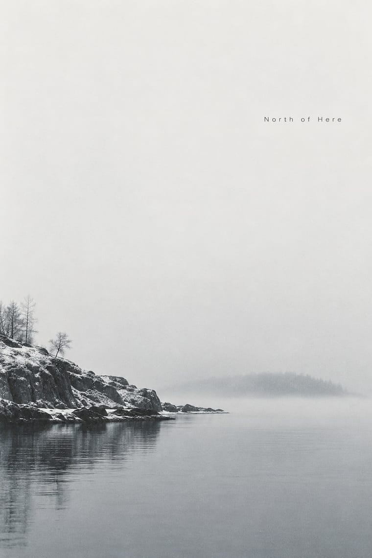
ECM Sleeve Aesthetic (Munich)
ECM Sleeve Aesthetic is one of Brodovitch Editorial Design’s nearest styles by choices; no real work of either fits the other better.
Choices that tell Brodovitch Editorial Design and ECM Sleeve Aesthetic apart Choice Brodovitch Editorial Design ECM Sleeve Aesthetic Visual tension characteristic avoids Monochrome occasional defining Limited spot colours characteristic — Single focal point occasional defining Broken grid characteristic — Both descend from Italian Futurism in the family tree.
-
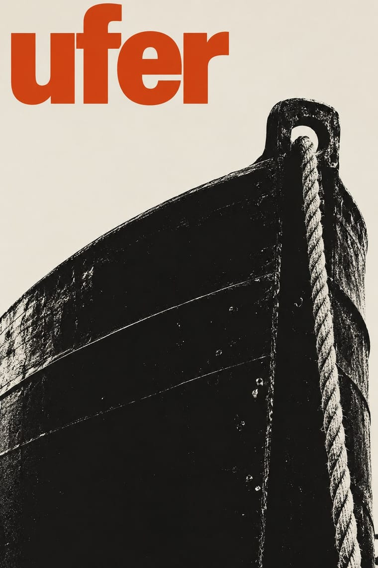
Post-Punk Record Sleeve (Stiff, Factory, 4AD)
Post-Punk Record Sleeve is one of Brodovitch Editorial Design’s nearest styles by choices; no real work of either fits the other better.
Choices that tell Brodovitch Editorial Design and Post-Punk Record Sleeve apart Choice Brodovitch Editorial Design Post-Punk Record Sleeve Light ground characteristic — Found & vernacular imagery — defining Broken grid characteristic — Single focal point occasional defining Sequential narrative characteristic — Both descend from Dada in the family tree.
-
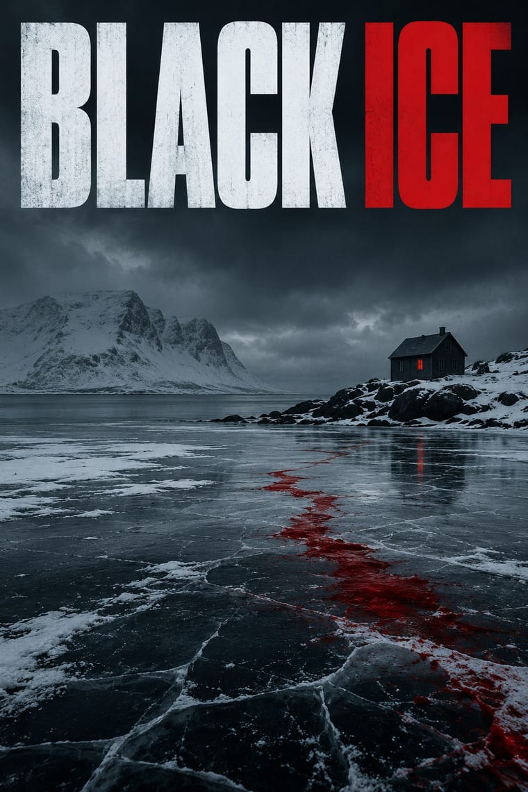
Nordic Noir Book Cover
Nordic Noir Book Cover is one of Brodovitch Editorial Design’s nearest styles by choices; no real work of either fits the other better.
Choices that tell Brodovitch Editorial Design and Nordic Noir Book Cover apart Choice Brodovitch Editorial Design Nordic Noir Book Cover Dynamic asymmetry defining occasional Dark ground — defining Generous white space defining occasional Naturalistic depiction — defining Light ground characteristic — No shared descent in the atlas: they reached these choices separately.
— means the choice isn’t among the style’s recorded choices. Critics recorded each work’s choices with the styles’ descriptions in view, so this shows whether the descriptions hold together, not proof that they are right.
06
Combine it with
Styles Brodovitch Editorial Design (Harper's Bazaar) pairs well with or plays against, from the research. Each is worked out as a combination: which style gives the type, the colours and the forms.
- Die Neue Typographie Contrasts · Asymmetry without rules: improvised and photographic rather than systematic.
- Surrealist Graphics Pairs well · Take its isolated body parts, torn edges and dreamlike juxtaposition, but apply them to the photographic spread.
- American Mid-Century Modernism Contrasts · Rand and Lustig build flat geometric pictograms; Brodovitch builds sequences of grainy photographs.
07
Sources
- https://en.wikipedia.org/wiki/Alexey_Brodovitch
- https://en.wikipedia.org/wiki/Harper%27s_Bazaar
- https://philamuseum.org/collection/object/153967
- Kerry William Purcell, Alexey Brodovitch (Phaidon, 2002)
How Stylogeny researches and checks a style: where the facts come from.