Style combination · Contrasts
Nordic Noir Book Cover × Penguin Paperback Design
Rational typographic series grid versus landscape-as-menace photography; borrow its fixed title and author positions.
Mix them and make something Nordic Noir Book Cover Penguin Paperback Design
01
What each style brings
Each part of the design comes from the style with the stronger say in it, and each style gives at least two.
Nordic Noir Book Cover Penguin Paperback Design (Three Bands to the Marber Grid)
- Type from Penguin Paperback Design
- Colour from Nordic Noir Book Cover
- Form from Penguin Paperback Design
- Composition from Nordic Noir Book Cover
- Surface from Nordic Noir Book Cover
02
The type
Open fonts standing in for each style’s own type, which is often hand-drawn or commercial.
Display · Penguin Paperback Design
Public
Fira Sans, standing in for Gill Sans (Eric Gill, Monotype: author and title on Edward Young's 1935 banded cover, kept with much improved letterspacing in Tschichold's reform)
Text · Nordic Noir Book Cover
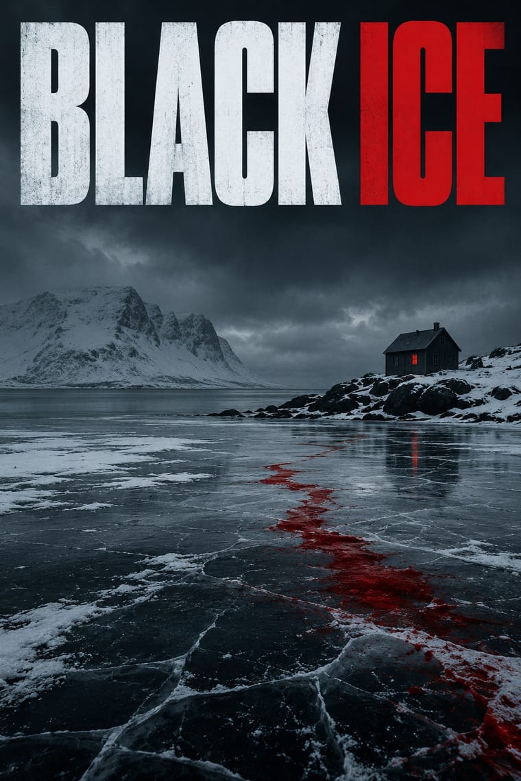
A series-branding template for translated Nordic crime fiction: one large cold photograph of snow, forest, water or a lit window under a dark sky, tinted or colour-graded, with a single saturated accent colour, usually blood red, and bold sans-serif capitals in fixed positions. The book-series template and the landscape-as-menace image distinguish it from other cold, dark sleeve styles.
Inter; Nordic Noir Book Cover used Bold grotesque sans-serif capitals and Scratched or distressed hand-lettered titles
03
The colours
The ground and leading colours come from Nordic Noir Book Cover, with a counter-accent from Penguin Paperback Design. The ink reads on the ground at 4.5:1 or more.
Nordic Noir Book Cover Penguin Paperback Design (Three Bands to the Marber Grid)
-
#0e1218ground · 36% -
#e8ecefink · 14% -
#b3171daccent · 18% -
#ef7d22accent · 14% -
#8fa3b3accent · 10% -
#c8285faccent · 8%
As CSS
:root {
  --ground: #0e1218;
  --ink: #e8ecef;
  --accent-1: #b3171d;
  --accent-2: #ef7d22;
  --accent-3: #8fa3b3;
  --accent-4: #c8285f;
  --font-display: "Fira Sans", sans-serif;
  --font-text: "Inter", sans-serif;
}
Use it with care
Penguin Paperback Design (Three Bands to the Marber Grid): The Penguin name and penguin symbol belong to the publisher, which still reissues its classic grid covers, and many cover photographs and drawings remain in their makers' copyright: draw your own emblem, do not combine an orange or green three-band cover with a bird emblem and a publisher cartouche so that it passes for Penguin, and never present a new design as a Penguin book.
04
The two styles

05
More combinations
With Nordic Noir Book Cover
With Penguin Paperback Design
- GOV.UK Design (GDS Style) Pairs well · Both are British systems that set one sans in fixed positions on white and let rules build the hierarchy; GOV.UK refuses pictures and gives each colour one job, so borrow Penguin's one colour per series when a text-led service has to sort many sections at a glance.
- International Typographic Style Pairs well · Facetti and Marber already brought Standard and Helvetica, a rule and ranged-left type to the paperback; borrow a Swiss modular grid to extend the Penguin top strip into a full series system for books or podcasts.
- London Transport Design Pairs well · Both are British systems with a fixed emblem and a Johnston-to-Gill humanist sans; pair London Transport's commissioned pictorial art with Penguin's genre colour bands when one identity has to carry many varied items.
- Vicente Rojo & Mexican Editorial Modernism Pairs well · Rojo's Ediciones Era covers share the white ground, fine rules and one image in a fixed field; combine them for a literary list that needs both a rigid frame and grainy, two-ink photographs.
- Bengali Modernist Book Cover (Prachchhad) Contrasts · Contemporary opposites in literary covers: Signet Press drew a new hand-lettered title for every book, Penguin set the same typeface in the same place on every one; choose by whether the series or the single title should lead.
- Hauntology & Ghost Box Design Contrasts · Ghost Box quotes the ruled Penguin band over a saturated field as an eerie, ironic memory; use the original when the template should simply sort and sell books, and Ghost Box when it should haunt.
- Giallo Mondadori Covers (I Libri Gialli) Contrasts · Penguin coded crime with green bands and type only; Mondadori coded it with yellow and a painted window. Borrow Penguin's fixed type positions to tidy a giallo template, or a painted window to warm a banded one.
- Book Blob (Abstract Colour-Blob Literary Fiction Cover) Contrasts · Penguin's bands and grid made every book look like its publisher on purpose. The blob made books from rival houses look like one another, so the cover signals comparable titles rather than an imprint. Borrow a house grid when a series identity should outlast the season's trend.