Counterculture · 1973–1989 · North America, Global / networked
Skateboard Deck Graphics
Also known as Skate graphics, Skateboard art, Deck art
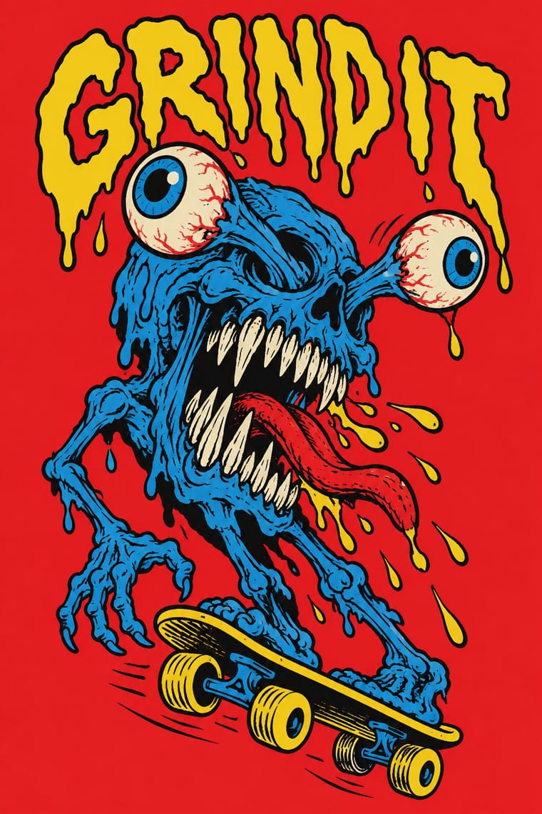
The graphics printed on the underside of skateboard decks, developed by Californian skate companies in the 1970s and 80s (the scope here; later photographic and parody decks are not covered). An artist-drawn image, usually a monster, skull, hand or cartoon figure in heavy ink outline, fills a tall vertical board in a few flat screenprinted colours, with a brand logo that repeats across a collectible series of models.
Make something in this style Get advice in this style Mix it with another style
01
How it works
- Draw the image by hand in heavy ink outline and fill it with a few flat colours.
- Compose for the tall vertical deck shape, with one bold figure filling the board.
- Choose aggressive, humorous subjects such as monsters, skulls, hands and cartoon characters.
- Repeat the brand logo on decks so a whole series reads as one product line.
- Make each model a collectible variant of the same drawn graphic.
California: skate companies out of Santa Cruz (NHS, Inc., founded 1973 by Richard Novak, Doug Haut and Jay Shuirman) and Powell Peralta (founded 1978); Jim Phillips, who began in surfboard shops and surf magazines in the 1960s, was art director for Santa Cruz in the 1970s and 80s
02
Its design choices
From Stylogeny’s vocabulary of design choices: defining choices make the style, characteristic ones are usual, occasional ones turn up now and then.
- Layout & composition
- Space & hierarchy
- Typography
- Colour
- Form & shape
- Surface & texture
- Medium & production
- Tone & intent
- Avoids
- Central symmetry, Generous white space, Grotesque & neo-grotesque, Photocopy & distress, Rational & objective, Authoritative & institutional
Palette
-
#e8202a -
#111111 -
#f5d312 -
#f2ede0 -
#1e7fcb
Typefaces
-
Santa Cruz logotype, hand-drawn by Jim Phillips
1978
-
Hand-lettered brand logos in thick outline
Known for
-
Santa Cruz Skateboards
NHS, Inc., founded 1973
-
Santa Cruz logo, Jim Phillips
1978
-
Screaming Hand, Jim Phillips
1985
-
Powell Peralta (founded 1978) and its Bones Brigade team
team created 1979
-
Creature Skateboards
distributed by NHS
03
Make something in this style
Say what you need, and Stylogeny’s image studio draws it from Skateboard Deck Graphics’s design choices and checks it against them. It takes about a minute, and you get a link to share.
04
Where it comes from, and what it’s close to
After it
The styles that grew out of it.
No later style in the atlas grew out of it yet.
Alike in its design choices
Styles that make many of the same choices, related or not, besides those above.
-
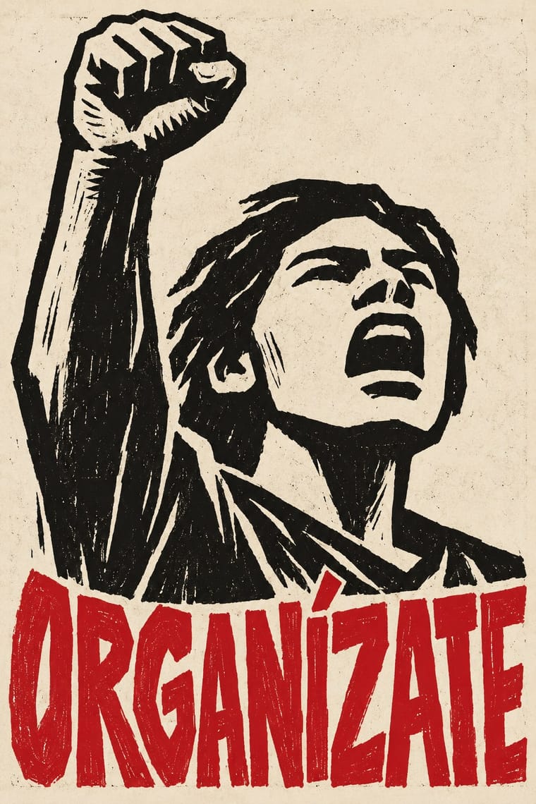
- Atelier Populaire (May '68 Screenprint Poster) 68% alike
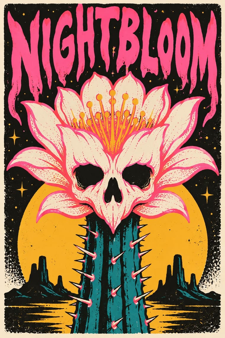
- Bitterkomix (Afrikaans Underground Comics) 66% alike
-
-
-
05
Often taken for
Skateboard Deck Graphics has no real works recorded yet, so these are its nearest styles by its choices alone, with the choices that tell them apart.
-
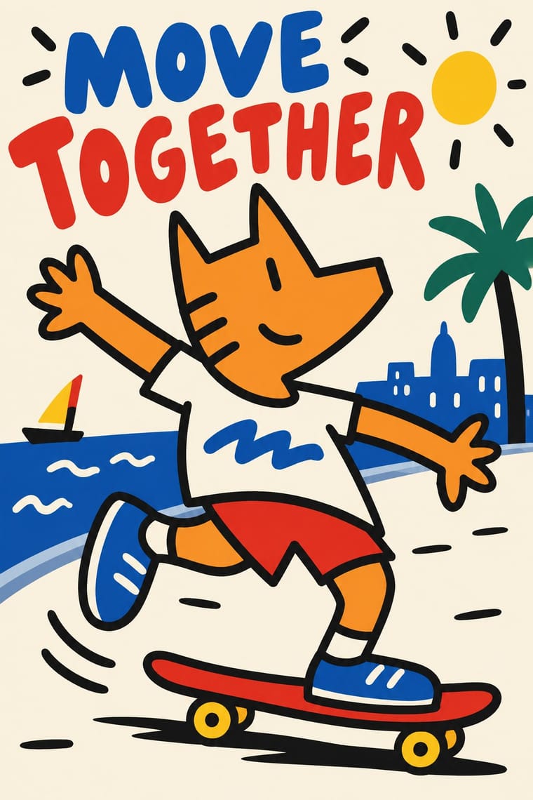
Cobi and Mariscal's Barcelona '92 Mascot Graphics
Cobi and Mariscal's Barcelona '92 Mascot Graphics is one of Skateboard Deck Graphics’s nearest styles by choices; no real work of either fits the other better.
Choices that tell Skateboard Deck Graphics and Cobi and Mariscal's Barcelona '92 Mascot Graphics apart Choice Skateboard Deck Graphics Cobi and Mariscal's Barcelona '92 Mascot Graphics Limited spot colours defining — Light ground — characteristic Hand-lettering defining occasional Full polychrome — characteristic Screen printing defining — No shared descent in the atlas: they reached these choices separately.
-
Atelier Populaire (May '68 Screenprint Poster)
Atelier Populaire is one of Skateboard Deck Graphics’s nearest styles by choices; no real work of either fits the other better.
Choices that tell Skateboard Deck Graphics and Atelier Populaire apart Choice Skateboard Deck Graphics Atelier Populaire Limited spot colours defining occasional Monochrome — defining Pen, brush & ink defining — Central symmetry avoids occasional Generous white space avoids occasional No shared descent in the atlas: they reached these choices separately.
-
Bitterkomix (Afrikaans Underground Comics)
Bitterkomix is one of Skateboard Deck Graphics’s nearest styles by choices; no real work of either fits the other better.
Choices that tell Skateboard Deck Graphics and Bitterkomix apart Choice Skateboard Deck Graphics Bitterkomix Isolated object defining occasional Monochrome — defining Single focal point defining occasional Framed panels — defining Emblems & badges characteristic — No shared descent in the atlas: they reached these choices separately.
-
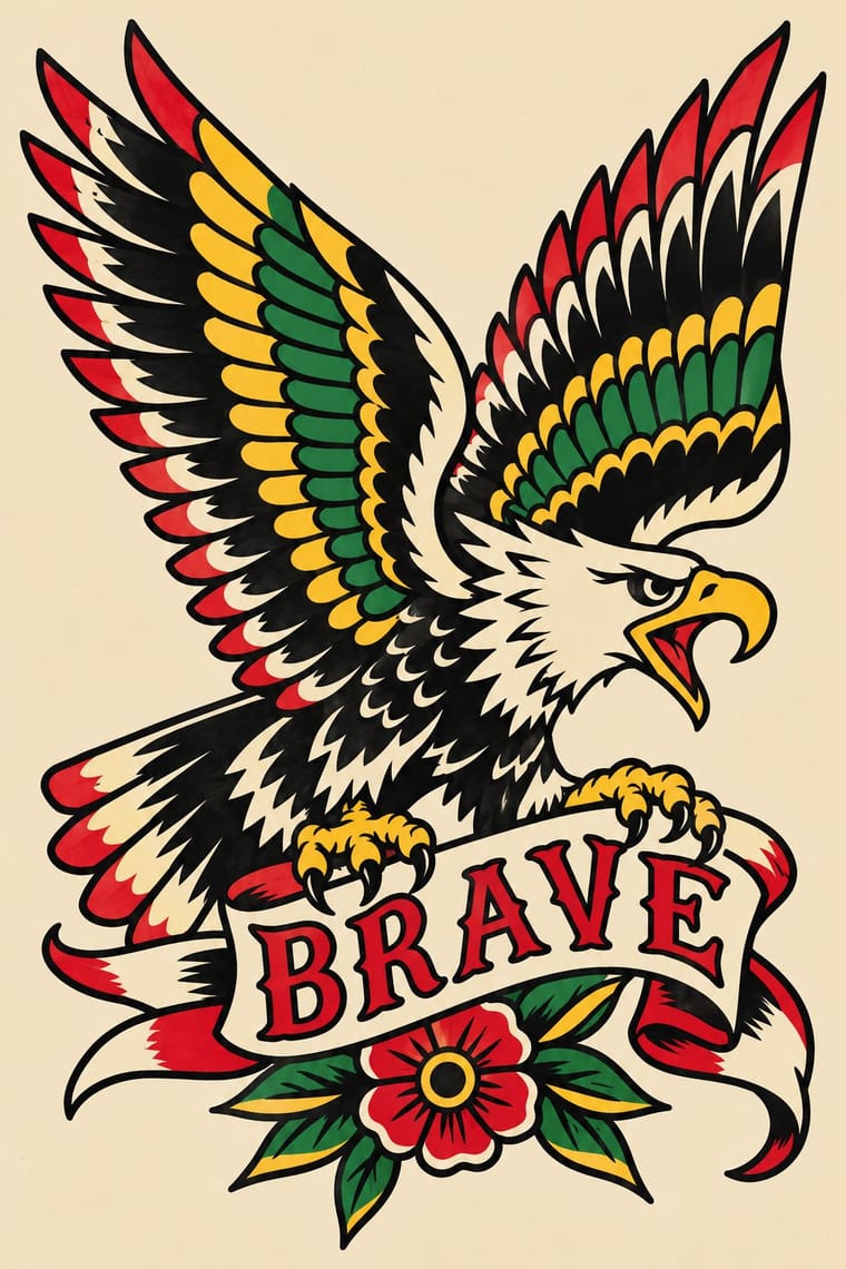
American Traditional Tattoo Flash
American Traditional Tattoo Flash is one of Skateboard Deck Graphics’s nearest styles by choices; no real work of either fits the other better.
Choices that tell Skateboard Deck Graphics and American Traditional Tattoo Flash apart Choice Skateboard Deck Graphics American Traditional Tattoo Flash Distortion & exaggeration defining — Central symmetry avoids occasional Ornament-free occasional avoids Primary triad — characteristic Comic & cartoon characteristic — No shared descent in the atlas: they reached these choices separately.
— means the choice isn’t among the style’s recorded choices. Critics recorded each work’s choices with the styles’ descriptions in view, so this shows whether the descriptions hold together, not proof that they are right.
06
Combine it with
Styles Skateboard Deck Graphics pairs well with or plays against, from the research. Each is worked out as a combination: which style gives the type, the colours and the forms.
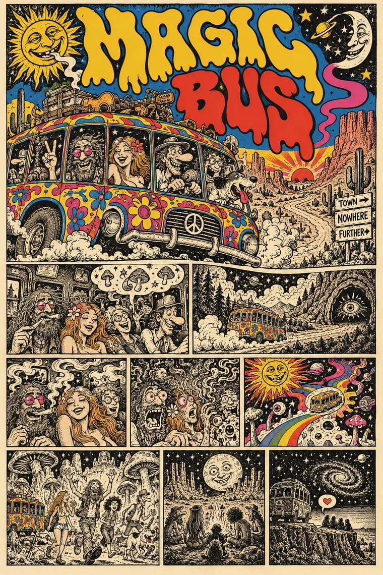
- American Traditional Tattoo Flash Pairs well · Both use bold outline and flat limited colour on a single emblem; borrow the flash sheet's emblematic symmetry, but keep the deck's comic humour.
- Punk & DIY Zine Pairs well · Share rebellious tone and hand lettering; swap the photocopied collage for a single inked figure to turn a punk flyer into a product graphic.
- Underground Comix Pairs well · Both draw distorted, humorous figures in ink; add a vertical single-image format and flat screenprint colours to move from comic page to deck.
07
Sources
- https://en.wikipedia.org/wiki/Santa_Cruz_Skateboards
- https://en.wikipedia.org/wiki/Powell_Peralta
- https://clubofthewaves.com/surf-artist/jim-phillips/
How Stylogeny researches and checks a style: where the facts come from.