Style combination · Pairs well
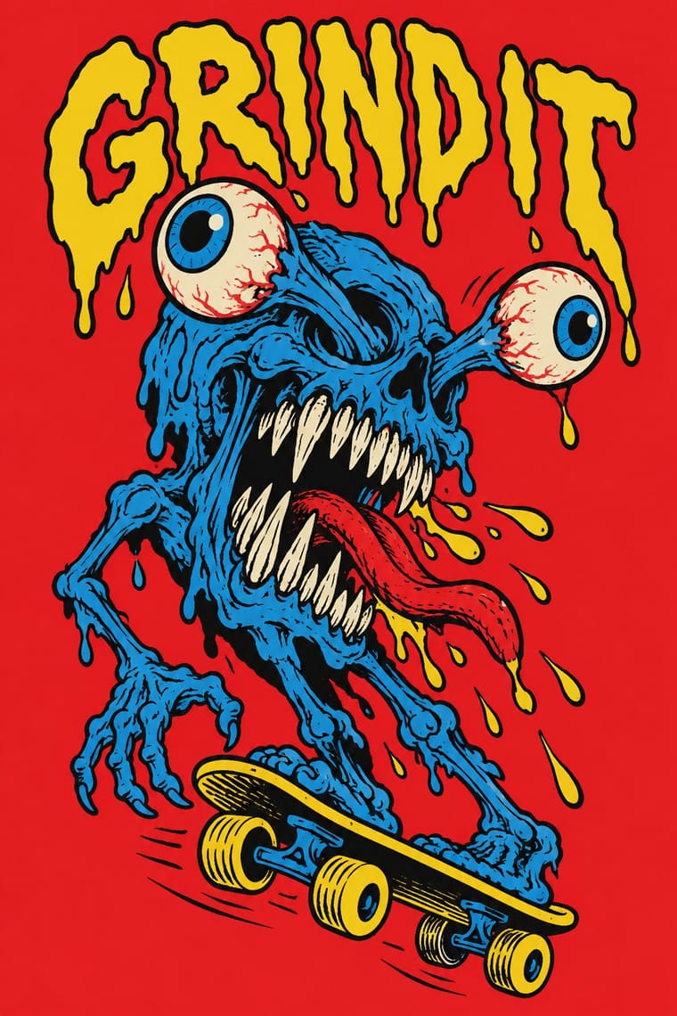
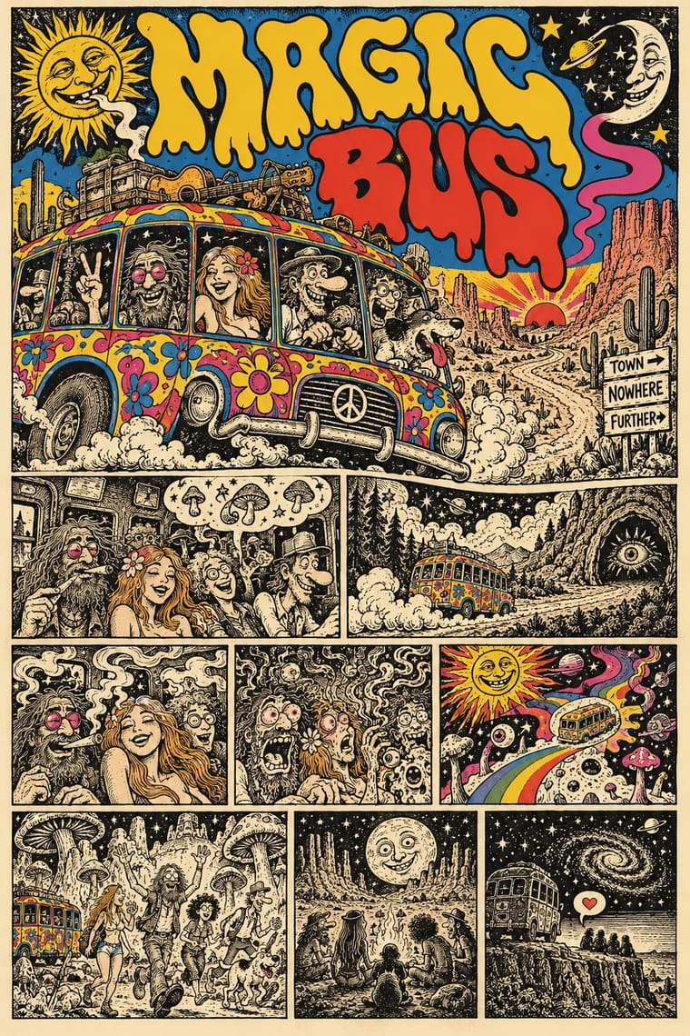
Skateboard Deck Graphics × Underground Comix
Both draw distorted, humorous figures in ink; add a vertical single-image format and flat screenprint colours to move from comic page to deck.
Mix them and make something Skateboard Deck Graphics Underground Comix
01
What each style brings
Each part of the design comes from the style with the stronger say in it, and each style gives at least two.
Skateboard Deck Graphics Underground Comix
- Type from Underground Comix
- Colour from Skateboard Deck Graphics
- Form from Underground Comix
- Composition from Skateboard Deck Graphics
- Surface from Skateboard Deck Graphics
-
Underground Comix avoids flat: this is where the two pull against each other.
02
The type
Open fonts standing in for each style’s own type, which is often hand-drawn or commercial.
Display · Underground Comix
Riot
Bangers, standing in for Pen-drawn balloon capitals (each cartoonist's own hand on the page, in the same pen as the drawing)
Text · Skateboard Deck Graphics
The graphics printed on the underside of skateboard decks, developed by Californian skate companies in the 1970s and 80s (the scope here; later photographic and parody decks are not covered). An artist-drawn image, usually a monster, skull, hand or cartoon figure in heavy ink outline, fills a tall vertical board in a few flat screenprinted colours, with a brand logo that repeats across a collectible series of models.
Archivo; Skateboard Deck Graphics used Santa Cruz logotype, hand-drawn by Jim Phillips and Hand-lettered brand logos in thick outline
03
The colours
The ground and leading colours come from Skateboard Deck Graphics, with a counter-accent from Underground Comix. The ink reads on the ground at 4.5:1 or more.
Skateboard Deck Graphics Underground Comix
-
#f2ede0ground · 36% -
#111111ink · 14% -
#f5d312accent · 18% -
#e8202aaccent · 14% -
#1e7fcbaccent · 10% -
#c9307aaccent · 8%
As CSS
:root {
  --ground: #f2ede0;
  --ink: #111111;
  --accent-1: #f5d312;
  --accent-2: #e8202a;
  --accent-3: #1e7fcb;
  --accent-4: #c9307a;
  --font-display: "Bangers", sans-serif;
  --font-text: "Archivo", sans-serif;
}
Use it with care
Underground Comix: Much of the canon trades in racial caricature, such as a Black woman drawn as an 'African native' caricature, and in graphic sexual violence against women and casual misogyny, which the women's comics of 1970 and 1972 answered in their own books: borrow the hatched line, the crowded panel and the candour, not the stereotypes, and give every character the same anatomy and drawing care. The characters and mastheads (Mr. Natural, Fritz the Cat, the Freak Brothers, the Checkered Demon, the Zap logo) still belong to their makers and estates: draw your own, never ask an image model for a named cartoonist's hand, living or dead, and never present a generated page as a vintage comic.
04
The two styles
05
More combinations
With Skateboard Deck Graphics
- American Traditional Tattoo Flash Pairs well · Both use bold outline and flat limited colour on a single emblem; borrow the flash sheet's emblematic symmetry, but keep the deck's comic humour.
- Punk & DIY Zine Pairs well · Share rebellious tone and hand lettering; swap the photocopied collage for a single inked figure to turn a punk flyer into a product graphic.
With Underground Comix
- Filipino Komiks Contrasts · Both put black-and-white hatched interiors behind colour covers, but komiks drew naturalistic folk heroes and romances for the country's most widely read periodicals, while comix push big-footed caricature into adult taboo for a head-shop audience.
- Psychedelic Poster Pairs well · Take the cover from the ballroom poster, with its clashing flat inks and melting letters, and keep the hatched black-and-white panels inside, as Zap did with Moscoso and Griffin.
- Escuela Bruguera (Spanish Humour Comics) Contrasts · Both draw rubbery big-footed caricatures, but Bruguera's are coloured, family-friendly gags; the undergrounds use the same cartoon body for adult taboo.
- Turkish Weekly Humour Magazines (Gırgır to Uykusuz) Contrasts · Both learned from Mad and crowd hand-lettered caricature into the panel, but the Istanbul weeklies are mass-circulation collective magazines whose cover lampoons the week's politics, while comix are self-published books whose shock is sex, drugs and taboo.
- L'Association and French Alternative Comics Pairs well · A later French-language small-press scene, one of whose founders turned to psychedelic and autobiographical comics after discovering Crumb and Shelton, keeps the black ink and the single author's hand but clears the crowding and the shock; borrow its book design to give a comix page a calmer format.
- Métal hurlant Science-Fiction Comics (Mœbius, Druillet & Les Humanoïdes Associés) Contrasts · Adult comics of the 1970s in two opposite registers: painted, luminous science-fiction vistas against cheap, crowded black-and-white satire.
- American Four-Colour Comic Book (Golden to Bronze Age) Contrasts · Same format, everything else reversed: set a four-colour, Code-approved house-style page beside a hatched black-and-white page by a single author to show what the undergrounds rejected.
- Punk & DIY Zine Pairs well · Both are cheap, self-published print made outside the mainstream; add cut-and-paste collage and Xerox grit to a hand-drawn comix page for the later punk-zine voice.