Avant-garde · 1921–1926 · Southern Europe, Central Europe
Zenitism (Zenit Magazine Typography)
Also known as Zenit, Zenitist typography, Micić's Zenit
Ljubomir Micić's Yugoslav avant-garde: the monthly Zenit (43 issues, 1921-1926) and its 'abstract metacosmic expressionism' and Balkan 'barbarogenius', a 'modern primitive'. Unlike Mavo or Constructivism it has expressionist roots, Balkan-primitivist doctrine and a multilingual review; it was twice banned. Page design is thinly sourced, so design traits are tentative. Micić later turned to Serbian nationalism; the 'barbarogenius' rhetoric is ethnonational. Wikipedia says Zenitism distanced itself from Dada.
Make something in this style Get advice in this style Mix it with another style
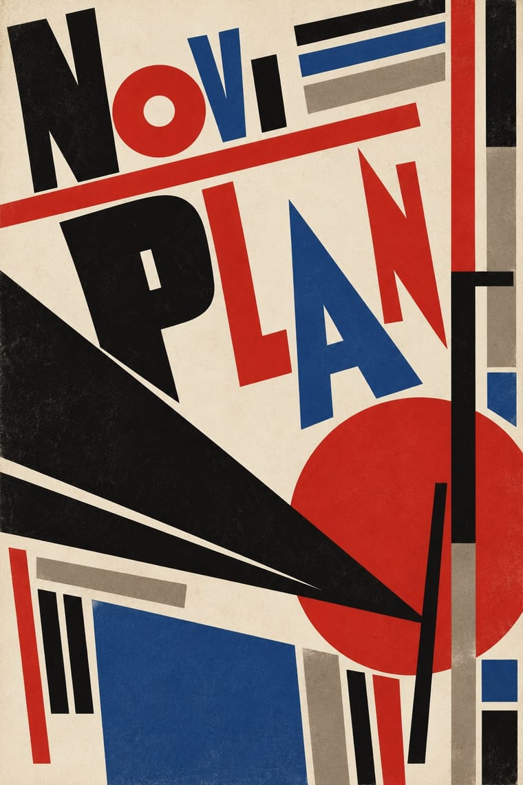
Use it with care
Micić later moved toward Serbian nationalism, and the 'barbarogenius' Balkan rhetoric is ethnonational. Treat Zenit as a historical avant-garde periodical, not a neutral look, and do not use its Balkan-primitivist framing as decorative exoticism.
01
How it works
- Treat the periodical as the manifesto: let the magazine's page, not a gallery, carry the movement's programme.
- Mix typefaces, scripts and sizes within one page so that no single tradition owns the text.
- Set heavy bars and rules across the page as structural, assertive marks.
- Place reproductions of new art, poems and polemic side by side in the same montage.
- Address a Balkan and international readership at once, printing contributions in several languages and refusing to defer to Western centres.
Zagreb (1921-1924), then Belgrade (from 1924): Ljubomir Micić, who launched the monthly Zenit and proclaimed the Zenitist manifesto in June 1921
02
Its design choices
From Stylogeny’s vocabulary of design choices: defining choices make the style, characteristic ones are usual, occasional ones turn up now and then.
- Layout & composition
- Space & hierarchy
- Typography
- Form & shape
- Surface & texture
- Ornament
- Medium & production
- Tone & intent
- Avoids
- Central symmetry, Modular grid, Floral & vegetal, Abundant decoration, Script, Luxurious & glamorous, Calm & contemplative
Palette
-
#eee6d3 -
#151515 -
#c8281f -
#8a8274 -
#2a4f8a
Typefaces
-
Mixed printers' display capitals set at contrasting sizes
tentative; not confirmed against digitised issues
-
Passages printed in several languages, untranslated
script mix not confirmed against digitised issues
Known for
-
Zenit magazine, 43 issues
Zagreb, then Belgrade, 1921-1926
-
Zenit no. 36 (1925), banned for 'inciting hatred towards the state' and the ban overturned by a court
-
Zenit no. 43 (1926), banned for 'inciting citizens to disobey the authorities' and the ban upheld on appeal
-
Ljubomir Micić, Zenitist manifesto
June 1921
03
Make something in this style
Say what you need, and Stylogeny’s image studio draws it from Zenitism (Zenit Magazine Typography)’s design choices and checks it against them. It takes about a minute, and you get a link to share.
04
Where it comes from, and what it’s close to
Before it
The style it grew out of, and the styles it borrowed from.
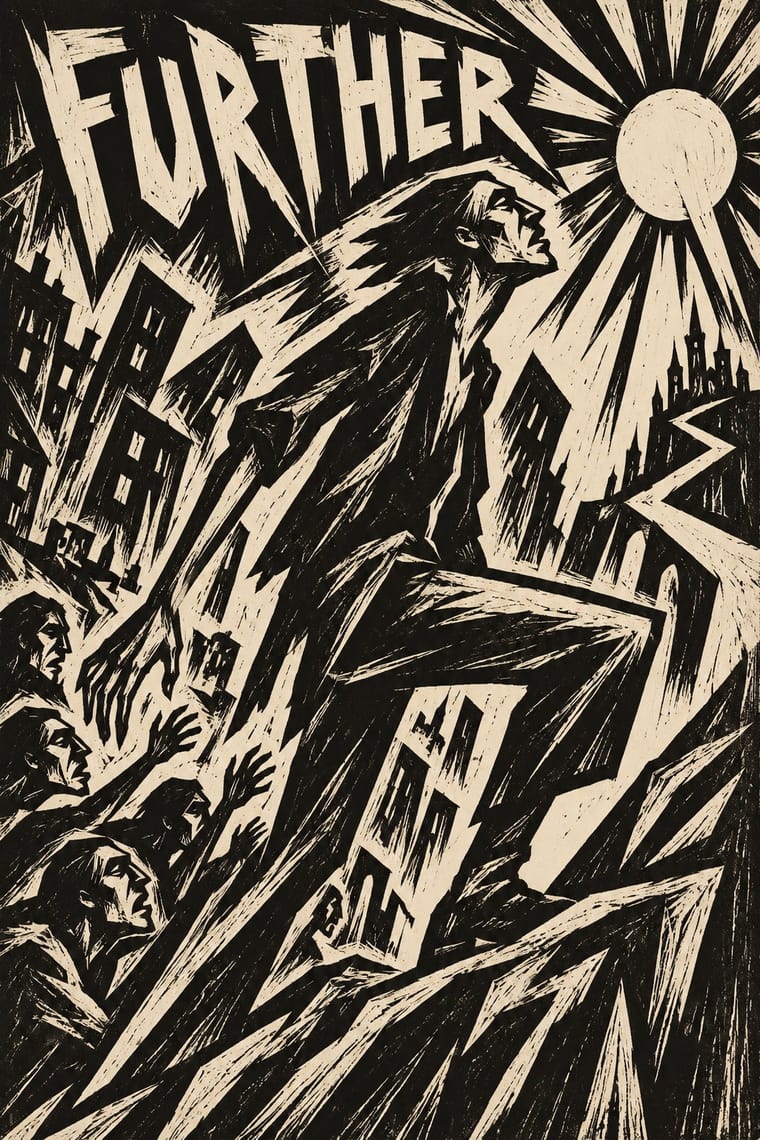
After it
The styles that grew out of it.
No later style in the atlas grew out of it yet.
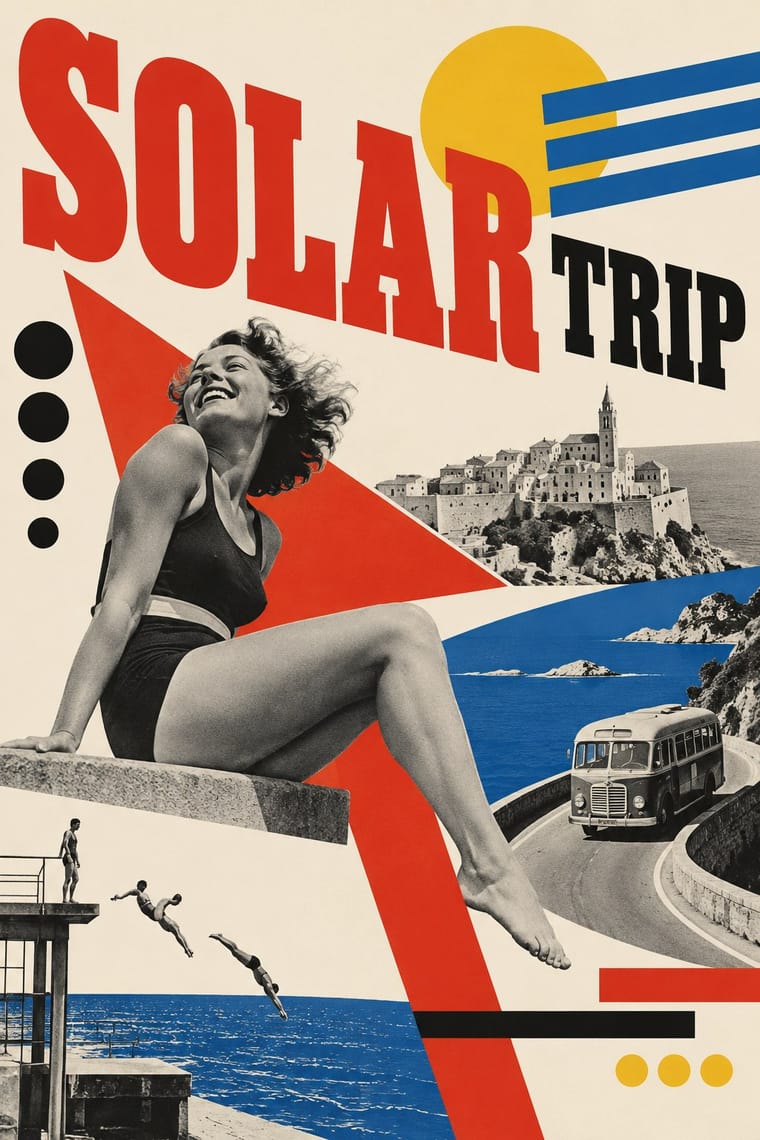
Alike in its design choices
Styles that make many of the same choices, related or not, besides those above.
05
Often taken for
Zenitism has no real works recorded yet, so these are its nearest styles by its choices alone, with the choices that tell them apart.
-
Dada
Dada is one of Zenitism’s nearest styles by choices; no real work of either fits the other better.
Choices that tell Zenitism and Dada apart Choice Zenitism Dada Non-representational defining occasional Photomontage occasional defining Utopian & idealistic characteristic — Collage & layering occasional defining Rotated & vertical setting occasional defining Both descend from Italian Futurism in the family tree.
-
Mavo
Mavo is one of Zenitism’s nearest styles by choices; no real work of either fits the other better.
Choices that tell Zenitism and Mavo apart Choice Zenitism Mavo Utopian & idealistic characteristic — Limited spot colours — defining Found & vernacular imagery — defining Carved line — defining Collage & layering occasional defining Both descend from Italian Futurism in the family tree.
-
Italian Futurism
Italian Futurism is one of Zenitism’s nearest styles by choices; no real work of either fits the other better.
Choices that tell Zenitism and Italian Futurism apart Choice Zenitism Italian Futurism Dynamic asymmetry defining — Diagonal axis — defining Non-representational defining occasional Angular & zigzag occasional defining Utopian & idealistic characteristic — Zenitism descends from Italian Futurism: a shared line, so the likeness is inherited.
-
Swiss Punk / New Wave Typography
Swiss Punk / New Wave Typography is one of Zenitism’s nearest styles by choices; no real work of either fits the other better.
Choices that tell Zenitism and Swiss Punk apart Choice Zenitism Swiss Punk Type as image characteristic — Broken grid — defining Agitational & persuasive defining — Grotesque & neo-grotesque — defining Utopian & idealistic characteristic — Both descend from Russian Constructivism in the family tree.
— means the choice isn’t among the style’s recorded choices. Critics recorded each work’s choices with the styles’ descriptions in view, so this shows whether the descriptions hold together, not proof that they are right.
06
Combine it with
Styles Zenitism (Zenit Magazine Typography) pairs well with or plays against, from the research. Each is worked out as a combination: which style gives the type, the colours and the forms.
- Czech Poetist Book Design (Devětsil) Pairs well · Another Central European offshoot of constructivist tools; borrow Poetism's lightness to soften Zenit's agitation.
- Russian Futurist Book Pairs well · Both treat the printed page as a manifesto in rough mixed type; combine them for a polemical artist's book.
- International Typographic Style Contrasts · Its grid and neutral voice are the opposite of Zenit's mixed, combative page.
07