Style combination · Pairs well
Czech Poetist Book Design × Zenitism
Another Central European offshoot of constructivist tools; borrow Poetism's lightness to soften Zenit's agitation.
Mix them and make something Czech Poetist Book Design Zenitism
01
What each style brings
Each part of the design comes from the style with the stronger say in it, and each style gives at least two.
Czech Poetist Book Design (Devětsil) Zenitism (Zenit Magazine Typography)
- Type from Zenitism
- Colour from Czech Poetist Book Design
- Form from Zenitism
- Composition from Czech Poetist Book Design
- Surface from Czech Poetist Book Design
02
The type
Open fonts standing in for each style’s own type, which is often hand-drawn or commercial.
Display · Zenitism
Tomorrow
Archivo Black; Zenitism used Mixed printers' display capitals set at contrasting sizes and Passages printed in several languages, untranslated
Text · Czech Poetist Book Design
The book and magazine design of the Czech Devětsil circle, where Karel Teige and his colleagues turned constructivist tools (asymmetry, sans and slab capitals, heavy bars, photomontage) toward Poetism's lyrical celebration of travel, cinema, jazz and the circus. Covers and 'picture poems' set type among postcards, ocean liners and aeroplanes, and in Abeceda (1926) a dancer's body poses as each letter of the alphabet.
Inter; Czech Poetist Book Design used Jobbing grotesque capitals from Prague print shops and Egyptienne slab-serif display capitals
03
The colours
The ground and leading colours come from Czech Poetist Book Design, with a counter-accent from Zenitism. The ink reads on the ground at 4.5:1 or more.
Czech Poetist Book Design (Devětsil) Zenitism (Zenit Magazine Typography)
-
#f2ebdcground · 36% -
#161514ink · 14% -
#e9b52caccent · 18% -
#c8281faccent · 14% -
#2a4f8aaccent · 10% -
#8a8274accent · 8%
As CSS
:root {
  --ground: #f2ebdc;
  --ink: #161514;
  --accent-1: #e9b52c;
  --accent-2: #c8281f;
  --accent-3: #2a4f8a;
  --accent-4: #8a8274;
  --font-display: "Archivo Black", sans-serif;
  --font-text: "Inter", sans-serif;
}
Use it with care
Zenitism (Zenit Magazine Typography): Micić later moved toward Serbian nationalism, and the 'barbarogenius' Balkan rhetoric is ethnonational. Treat Zenit as a historical avant-garde periodical, not a neutral look, and do not use its Balkan-primitivist framing as decorative exoticism.
04
The two styles
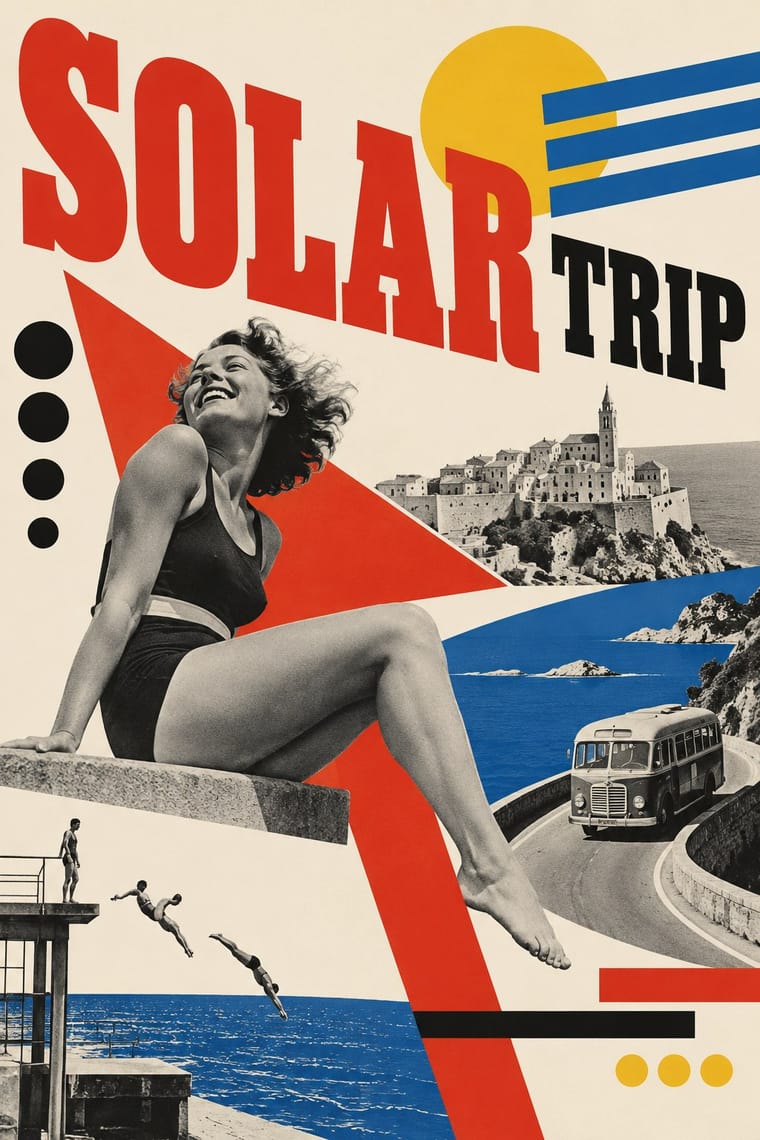
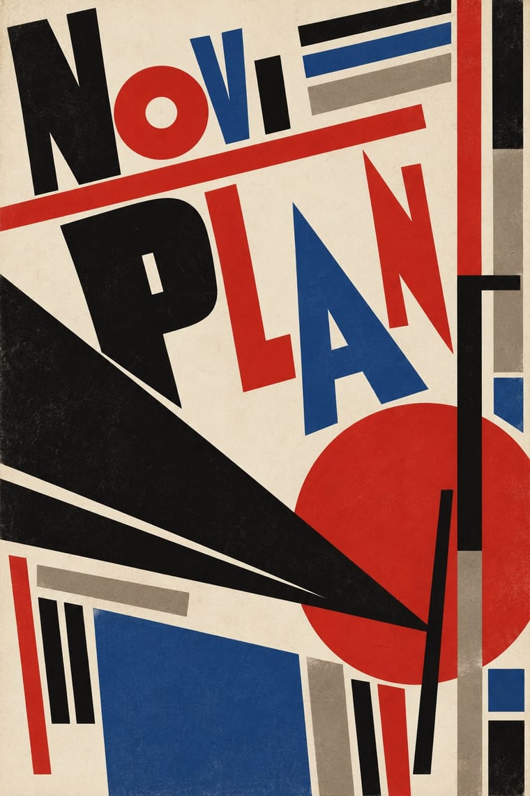
05
More combinations
With Czech Poetist Book Design
- Surrealist Graphics Pairs well · Štyrský and Toyen pushed this montage toward dream imagery; add one uncanny juxtaposition to tip a lyrical cover into the strange.
- Russian Constructivism Contrasts · Same bars, diagonals and photomontage with the opposite mood; use the Poetist version when a constructivist layout needs lightness and wit instead of command.
- Kinetic Typography & Variable Type Pairs well · Abeceda's dancer-as-letter photographs are a print ancestor of type that moves; borrow the idea of a body performing each glyph for motion identities.
- Risograph & Indie Print Culture Pairs well · Two-colour riso and found photographs recreate the red-and-black montage covers cheaply and with the same playful immediacy.
- Brazilian Modernismo Graphics (Klaxon and the Semana de 22) Pairs well · Two playful letterpress avant-gardes of the 1920s that turned posters, programmes and adverts into poems; Devětsil's photomontage and bars can stand in where Klaxon would use a contour drawing.