Style combination · Contrasts
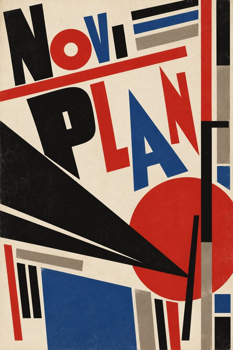
International Typographic Style × Zenitism
Its grid and neutral voice are the opposite of Zenit's mixed, combative page.
Mix them and make something International Typographic Style Zenitism
01
What each style brings
Each part of the design comes from the style with the stronger say in it, and each style gives at least two.
International Typographic Style Zenitism (Zenit Magazine Typography)
- Type from International Typographic Style
- Colour from International Typographic Style
- Form from Zenitism
- Composition from International Typographic Style
-
Zenitism avoids modular grid: this is where the two pull against each other, which is the point of the contrast.
- Surface from Zenitism
-
02
The type
Open fonts standing in for each style’s own type, which is often hand-drawn or commercial.
Text · Zenitism
Ljubomir Micić's Yugoslav avant-garde: the monthly Zenit (43 issues, 1921-1926) and its 'abstract metacosmic expressionism' and Balkan 'barbarogenius', a 'modern primitive'. Unlike Mavo or Constructivism it has expressionist roots, Balkan-primitivist doctrine and a multilingual review; it was twice banned. Page design is thinly sourced, so design traits are tentative. Micić later turned to Serbian nationalism; the 'barbarogenius' rhetoric is ethnonational. Wikipedia says Zenitism distanced itself from Dada.
Jost; Zenitism used Mixed printers' display capitals set at contrasting sizes and Passages printed in several languages, untranslated
03
The colours
The ground and leading colours come from International Typographic Style, with a counter-accent from Zenitism. The ink reads on the ground at 4.5:1 or more.
International Typographic Style Zenitism (Zenit Magazine Typography)
-
#f2f0e9ground · 39% -
#111111ink · 15% -
#e1251baccent · 20% -
#1f4e9caccent · 15% -
#7a7a7aaccent · 11%
As CSS
:root {
  --ground: #f2f0e9;
  --ink: #111111;
  --accent-1: #e1251b;
  --accent-2: #1f4e9c;
  --accent-3: #7a7a7a;
  --font-display: "Inter Tight", sans-serif;
  --font-text: "Jost", sans-serif;
}
Use it with care
Zenitism (Zenit Magazine Typography): Micić later moved toward Serbian nationalism, and the 'barbarogenius' Balkan rhetoric is ethnonational. Treat Zenit as a historical avant-garde periodical, not a neutral look, and do not use its Balkan-primitivist framing as decorative exoticism.
04
The two styles

05
More combinations
With International Typographic Style
- Art Nouveau Contrasts · Ornamental curves against an orthogonal grid make a strong deliberate tension.
- Brutalist Web Design Pairs well · Strip the grid to raw HTML defaults to get a rawer, contemporary take on Swiss honesty.
- Psychedelic Poster Contrasts · Its exact opposite on legibility; borrow one swirling element to break a too-cold Swiss layout.
- Japanese Postwar Modernism Pairs well · Add Japanese restraint and emblematic colour fields to the grid for warmth without losing order.
- American Traditional Tattoo Flash Contrasts · Rational grid and sans-serif against sentimental, hand-lettered emblems: one flash motif on a Swiss layout makes a sharp contrast.
- Graffiti & Hip-Hop Graphics Contrasts · Put a single tag or throw-up over a strict Swiss grid to stage the clash between institutional order and a street voice.
- Pop Art Graphics Contrasts · Set one loud appropriated Pop image inside a strict grid with a neutral grotesque so the irony reads as deliberate rather than chaotic.
- Italian Painted Film Poster (Rome Studios) Contrasts · Grid, restraint and photographic objectivity are the opposite of a crowded painted montage.
With Zenitism
- Czech Poetist Book Design (Devětsil) Pairs well · Another Central European offshoot of constructivist tools; borrow Poetism's lightness to soften Zenit's agitation.
- Russian Futurist Book Pairs well · Both treat the printed page as a manifesto in rough mixed type; combine them for a polemical artist's book.