Postmodern · 1998–present · Western Europe, Northern Europe, Global / networked
Conversational Brand-Voice Packaging
Also known as Chatty packaging, Brand voice packaging, Copy-led packaging
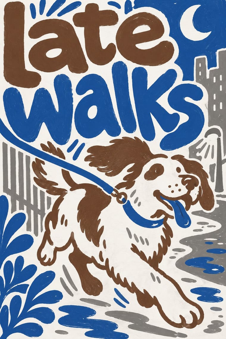
A packaging approach in which the pack becomes a stage for a human voice: informal, first-person copy fills the sides and back, set in lettering and custom type that look made by a person, beside a small mark. The visual signature, shared by both brands, is large, irregular, hand-made-looking type with copy as the main graphic material and a small logo. Innocent (UK) is lighter and friendlier, Oatly (Sweden) denser and plainer; Oatly's Forsman & Bodenfors system treated the pack as advertising space.
Make something in this style Get advice in this style Mix it with another style
01
How it works
- Write the pack copy in a first-person, speaking voice and give it the space of a label, not a footnote.
- Let the text itself be the graphic device, set large and loose on the sides and back of the pack.
- Draw the lettering and small illustrations so they look made by a person, not a system.
- Keep the logo a small, friendly mark and let the copy carry the personality.
- Joke at the product's own claims, rivals and legal limits, and print the joke on the pack.
London, UK (Innocent Drinks, founded 1998) and Sweden (Oatly)
02
Its design choices
From Stylogeny’s vocabulary of design choices: defining choices make the style, characteristic ones are usual, occasional ones turn up now and then.
- Layout & composition
- Space & hierarchy
- Typography
- Form & shape
- Surface & texture
- Imagery
- Medium & production
- Tone & intent
- Avoids
- Generous white space, Geometric sans, Pastel, Abundant decoration, Emblems & badges, Authoritative & institutional, Luxurious & glamorous, 3D render
Palette
-
#ffffff -
#f3efe6 -
#8a8a86 -
#6b4f3a -
#2f5d9b
Typefaces
-
Oatly headlines
a mix of lettering and custom typefaces, including John Rounded and Toni Grotesk (Fonts In Use)
-
Oatly body text
FF Magda, a distressed take on the Cubic typewriter style (Fonts In Use)
-
Oatly lettering by Lars Elfman of Forsman & Bodenfors
Fonts In Use
Known for
-
Innocent Drinks bottles, whose back-of-pack copy keeps a playful tone of voice
Innocent Drinks, founded 1998
-
Oatly cartons from the Forsman & Bodenfors packaging system (2014-2015), designed as part advertising space with brand attributes and benefits called out on pack
-
Oatly's invented brand names Pjölk, Brölk, Sölk and Trölk, trademarked in response to Arla adverts that used a fake Pjölk brand
03
Make something in this style
Say what you need, and Stylogeny’s image studio draws it from Conversational Brand-Voice Packaging’s design choices and checks it against them. It takes about a minute, and you get a link to share.
04
Where it comes from, and what it’s close to
Before it
The style it grew out of, and the styles it borrowed from.
Nothing earlier is recorded: in the atlas it is a starting point.
After it
The styles that grew out of it.
No later style in the atlas grew out of it yet.
Alike in its design choices
Styles that make many of the same choices, related or not, besides those above.
-
- Bitterkomix (Afrikaans Underground Comics) 55% alike
-
- Brazilian Modernismo Graphics (Klaxon and the Semana de 22) 52% alike
-
-
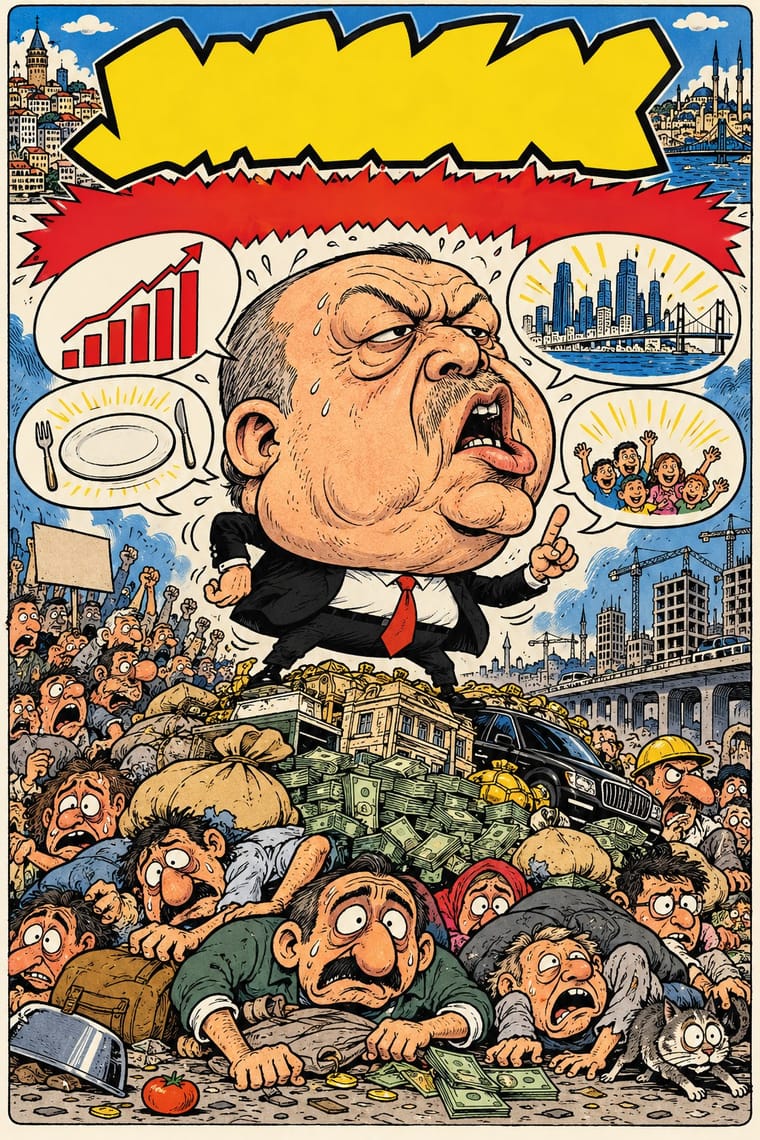
05
Often taken for
Conversational Brand-Voice Packaging has no real works recorded yet, so these are its nearest styles by its choices alone, with the choices that tell them apart.
-
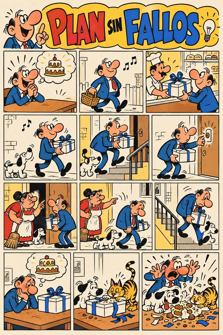
Escuela Bruguera (Spanish Humour Comics)
Escuela Bruguera is one of Conversational Brand-Voice Packaging’s nearest styles by choices; no real work of either fits the other better.
Choices that tell Conversational Brand-Voice Packaging and Escuela Bruguera apart Choice Conversational Brand-Voice Packaging Escuela Bruguera Horror vacui defining occasional Distortion & exaggeration — defining Rounded & pill characteristic — Comic & cartoon — defining Dynamic asymmetry characteristic — No shared descent in the atlas: they reached these choices separately.
-
Bitterkomix (Afrikaans Underground Comics)
Bitterkomix is one of Conversational Brand-Voice Packaging’s nearest styles by choices; no real work of either fits the other better.
Choices that tell Conversational Brand-Voice Packaging and Bitterkomix apart Choice Conversational Brand-Voice Packaging Bitterkomix Rounded & pill characteristic — Monochrome — defining Dynamic asymmetry characteristic — Distortion & exaggeration — defining Extreme scale contrast characteristic — No shared descent in the atlas: they reached these choices separately.
-
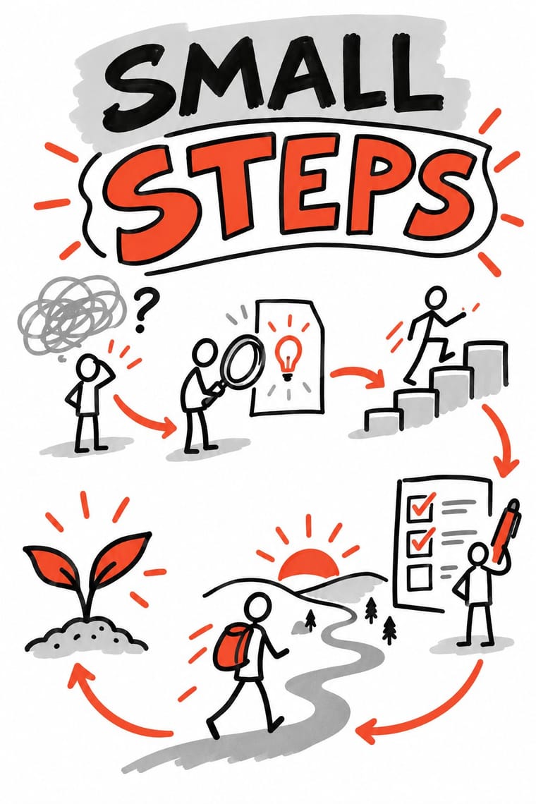
Sketchnoting and Graphic Recording
Sketchnoting and Graphic Recording is one of Conversational Brand-Voice Packaging’s nearest styles by choices; no real work of either fits the other better.
Choices that tell Conversational Brand-Voice Packaging and Sketchnoting and Graphic Recording apart Choice Conversational Brand-Voice Packaging Sketchnoting and Graphic Recording Rounded & pill characteristic — Pictogram — defining Ornament-free characteristic — Icons & pictograms — defining Extreme scale contrast characteristic — No shared descent in the atlas: they reached these choices separately.
-
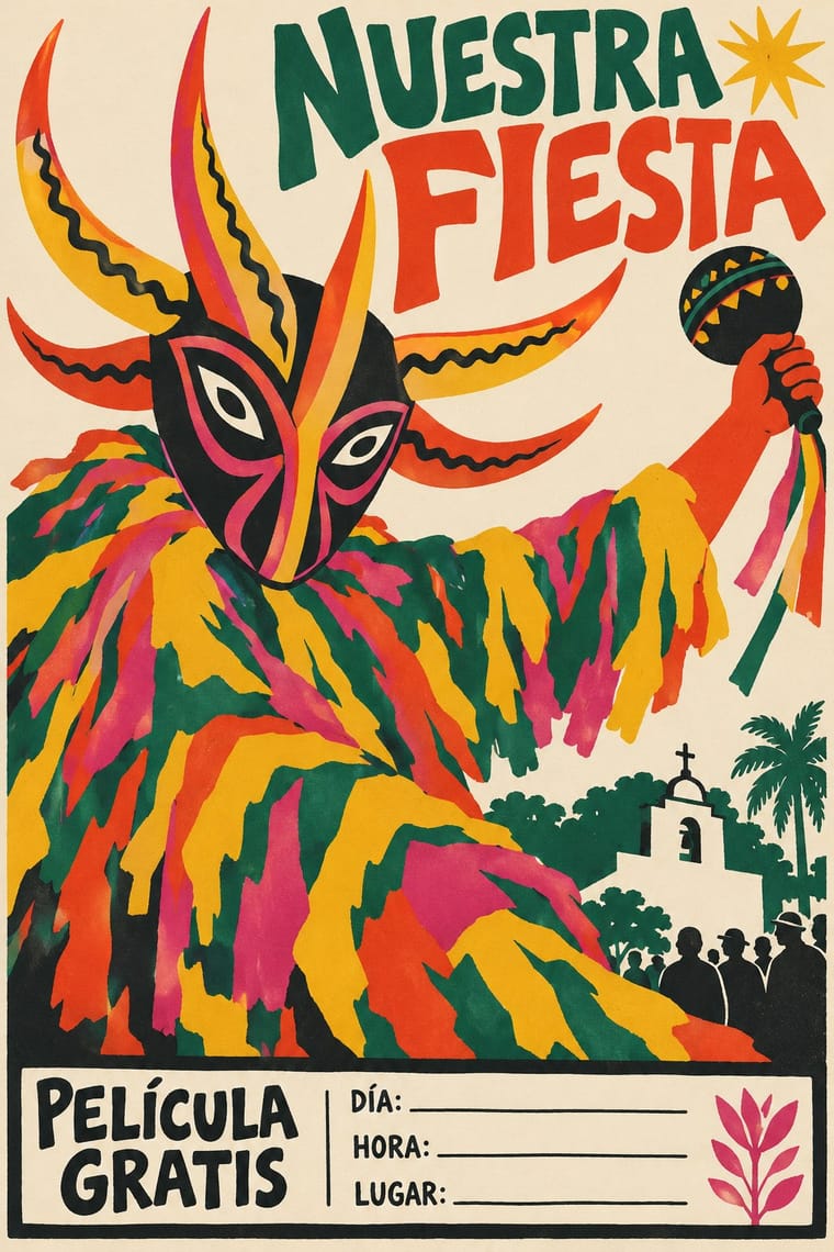
Brazilian Modernismo Graphics (Klaxon and the Semana de 22)
Brazilian Modernismo Graphics is one of Conversational Brand-Voice Packaging’s nearest styles by choices; no real work of either fits the other better.
Choices that tell Conversational Brand-Voice Packaging and Brazilian Modernismo Graphics apart Choice Conversational Brand-Voice Packaging Brazilian Modernismo Graphics Horror vacui defining — Pastel avoids occasional Rounded & pill characteristic — Flat occasional defining Ornament-free characteristic — No shared descent in the atlas: they reached these choices separately.
— means the choice isn’t among the style’s recorded choices. Critics recorded each work’s choices with the styles’ descriptions in view, so this shows whether the descriptions hold together, not proof that they are right.
06
Combine it with
Styles Conversational Brand-Voice Packaging pairs well with or plays against, from the research. Each is worked out as a combination: which style gives the type, the colours and the forms.
- DTC 'Blanding' / Millennial Minimalism Contrasts · Same warm friendliness but opposite on density: fill the pack with voice instead of leaving it pale and empty.
- Hipster Artisanal Revival Contrasts · Both are hand-made in feel, but this one jokes in plain speech instead of staging vintage badges.
- Plain Tobacco Packaging Contrasts · The regulated pack removes voice entirely; this one makes voice the whole design.
07
Sources
- https://en.wikipedia.org/wiki/Innocent_Drinks (founding in 1998 by Richard Reed, Adam Balon and Jon Wright)
- https://en.wikipedia.org/wiki/Oatly (Pjölk, Brölk, Sölk and Trölk)
- https://fontsinuse.com/uses/37736/oatly-packaging-2015 (Oatly typefaces: John Rounded, Toni Grotesk, FF Magda; lettering by Lars Elfman)
- https://thedieline.com/blog/2014/9/23/oatly (Forsman & Bodenfors packaging system as part advertising space, brand attributes called out on pack)
- https://www.packagingnews.co.uk/design/new-packs/innocent-drinks-revamps-packaging-design-across-portfolio-15-11-2024 (Innocent keeps playful back-of-pack copy and hand-drawn touches)
How Stylogeny researches and checks a style: where the facts come from.