Style combination · Contrasts
Conversational Brand-Voice Packaging × Plain Tobacco Packaging
The regulated pack removes voice entirely; this one makes voice the whole design.
Mix them and make something Conversational Brand-Voice Packaging Plain Tobacco Packaging
01
What each style brings
Each part of the design comes from the style with the stronger say in it, and each style gives at least two.
Conversational Brand-Voice Packaging Plain Tobacco Packaging
- Type from Plain Tobacco Packaging
- Colour from Conversational Brand-Voice Packaging
- Form from Plain Tobacco Packaging
- Composition from Plain Tobacco Packaging
- Surface from Conversational Brand-Voice Packaging
-
02
The type
Open fonts standing in for each style’s own type, which is often hand-drawn or commercial.
Display · Plain Tobacco Packaging
Notice
Inter Tight, standing in for Helvetica (Max Miedinger with Eduard Hoffmann, 1957): Australia's warning statements in bold capitals and its explanatory and information messages in upper and lower case, under the Competition and Consumer (Tobacco) Information Standard 2011
Text · Conversational Brand-Voice Packaging
A packaging approach in which the pack becomes a stage for a human voice: informal, first-person copy fills the sides and back, set in lettering and custom type that look made by a person, beside a small mark. The visual signature, shared by both brands, is large, irregular, hand-made-looking type with copy as the main graphic material and a small logo. Innocent (UK) is lighter and friendlier, Oatly (Sweden) denser and plainer; Oatly's Forsman & Bodenfors system treated the pack as advertising space.
Inter; Conversational Brand-Voice Packaging used Oatly headlines and Oatly body text
03
The colours
The ground and leading colours come from Conversational Brand-Voice Packaging, with a counter-accent from Plain Tobacco Packaging. The ink reads on the ground at 4.5:1 or more.
Conversational Brand-Voice Packaging Plain Tobacco Packaging
-
#ffffffground · 36% -
#6b4f3aink · 14% -
#2f5d9baccent · 18% -
#ffd100accent · 14% -
#8a8a86accent · 10% -
#c8102eaccent · 8%
As CSS
:root {
  --ground: #ffffff;
  --ink: #6b4f3a;
  --accent-1: #2f5d9b;
  --accent-2: #ffd100;
  --accent-3: #8a8a86;
  --accent-4: #c8102e;
  --font-display: "Inter Tight", sans-serif;
  --font-text: "Inter", sans-serif;
}
Use it with care
Plain Tobacco Packaging: Graphic health warnings show real disease and are official public-health instruments; WHO's warning database lists the Australian Government as the owner of its warning images, which it may license to other countries free of charge. Use the shock imagery only for genuine health communication, never as decoration or as a parody that could mislead about a product's risks, and check the terms before reproducing a country's actual warning photographs or mandated layouts. Respect the dignity of the people pictured, never generate imagery that could pass for an official warning, and do not turn the drab-pack look into anti-brand styling for tobacco, vaping or nicotine products, which would make a tool against persuasion persuasive again.
04
The two styles
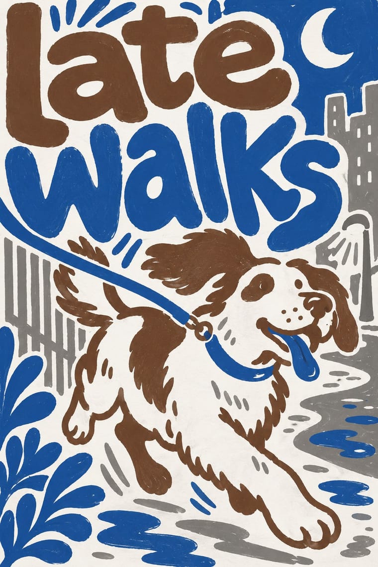
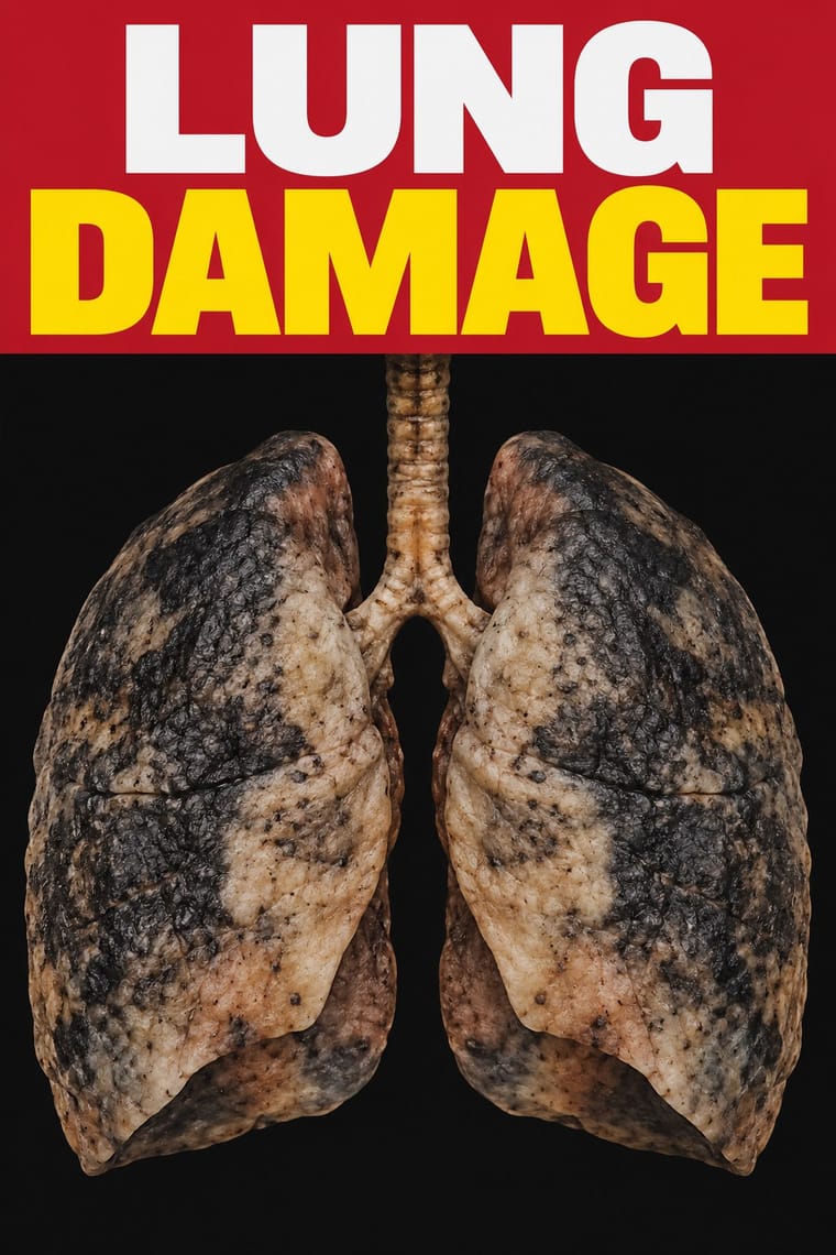
05
More combinations
With Conversational Brand-Voice Packaging
With Plain Tobacco Packaging
- GOV.UK Design (GDS Style) Pairs well · Another state system of fixed constants where each colour has one job; borrow its plain wording and one-message-per-surface discipline for the leaflets and screens that sit around a health warning.
- HfG Ulm Systematic Design Contrasts · Ulm's coded colours, single type family and manual built recognition for Braun and Lufthansa; plain packaging uses the same rule-bound specification to erase it, a reminder that a design system can suppress identity as well as build it.
- ACT UP & Gran Fury AIDS Activist Graphics Pairs well · Gran Fury's white capitals on black are the activist cousin of the mandated warning statement; borrow their wit when a health message must persuade without leaning on clinical shock photographs.
- DTC 'Blanding' / Millennial Minimalism Contrasts · Both reduce a pack to one colour and a small sans-serif name, but blanding picks a pleasing pastel to seduce and plain packaging picks the least appealing shade to repel; choose the colour first, because it decides which way the reduction works.
- Cuban Tobacco Lithography (Habilitaciones & Marquillas) Contrasts · The gilded, embossed and bordered cigar label is everything a plain pack is forbidden to be; set the two side by side to show how much of tobacco's appeal was carried by ornament alone.
- Nutri-Score (Front-of-Pack Colour-Grade Label) Contrasts · Plain packaging strips the brand and hands the face to the state; Nutri-Score leaves the brand intact and adds a small standardised inset in the lower third. Decide whether the public message should replace the design or sit inside it.
- Front-of-Pack Warning Octagons (Latin American Food Warning Seals) Contrasts · Plain packaging erases the brand and hands the face to a shock photograph; the octagons leave the brand intact and add a small, uniform black sign. Choose between them by deciding whether the warning should replace the design or interrupt it.
- Analog Horror Graphics Contrasts · Both frighten with the flat, mandatory voice of an official warning: plain packaging does it for real, in print, with matt drab brown, clinical photographs and Helvetica capitals; analog horror fakes it on a screen and lets the signal decay. Borrow plain packaging's uncompromising flatness for a fictional warning screen, and save the noise for the moment the threat appears.