Style combination · Contrasts
Conversational Brand-Voice Packaging × DTC 'Blanding'
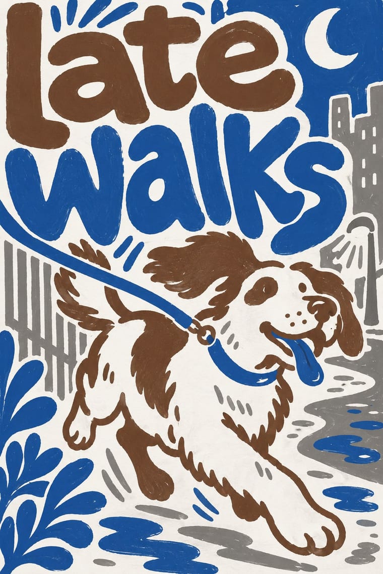
Same warm friendliness but opposite on density: fill the pack with voice instead of leaving it pale and empty.
Mix them and make something Conversational Brand-Voice Packaging DTC 'Blanding'
01
What each style brings
Each part of the design comes from the style with the stronger say in it, and each style gives at least two.
Conversational Brand-Voice Packaging DTC 'Blanding' / Millennial Minimalism
- Type from DTC 'Blanding'
-
Conversational Brand-Voice Packaging avoids geometric sans: this is where the two pull against each other, which is the point of the contrast.
- Colour from Conversational Brand-Voice Packaging
- Form from DTC 'Blanding'
- Composition from DTC 'Blanding'
-
Conversational Brand-Voice Packaging avoids generous white space: this is where the two pull against each other, which is the point of the contrast.
- Surface from Conversational Brand-Voice Packaging
-
02
The type
Open fonts standing in for each style’s own type, which is often hand-drawn or commercial.
Display · DTC 'Blanding'
Kin
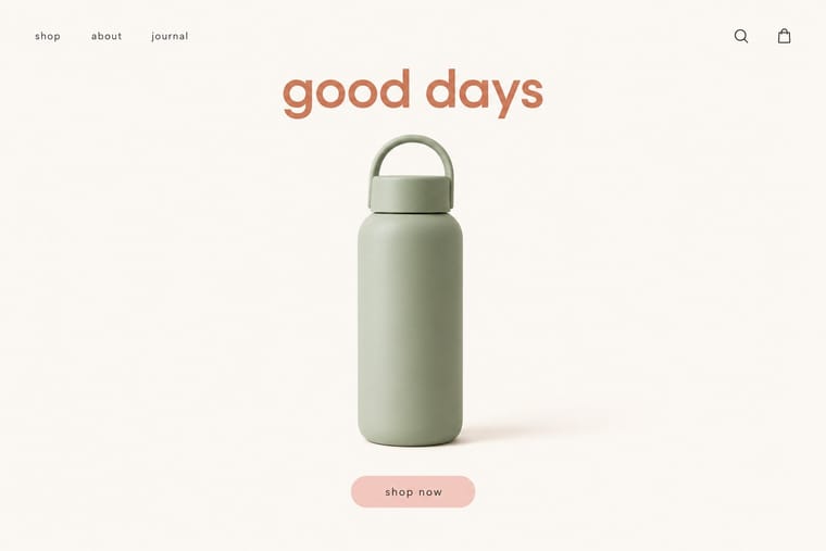
Hanken Grotesk, standing in for Circular (Laurenz Brunner, Lineto, 2013)
Text · Conversational Brand-Voice Packaging
A packaging approach in which the pack becomes a stage for a human voice: informal, first-person copy fills the sides and back, set in lettering and custom type that look made by a person, beside a small mark. The visual signature, shared by both brands, is large, irregular, hand-made-looking type with copy as the main graphic material and a small logo. Innocent (UK) is lighter and friendlier, Oatly (Sweden) denser and plainer; Oatly's Forsman & Bodenfors system treated the pack as advertising space.
Inter; Conversational Brand-Voice Packaging used Oatly headlines and Oatly body text
03
The colours
The ground and leading colours come from Conversational Brand-Voice Packaging, with a counter-accent from DTC 'Blanding'. The ink reads on the ground at 4.5:1 or more.
Conversational Brand-Voice Packaging DTC 'Blanding' / Millennial Minimalism
-
#ffffffground · 36% -
#6b4f3aink · 14% -
#2f5d9baccent · 18% -
#d27c5daccent · 14% -
#8a8a86accent · 10% -
#f2e3a8accent · 8%
As CSS
:root {
  --ground: #ffffff;
  --ink: #6b4f3a;
  --accent-1: #2f5d9b;
  --accent-2: #d27c5d;
  --accent-3: #8a8a86;
  --accent-4: #f2e3a8;
  --font-display: "Hanken Grotesk", sans-serif;
  --font-text: "Inter", sans-serif;
}
04
The two styles
05
More combinations
With Conversational Brand-Voice Packaging
With DTC 'Blanding'
- Scandinavian Functionalism Pairs well · Shares a warm, domestic restraint; borrow Nordic materials and craft photography to give a pastel system more texture and credibility.
- Neo-Brutalism Contrasts · The post-blanding swing: thick outlines, clashing brights and hard shadows are the quickest way out of pastel sameness.
- Neoclassical Book Typography Contrasts · Luxury's other reduction: a single Didone wordmark signals heritage where the lowercase sans signals approachability.
- Corporate Memphis Pairs well · Its illustration-led sibling; add a few flat vector figures when seamless-backdrop photography alone feels too cold.
- Minimalist Graphic Design Contrasts · Its austere parent: swap pastel and chatty copy back to monochrome and silence when a brand needs authority rather than friendliness.
- Natural Wine Label Art Contrasts · Blanding sells a frictionless, agency-made brand in lowercase geometric sans and pastels; the natural wine label sells a person through an untrained drawing. Use the contrast to decide whether a product should feel designed or made.
- Hipster Artisanal Revival Contrasts · Where this dressed new firms as old ones, blanding dressed them as frictionless and new, with lowercase geometric sans, pastels and white space; set the two side by side to place a brand between heritage and novelty.
- Guochao (China-Chic National Trend) Contrasts · Western direct-to-consumer brands strip identity to pastel sans-serif minimalism; guochao sells ornament and heritage instead, so use one to test the other.