Counterculture · 1970–1989 · East Asia
Garo and Heta-uma (Japanese Underground Manga and 'Bad-Good' Illustration)
Also known as Heta-uma, ヘタウマ, Garo manga, Alternative manga
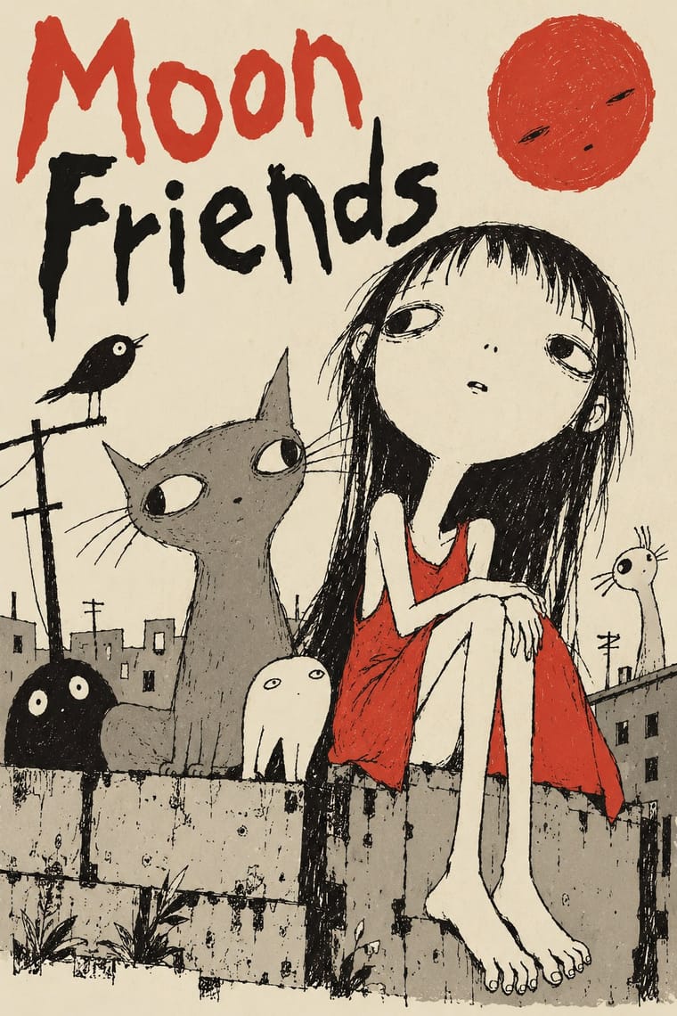
The deliberately crude, naive-looking drawing of Japan's alternative manga and illustration, centred on the magazine Garo (1964-2002) from the 1970s. Wobbly pen lines, flat or scratchy fills and unpolished hand lettering were chosen on purpose, as 'bad but good' (heta-uma), against the polished look of commercial story manga. Garo also ran realist gekiga, which is outside this idiom. Modern viewers regard a rabbit painting attributed to Tokugawa Iemitsu as an early precursor. The idiom reached illustration and marketing in the 1970s and 1980s.
Make something in this style Get advice in this style Mix it with another style
01
How it works
- Draw with a wobbly, unrefined pen line and leave the awkwardness visible as the intended look.
- Simplify figures into childlike, lopsided, distorted shapes with blank or scratchy faces.
- Fill areas with flat tone or loose hatching rather than polished shading or screentone.
- Letter titles and speech by hand, uneven and unpolished, as part of the drawing.
- Hold a deadpan, absurd or rebellious tone and let a crude drawing carry a sharp or surreal joke.
- Keep the printing plain: mostly black ink on paper, with colour used sparingly.
Tokyo, Japan: the idiom grew in the 1970s around the monthly manga anthology Garo (founded July 1964 by Katsuichi Nagai, published by Seirindo until 2002); illustrator Shoji Yamafuji heard the term 'heta-uma' ('bad but good') in the early 1970s, and the idiom declined by the end of the 1980s
02
Its design choices
From Stylogeny’s vocabulary of design choices: defining choices make the style, characteristic ones are usual, occasional ones turn up now and then.
- Layout & composition
- Space & hierarchy
- Colour
- Form & shape
- Surface & texture
- Medium & production
- Tone & intent
- Avoids
- Gloss & highlights, Halftone & Ben-Day dots, Modular grid, Grotesque & neo-grotesque, Naturalistic depiction, Straight photography, Authoritative & institutional, Luxurious & glamorous
Palette
-
#f1ead8 -
#161412 -
#8a8478 -
#d8392b
Typefaces
-
Uneven hand-drawn katakana and hiragana lettering inside the drawing
-
Hand-lettered Garo titles and credits in brush and pen
Known for
-
Penguin Gohan, drawn by Teruhiko Yumura ('King Terry') and written by Shigesato Itoi, serialised in Garo
1976
-
Yoshikazu Ebisu, heta-uma artist
-
Takashi Nemoto, heta-uma artist
-
Garo magazine
Seirindo, July 1964 to December 2002
03
Make something in this style
Say what you need, and Stylogeny’s image studio draws it from Garo and Heta-uma (Japanese Underground Manga and 'Bad-Good' Illustration)’s design choices and checks it against them. It takes about a minute, and you get a link to share.
04
Where it comes from, and what it’s close to
Before it
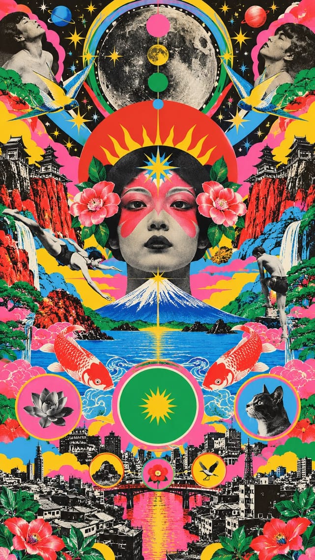
The style it grew out of, and the styles it borrowed from.
After it
The styles that grew out of it.
No later style in the atlas grew out of it yet.
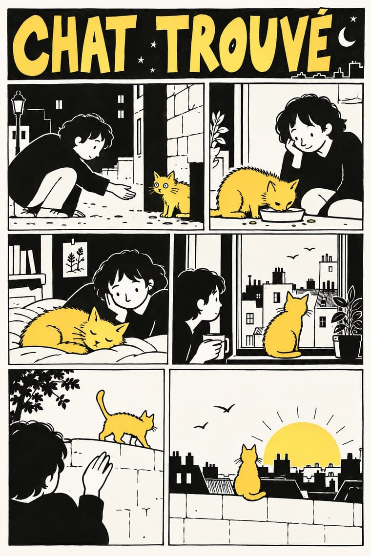
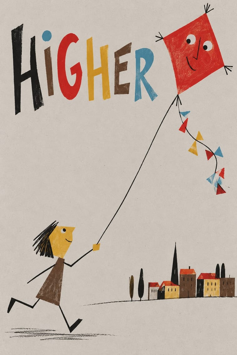
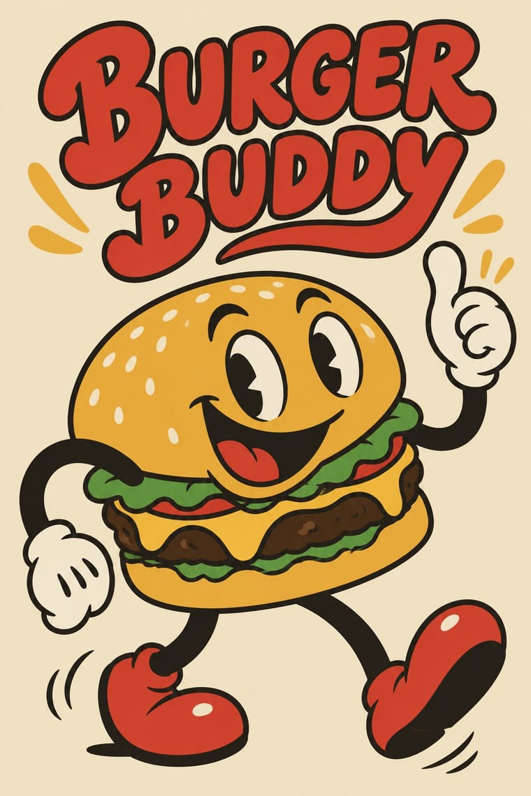
Alike in its design choices
Styles that make many of the same choices, related or not, besides those above.
- Arab Press Caricature (Rose al-Yusuf to Naji al-Ali) 73% alike
-
-
-
-
-
05
Often taken for
Garo and Heta-uma has no real works recorded yet, so these are its nearest styles by its choices alone, with the choices that tell them apart.
-
Arab Press Caricature (Rose al-Yusuf to Naji al-Ali)
Arab Press Caricature is one of Garo and Heta-uma’s nearest styles by choices; no real work of either fits the other better.
Choices that tell Garo and Heta-uma and Arab Press Caricature apart Choice Garo and Heta-uma Arab Press Caricature Restrained accents characteristic — Naturalistic depiction avoids occasional Halftone & Ben-Day dots avoids occasional Single focal point occasional defining Extreme scale contrast — characteristic No shared descent in the atlas: they reached these choices separately.
-
Natural Wine Label Art
Natural Wine Label Art is one of Garo and Heta-uma’s nearest styles by choices; no real work of either fits the other better.
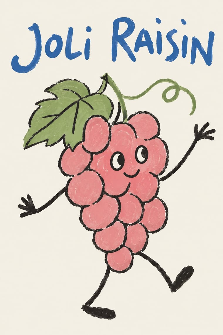
Choices that tell Garo and Heta-uma and Natural Wine Label Art apart Choice Garo and Heta-uma Natural Wine Label Art Distortion & exaggeration defining occasional Grotesque & neo-grotesque avoids occasional Limited spot colours characteristic — Isolated object occasional defining Ironic & self-aware defining occasional No shared descent in the atlas: they reached these choices separately.
-
Arab Independent Comics (Samandal, TokTok, Lab619, Skefkef)
Arab Independent Comics is one of Garo and Heta-uma’s nearest styles by choices; no real work of either fits the other better.
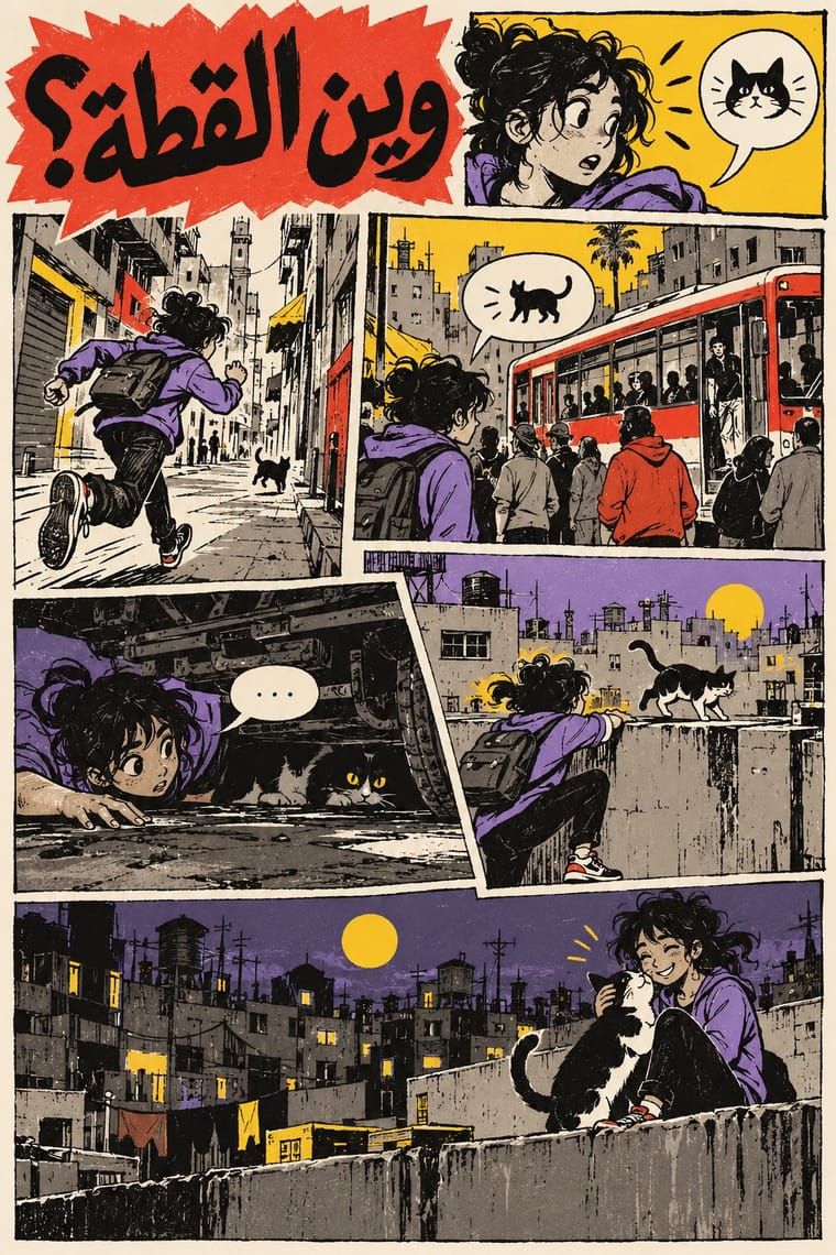
Choices that tell Garo and Heta-uma and Arab Independent Comics apart Choice Garo and Heta-uma Arab Independent Comics Flat fields characteristic — Naturalistic depiction avoids occasional Restrained accents characteristic — Framed panels occasional defining Generous white space characteristic — No shared descent in the atlas: they reached these choices separately.
-
L'Association and French Alternative Comics
L'Association and French Alternative Comics is one of Garo and Heta-uma’s nearest styles by choices; no real work of either fits the other better.
Choices that tell Garo and Heta-uma and L'Association and French Alternative Comics apart Choice Garo and Heta-uma L'Association and French Alternative Comics Paper & letterpress bite characteristic — Modular grid avoids characteristic Flat — defining Framed panels occasional defining Sequential narrative occasional defining No shared descent in the atlas: they reached these choices separately.
— means the choice isn’t among the style’s recorded choices. Critics recorded each work’s choices with the styles’ descriptions in view, so this shows whether the descriptions hold together, not proof that they are right.
06
Combine it with
Styles Garo and Heta-uma (Japanese Underground Manga and 'Bad-Good' Illustration) pairs well with or plays against, from the research. Each is worked out as a combination: which style gives the type, the colours and the forms.
- Underground Comix Pairs well · A US counterculture parallel in crude, rebellious line; heta-uma is quieter, flatter and more deadpan.
- Superflat Pairs well · Later Japanese flat, naive-looking art that borrows the same wilful lack of polish with a glossier surface.
- Angura Theatre Poster Pairs well · Both are 1960s-70s Tokyo underground print; set crude Garo-style figures against angura's crowded silkscreen colour.
- Story Manga (Postwar Japanese Comics) Contrasts · The polished, screentoned, formula-paneled commercial manga is the exact norm heta-uma rejects.
07
Sources
- https://en.wikipedia.org/wiki/Heta-uma
- https://en.wikipedia.org/wiki/Garo_(magazine)
- https://en.wikipedia.org/wiki/Teruhiko_Yumura
How Stylogeny researches and checks a style: where the facts come from.