Style combination · Contrasts
Garo and Heta-uma × Story Manga
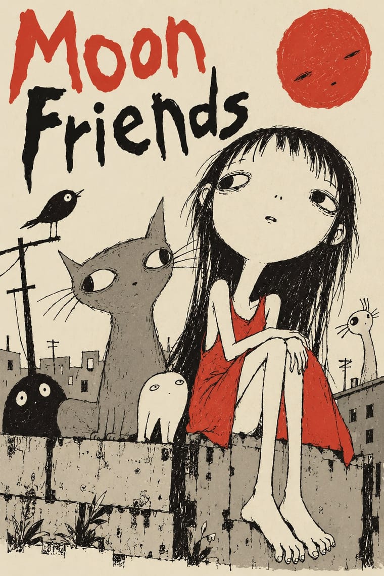
The polished, screentoned, formula-paneled commercial manga is the exact norm heta-uma rejects.
01
What each style brings
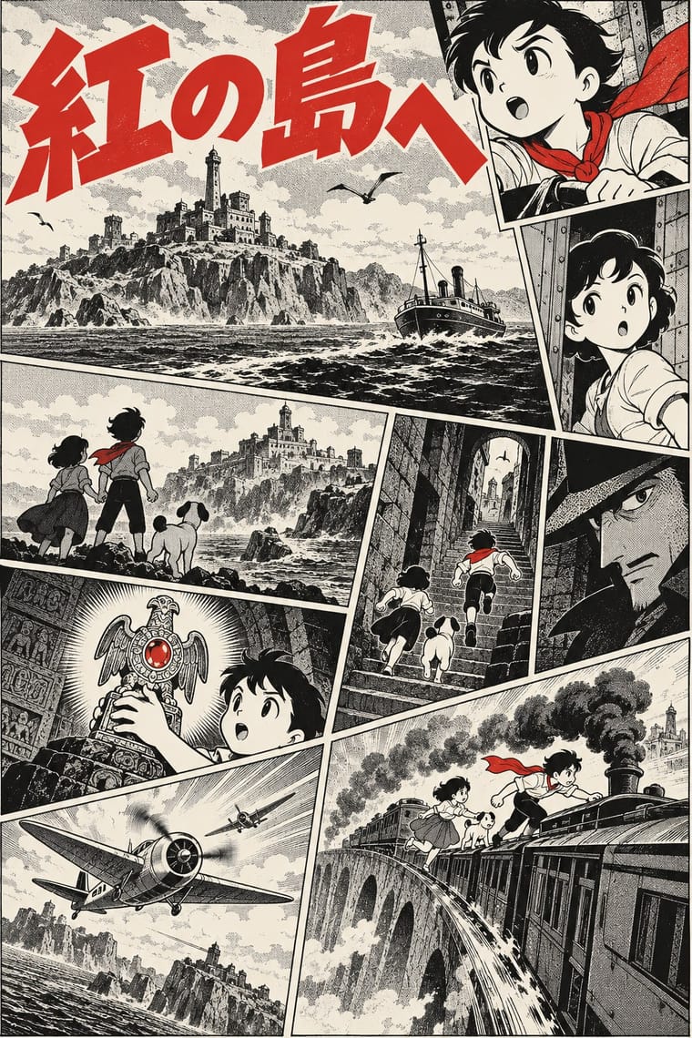
Each part of the design comes from the style with the stronger say in it, and each style gives at least two.
Garo and Heta-uma (Japanese Underground Manga and 'Bad-Good' Illustration) Story Manga (Postwar Japanese Comics)
- Type from Garo and Heta-uma
- Colour from Story Manga
- Form from Garo and Heta-uma
- Composition from Story Manga
- Surface from Story Manga
-
Garo and Heta-uma avoids halftone & ben-day dots: this is where the two pull against each other, which is the point of the contrast.
02
The type
Open fonts standing in for each style’s own type, which is often hand-drawn or commercial.
Display · Garo and Heta-uma
Hello
Londrina Solid; Garo and Heta-uma used Uneven hand-drawn katakana and hiragana lettering inside the drawing and Hand-lettered Garo titles and credits in brush and pen
Text · Story Manga
The black-and-white narrative comic of postwar Japan, from Tezuka Osamu's Shin Takarajima (1947) to the weekly boys' magazines of 1959 and 1968 and the paperbacks that collect them. Pages read right to left; panels change size and slant, bleed off the page and are broken by figures, cutting like film. Grey comes from dot screentone; motion and feeling from speed lines, focus lines and a codified set of symbols. Dialogue runs vertically in tall balloons, sound effects are drawn into the picture, and big-eyed, simplified characters act against detailed backgrounds.
Shippori Mincho; Story Manga used Anchi-goshi balloon setting and Fine Mincho balloon setting
03
The colours
The ground and leading colours come from Story Manga, with a counter-accent from Garo and Heta-uma. The ink reads on the ground at 4.5:1 or more.
Garo and Heta-uma (Japanese Underground Manga and 'Bad-Good' Illustration) Story Manga (Postwar Japanese Comics)
-
#f6f3eaground · 36% -
#141414ink · 14% -
#d32f2faccent · 18% -
#cfcfcfaccent · 14% -
#8a8478accent · 10% -
#4d4d4daccent · 8%
As CSS
:root {
  --ground: #f6f3ea;
  --ink: #141414;
  --accent-1: #d32f2f;
  --accent-2: #cfcfcf;
  --accent-3: #8a8478;
  --accent-4: #4d4d4d;
  --font-display: "Londrina Solid", cursive;
  --font-text: "Shippori Mincho", serif;
}
Use it with care
Story Manga (Postwar Japanese Comics): Manga characters and series, from Astro Boy to Dragon Ball and One Piece, are in copyright and belong to their creators and publishers, and manga is the living work of professional artists and assistants: draw original characters in the shared idiom, never ask an image model for a named series, character or artist's hand, and label generated pages as AI-made rather than presenting them as a manga artist's work. Some of Tezuka's own books drew foreigners, including Black Africans and Asians, in exaggerated caricature; after protests from September 1990 by the Osaka-based Association to Stop Racism Against Blacks, Tezuka Productions put a disclaimer slip into his books. Give every character the same drawing care, and never use skin, lips or dress as ethnic shorthand.
04
The two styles
05
More combinations
With Garo and Heta-uma
- Underground Comix Pairs well · A US counterculture parallel in crude, rebellious line; heta-uma is quieter, flatter and more deadpan.
- Superflat Pairs well · Later Japanese flat, naive-looking art that borrows the same wilful lack of polish with a glossier surface.
- Angura Theatre Poster Pairs well · Both are 1960s-70s Tokyo underground print; set crude Garo-style figures against angura's crowded silkscreen colour.
With Story Manga
- Korean Webtoon Graphics Contrasts · The Korean webtoon turned manhwa, Korean comics shaped in part by Japanese manga, into a single full-colour scroll column with long empty gutters, first on PC portals and then on phones; return to story manga for a printed spread of black-and-white panels read right to left, with screentone and panels that bleed and break.
- American Four-Colour Comic Book (Golden to Bronze Age) Contrasts · Both are mass-market pen-and-ink comics with balloons and sound effects; the American comic book reads left to right in four-colour dot tints with hand-lettered capitals in a steadier grid, while story manga stays black and white, reads right to left, greys with screentone and sets its dialogue vertically.
- Lianhuanhua Picture-Story Books Contrasts · Both are cheap, widely rented East Asian picture-story books; lianhuanhua gives each palm-sized page one framed drawing with a caption beneath and no balloons, while story manga packs a page with panels of changing size, balloons, speed lines and drawn sound effects.
- Superflat Contrasts · Murakami's Superflat lifts anime and manga figures out of the story onto one flat, glossy, polychrome plane for the gallery; story manga keeps the sequence, the depth of its backgrounds and its single black ink.
- Taishō Roman & Lyrical Illustration Pairs well · Jojōga's large, highlighted, long-lashed eyes passed from Nakahara Jun'ichi to Takahashi Macoto, who added stars and dots to the iris, and so into shōjo manga; add Taishō lyrical faces, kimono patterns and soft lines to a manga page for a period romance.
- Ligne Claire (Franco-Belgian Clear Line) Contrasts · Ligne claire closes every form with one even contour and flat colour, with no hatching or tone; story manga varies its line weight and builds grey and mood from screentone, solid blacks, speed lines and focus lines.
- Kawaii Design Pairs well · Kawaii takes manga's round faces and symbols but not its page; borrow its pastel mascots and rounded type for a comedy chapter, a character goods tie-in or a super-deformed aside, and keep the panels and screentone.
- Shōjo Manga (Japanese Girls' Comics) Pairs well · Girls' manga grew out of story manga from Tezuka's Princess Knight on and took its flowers, screentone moods and floating monologues furthest; borrow those when a story-manga page needs interior feeling rather than action.