Counterculture · 1992–present · Western Europe, Global / networked
Gabber and Hardcore Graphics (Rotterdam and Thunderdome)
Also known as Gabber flyers, Dutch hardcore techno graphics, Thunderdome artwork
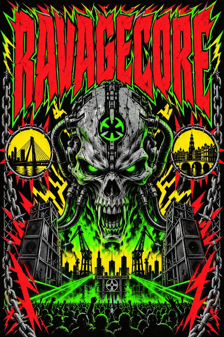
The visual language of Dutch gabber and hardcore techno, from the Rotterdam Records and Mokum labels and ID&T's Thunderdome parties: hard capitals, graffiti-derived logos and emblems such as the Thunderdome wizard, airbrushed horror and fantasy illustration on flyers and CD covers, and loud tracksuit colour in the crowd. It narrows the rave flyer's psychedelia into aggression and menace.
Make something in this style Get advice in this style Mix it with another style
Use it with care
Early gabber had a small racist minority: some wore Lonsdale clothing tied to right-wing extremism, and the German neo-Nazi fringe followed the scene, while Dutch neo-Nazis tried to exploit the 2000s revival without lasting. Labels and artists answered with anti-fascist statements. Shaved heads, bomber jackets and tracksuits are scene dress, not a political sign, so do not pair them with far-right or Nazi symbols. Rotterdam and Amsterdam both shaped the style (the word comes from Amsterdam slang), so credit both.
01
How it works
- Set the party or label name in heavy, condensed capitals.
- Build the identity on one graffiti-born emblem or mascot, as Thunderdome did with its wizard, a mural by the graffiti artist MODE 2.
- Illustrate flyers and covers with airbrushed or painted horror and fantasy scenes, the genre's own lineage running from Frazetta, Vallejo and Giger to Victor Feenstra's original Thunderdome artwork.
- Pack the lineup, venue and label logos tight in all-caps blocks, keeping soft pastel and gradient effects out.
- Keep the scene's stance explicit: some labels, Mokum among them, printed anti-fascist and anti-racist statements on their records.
Rotterdam, Amsterdam and Utrecht, Netherlands, early 1990s
02
Its design choices
From Stylogeny’s vocabulary of design choices: defining choices make the style, characteristic ones are usual, occasional ones turn up now and then.
- Layout & composition
- Space & hierarchy
- Typography
- Colour
- Form & shape
- Surface & texture
- Imagery
- Medium & production
- Tone & intent
- Avoids
- Pastel, Light ground, Generous white space, Floral & vegetal, Humanist & Garalde serif, Paper & letterpress bite, Calm & contemplative, Luxurious & glamorous, Gradients, Iridescent & holographic, Playful & witty
Palette
-
#0a0a0a -
#39ff14 -
#ffe600 -
#e8142c -
#c0c4c8
Typefaces
-
Heavy condensed all-caps display lettering
-
Graffiti-derived logotypes
Known for
-
Victor Feenstra's airbrush artwork for Thunderdome parties, CD covers and merchandise
from Thunderdome VII
-
The Thunderdome wizard logo
ID&T
-
Kees Linia's cartoon covers for Rotterdam Records sleeves
-
Thunderdome compilation series
ID&T and Arcade Records, from 1993
-
Mokum Records sleeves
label founded 1993
03
Make something in this style
Say what you need, and Stylogeny’s image studio draws it from Gabber and Hardcore Graphics (Rotterdam and Thunderdome)’s design choices and checks it against them. It takes about a minute, and you get a link to share.
04
Where it comes from, and what it’s close to
Before it
The style it grew out of, and the styles it borrowed from.
After it
The styles that grew out of it.
No later style in the atlas grew out of it yet.
Alike in its design choices
Styles that make many of the same choices, related or not, besides those above.
05
Often taken for
Gabber and Hardcore Graphics has no real works recorded yet, so these are its nearest styles by its choices alone, with the choices that tell them apart.
-
Bandung Distro Graphics
Bandung Distro Graphics is one of Gabber and Hardcore Graphics’s nearest styles by choices; no real work of either fits the other better.
Choices that tell Gabber and Hardcore Graphics and Bandung Distro Graphics apart Choice Gabber and Hardcore Graphics Bandung Distro Graphics Condensed display defining — Flat — defining Fluorescent & neon characteristic — Collage & layering — characteristic Angular & zigzag characteristic — No shared descent in the atlas: they reached these choices separately.
-
Ultras Graphics (Curva Banners and Tifo)
Ultras Graphics is one of Gabber and Hardcore Graphics’s nearest styles by choices; no real work of either fits the other better.
Choices that tell Gabber and Hardcore Graphics and Ultras Graphics apart Choice Gabber and Hardcore Graphics Ultras Graphics Dark ground defining — Repetition & rhythm — defining Condensed display defining — Hand-lettering — defining Fluorescent & neon characteristic — No shared descent in the atlas: they reached these choices separately.
-
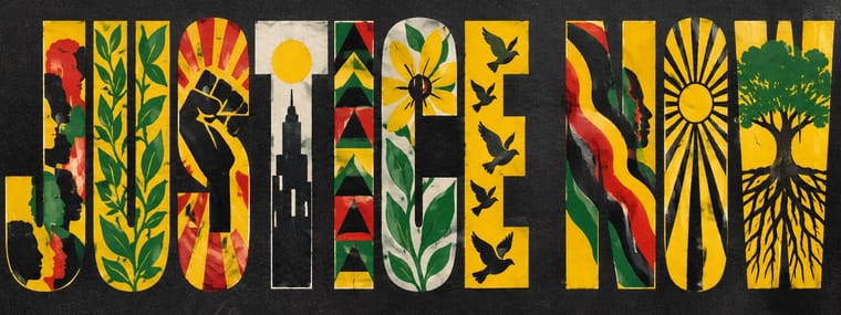
Black Lives Matter Street Murals
Black Lives Matter Street Murals is one of Gabber and Hardcore Graphics’s nearest styles by choices; no real work of either fits the other better.
Choices that tell Gabber and Hardcore Graphics and Black Lives Matter Street Murals apart Choice Gabber and Hardcore Graphics Black Lives Matter Street Murals Emblems & badges defining occasional Type as image occasional defining Fluorescent & neon characteristic — Full polychrome — characteristic Angular & zigzag characteristic — No shared descent in the atlas: they reached these choices separately.
-
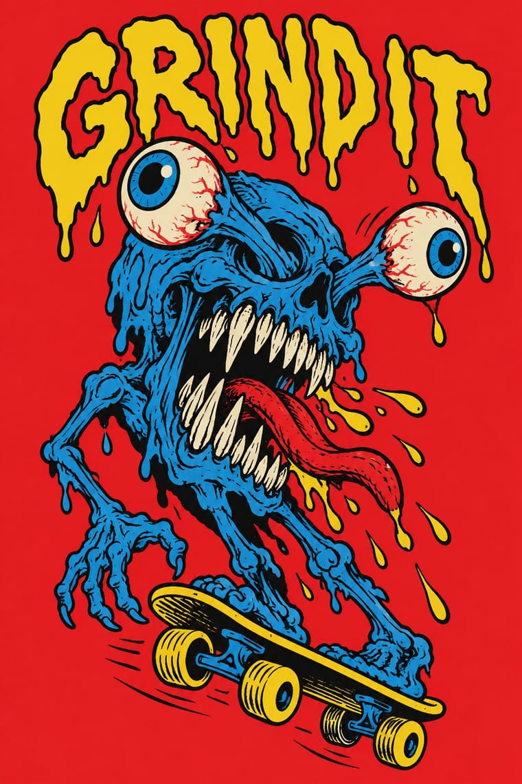
Skateboard Deck Graphics
Skateboard Deck Graphics is one of Gabber and Hardcore Graphics’s nearest styles by choices; no real work of either fits the other better.
Choices that tell Gabber and Hardcore Graphics and Skateboard Deck Graphics apart Choice Gabber and Hardcore Graphics Skateboard Deck Graphics Dark ground defining — Line illustration — defining All caps defining occasional Hand-lettering — defining Condensed display defining occasional No shared descent in the atlas: they reached these choices separately.
— means the choice isn’t among the style’s recorded choices. Critics recorded each work’s choices with the styles’ descriptions in view, so this shows whether the descriptions hold together, not proof that they are right.
06
Combine it with
Styles Gabber and Hardcore Graphics (Rotterdam and Thunderdome) pairs well with or plays against, from the research. Each is worked out as a combination: which style gives the type, the colours and the forms.
- Black Metal Graphics Contrasts · Both use menace and emblems, but one is neon and rendered, the other monochrome and hand-inked.
- PC Music Graphics Contrasts · Glossy chrome and loud colour appear in both, but hardcore keeps them aggressive where hyperpop makes them sugary.
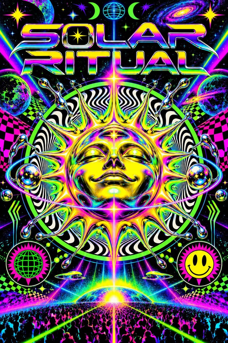
- Rave & Acid House Graphics Pairs well · Shares the flyer's info-heavy format and logotype culture, but hardens psychedelia into horror and menace and avoids the gradient and iridescence.
07
Sources
- Wikipedia, Gabber (labels, Euromasters 1992, Mokum slogan, fashion, far-right fringe, Rotterdam and Amsterdam)
- Wikipedia, Thunderdome (music festival) (ID&T, compilations from 1993; the first Thunderdome party was 3 October 1992 in Heerenveen, while The Final Exam, 20 June 1992, was an earlier ID&T rave)
- Wikipedia, Mokum Records (founded 1993; slogan given there as 'United Gabbers Against Racism & Fascism')
- Design Museum Den Bosch, Gabber exhibition page (flyers, fantasy and horror artwork, Victor Feenstra airbrush work)
- Google Arts & Culture, A Brief History of Gabber, Netherlands Institute for Sound and Vision (flyer collections, wizard logo by MODE 2, Kees Linia, Feenstra)
How Stylogeny researches and checks a style: where the facts come from.