Style combination · Contrasts
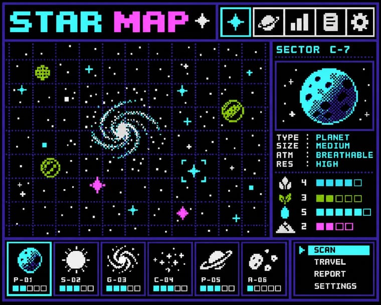
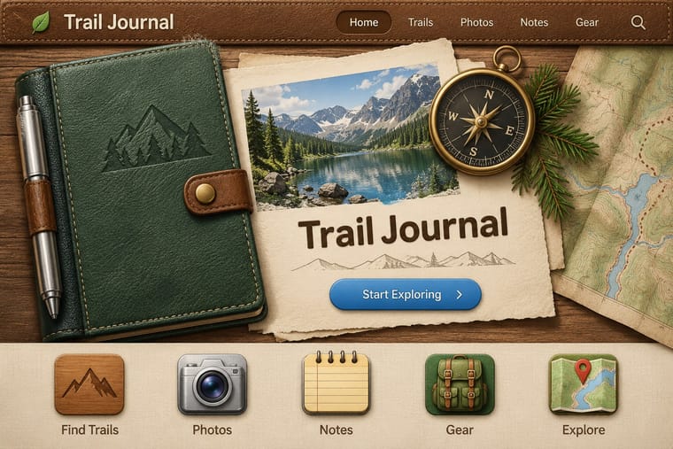
Bitmap × Skeuomorphic UI
Photoreal leather and glass are the opposite pole of 1-bit honesty; jump from one to the other to tell a story of interface history.
Pairing a 1-bit icon with its photoreal descendant shows that the metaphor, not the rendering, carries the meaning.
01
What each style brings
Each part of the design comes from the style with the stronger say in it, and each style gives at least two.
Bitmap & Pixel Graphics Skeuomorphic UI
- Type from Bitmap
- Colour from Skeuomorphic UI
-
Bitmap avoids gradients: this is where the two pull against each other, which is the point of the contrast.
- Form from Bitmap
- Composition from Bitmap
- Surface from Skeuomorphic UI
-
Bitmap avoids skeuomorphic material and gloss & highlights: this is where the two pull against each other, which is the point of the contrast.
02
The type
Open fonts standing in for each style’s own type, which is often hand-drawn or commercial.
Text · Skeuomorphic UI
Interface design that imitates physical materials and objects (stitched leather, linen, wooden shelves, brushed aluminium, felt, paper and glass) so that digital tools look and behave like their real-world counterparts. Extending the GUI's desktop metaphor into photorealism, it ran from Apple's Aqua and brushed-metal interfaces around 2000 to its peak in iOS 1–6 and Mac OS X Lion, and was abandoned for flat design with iOS 7 in 2013.
Inter; Skeuomorphic UI used Lucida Grande and Helvetica
03
The colours
The ground and leading colours come from Skeuomorphic UI, with a counter-accent from Bitmap. The ink reads on the ground at 4.5:1 or more.
Bitmap & Pixel Graphics Skeuomorphic UI
-
#f7e48cground · 36% -
#6b4226ink · 14% -
#4a87c9accent · 18% -
#9bbc0faccent · 14% -
#2f6b3aaccent · 10% -
#ff55ffaccent · 8%
As CSS
:root {
  --ground: #f7e48c;
  --ink: #6b4226;
  --accent-1: #4a87c9;
  --accent-2: #9bbc0f;
  --accent-3: #2f6b3a;
  --accent-4: #ff55ff;
  --font-display: "Pixelify Sans", monospace;
  --font-text: "Inter", sans-serif;
}
04
The two styles
05
More combinations
With Bitmap
- Andean Woven Graphic Systems Pairs well · The woven cell of Andean tapestry is a pre-digital pixel grid; draw pixel icons with its stepped diagonals, but credit weaving communities rather than copying their motifs.
- International Typographic Style Pairs well · Snap pixel type and icons to a strict Swiss grid for a rational, screen-native take on modernist order.
- Art Nouveau Contrasts · Whiplash curves cannot survive a coarse pixel grid; staging that clash makes a memorable, deliberately jagged ornament.
- Kawaii Design Pairs well · Sprite-scale characters and kawaii roundness merge naturally; keep the palette limited so pixel mascots stay crisp.
- Demoscene Graphics (Cracktros, Demos & Text-Mode Art) Contrasts · Bitmap graphics is the legible, flat pixel of icons, sprites and system fonts; scene graphics spend the same pixels on chrome, gradients and motion for show. Pick the icon grid for an interface and the scene logo for a title screen.
- Square Kufic (Bannāʾī) Pairs well · Both build letters from square units, and Sakkal compares building bricks to large pixels; set a bitmap Latin wordmark on the same cell size as a square-Kufic mark for a bilingual identity, but keep sacred formulas out of jokey, game-like pixel contexts.
- Isometric Pixel Art Contrasts · Same hand-placed pixels, but front-on icons and sprites under hardware limits against a crammed, full-colour 2:1 city made as a picture.
- Diné (Navajo) Weaving Design Pairs well · The weft step and the pixel are the same constraint. Draw icons and letters with stepped diagonals on a square grid, and credit the weaving logic rather than lifting particular rug designs.
With Skeuomorphic UI
- Frutiger Aero Pairs well · Share gloss and depth; combine Aero's glass and nature with skeuomorphic objects for convincing 2000s-nostalgia interfaces.
- Neumorphism Pairs well · Neumorphism keeps the light source and extrusion but drops the textures; borrow one material cue to give soft UI more character.
- Flat Design Contrasts · It is the style flat design was defined against; toggling between them is the clearest way to show an interface's evolution.
- Basel Object Poster (Swiss Sachplakat) Pairs well · Skeuomorphic app icons rendered glass, metal and leather the same way for screens; a Basel-style single product with a soft cast shadow on a dark ground makes a strong hero image for packaging or a product launch.
- Chaekgeori & Minhwa Screen Painting Pairs well · A wooden bookshelf interface is a digital chaekgado; use its compartment grid and trompe-l'oeil objects for a playful library or catalogue UI.
- Metro (Microsoft Design Language) Contrasts · The opposite answer to the same era: material realism against pure typographic flatness.
- Media-Player & Desktop Skins (Winamp-Era Skinning) Contrasts · The platform makers' coherent, usable imitation of leather and paper against the fans' oversized fictional machines.
- Bento Feature-Grid Design Contrasts · Place one richly rendered object in a single tile while the rest stay flat, to give the grid a focal point.