Style combination · Pairs well
Bitmap × Kawaii Design
Sprite-scale characters and kawaii roundness merge naturally; keep the palette limited so pixel mascots stay crisp.
01
What each style brings
Each part of the design comes from the style with the stronger say in it, and each style gives at least two.
Bitmap & Pixel Graphics Kawaii Design
- Type from Bitmap
- Colour from Kawaii Design
- Form from Kawaii Design
- Composition from Bitmap
- Surface from Bitmap
02
The type
Open fonts standing in for each style’s own type, which is often hand-drawn or commercial.
Text · Kawaii Design
Japan's culture of cuteness, which grew from 1970s teenage rounded handwriting and shōjo fancy goods into a global design language through Sanrio, character merchandise and emoji. Its decisions are simple and consistent: rounded forms, oversized heads and minimal faces, pastel or candy colour in flat fields, scattered hearts and sparkles, and friendly rounded type.
Zen Maru Gothic; Kawaii Design used Maru-ji and Maru Gothic rounded type
03
The colours
The ground and leading colours come from Kawaii Design, with a counter-accent from Bitmap. The ink reads on the ground at 4.5:1 or more.
Bitmap & Pixel Graphics Kawaii Design
-
#fff4a3ground · 36% -
#141414ink · 14% -
#e60033accent · 18% -
#9bbc0faccent · 14% -
#a8d8ffaccent · 10% -
#ff55ffaccent · 8%
As CSS
:root {
  --ground: #fff4a3;
  --ink: #141414;
  --accent-1: #e60033;
  --accent-2: #9bbc0f;
  --accent-3: #a8d8ff;
  --accent-4: #ff55ff;
  --font-display: "Pixelify Sans", monospace;
  --font-text: "Zen Maru Gothic", sans-serif;
}
04
The two styles
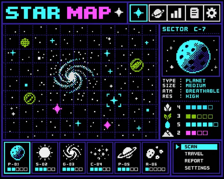
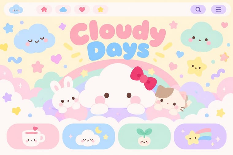
05
More combinations
With Bitmap
- Andean Woven Graphic Systems Pairs well · The woven cell of Andean tapestry is a pre-digital pixel grid; draw pixel icons with its stepped diagonals, but credit weaving communities rather than copying their motifs.
- Skeuomorphic UI Contrasts · Photoreal leather and glass are the opposite pole of 1-bit honesty; jump from one to the other to tell a story of interface history.
- International Typographic Style Pairs well · Snap pixel type and icons to a strict Swiss grid for a rational, screen-native take on modernist order.
- Art Nouveau Contrasts · Whiplash curves cannot survive a coarse pixel grid; staging that clash makes a memorable, deliberately jagged ornament.
- Demoscene Graphics (Cracktros, Demos & Text-Mode Art) Contrasts · Bitmap graphics is the legible, flat pixel of icons, sprites and system fonts; scene graphics spend the same pixels on chrome, gradients and motion for show. Pick the icon grid for an interface and the scene logo for a title screen.
- Square Kufic (Bannāʾī) Pairs well · Both build letters from square units, and Sakkal compares building bricks to large pixels; set a bitmap Latin wordmark on the same cell size as a square-Kufic mark for a bilingual identity, but keep sacred formulas out of jokey, game-like pixel contexts.
- Isometric Pixel Art Contrasts · Same hand-placed pixels, but front-on icons and sprites under hardware limits against a crammed, full-colour 2:1 city made as a picture.
- Diné (Navajo) Weaving Design Pairs well · The weft step and the pixel are the same constraint. Draw icons and letters with stepped diagonals on a square grid, and credit the weaving logic rather than lifting particular rug designs.
With Kawaii Design
- Techno-Futurist Graphics Pairs well · A cute mascot inside a dense techno-corporate layout softens its satire; Groovisions' Chappie is the model.
- Grunge Typography Contrasts · Grunge's dirt and illegibility is kawaii's opposite; one cute character on a distressed texture creates knowing dissonance.
- Memphis Design Pairs well · Kawaii characters sit happily on Memphis pastel geometry; combine them for playful packaging with a little more edge.
- Dark Tech Minimalism Contrasts · Use a single pastel mascot or emoji moment to humanise a cold, dark interface without changing its structure.
- Claymorphism & Soft 3D Pairs well · Kawaii's oversized heads, minimal faces and scattered sparkles translate directly into clay volumes; use its character rules for mascots and emoji so the 3D figures stay simple and readable at small sizes.
- Moomin Graphics (Tove Jansson's Pen-Drawn World and its Licensed Afterlife) Contrasts · Its round, white characters sit near kawaii fancy goods, but they keep a hatched, melancholy world around them that kawaii fancy goods leave out.
- Superflat Contrasts · Kawaii offers sincere, simple, pastel cuteness for fancy goods; switch to Superflat when the cute should be saturated, crowded, many-eyed and ironic, a comment on consumer culture rather than a product of it.
- VTuber Avatar and Stream Graphics Contrasts · Its parent in cute character culture, but kawaii fixes a static mascot on pastel goods and print; switch to VTuber graphics when the character has to move, talk and answer a live chat, with a performer's voice and a whole stream screen around it.