Style combination · Pairs well
Chaekgeori × Skeuomorphic UI
A wooden bookshelf interface is a digital chaekgado; use its compartment grid and trompe-l'oeil objects for a playful library or catalogue UI.
01
What each style brings
Each part of the design comes from the style with the stronger say in it, and each style gives at least two.
Chaekgeori & Minhwa Screen Painting Skeuomorphic UI
- Type from Chaekgeori
- Colour from Skeuomorphic UI
- Form from Chaekgeori
- Composition from Chaekgeori
- Surface from Skeuomorphic UI
02
The type
Open fonts standing in for each style’s own type, which is often hand-drawn or commercial.
Display · Chaekgeori
Velvet
Shippori Mincho; Chaekgeori used Haeseo (regular script) brush characters and Munjado pictorial ideographs built from emblematic motifs
Text · Skeuomorphic UI
Interface design that imitates physical materials and objects (stitched leather, linen, wooden shelves, brushed aluminium, felt, paper and glass) so that digital tools look and behave like their real-world counterparts. Extending the GUI's desktop metaphor into photorealism, it ran from Apple's Aqua and brushed-metal interfaces around 2000 to its peak in iOS 1–6 and Mac OS X Lion, and was abandoned for flat design with iOS 7 in 2013.
Inter; Skeuomorphic UI used Lucida Grande and Helvetica
03
The colours
The ground and leading colours come from Skeuomorphic UI, with a counter-accent from Chaekgeori. The ink reads on the ground at 4.5:1 or more.
Chaekgeori & Minhwa Screen Painting Skeuomorphic UI
-
#f7e48cground · 36% -
#6b4226ink · 14% -
#4a87c9accent · 18% -
#d9a23aaccent · 14% -
#2f6b3aaccent · 10% -
#b8392baccent · 8%
As CSS
:root {
  --ground: #f7e48c;
  --ink: #6b4226;
  --accent-1: #4a87c9;
  --accent-2: #d9a23a;
  --accent-3: #2f6b3a;
  --accent-4: #b8392b;
  --font-display: "Shippori Mincho", serif;
  --font-text: "Inter", sans-serif;
}
04
The two styles
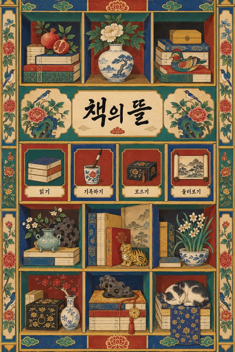
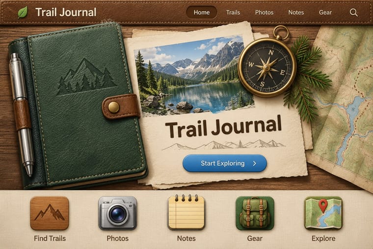
05
More combinations
With Chaekgeori
- Out-of-Square Hangul Typography Pairs well · Set a munjado-style pictorial character beside modular out-of-square Hangul to bridge Joseon folk painting and contemporary Korean type.
- Nianhua & Chinese Folk Print Pairs well · Both are auspicious household pictures; drop nianhua rebuses (a fish for surplus, a bat for fortune) into the compartments of a chaekgado grid for festive packaging.
- Cubist Pictorial Space Pairs well · Chaekgeori already shows objects from several viewpoints at once; borrow Cubist faceting to push its tilted shelves further, or cite chaekgeori as an East Asian precedent for multi-view still life.
- Ma & Wabi-sabi Aesthetics Contrasts · Chaekgeori fills the screen with prized possessions where ma leaves it empty; isolate one shelf object on a blank ground to move between display and restraint.
- Song–Ming Woodblock Book Typography (Songti / Mincho) Pairs well · Chaekgeori screens paint stacks of the scholar's books; pair a painted bookcase grid with real ruled, framed Myeongjo text pages for a Korean scholarly identity.
- Burmese Parabaik Painting (Konbaung Folding Books) Pairs well · Both are court paintings on a folding support that took Western-derived shading and recession into a local convention; set a parabaik procession beside a chaekgado shelf to compare how each folds depth into panels.
- Korean Commercial Calligraphy (Kaelligeurapi) Pairs well · Munjado paints a character full of pictures and commercial calligraphy bends a brushed word into a picture of its meaning; pair them for a Korean identity in which writing and image are the same mark.
- Minjung Woodcut Graphics (Korean People's Art) Pairs well · Minjung artists studied folk painting; borrow minhwa's flat colour and folk motifs to warm a black-and-white print.
With Skeuomorphic UI
- Bitmap & Pixel Graphics Contrasts · Pairing a 1-bit icon with its photoreal descendant shows that the metaphor, not the rendering, carries the meaning.
- Frutiger Aero Pairs well · Share gloss and depth; combine Aero's glass and nature with skeuomorphic objects for convincing 2000s-nostalgia interfaces.
- Neumorphism Pairs well · Neumorphism keeps the light source and extrusion but drops the textures; borrow one material cue to give soft UI more character.
- Flat Design Contrasts · It is the style flat design was defined against; toggling between them is the clearest way to show an interface's evolution.
- Basel Object Poster (Swiss Sachplakat) Pairs well · Skeuomorphic app icons rendered glass, metal and leather the same way for screens; a Basel-style single product with a soft cast shadow on a dark ground makes a strong hero image for packaging or a product launch.
- Metro (Microsoft Design Language) Contrasts · The opposite answer to the same era: material realism against pure typographic flatness.
- Media-Player & Desktop Skins (Winamp-Era Skinning) Contrasts · The platform makers' coherent, usable imitation of leather and paper against the fans' oversized fictional machines.
- Bento Feature-Grid Design Contrasts · Place one richly rendered object in a single tile while the rest stay flat, to give the grid a focal point.