Style combination · Pairs well
Frutiger Aero × Skeuomorphic UI
Share gloss and depth; combine Aero's glass and nature with skeuomorphic objects for convincing 2000s-nostalgia interfaces.
01
What each style brings
Each part of the design comes from the style with the stronger say in it, and each style gives at least two.
Frutiger Aero Skeuomorphic UI
- Type from Frutiger Aero
- Colour from Frutiger Aero
- Form from Skeuomorphic UI
- Composition from Skeuomorphic UI
- Surface from Frutiger Aero
02
The type
Open fonts standing in for each style’s own type, which is often hand-drawn or commercial.
Text · Skeuomorphic UI
Interface design that imitates physical materials and objects (stitched leather, linen, wooden shelves, brushed aluminium, felt, paper and glass) so that digital tools look and behave like their real-world counterparts. Extending the GUI's desktop metaphor into photorealism, it ran from Apple's Aqua and brushed-metal interfaces around 2000 to its peak in iOS 1–6 and Mac OS X Lion, and was abandoned for flat design with iOS 7 in 2013.
Inter; Skeuomorphic UI used Lucida Grande and Helvetica
03
The colours
The ground and leading colours come from Frutiger Aero, with a counter-accent from Skeuomorphic UI. The ink reads on the ground at 4.5:1 or more.
Frutiger Aero Skeuomorphic UI
-
#f5fbffground · 36% -
#0b5fa5ink · 14% -
#22c3c9accent · 18% -
#4a87c9accent · 14% -
#4fb3e8accent · 10% -
#2f6b3aaccent · 8%
As CSS
:root {
  --ground: #f5fbff;
  --ink: #0b5fa5;
  --accent-1: #22c3c9;
  --accent-2: #4a87c9;
  --accent-3: #4fb3e8;
  --accent-4: #2f6b3a;
  --font-display: "Fira Sans", sans-serif;
  --font-text: "Inter", sans-serif;
}
04
The two styles
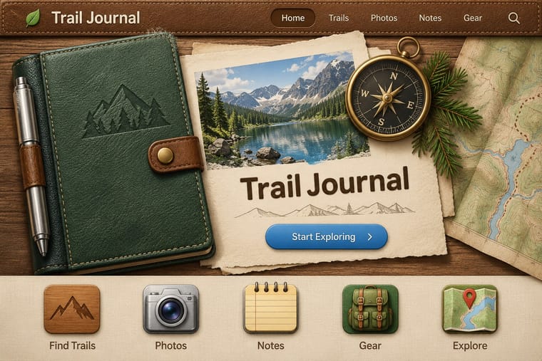
05
More combinations
With Frutiger Aero
- Vaporwave Pairs well · Both trade on mid-2000s tech nostalgia; mix Aero bubbles and skies with vaporwave's pastel 3D for retro-internet campaigns.
- Brutalist Web Design Contrasts · Raw HTML against bubbly gloss is a sharp foil for ironic or nostalgic web projects.
- Glassmorphism Pairs well · Glassmorphism is its flatter heir; reintroduce a touch of Aero gloss and nature photography to warm up frosted-glass UI.
- Flat Design Contrasts · Flat design was the reaction that ended it; toggle gloss against flat to signal ‘then and now’ in retro tech work.
- Forum Signature Art (Sig & C4D Render Graphics) Contrasts · The same years' glossy, light and airy interface look against the sig's dark, smudged depth.
- Punk & DIY Zine Contrasts · Glossy optimism is everything punk rejects; one torn xerox fragment on an aero gradient reads as instant sabotage.
- Solarpunk Contrasts · Both pair green nature with optimistic technology, but Aero renders it as glossy stock photography, bubbles and glass for a product; choose solarpunk for painted, handmade, lived-in places and shared infrastructure.
- Glitch Art & Datamosh Graphics Contrasts · Aero's glossy, seamless interface is the frictionless technology glitch art questions; corrupt one Aero-style screen to show what the gloss hides.
With Skeuomorphic UI
- Bitmap & Pixel Graphics Contrasts · Pairing a 1-bit icon with its photoreal descendant shows that the metaphor, not the rendering, carries the meaning.
- Neumorphism Pairs well · Neumorphism keeps the light source and extrusion but drops the textures; borrow one material cue to give soft UI more character.
- Flat Design Contrasts · It is the style flat design was defined against; toggling between them is the clearest way to show an interface's evolution.
- Basel Object Poster (Swiss Sachplakat) Pairs well · Skeuomorphic app icons rendered glass, metal and leather the same way for screens; a Basel-style single product with a soft cast shadow on a dark ground makes a strong hero image for packaging or a product launch.
- Chaekgeori & Minhwa Screen Painting Pairs well · A wooden bookshelf interface is a digital chaekgado; use its compartment grid and trompe-l'oeil objects for a playful library or catalogue UI.
- Metro (Microsoft Design Language) Contrasts · The opposite answer to the same era: material realism against pure typographic flatness.
- Media-Player & Desktop Skins (Winamp-Era Skinning) Contrasts · The platform makers' coherent, usable imitation of leather and paper against the fans' oversized fictional machines.
- Bento Feature-Grid Design Contrasts · Place one richly rendered object in a single tile while the rest stay flat, to give the grid a focal point.