Style combination · Contrasts
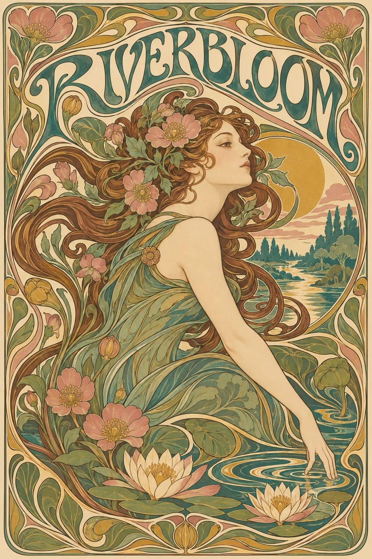
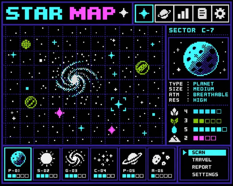
Art Nouveau × Bitmap
Whiplash curves cannot survive a coarse pixel grid; staging that clash makes a memorable, deliberately jagged ornament.
01
What each style brings
Each part of the design comes from the style with the stronger say in it, and each style gives at least two.
Art Nouveau Bitmap & Pixel Graphics
- Type from Bitmap
- Colour from Art Nouveau
- Form from Art Nouveau
-
Bitmap avoids whiplash line: this is where the two pull against each other, which is the point of the contrast.
- Composition from Art Nouveau
- Surface from Bitmap
02
The type
Open fonts standing in for each style’s own type, which is often hand-drawn or commercial.
Text · Art Nouveau
An international 'new art' that sought a modern style free of historical revival, drawing its forms from plant growth and the female figure. Graphic work flows with whiplash curves and stylised flowers, frames idealised women in arches, halos and mosaic borders, and draws custom lettering that bends to fill the space, fusing image, ornament and type into one decorative surface.
Bodoni Moda; Art Nouveau used Arnold Böcklin and Eckmann
03
The colours
The ground and leading colours come from Art Nouveau, with a counter-accent from Bitmap. The ink reads on the ground at 4.5:1 or more.
Art Nouveau Bitmap & Pixel Graphics
-
#efe2c4ground · 36% -
#4b3b2aink · 14% -
#c9a24baccent · 18% -
#9bbc0faccent · 14% -
#3f7a75accent · 10% -
#ff55ffaccent · 8%
As CSS
:root {
  --ground: #efe2c4;
  --ink: #4b3b2a;
  --accent-1: #c9a24b;
  --accent-2: #9bbc0f;
  --accent-3: #3f7a75;
  --accent-4: #ff55ff;
  --font-display: "Pixelify Sans", monospace;
  --font-text: "Bodoni Moda", serif;
}
04
The two styles
05
More combinations
With Art Nouveau
- Fileteado Porteño Pairs well · Fileteado's acanthus scrolls share the whiplash; combine them for ornate, hand-made lettering frames.
- International Typographic Style Contrasts · Ornamental curves against an orthogonal grid make a strong deliberate tension; let one botanical flourish break a cold grid.
- Psychedelic Poster Pairs well · San Francisco poster artists lifted Mucha's figures and whiplash wholesale; push the curves into saturated, vibrating colour for a 1960s-flavoured revival.
- Russian Constructivism Contrasts · Organic sensuality versus machine-age diagonals: use the opposition to stage nature against industry.
- Vienna Secession Contrasts · Set French whiplash against the Viennese square to show the turn from organic to geometric ornament within one decorative idiom.
- Skønvirke (Danish Art Nouveau, Bindesbøll) Contrasts · Shares the hand-lettering and abundance but swaps the whiplash line and the female figure for blunt abstract masses; set side by side they show the heavy Danish variant.
- Expressionist Woodcut Graphics Contrasts · The parent's smooth whiplash and floral harmony is exactly what the gouge splinters; use one against the other to stage order breaking down.
- Beggarstaffs Poster (Nicholson & Pryde) Contrasts · Its curving floral line is the opposite of cut masses; set side by side to show how much a poster can drop.
With Bitmap
- Andean Woven Graphic Systems Pairs well · The woven cell of Andean tapestry is a pre-digital pixel grid; draw pixel icons with its stepped diagonals, but credit weaving communities rather than copying their motifs.
- Skeuomorphic UI Contrasts · Photoreal leather and glass are the opposite pole of 1-bit honesty; jump from one to the other to tell a story of interface history.
- International Typographic Style Pairs well · Snap pixel type and icons to a strict Swiss grid for a rational, screen-native take on modernist order.
- Kawaii Design Pairs well · Sprite-scale characters and kawaii roundness merge naturally; keep the palette limited so pixel mascots stay crisp.
- Demoscene Graphics (Cracktros, Demos & Text-Mode Art) Contrasts · Bitmap graphics is the legible, flat pixel of icons, sprites and system fonts; scene graphics spend the same pixels on chrome, gradients and motion for show. Pick the icon grid for an interface and the scene logo for a title screen.
- Square Kufic (Bannāʾī) Pairs well · Both build letters from square units, and Sakkal compares building bricks to large pixels; set a bitmap Latin wordmark on the same cell size as a square-Kufic mark for a bilingual identity, but keep sacred formulas out of jokey, game-like pixel contexts.
- Isometric Pixel Art Contrasts · Same hand-placed pixels, but front-on icons and sprites under hardware limits against a crammed, full-colour 2:1 city made as a picture.
- Diné (Navajo) Weaving Design Pairs well · The weft step and the pixel are the same constraint. Draw icons and letters with stepped diagonals on a square grid, and credit the weaving logic rather than lifting particular rug designs.