Style combination · Pairs well
Basel Object Poster × Skeuomorphic UI
Skeuomorphic app icons rendered glass, metal and leather the same way for screens; a Basel-style single product with a soft cast shadow on a dark ground makes a strong hero image for packaging or a product launch.
Mix them and make something Basel Object Poster Skeuomorphic UI
01
What each style brings
Each part of the design comes from the style with the stronger say in it, and each style gives at least two.
Basel Object Poster (Swiss Sachplakat) Skeuomorphic UI
- Type from Basel Object Poster
- Colour from Skeuomorphic UI
- Form from Skeuomorphic UI
- Composition from Basel Object Poster
- Surface from Basel Object Poster
02
The type
Open fonts standing in for each style’s own type, which is often hand-drawn or commercial.
Display · Basel Object Poster
Pop
Fira Sans, standing in for Brand name painted on the product (the woven MARQUE PKZ label, 1923; BINACA on the tube and METAMETA embossed on the fuel tablet, 1941)
Text · Skeuomorphic UI
Interface design that imitates physical materials and objects (stitched leather, linen, wooden shelves, brushed aluminium, felt, paper and glass) so that digital tools look and behave like their real-world counterparts. Extending the GUI's desktop metaphor into photorealism, it ran from Apple's Aqua and brushed-metal interfaces around 2000 to its peak in iOS 1–6 and Mac OS X Lion, and was abandoned for flat design with iOS 7 in 2013.
Inter; Skeuomorphic UI used Lucida Grande and Helvetica
03
The colours
The ground and leading colours come from Skeuomorphic UI, with a counter-accent from Basel Object Poster. The ink reads on the ground at 4.5:1 or more.
Basel Object Poster (Swiss Sachplakat) Skeuomorphic UI
-
#f7e48cground · 36% -
#6b4226ink · 14% -
#4a87c9accent · 18% -
#f0c419accent · 14% -
#2f6b3aaccent · 10% -
#e0472baccent · 8%
As CSS
:root {
  --ground: #f7e48c;
  --ink: #6b4226;
  --accent-1: #4a87c9;
  --accent-2: #f0c419;
  --accent-3: #2f6b3a;
  --accent-4: #e0472b;
  --font-display: "Fira Sans", sans-serif;
  --font-text: "Inter", sans-serif;
}
04
The two styles
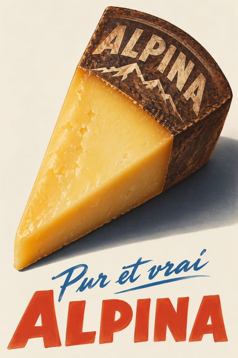
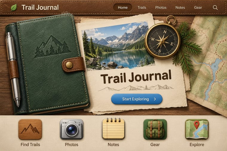
05
More combinations
With Basel Object Poster
- Art Deco Contrasts · A source as well as a foil: Leupin studied at the École Paul Colin in Paris in 1935-36 and took strong impressions from Colin and from Colin's rival Cassandre. Both make a product a heroic icon, but Deco stylises it into a geometric silhouette with airbrushed gradation and geometric capitals, while Basel paints the real object, its material and its label, as a still life.
- International Typographic Style Contrasts · The style that displaced it in the same cities around 1950: a grid, objective photography and a neutral grotesque instead of one painted object and a hand-lettered name. Set the two side by side to show the shift from crafted illusion to systematic information.
- Plakatstil / Sachplakat Contrasts · Its parent and nearest relative: Berlin's Sachplakat flattens the product into a silhouette in two to four flat colours with heavy block lettering, while Basel paints the same single object in full light and shadow, glass and tweed included. Choose Basel when the material of the product should sell it.
- Surrealist Graphics Pairs well · Both paint ordinary things with illusionistic precision until they look strange; borrow a Magritte-like juxtaposition to push a Basel still life from product portrait to visual riddle, as Leupin did with his newspaper and globe.
- Pop Art Graphics Contrasts · Both make an icon of a consumer product, but Pop repeats it in flat screenprinted colour with irony, where Basel paints one specimen with reverent, tactile care.
- West German Conceptual Film & Culture Poster (Hillmann and Rambow) Contrasts · Both isolate one object on a plain ground, but Basel paints a product in glossy lithographic realism to sell it; here the object stands for a film's theme, is cut to a flat silhouette or a grainy photograph, and rarely flatters.
- French Post-War Visual-Gag Poster (Savignac, Villemot, Morvan) Contrasts · Its Swiss contemporary paints the product as a modelled, larger-than-life icon; choose between wit by cartoon drawing and wit by illusion, or set one against the other.
- Finnish Symbol Poster (the 'Finnish School', 1954–1995) Contrasts · Kamekura compared Varis's humour to Leupin's, but the Basel poster paints the object in glossy relief where the Finnish one flattens it into a sign.
With Skeuomorphic UI
- Bitmap & Pixel Graphics Contrasts · Pairing a 1-bit icon with its photoreal descendant shows that the metaphor, not the rendering, carries the meaning.
- Frutiger Aero Pairs well · Share gloss and depth; combine Aero's glass and nature with skeuomorphic objects for convincing 2000s-nostalgia interfaces.
- Neumorphism Pairs well · Neumorphism keeps the light source and extrusion but drops the textures; borrow one material cue to give soft UI more character.
- Flat Design Contrasts · It is the style flat design was defined against; toggling between them is the clearest way to show an interface's evolution.
- Chaekgeori & Minhwa Screen Painting Pairs well · A wooden bookshelf interface is a digital chaekgado; use its compartment grid and trompe-l'oeil objects for a playful library or catalogue UI.
- Metro (Microsoft Design Language) Contrasts · The opposite answer to the same era: material realism against pure typographic flatness.
- Media-Player & Desktop Skins (Winamp-Era Skinning) Contrasts · The platform makers' coherent, usable imitation of leather and paper against the fans' oversized fictional machines.
- Bento Feature-Grid Design Contrasts · Place one richly rendered object in a single tile while the rest stay flat, to give the grid a focal point.