Style combination · Contrasts
Flat Design × Skeuomorphic UI
It is the style flat design was defined against; toggling between them is the clearest way to show an interface's evolution.
Its direct predecessor and foil: one realistic, textured object on an otherwise flat screen becomes an instant focal point.
01
What each style brings
Each part of the design comes from the style with the stronger say in it, and each style gives at least two.
Flat Design Skeuomorphic UI
- Type from Flat Design
- Colour from Flat Design
-
Skeuomorphic UI avoids flat fields: this is where the two pull against each other, which is the point of the contrast.
- Form from Flat Design
- Composition from Skeuomorphic UI
-
Flat Design avoids illusion of depth: this is where the two pull against each other, which is the point of the contrast.
- Surface from Skeuomorphic UI
-
Flat Design avoids skeuomorphic material and gloss & highlights: this is where the two pull against each other, which is the point of the contrast.
02
The type
Open fonts standing in for each style’s own type, which is often hand-drawn or commercial.
Text · Flat Design
An interface and illustration language that stripped screens of simulated materials, replacing bevels, gloss and textures with solid fields of colour, clean sans-serif type and reduced pictograms. Formalised in Microsoft's Metro design language (Windows Phone 7, 2010) and made mainstream by Apple's iOS 7 (2013), it applied Swiss modernist reduction to responsive, touch-first screens.
Inter; Flat Design used Segoe UI and Helvetica Neue
03
The colours
The ground and leading colours come from Flat Design, with a counter-accent from Skeuomorphic UI. The ink reads on the ground at 4.5:1 or more.
Flat Design Skeuomorphic UI
-
#ecf0f1ground · 36% -
#2c3e50ink · 14% -
#f1c40faccent · 18% -
#4a87c9accent · 14% -
#e74c3caccent · 10% -
#2f6b3aaccent · 8%
As CSS
:root {
  --ground: #ecf0f1;
  --ink: #2c3e50;
  --accent-1: #f1c40f;
  --accent-2: #4a87c9;
  --accent-3: #e74c3c;
  --accent-4: #2f6b3a;
  --font-display: "Inter", sans-serif;
  --font-text: "Inter", sans-serif;
}
04
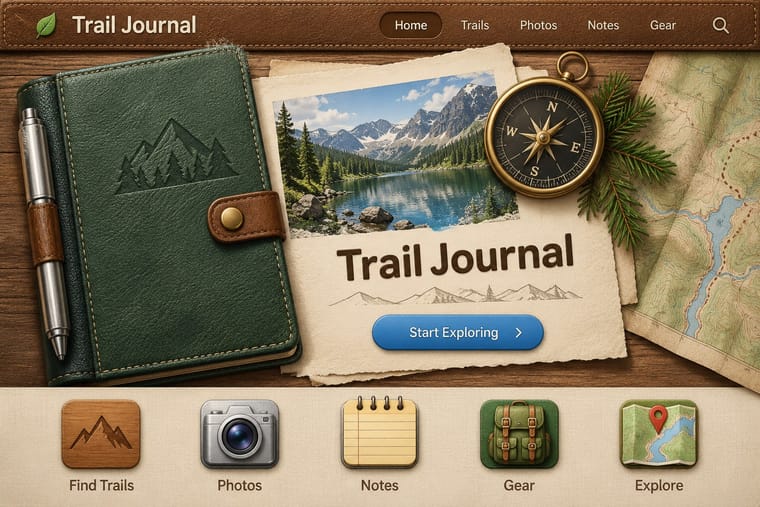
The two styles

05
More combinations
With Flat Design
- Japanese Postwar Modernism Pairs well · Add the emblematic circles and calm colour fields of Japanese postwar posters to give flat screens a stronger focal image.
- Victorian Letterpress & Wood Type Contrasts · Ornamented wood type and dense rules show everything flat design removed; quote one decorative headline to warm a sterile interface.
- Isotype Pictorial Statistics Pairs well · Borrow Isotype's rows of identical counting pictograms to turn a flat icon set into honest, readable data graphics.
- Indie Pixel Art Revival Contrasts · Resolution-independent vector flatness against a deliberately coarse grid lit with glows and depth.
- Arts & Crafts Movement Contrasts · Borrow one engraved border or initial to give a flat interface a crafted, editorial moment against its vector minimalism.
- WPA Silkscreen Posters Pairs well · Its flat layered shapes translate directly to vector; use the national-park look for warm, civic flat illustration.
- Munich 1972 Olympic Design (Otl Aicher) Pairs well · Flat icon families descend from these round-headed figures; borrow a single stroke width (which, as Holt shows, the 1972 figures only approximate, since a limb built from an orthogonal and a 45-degree segment cannot keep one thickness) and the 0, 45 and 90-degree rule to keep a screen icon set coherent.
- Ligne Claire (Franco-Belgian Clear Line) Pairs well · Flat, unshaded fields translate directly to screen; add ligne claire's even outline and documented settings to flat UI illustration for scenes with more narrative and character, keeping ligne claire's perspective, which flat design avoids.
With Skeuomorphic UI
- Bitmap & Pixel Graphics Contrasts · Pairing a 1-bit icon with its photoreal descendant shows that the metaphor, not the rendering, carries the meaning.
- Frutiger Aero Pairs well · Share gloss and depth; combine Aero's glass and nature with skeuomorphic objects for convincing 2000s-nostalgia interfaces.
- Neumorphism Pairs well · Neumorphism keeps the light source and extrusion but drops the textures; borrow one material cue to give soft UI more character.
- Basel Object Poster (Swiss Sachplakat) Pairs well · Skeuomorphic app icons rendered glass, metal and leather the same way for screens; a Basel-style single product with a soft cast shadow on a dark ground makes a strong hero image for packaging or a product launch.
- Chaekgeori & Minhwa Screen Painting Pairs well · A wooden bookshelf interface is a digital chaekgado; use its compartment grid and trompe-l'oeil objects for a playful library or catalogue UI.
- Metro (Microsoft Design Language) Contrasts · The opposite answer to the same era: material realism against pure typographic flatness.
- Media-Player & Desktop Skins (Winamp-Era Skinning) Contrasts · The platform makers' coherent, usable imitation of leather and paper against the fans' oversized fictional machines.
- Bento Feature-Grid Design Contrasts · Place one richly rendered object in a single tile while the rest stay flat, to give the grid a focal point.