Style combination · Pairs well
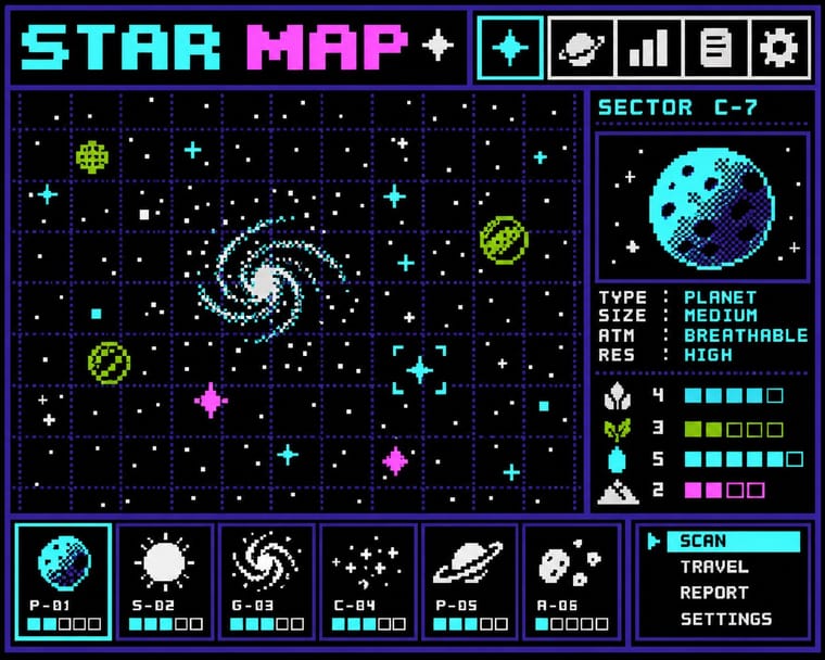
Bitmap × International Typographic Style
Snap pixel type and icons to a strict Swiss grid for a rational, screen-native take on modernist order.
Mix them and make something Bitmap International Typographic Style
01
What each style brings
Each part of the design comes from the style with the stronger say in it, and each style gives at least two.
Bitmap & Pixel Graphics International Typographic Style
- Type from Bitmap
- Colour from International Typographic Style
- Form from Bitmap
- Composition from International Typographic Style
- Surface from Bitmap
02
The type
Open fonts standing in for each style’s own type, which is often hand-drawn or commercial.
Text · International Typographic Style
A post-war refinement of the New Typography in which the mathematical grid, objective photography and neo-grotesque sans-serifs were used to communicate with clarity and neutrality. Taught at the Basel and Zurich schools, it became the default language of international corporate and institutional communication.
Inter; International Typographic Style used Akzidenz-Grotesk and Helvetica
03
The colours
The ground and leading colours come from International Typographic Style, with a counter-accent from Bitmap. The ink reads on the ground at 4.5:1 or more.
Bitmap & Pixel Graphics International Typographic Style
-
#f2f0e9ground · 36% -
#111111ink · 14% -
#e1251baccent · 18% -
#9bbc0faccent · 14% -
#1f4e9caccent · 10% -
#ff55ffaccent · 8%
As CSS
:root {
  --ground: #f2f0e9;
  --ink: #111111;
  --accent-1: #e1251b;
  --accent-2: #9bbc0f;
  --accent-3: #1f4e9c;
  --accent-4: #ff55ff;
  --font-display: "Pixelify Sans", monospace;
  --font-text: "Inter", sans-serif;
}
04
The two styles

05
More combinations
With Bitmap
- Andean Woven Graphic Systems Pairs well · The woven cell of Andean tapestry is a pre-digital pixel grid; draw pixel icons with its stepped diagonals, but credit weaving communities rather than copying their motifs.
- Skeuomorphic UI Contrasts · Photoreal leather and glass are the opposite pole of 1-bit honesty; jump from one to the other to tell a story of interface history.
- Art Nouveau Contrasts · Whiplash curves cannot survive a coarse pixel grid; staging that clash makes a memorable, deliberately jagged ornament.
- Kawaii Design Pairs well · Sprite-scale characters and kawaii roundness merge naturally; keep the palette limited so pixel mascots stay crisp.
- Demoscene Graphics (Cracktros, Demos & Text-Mode Art) Contrasts · Bitmap graphics is the legible, flat pixel of icons, sprites and system fonts; scene graphics spend the same pixels on chrome, gradients and motion for show. Pick the icon grid for an interface and the scene logo for a title screen.
- Square Kufic (Bannāʾī) Pairs well · Both build letters from square units, and Sakkal compares building bricks to large pixels; set a bitmap Latin wordmark on the same cell size as a square-Kufic mark for a bilingual identity, but keep sacred formulas out of jokey, game-like pixel contexts.
- Isometric Pixel Art Contrasts · Same hand-placed pixels, but front-on icons and sprites under hardware limits against a crammed, full-colour 2:1 city made as a picture.
- Diné (Navajo) Weaving Design Pairs well · The weft step and the pixel are the same constraint. Draw icons and letters with stepped diagonals on a square grid, and credit the weaving logic rather than lifting particular rug designs.
With International Typographic Style
- Art Nouveau Contrasts · Ornamental curves against an orthogonal grid make a strong deliberate tension.
- Brutalist Web Design Pairs well · Strip the grid to raw HTML defaults to get a rawer, contemporary take on Swiss honesty.
- Psychedelic Poster Contrasts · Its exact opposite on legibility; borrow one swirling element to break a too-cold Swiss layout.
- Japanese Postwar Modernism Pairs well · Add Japanese restraint and emblematic colour fields to the grid for warmth without losing order.
- American Traditional Tattoo Flash Contrasts · Rational grid and sans-serif against sentimental, hand-lettered emblems: one flash motif on a Swiss layout makes a sharp contrast.
- Graffiti & Hip-Hop Graphics Contrasts · Put a single tag or throw-up over a strict Swiss grid to stage the clash between institutional order and a street voice.
- Pop Art Graphics Contrasts · Set one loud appropriated Pop image inside a strict grid with a neutral grotesque so the irony reads as deliberate rather than chaotic.
- Italian Painted Film Poster (Rome Studios) Contrasts · Grid, restraint and photographic objectivity are the opposite of a crowded painted montage.