Style combination · Pairs well
Flat Design × Low Poly Illustration
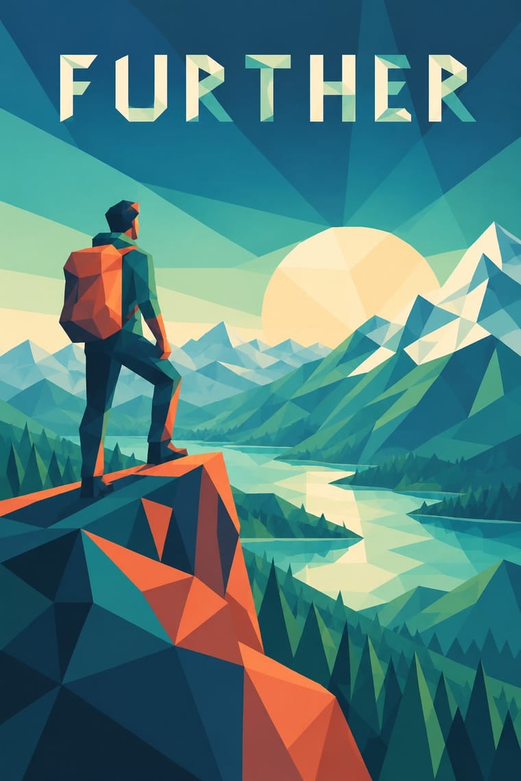
Flat design's solid fields, sans type and calm grids make a quiet frame for one faceted hero illustration or a triangle-mesh header; keep the interface flat so the facets are the only place where depth appears.
Mix them and make something Flat Design Low Poly Illustration
01
What each style brings
Each part of the design comes from the style with the stronger say in it, and each style gives at least two.
Flat Design Low Poly Illustration
- Type from Flat Design
- Colour from Flat Design
- Form from Low Poly Illustration
- Composition from Low Poly Illustration
-
Flat Design avoids illusion of depth: this is where the two pull against each other.
- Surface from Flat Design
02
The type
Open fonts standing in for each style’s own type, which is often hand-drawn or commercial.
Text · Low Poly Illustration
A digital illustration and game look in which subjects are built from a visible mesh of a few flat-shaded polygons, so that animals, faces, vehicles and landscapes read as hard-edged facets with no outline or texture. Around 2012 the polygon budgets of early real-time 3D became a chosen style, in Timothy J. Reynolds's Cinema 4D illustrations and then in indie games such as MirrorMoon EP (2013). Triangulation tools such as Trianglify then carried it into 2D vector art, posters and web backgrounds.
Jost; Low Poly Illustration used Faceted display faces that replace every curve with straight segments, such as Ray Larabie's Alphii (Typodermic, 2006), which in the foundry's words 'does not imitate a mesh or toolpath; it shares their economy' and A clean geometric sans set flat beside the faceted picture, so the letters stay legible while the mesh carries the image
03
The colours
The ground and leading colours come from Flat Design, with a counter-accent from Low Poly Illustration. The ink reads on the ground at 4.5:1 or more.
Flat Design Low Poly Illustration
-
#ecf0f1ground · 36% -
#2c3e50ink · 14% -
#f1c40faccent · 18% -
#e8704faccent · 14% -
#3fa58aaccent · 10% -
#3498dbaccent · 8%
As CSS
:root {
  --ground: #ecf0f1;
  --ink: #2c3e50;
  --accent-1: #f1c40f;
  --accent-2: #e8704f;
  --accent-3: #3fa58a;
  --accent-4: #3498db;
  --font-display: "Inter", sans-serif;
  --font-text: "Jost", sans-serif;
}
04
The two styles

05
More combinations
With Flat Design
- Skeuomorphic UI Contrasts · Its direct predecessor and foil: one realistic, textured object on an otherwise flat screen becomes an instant focal point.
- Japanese Postwar Modernism Pairs well · Add the emblematic circles and calm colour fields of Japanese postwar posters to give flat screens a stronger focal image.
- Victorian Letterpress & Wood Type Contrasts · Ornamented wood type and dense rules show everything flat design removed; quote one decorative headline to warm a sterile interface.
- Isotype Pictorial Statistics Pairs well · Borrow Isotype's rows of identical counting pictograms to turn a flat icon set into honest, readable data graphics.
- Indie Pixel Art Revival Contrasts · Resolution-independent vector flatness against a deliberately coarse grid lit with glows and depth.
- Arts & Crafts Movement Contrasts · Borrow one engraved border or initial to give a flat interface a crafted, editorial moment against its vector minimalism.
- WPA Silkscreen Posters Pairs well · Its flat layered shapes translate directly to vector; use the national-park look for warm, civic flat illustration.
- Munich 1972 Olympic Design (Otl Aicher) Pairs well · Flat icon families descend from these round-headed figures; borrow a single stroke width (which, as Holt shows, the 1972 figures only approximate, since a limb built from an orthogonal and a 45-degree segment cannot keep one thickness) and the 0, 45 and 90-degree rule to keep a screen icon set coherent.
With Low Poly Illustration
- Claymorphism & Soft 3D Contrasts · Both float one rendered object on a pale ground, but clay is inflated, rounded and softly shaded while low poly is cut into hard facets with stepped tones; choose clay for warmth and touch, low poly for crispness and a constructed, mineral feel.
- Bitmap & Pixel Graphics Pairs well · Both turn the limits of early game hardware into a chosen look, square pixels in 2D and few polygons in 3D (Wikipedia's 'Low poly' calls it the 3D analogue of pixel art, without a source). Pair a faceted scene with pixel type and icons for a retro-game interface, or set the square step against the triangle to show the two eras side by side.
- Art Nouveau Contrasts · Whiplash curves cannot survive a polygon budget; stage one sinuous line against a faceted field for deliberate tension, or use Art Nouveau to see everything low poly gives up.
- Cubist Pictorial Space Contrasts · Cubism breaks an object into planes seen from several viewpoints at once and flattens the space; low poly facets it from one consistent viewpoint and keeps the perspective. Borrow Cubist overlap only when ambiguity, not legibility, is the point.
- Generative & Dynamic Identities Pairs well · Generate the triangle mesh from seeded points and a colour ramp, as Trianglify does, to give an identity a family of backgrounds that vary per page or per user but always read as one system.
- PS1 / Lo-Fi 3D Revival (PSX Aesthetic) Contrasts · Both count polygons, but low poly shows clean, untextured flat-shaded facets on bright grounds with a calm tone, while the PSX look wraps its meshes in tiny warping textures, fog and grain to make dread. Keep the facets clean for decoration and dirty them for horror.
- Cel-Shaded Game Graphics (Toon-Shaded Real-Time 3D) Contrasts · Both stylise real-time 3D, but low poly shows faceted polygons with no outlines; contrast inked silhouettes with bare facets.
- Isometric Tech Illustration Contrasts · Faceted meshes with perspective against parallel-projected boxes in three flat tones.