Style combination · Pairs well
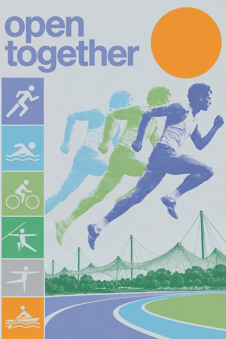
Flat Design × Munich 1972 Olympic Design
Flat icon families descend from these round-headed figures; borrow a single stroke width (which, as Holt shows, the 1972 figures only approximate, since a limb built from an orthogonal and a 45-degree segment cannot keep one thickness) and the 0, 45 and 90-degree rule to keep a screen icon set coherent.
Mix them and make something Flat Design Munich 1972 Olympic Design
01
What each style brings
Each part of the design comes from the style with the stronger say in it, and each style gives at least two.
Flat Design Munich 1972 Olympic Design (Otl Aicher)
- Type from Munich 1972 Olympic Design
- Colour from Munich 1972 Olympic Design
- Form from Flat Design
- Composition from Munich 1972 Olympic Design
- Surface from Flat Design
02
The type
Open fonts standing in for each style’s own type, which is often hand-drawn or commercial.
Display · Munich 1972 Olympic Design
Grid
Inter Tight, standing in for Univers (Adrian Frutiger, 1957), the only typeface of the Games' official communications, with Univers 55 as the house weight
Text · Flat Design
An interface and illustration language that stripped screens of simulated materials, replacing bevels, gloss and textures with solid fields of colour, clean sans-serif type and reduced pictograms. Formalised in Microsoft's Metro design language (Windows Phone 7, 2010) and made mainstream by Apple's iOS 7 (2013), it applied Swiss modernist reduction to responsive, touch-first screens.
Inter; Flat Design used Segoe UI and Helvetica Neue
03
The colours
The ground and leading colours come from Munich 1972 Olympic Design, with a counter-accent from Flat Design. The ink reads on the ground at 4.5:1 or more.
Flat Design Munich 1972 Olympic Design (Otl Aicher)
-
#9ccf7cground · 36% -
#141414ink · 14% -
#49aa76accent · 18% -
#e74c3caccent · 14% -
#8a96c4accent · 10% -
#3498dbaccent · 8%
As CSS
:root {
  --ground: #9ccf7c;
  --ink: #141414;
  --accent-1: #49aa76;
  --accent-2: #e74c3c;
  --accent-3: #8a96c4;
  --accent-4: #3498db;
  --font-display: "Inter Tight", sans-serif;
  --font-text: "Inter", sans-serif;
}
Use it with care
Munich 1972 Olympic Design (Otl Aicher): The Olympic rings are a protected IOC mark and the Munich posters, emblem and pictograms are the work of named designers: borrow the method (one grid, a light landscape palette, grid-drawn figures), not the artefacts. The 'cheerful Games' are also bound up with the Munich massacre of 5–6 September 1972, when Black September gunmen killed 11 members of the Israeli team; use the identity's optimism knowingly.
04
The two styles

05
More combinations
With Flat Design
- Skeuomorphic UI Contrasts · Its direct predecessor and foil: one realistic, textured object on an otherwise flat screen becomes an instant focal point.
- Japanese Postwar Modernism Pairs well · Add the emblematic circles and calm colour fields of Japanese postwar posters to give flat screens a stronger focal image.
- Victorian Letterpress & Wood Type Contrasts · Ornamented wood type and dense rules show everything flat design removed; quote one decorative headline to warm a sterile interface.
- Isotype Pictorial Statistics Pairs well · Borrow Isotype's rows of identical counting pictograms to turn a flat icon set into honest, readable data graphics.
- Indie Pixel Art Revival Contrasts · Resolution-independent vector flatness against a deliberately coarse grid lit with glows and depth.
- Arts & Crafts Movement Contrasts · Borrow one engraved border or initial to give a flat interface a crafted, editorial moment against its vector minimalism.
- WPA Silkscreen Posters Pairs well · Its flat layered shapes translate directly to vector; use the national-park look for warm, civic flat illustration.
- Ligne Claire (Franco-Belgian Clear Line) Pairs well · Flat, unshaded fields translate directly to screen; add ligne claire's even outline and documented settings to flat UI illustration for scenes with more narrative and character, keeping ligne claire's perspective, which flat design avoids.
With Munich 1972 Olympic Design
- Japanese Postwar Modernism Pairs well · Munich built its pictograms partly on Tokyo 1964's; add Kamekura's single emblem on a wide empty field to a Munich layout when one poster must carry more gravity than a series.
- HfG Ulm Systematic Design Contrasts · Aicher's own Ulm method (one grid, one grotesque, a manual) applied to a public festival instead of a company: Lufthansa's dark blue, yellow, black and white give way to a landscape spectrum of blues, greens, silver and oranges, pictograms and posterised photographs. Start from Ulm for a corporate system, from Munich when the system must feel friendly.
- Isotype Pictorial Statistics Pairs well · Isotype's figures count, Munich's direct: combine Neurath's rows of counted signs with Aicher's grid-drawn sports figures for public information that both explains and guides.
- Wordless Flat-Pack Assembly Instructions Pairs well · Aicher's pictogram system gives the tool and warning signs a stricter grid while the drawings stay in outline.
- Cobi and Mariscal's Barcelona '92 Mascot Graphics Contrasts · The rational pictogram grid against a single drawn mascot; mixing them shows how much a hand-drawn character loosens an institutional system.