Style combination · Contrasts
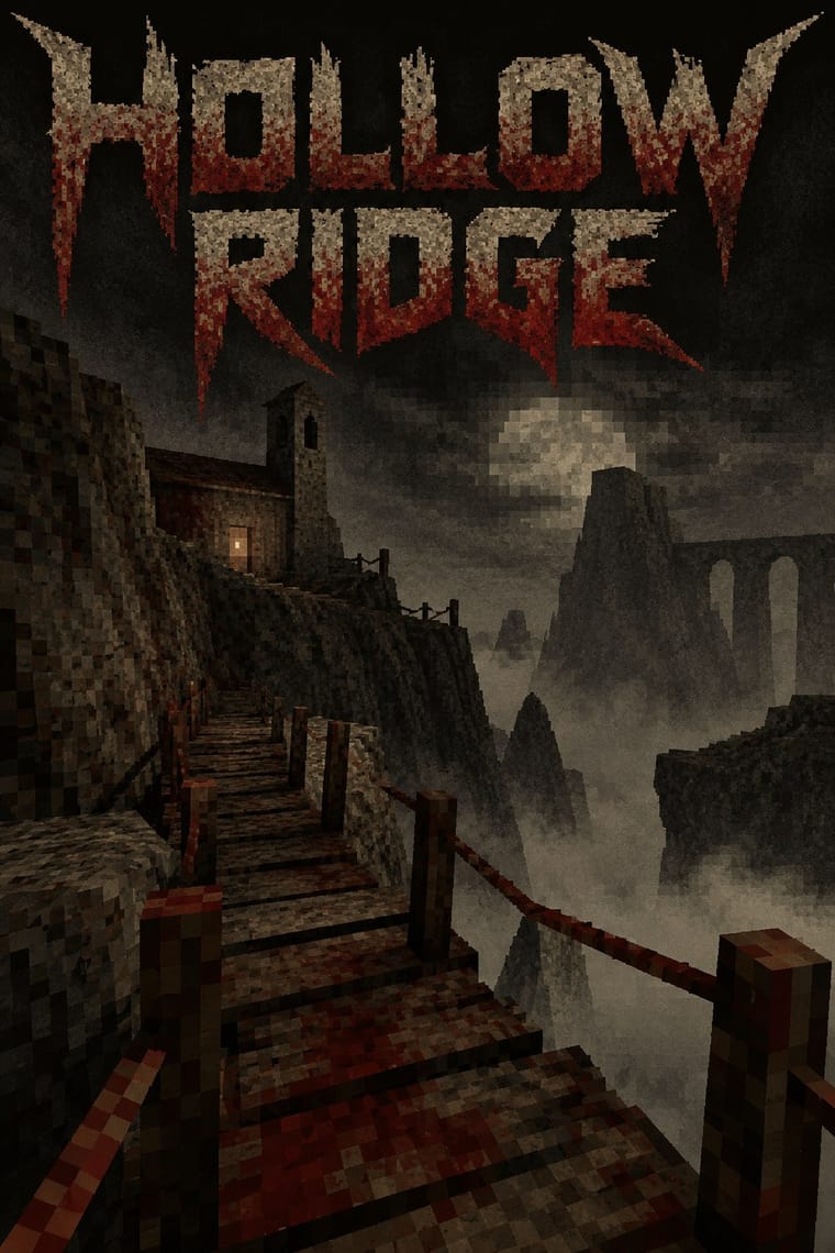
Low Poly Illustration × PS1
Both count polygons, but low poly shows clean, untextured flat-shaded facets on bright grounds with a calm tone, while the PSX look wraps its meshes in tiny warping textures, fog and grain to make dread. Keep the facets clean for decoration and dirty them for horror.
01
What each style brings
Each part of the design comes from the style with the stronger say in it, and each style gives at least two.
Low Poly Illustration PS1 / Lo-Fi 3D Revival (PSX Aesthetic)
- Type from PS1
- Colour from Low Poly Illustration
- Form from Low Poly Illustration
- Composition from PS1
- Surface from PS1
02
The type
Open fonts standing in for each style’s own type, which is often hand-drawn or commercial.
Display · PS1
Again
Press Start 2P, standing in for Bitmap and pixel fonts in capitals for menus and HUDs, in the manner of the PlayStation demo-disc and Namco Museum front ends the Haunted PS1 Demo Discs model their menus on (a working description: the scene has no settled typeface canon)
Text · Low Poly Illustration
A digital illustration and game look in which subjects are built from a visible mesh of a few flat-shaded polygons, so that animals, faces, vehicles and landscapes read as hard-edged facets with no outline or texture. Around 2012 the polygon budgets of early real-time 3D became a chosen style, in Timothy J. Reynolds's Cinema 4D illustrations and then in indie games such as MirrorMoon EP (2013). Triangulation tools such as Trianglify then carried it into 2D vector art, posters and web backgrounds.
Jost; Low Poly Illustration used Faceted display faces that replace every curve with straight segments, such as Ray Larabie's Alphii (Typodermic, 2006), which in the foundry's words 'does not imitate a mesh or toolpath; it shares their economy' and A clean geometric sans set flat beside the faceted picture, so the letters stay legible while the mesh carries the image
03
The colours
The ground and leading colours come from Low Poly Illustration, with a counter-accent from PS1. The ink reads on the ground at 4.5:1 or more.
Low Poly Illustration PS1 / Lo-Fi 3D Revival (PSX Aesthetic)
-
#f1e8d0ground · 36% -
#163a4fink · 14% -
#e8704faccent · 18% -
#6b1d16accent · 14% -
#3fa58aaccent · 10% -
#5c5446accent · 8%
As CSS
:root {
  --ground: #f1e8d0;
  --ink: #163a4f;
  --accent-1: #e8704f;
  --accent-2: #6b1d16;
  --accent-3: #3fa58a;
  --accent-4: #5c5446;
  --font-display: "Press Start 2P", monospace;
  --font-text: "Jost", sans-serif;
}
04
The two styles

05
More combinations
With Low Poly Illustration
- Claymorphism & Soft 3D Contrasts · Both float one rendered object on a pale ground, but clay is inflated, rounded and softly shaded while low poly is cut into hard facets with stepped tones; choose clay for warmth and touch, low poly for crispness and a constructed, mineral feel.
- Bitmap & Pixel Graphics Pairs well · Both turn the limits of early game hardware into a chosen look, square pixels in 2D and few polygons in 3D (Wikipedia's 'Low poly' calls it the 3D analogue of pixel art, without a source). Pair a faceted scene with pixel type and icons for a retro-game interface, or set the square step against the triangle to show the two eras side by side.
- Art Nouveau Contrasts · Whiplash curves cannot survive a polygon budget; stage one sinuous line against a faceted field for deliberate tension, or use Art Nouveau to see everything low poly gives up.
- Cubist Pictorial Space Contrasts · Cubism breaks an object into planes seen from several viewpoints at once and flattens the space; low poly facets it from one consistent viewpoint and keeps the perspective. Borrow Cubist overlap only when ambiguity, not legibility, is the point.
- Flat Design Pairs well · Flat design's solid fields, sans type and calm grids make a quiet frame for one faceted hero illustration or a triangle-mesh header; keep the interface flat so the facets are the only place where depth appears.
- Generative & Dynamic Identities Pairs well · Generate the triangle mesh from seeded points and a colour ramp, as Trianglify does, to give an identity a family of backgrounds that vary per page or per user but always read as one system.
- Cel-Shaded Game Graphics (Toon-Shaded Real-Time 3D) Contrasts · Both stylise real-time 3D, but low poly shows faceted polygons with no outlines; contrast inked silhouettes with bare facets.
- Isometric Tech Illustration Contrasts · Faceted meshes with perspective against parallel-projected boxes in three flat tones.
With PS1
- Analog Horror Graphics Contrasts · Both mine 1990s screens for fear, and Puppet Combo borrows from VHS, but analog horror fakes flat 2D broadcast and tape graphics, while the PSX revival builds navigable, textured 3D spaces. Choose the warning screen or the walkable room.
- Demoscene Graphics (Cracktros, Demos & Text-Mode Art) Contrasts · The demoscene shows a machine performing flawlessly at its limit in chrome and gradients; the PSX revival fakes old hardware's flaws on a modern engine and keeps them murky. Pick mastery or imitation of limits.
- Bitmap & Pixel Graphics Pairs well · The PSX look is the bitmap pixel stretched across 3D surfaces; set its menus, HUD and captions in hard-edged bitmap capitals so the type shares the textures' resolution.
- Weirdcore & Dreamcore Pairs well · Both turn half-familiar empty places uncanny; render a weirdcore corridor or mall as a fogged, low-texture 3D room you can walk through rather than a found snapshot.
- Vaporwave Contrasts · Vaporwave also reuses early 3D, but as pastel, ironic collage of busts and grids; the PSX revival keeps the 3D in dark earth tones and fog for horror. Drop the pastels when the brief wants unease.