Style combination · Pairs well
Flat Design × Isotype Pictorial Statistics
Flat icon sets are Isotype's heirs; apply its one-symbol-one-meaning rule to keep an icon family consistent.
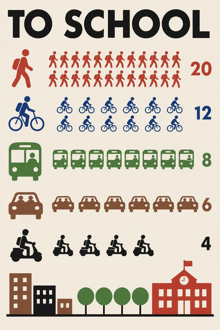
Borrow Isotype's rows of identical counting pictograms to turn a flat icon set into honest, readable data graphics.
Mix them and make something Flat Design Isotype Pictorial Statistics
01
What each style brings
Each part of the design comes from the style with the stronger say in it, and each style gives at least two.
Flat Design Isotype Pictorial Statistics
- Type from Flat Design
- Colour from Isotype Pictorial Statistics
- Form from Flat Design
- Composition from Isotype Pictorial Statistics
- Surface from Flat Design
02
The type
Open fonts standing in for each style’s own type, which is often hand-drawn or commercial.
Text · Isotype Pictorial Statistics
A method of visual education developed by Otto Neurath, Marie Neurath (Reidemeister) and Gerd Arntz in Red Vienna from 1925, which turns statistics into rows of identical pictograms where a greater quantity is shown by more signs, never by bigger ones. Continued in The Hague and Oxford until 1971, its standardised symbols, flat colours and sans-serif captions laid the foundations of modern information graphics and pictogram systems.
Jost; Isotype Pictorial Statistics used Futura and Gerd Arntz's linocut pictogram set (c. 4,000 signs), used like a fount of picture-type
03
The colours
The ground and leading colours come from Isotype Pictorial Statistics, with a counter-accent from Flat Design. The ink reads on the ground at 4.5:1 or more.
Flat Design Isotype Pictorial Statistics
-
#f2ecdfground · 36% -
#1a1a1aink · 14% -
#c8372daccent · 18% -
#f1c40faccent · 14% -
#2c5aa0accent · 10% -
#8a5a3baccent · 8%
As CSS
:root {
  --ground: #f2ecdf;
  --ink: #1a1a1a;
  --accent-1: #c8372d;
  --accent-2: #f1c40f;
  --accent-3: #2c5aa0;
  --accent-4: #8a5a3b;
  --font-display: "Inter", sans-serif;
  --font-text: "Jost", sans-serif;
}
04
The two styles

05
More combinations
With Flat Design
- Skeuomorphic UI Contrasts · Its direct predecessor and foil: one realistic, textured object on an otherwise flat screen becomes an instant focal point.
- Japanese Postwar Modernism Pairs well · Add the emblematic circles and calm colour fields of Japanese postwar posters to give flat screens a stronger focal image.
- Victorian Letterpress & Wood Type Contrasts · Ornamented wood type and dense rules show everything flat design removed; quote one decorative headline to warm a sterile interface.
- Indie Pixel Art Revival Contrasts · Resolution-independent vector flatness against a deliberately coarse grid lit with glows and depth.
- Arts & Crafts Movement Contrasts · Borrow one engraved border or initial to give a flat interface a crafted, editorial moment against its vector minimalism.
- WPA Silkscreen Posters Pairs well · Its flat layered shapes translate directly to vector; use the national-park look for warm, civic flat illustration.
- Munich 1972 Olympic Design (Otl Aicher) Pairs well · Flat icon families descend from these round-headed figures; borrow a single stroke width (which, as Holt shows, the 1972 figures only approximate, since a limb built from an orthogonal and a 45-degree segment cannot keep one thickness) and the 0, 45 and 90-degree rule to keep a screen icon set coherent.
- Ligne Claire (Franco-Belgian Clear Line) Pairs well · Flat, unshaded fields translate directly to screen; add ligne claire's even outline and documented settings to flat UI illustration for scenes with more narrative and character, keeping ligne claire's perspective, which flat design avoids.
With Isotype Pictorial Statistics
- International Typographic Style Pairs well · Set Isotype rows of pictograms on a Swiss grid for public information that is rigorous yet friendly.
- Socialist Realist Propaganda Poster Contrasts · Socialist Realism dramatises with heroic figures while Isotype persuades by counting; choose evidence over emotion when trust matters.
- Corporate Memphis Contrasts · Corporate Memphis uses flat figures for mood; Isotype's figures always count something, so use people icons only when they carry data.
- Ancient Egyptian Hieroglyphic & Register Composition Pairs well · Otto Neurath called his visual autobiography From hieroglyphics to Isotype, with chapters on hieroglyphics through the centuries and their renaissance; borrow the rule-bound sign family and rows of standing figures, but note the opposite rule of size: Isotype shows more by adding signs of equal size, Egypt shows rank by making one figure bigger.
- Data Humanism Contrasts · Isotype fixes one standard sign per thing and counts by repeating it so anyone can read the chart; data humanism invents a new code for each dataset and asks for slow reading. Choose Isotype for public information, data humanism for portraits of particular lives.
- Schematic Transit Diagram (Beck Tube Map Idiom) Pairs well · Add pictorial statistics beside the diagram to carry quantities as well as connections.
- Warli Painting Contrasts · Both build people from a few reduced shapes and repeat them in rows; Isotype's figures count data in flat colours on a light ground, Warli's narrate ritual and village life in white on earth, so borrow the repetition but not the meaning.
- Nutri-Score (Front-of-Pack Colour-Grade Label) Pairs well · Both turn data into a sign anyone can read at a glance; borrow Isotype's repeated pictograms to explain the five grades on shelf talkers, leaflets or school material.