Style combination · Pairs well
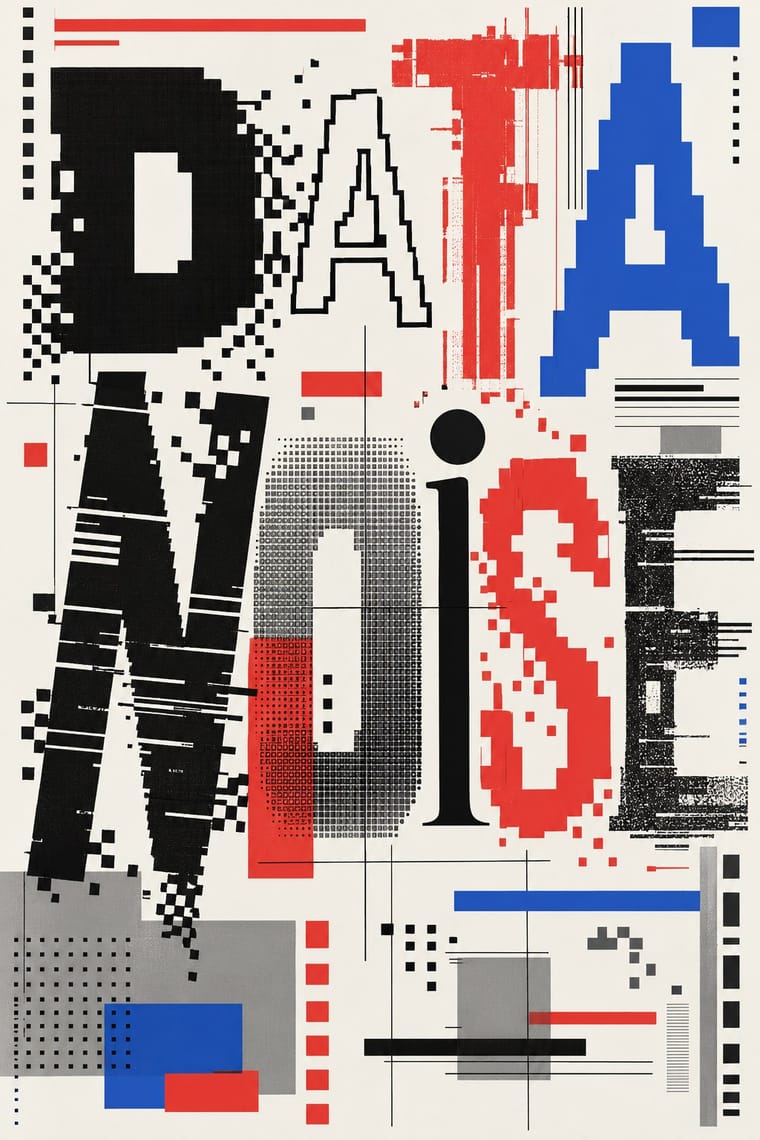
Bitmap × Emigre
Combine Emigre's bitmap faces with early-Mac pixel icons for an authentic mid-1980s desktop look.
01
What each style brings
Each part of the design comes from the style with the stronger say in it, and each style gives at least two.
Bitmap & Pixel Graphics Emigre & Early Digital Type
- Type from Emigre
- Colour from Emigre
- Form from Bitmap
- Composition from Bitmap
- Surface from Bitmap
02
The type
Open fonts standing in for each style’s own type, which is often hand-drawn or commercial.
Text · Bitmap
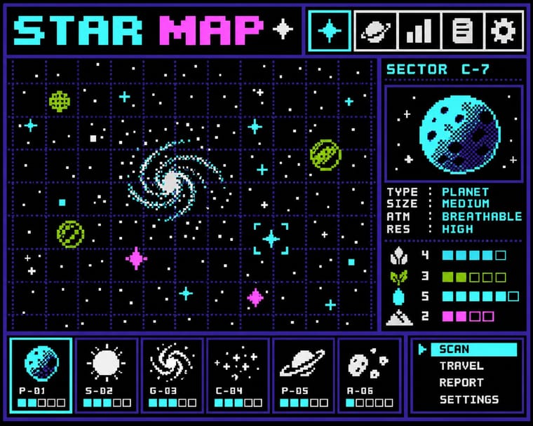
Graphics and lettering built from the square pixels of low-resolution screens (arcade and console sprites, home-computer displays and the first graphical user interfaces), where every dot was placed by hand within tight limits of memory, resolution and palette. Designers such as Susan Kare turned those constraints into a language of legible pictogram icons, jagged bitmap fonts and dithered tones.
VT323; Bitmap used Chicago and Geneva and Monaco
03
The colours
The ground and leading colours come from Emigre, with a counter-accent from Bitmap. The ink reads on the ground at 4.5:1 or more.
Bitmap & Pixel Graphics Emigre & Early Digital Type
-
#f4f2ecground · 36% -
#111111ink · 14% -
#e03c31accent · 18% -
#9bbc0faccent · 14% -
#2b59c3accent · 10% -
#ff55ffaccent · 8%
As CSS
:root {
  --ground: #f4f2ec;
  --ink: #111111;
  --accent-1: #e03c31;
  --accent-2: #9bbc0f;
  --accent-3: #2b59c3;
  --accent-4: #ff55ff;
  --font-display: "Workbench", monospace;
  --font-text: "VT323", monospace;
}
04
The two styles
05
More combinations
With Bitmap
- Andean Woven Graphic Systems Pairs well · The woven cell of Andean tapestry is a pre-digital pixel grid; draw pixel icons with its stepped diagonals, but credit weaving communities rather than copying their motifs.
- Skeuomorphic UI Contrasts · Photoreal leather and glass are the opposite pole of 1-bit honesty; jump from one to the other to tell a story of interface history.
- International Typographic Style Pairs well · Snap pixel type and icons to a strict Swiss grid for a rational, screen-native take on modernist order.
- Art Nouveau Contrasts · Whiplash curves cannot survive a coarse pixel grid; staging that clash makes a memorable, deliberately jagged ornament.
- Kawaii Design Pairs well · Sprite-scale characters and kawaii roundness merge naturally; keep the palette limited so pixel mascots stay crisp.
- Demoscene Graphics (Cracktros, Demos & Text-Mode Art) Contrasts · Bitmap graphics is the legible, flat pixel of icons, sprites and system fonts; scene graphics spend the same pixels on chrome, gradients and motion for show. Pick the icon grid for an interface and the scene logo for a title screen.
- Square Kufic (Bannāʾī) Pairs well · Both build letters from square units, and Sakkal compares building bricks to large pixels; set a bitmap Latin wordmark on the same cell size as a square-Kufic mark for a bilingual identity, but keep sacred formulas out of jokey, game-like pixel contexts.
- Isometric Pixel Art Contrasts · Same hand-placed pixels, but front-on icons and sprites under hardware limits against a crammed, full-colour 2:1 city made as a picture.
With Emigre
- Out-of-Square Hangul Typography Pairs well · Ahn Sang-soo's Bogoseo/Bogoseo ran a parallel 1980s magazine experiment with a constructed alphabet; set an Emigre face beside out-of-square Hangul for a bilingual experimental spread.
- Neo-Swiss Revival Contrasts · Neo-Swiss restraint is the foil to Emigre's typographic overload; one Emigre display face in a neo-Swiss layout adds personality.
- Early Web Vernacular Pairs well · Low-resolution type and layered layouts carry naturally into table-based web pages and GIF graphics.
- Post-Binary Typography (Bye Bye Binary and Inclusive French Type) Pairs well · Both are type-led laboratories that publish their own magazine as a showcase for their fonts. In Zone Mixte (2022) êkhô studio chose BBB Baskervvol with Baskerville's erasure of Sarah Eaves in mind, the story Zuzana Licko honoured in Mrs Eaves (1996); set a Baskervvol text in an Emigre-style specimen spread to join the two foundry experiments.
- Phototype Expressive Typography (Lubalin & U&lc) Contrasts · Both were made by a new type technology; Emigre's bitmap and PostScript faces end the phototype era, so set a Lubalin ligature against a coarse bitmap word to show how the tool shapes the letter.
- South African Vernacular Design (Ijusi) Contrasts · Ijusi's Typografika issues answered the 1990s experimental-font culture (Walker's Red Mercury pays tribute to Jonathan Barnbrook, whose early faces Emigre released), but drew their letters from Durban's shopfront hoardings, funeral parlours, beadwork and wire craft rather than from the screen; use Emigre for the digital edge and Ijusi for a sense of place.
- Cranbrook & Deconstructivist Typography Pairs well · Emigre published Cranbrook work; set layered Cranbrook-style spreads in Emigre's early digital typefaces.