Style combination · Pairs well
Cranbrook × Emigre
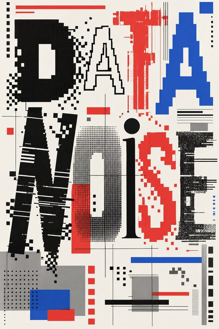
Emigre published Cranbrook work; set layered Cranbrook-style spreads in Emigre's early digital typefaces.
01
What each style brings
Each part of the design comes from the style with the stronger say in it, and each style gives at least two.
Cranbrook & Deconstructivist Typography Emigre & Early Digital Type
- Type from Emigre
- Colour from Cranbrook
- Form from Emigre
- Composition from Cranbrook
- Surface from Cranbrook
-
02
The type
Open fonts standing in for each style’s own type, which is often hand-drawn or commercial.
Text · Cranbrook
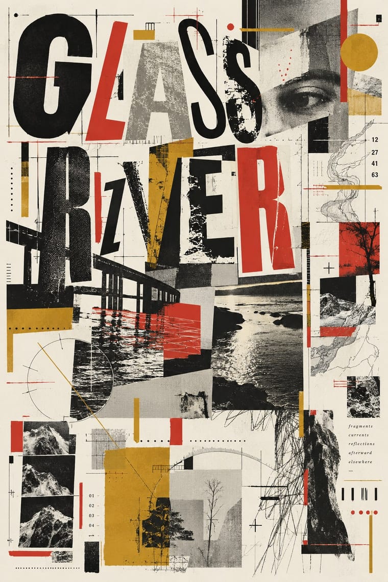
Graduate-school experimentation, centred on Katherine and Michael McCoy's Cranbrook design programme, that applied post-structuralist literary theory to the page. Text and image were layered into dense fields to be read rather than merely seen; typographic hierarchy was fractured, vernacular lettering was mixed with theory, and meaning was left open for the reader to construct.
Inter; Cranbrook used Keedy Sans and Dead History
03
The colours
The ground and leading colours come from Cranbrook, with a counter-accent from Emigre. The ink reads on the ground at 4.5:1 or more.
Cranbrook & Deconstructivist Typography Emigre & Early Digital Type
-
#f2efe6ground · 36% -
#141414ink · 14% -
#d1342caccent · 18% -
#c99a2eaccent · 14% -
#2b59c3accent · 10% -
#8a8780accent · 8%
As CSS
:root {
  --ground: #f2efe6;
  --ink: #141414;
  --accent-1: #d1342c;
  --accent-2: #c99a2e;
  --accent-3: #2b59c3;
  --accent-4: #8a8780;
  --font-display: "Workbench", monospace;
  --font-text: "Inter", sans-serif;
}
04
The two styles
05
More combinations
With Cranbrook
- Renaissance Book Typography Contrasts · The single justified book block is what deconstruction questions; quoting it inside a layered layout makes the critique explicit.
- International Typographic Style Contrasts · Swiss clarity is the master narrative Cranbrook took apart; keep one Swiss column as a legible anchor in a deconstructed spread.
- Brutalist Web Design Pairs well · Competing hierarchies translate to the browser as overlapping, barely styled HTML layers.
- Dutch Expressive Postmodernism (Studio Dumbar & Hard Werken) Contrasts · Its transatlantic contemporary: Katherine McCoy of Cranbrook co-organised the 1986 Chicago show of Dutch design. Cranbrook layers text to be read and argued over; the Dutch studios layer pictures, colour and staged depth to be enjoyed. Choose Cranbrook for theory-laden spreads and the Dutch idiom for posters that must play.
- Die Neue Typographie Contrasts · Cranbrook dismantled exactly these rules; state one New Typography convention clearly, then break it on purpose.
- Total Design & Dutch Functionalism Contrasts · Cranbrook's layered, reader-dependent pages invert Total Design's single impersonal reading; set one against the other to argue order versus interpretation.
- South African Vernacular Design (Ijusi) Contrasts · Both layer vernacular lettering into experimental pages, but Cranbrook starts from literary theory and Ijusi from Durban's streets and the politics of a new democracy; choose by whether the brief is about reading or about place.
With Emigre
- Out-of-Square Hangul Typography Pairs well · Ahn Sang-soo's Bogoseo/Bogoseo ran a parallel 1980s magazine experiment with a constructed alphabet; set an Emigre face beside out-of-square Hangul for a bilingual experimental spread.
- Neo-Swiss Revival Contrasts · Neo-Swiss restraint is the foil to Emigre's typographic overload; one Emigre display face in a neo-Swiss layout adds personality.
- Bitmap & Pixel Graphics Pairs well · Combine Emigre's bitmap faces with early-Mac pixel icons for an authentic mid-1980s desktop look.
- Early Web Vernacular Pairs well · Low-resolution type and layered layouts carry naturally into table-based web pages and GIF graphics.
- Post-Binary Typography (Bye Bye Binary and Inclusive French Type) Pairs well · Both are type-led laboratories that publish their own magazine as a showcase for their fonts. In Zone Mixte (2022) êkhô studio chose BBB Baskervvol with Baskerville's erasure of Sarah Eaves in mind, the story Zuzana Licko honoured in Mrs Eaves (1996); set a Baskervvol text in an Emigre-style specimen spread to join the two foundry experiments.
- Phototype Expressive Typography (Lubalin & U&lc) Contrasts · Both were made by a new type technology; Emigre's bitmap and PostScript faces end the phototype era, so set a Lubalin ligature against a coarse bitmap word to show how the tool shapes the letter.
- South African Vernacular Design (Ijusi) Contrasts · Ijusi's Typografika issues answered the 1990s experimental-font culture (Walker's Red Mercury pays tribute to Jonathan Barnbrook, whose early faces Emigre released), but drew their letters from Durban's shopfront hoardings, funeral parlours, beadwork and wire craft rather than from the screen; use Emigre for the digital edge and Ijusi for a sense of place.