Style combination · Pairs well
Early Web Vernacular × Emigre
Low-resolution type and layered layouts carry naturally into table-based web pages and GIF graphics.
01
What each style brings
Each part of the design comes from the style with the stronger say in it, and each style gives at least two.
Early Web Vernacular Emigre & Early Digital Type
- Type from Emigre
- Colour from Early Web Vernacular
- Form from Emigre
- Composition from Early Web Vernacular
-
Emigre avoids central symmetry: this is where the two pull against each other.
- Surface from Early Web Vernacular
02
The type
Open fonts standing in for each style’s own type, which is often hand-drawn or commercial.
Text · Early Web Vernacular
The amateur web of the mid-1990s to early 2000s, when millions of people hand-coded personal homepages on free hosts such as GeoCities with table layouts, browser-default fonts, tiled backgrounds, animated GIFs, MIDI soundtracks, hit counters and ‘under construction’ signs. Its look came from HTML's limits, slow modems and enthusiastic bricolage rather than professional design; Olia Lialina later named it ‘a vernacular web’.
Newsreader; Early Web Vernacular used Times New Roman and Comic Sans MS
03
The colours
The ground and leading colours come from Early Web Vernacular, with a counter-accent from Emigre. The ink reads on the ground at 4.5:1 or more.
Early Web Vernacular Emigre & Early Digital Type
-
#000080ground · 36% -
#00ff00ink · 14% -
#0000ffaccent · 18% -
#e03c31accent · 14% -
#ff00ffaccent · 10% -
#2b59c3accent · 8%
As CSS
:root {
  --ground: #000080;
  --ink: #00ff00;
  --accent-1: #0000ff;
  --accent-2: #e03c31;
  --accent-3: #ff00ff;
  --accent-4: #2b59c3;
  --font-display: "Workbench", monospace;
  --font-text: "Newsreader", serif;
}
04
The two styles
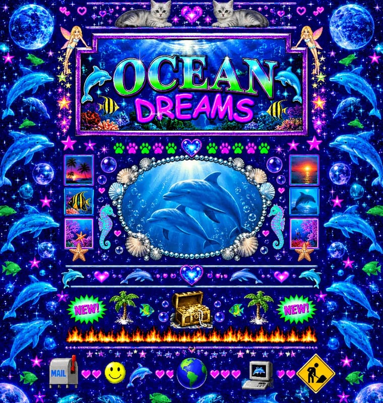
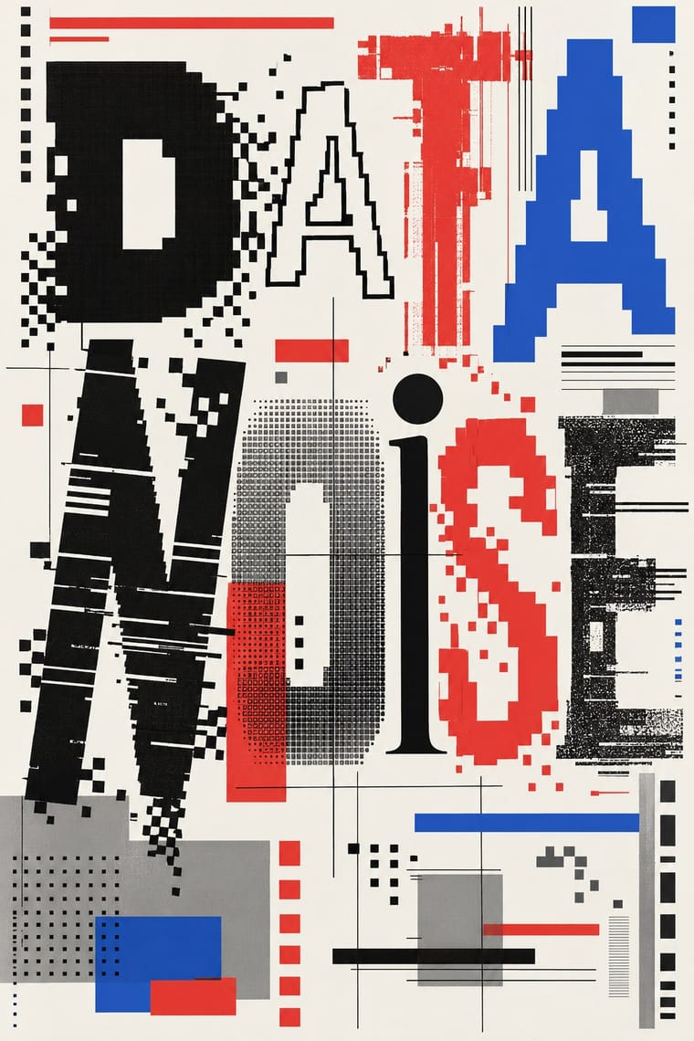
05
More combinations
With Early Web Vernacular
- Vaporwave Pairs well · Vaporwave already mines this archive; combine tiled backgrounds and default fonts with its pastel 3D for nostalgic net art.
- Material Design Contrasts · Material's systematic spacing and elevation are everything the amateur web lacked; use it as the ‘after’ to this ‘before’.
- International Typographic Style Contrasts · A single centred Comic Sans headline on a Swiss grid makes a sharp, funny statement about taste and authority.
- Brutalist Web Design Pairs well · Drop the GIFs but keep raw HTML defaults and visible structure for a contemporary, knowingly unpolished site.
- Media-Player & Desktop Skins (Winamp-Era Skinning) Pairs well · The same amateur, communal web of the late 1990s; pair a skin with a fan homepage for a full period set.
- Weirdcore & Dreamcore Pairs well · Frame a weirdcore still in an old browser window, a default dialog box or a low-resolution GIF to make its debt to the amateur early web explicit; keep the window empty rather than crowding it with the early web's badges and counters.
- Flash Vector Cartoon (Newgrounds-Era Web Animation) Pairs well · Its native habitat: put the cartoon in a cluttered portal page of banners and visitor counters for the full dial-up context.
- Japanese Dense Web Design Contrasts · This grew from the early web's link directories and table layouts, but the early web was amateur bricolage on dark tiled grounds, while this is a professional convention on white in system gothics; borrow its column discipline to tame a GeoCities pastiche.
With Emigre
- Out-of-Square Hangul Typography Pairs well · Ahn Sang-soo's Bogoseo/Bogoseo ran a parallel 1980s magazine experiment with a constructed alphabet; set an Emigre face beside out-of-square Hangul for a bilingual experimental spread.
- Neo-Swiss Revival Contrasts · Neo-Swiss restraint is the foil to Emigre's typographic overload; one Emigre display face in a neo-Swiss layout adds personality.
- Bitmap & Pixel Graphics Pairs well · Combine Emigre's bitmap faces with early-Mac pixel icons for an authentic mid-1980s desktop look.
- Post-Binary Typography (Bye Bye Binary and Inclusive French Type) Pairs well · Both are type-led laboratories that publish their own magazine as a showcase for their fonts. In Zone Mixte (2022) êkhô studio chose BBB Baskervvol with Baskerville's erasure of Sarah Eaves in mind, the story Zuzana Licko honoured in Mrs Eaves (1996); set a Baskervvol text in an Emigre-style specimen spread to join the two foundry experiments.
- Phototype Expressive Typography (Lubalin & U&lc) Contrasts · Both were made by a new type technology; Emigre's bitmap and PostScript faces end the phototype era, so set a Lubalin ligature against a coarse bitmap word to show how the tool shapes the letter.
- South African Vernacular Design (Ijusi) Contrasts · Ijusi's Typografika issues answered the 1990s experimental-font culture (Walker's Red Mercury pays tribute to Jonathan Barnbrook, whose early faces Emigre released), but drew their letters from Durban's shopfront hoardings, funeral parlours, beadwork and wire craft rather than from the screen; use Emigre for the digital edge and Ijusi for a sense of place.
- Cranbrook & Deconstructivist Typography Pairs well · Emigre published Cranbrook work; set layered Cranbrook-style spreads in Emigre's early digital typefaces.