Style combination · Pairs well
Emigre × Out-of-Square Hangul Typography
Ahn Sang-soo's Bogoseo/Bogoseo ran a parallel 1980s magazine experiment with a constructed alphabet; set an Emigre face beside out-of-square Hangul for a bilingual experimental spread.
Both turned a constructed alphabet into a magazine laboratory in the 1980s; set an Emigre-era Latin face beside an out-of-square Hangul face for a bilingual experimental spread.
Mix them and make something Emigre Out-of-Square Hangul Typography
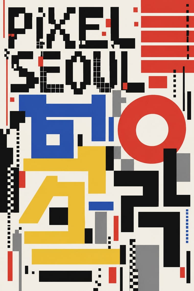
01
What each style brings
Each part of the design comes from the style with the stronger say in it, and each style gives at least two.
Emigre & Early Digital Type Out-of-Square Hangul Typography
- Type from Emigre
- Colour from Out-of-Square Hangul Typography
- Form from Out-of-Square Hangul Typography
- Composition from Emigre
- Surface from Emigre
02
The type
Open fonts standing in for each style’s own type, which is often hand-drawn or commercial.
Text · Out-of-Square Hangul Typography
A Korean typographic movement that frees Hangul from the equal square in which metal and photo type had always set each syllable. Beginning with Ahn Sang-soo's 1985 typeface, jamo keep fixed sizes so syllables vary in height and lines hang from a shared top edge; letters are built from circle, dot and straight stroke, and in posters and the magazine Bogoseo/Bogoseo they are enlarged until they become the picture.
Jost; Out-of-Square Hangul Typography used Ahn Sang-soo typeface and Isang-che, Mir-che and Mano-che
03
The colours
The ground and leading colours come from Out-of-Square Hangul Typography, with a counter-accent from Emigre. The ink reads on the ground at 4.5:1 or more.
Emigre & Early Digital Type Out-of-Square Hangul Typography
-
#f5f3eeground · 36% -
#111111ink · 14% -
#f2c12eaccent · 18% -
#e03c31accent · 14% -
#2b59c3accent · 10% -
#8c8c8caccent · 8%
As CSS
:root {
  --ground: #f5f3ee;
  --ink: #111111;
  --accent-1: #f2c12e;
  --accent-2: #e03c31;
  --accent-3: #2b59c3;
  --accent-4: #8c8c8c;
  --font-display: "Workbench", monospace;
  --font-text: "Jost", sans-serif;
}
04
The two styles
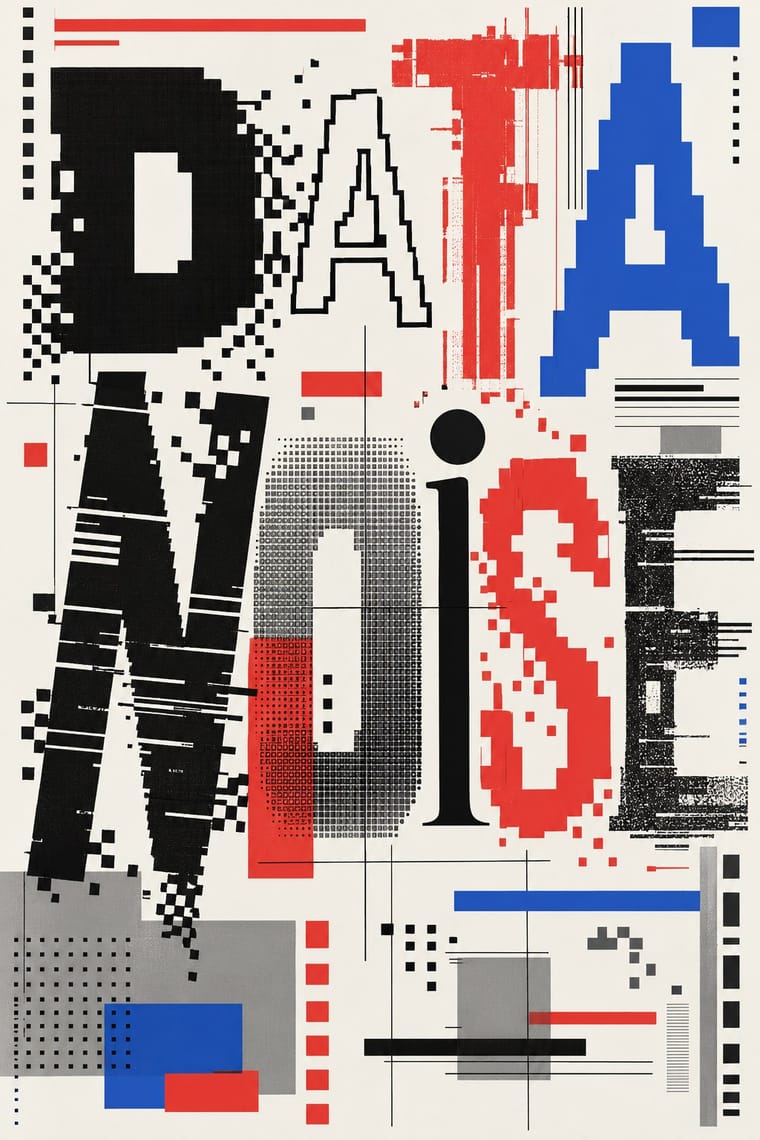
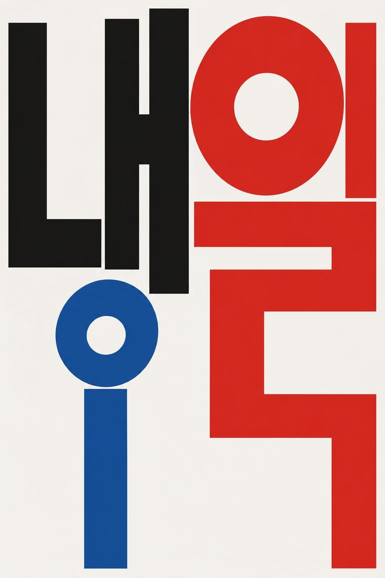
05
More combinations
With Emigre
- Neo-Swiss Revival Contrasts · Neo-Swiss restraint is the foil to Emigre's typographic overload; one Emigre display face in a neo-Swiss layout adds personality.
- Bitmap & Pixel Graphics Pairs well · Combine Emigre's bitmap faces with early-Mac pixel icons for an authentic mid-1980s desktop look.
- Early Web Vernacular Pairs well · Low-resolution type and layered layouts carry naturally into table-based web pages and GIF graphics.
- Post-Binary Typography (Bye Bye Binary and Inclusive French Type) Pairs well · Both are type-led laboratories that publish their own magazine as a showcase for their fonts. In Zone Mixte (2022) êkhô studio chose BBB Baskervvol with Baskerville's erasure of Sarah Eaves in mind, the story Zuzana Licko honoured in Mrs Eaves (1996); set a Baskervvol text in an Emigre-style specimen spread to join the two foundry experiments.
- Phototype Expressive Typography (Lubalin & U&lc) Contrasts · Both were made by a new type technology; Emigre's bitmap and PostScript faces end the phototype era, so set a Lubalin ligature against a coarse bitmap word to show how the tool shapes the letter.
- South African Vernacular Design (Ijusi) Contrasts · Ijusi's Typografika issues answered the 1990s experimental-font culture (Walker's Red Mercury pays tribute to Jonathan Barnbrook, whose early faces Emigre released), but drew their letters from Durban's shopfront hoardings, funeral parlours, beadwork and wire craft rather than from the screen; use Emigre for the digital edge and Ijusi for a sense of place.
- Cranbrook & Deconstructivist Typography Pairs well · Emigre published Cranbrook work; set layered Cranbrook-style spreads in Emigre's early digital typefaces.
With Out-of-Square Hangul Typography
- International Typographic Style Pairs well · Place a modular out-of-square headline on a strict Swiss grid so the hanging, irregular syllables read as deliberate against an ordered page.
- Chaekgeori & Minhwa Screen Painting Pairs well · Munjado builds a character from pictures and out-of-square Hangul builds pictures from letters; combine them for a Korean identity that spans folk painting and modern type.
- Hong Kong Neon & Beiwei Shop-Sign Lettering Contrasts · Beiwei's chisel-edged, stele-derived brush script is the opposite of monoline geometric jamo; set the two side by side to show calligraphic against constructed East Asian lettering.
- Roman-like Thai Typography (modern loopless Thai) Pairs well · Both modernise an Asian script by dropping a defining convention, the square cell in Hangul and the head loop in Thai; set them together for a pan-Asian modern type specimen or festival identity.
- Seoul Independent Graphic Design (Small-Studio Scene) Pairs well · Ahn Sang-soo freed Hangul from the square in 1985, and Sulki & Min have gone further back, to Cho Young-jae's 1976 proposal to restructure Hangul for typewriters, a study they say has rarely been discussed with the depth it deserves, and to the origins of unsquared Hangul; set a hanging, de-squared headline in a centred one-colour poster to join the generations.
- Korean Commercial Calligraphy (Kaelligeurapi) Contrasts · Both free Hangul from the equal square, but Ahn Sang-soo constructs monoline jamo as a reusable typeface while kaelligeurapi writes each word once with the brush; choose between a system and a signature.
- Newtro (Korean New-Retro) Contrasts · Set the modernist, geometric de-squared Hangul of Ahn Sang-soo against newtro's revived brush and cursive label lettering to show two ideas of fashionable Hangul.
- Song–Ming Woodblock Book Typography (Songti / Mincho) Contrasts · Ahn Sang-soo's typeface broke exactly the equal square that Myeongjo keeps; run Myeongjo body text under out-of-square headings to stage tradition against experiment.