Style combination · Pairs well
Contemporary Arabic × Bulaq Naskh Book Printing
Set long reading text in an Amiri-style calligraphic Naskh and use a low-contrast contemporary Arabic sans for headings, captions and screens, so each register does one job.
Mix them and make something Contemporary Arabic Bulaq Naskh Book Printing
01
What each style brings
Each part of the design comes from the style with the stronger say in it, and each style gives at least two.
Contemporary Arabic & Dual-Script Type Design Bulaq (Amiriyya) Naskh Book Printing
- Type from Contemporary Arabic
-
Bulaq Naskh Book Printing avoids grotesque & neo-grotesque: this is where the two pull against each other.
- Colour from Contemporary Arabic
- Form from Bulaq Naskh Book Printing
- Composition from Bulaq Naskh Book Printing
- Surface from Bulaq Naskh Book Printing
02
The type
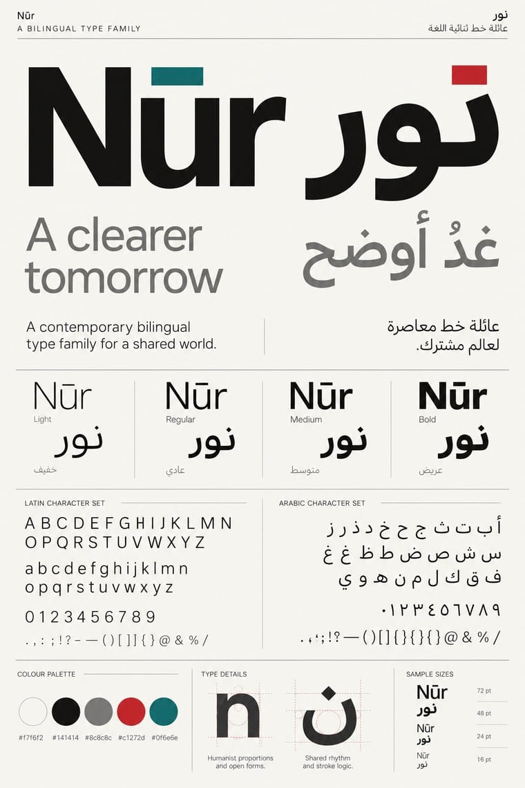
Open fonts standing in for each style’s own type, which is often hand-drawn or commercial.
Display · Contemporary Arabic
Index
Fira Sans, standing in for Frutiger Arabic and Helvetica Arabic (Nadine Chahine)
Text · Bulaq Naskh Book Printing
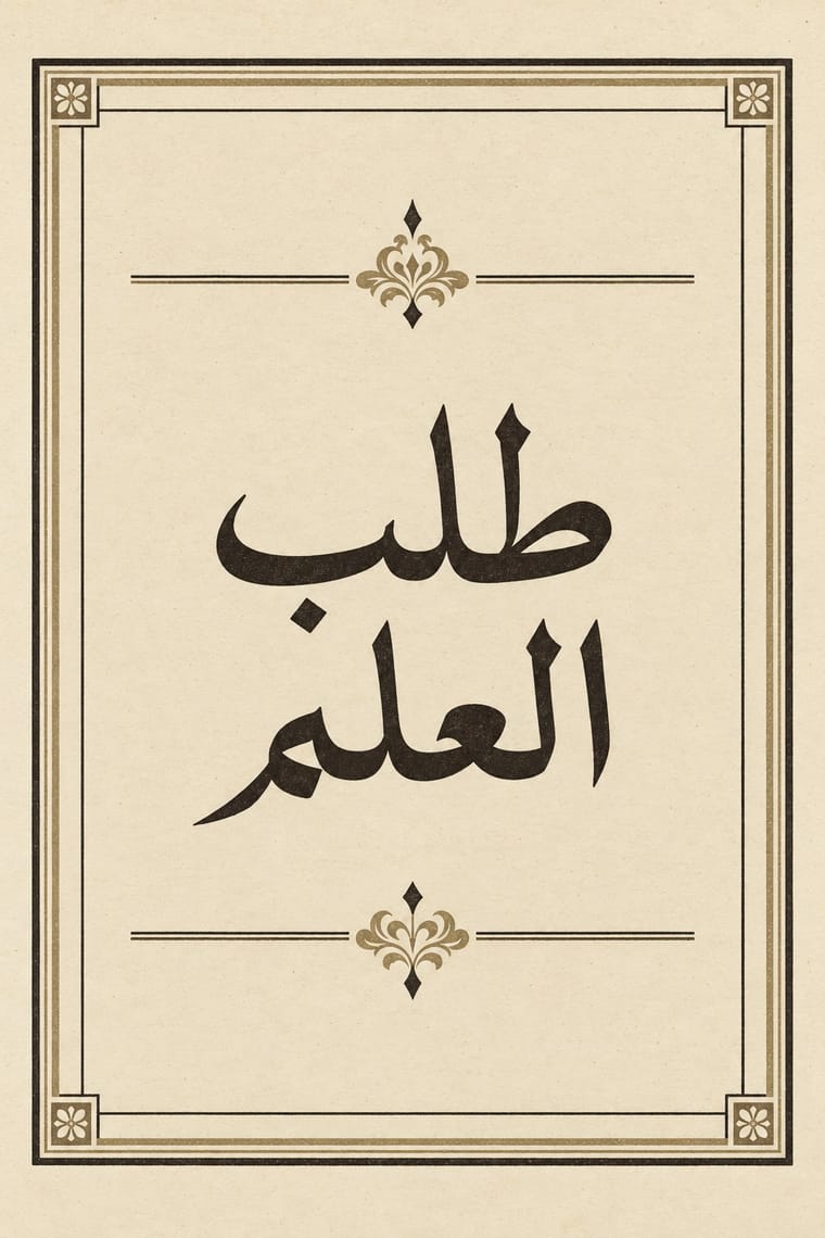
The page of the Arabic printed book as Egypt's state press at Bulaq shaped it from 1822: justified blocks of black Naskh type on pale paper, often boxed in a ruled frame, with an ornamental headpiece on the opening page, headings set larger or in a second script such as Nastaʿlīq, and almost no pictures. It printed army manuals, laws, textbooks, translated science, the Arabic classics and the official gazette. Calligraphers drew its later types, Mirza Sanglakh and then Muhammad Jaʿfar, whose 1905–06 body type was the basis of the 1924 Qur'an and lives on as Khaled Hosny's Amiri.
Libre Caslon Text; Bulaq Naskh Book Printing used Bulaq (Amiriyya) Naskh body type, 1905–06, drawn by the calligrapher Muhammad Jaʿfar Bey and Bulaq Naskh and Nastaʿlīq types by the Persian calligrapher Mirza Sanglakh, made for Muhammad Ali's press
03
The colours
The ground and leading colours come from Contemporary Arabic, with a counter-accent from Bulaq Naskh Book Printing. The ink reads on the ground at 4.5:1 or more.
Contemporary Arabic & Dual-Script Type Design Bulaq (Amiriyya) Naskh Book Printing
-
#f7f6f2ground · 36% -
#141414ink · 14% -
#c1272daccent · 18% -
#7a5236accent · 14% -
#0f6e6eaccent · 10% -
#cdbb93accent · 8%
As CSS
:root {
  --ground: #f7f6f2;
  --ink: #141414;
  --accent-1: #c1272d;
  --accent-2: #7a5236;
  --accent-3: #0f6e6e;
  --accent-4: #cdbb93;
  --font-display: "Fira Sans", sans-serif;
  --font-text: "Libre Caslon Text", serif;
}
Use it with care
Contemporary Arabic & Dual-Script Type Design: Arabic must be set with correct contextual shaping and right-to-left direction; disconnected or reversed letters are a common and offensive error. Have every Arabic word checked by a fluent reader, avoid setting Qur'anic verses or the names of God and the Prophet as decorative texture, and commission or credit Arabic type designers rather than deriving Arabic glyphs from a Latin font.
Bulaq (Amiriyya) Naskh Book Printing: The press also set the Qur'an (the 1924 Cairo edition) and hadith collections such as the Sultaniyya Sahih al-Bukhari, and Bulaq-style Naskh and Amiri are still used for Qur'anic and religious text, so never crop, mirror or distort Qur'anic verses or the names of God and the Prophet, use them as texture, or put them on floors, footwear or throwaway packaging. Set Arabic right to left with correct contextual shaping, have every word read by a fluent reader, never fill a layout with pseudo-Arabic, and never present a generated page as a historical Bulaq imprint.
04
The two styles
05
More combinations
With Contemporary Arabic
- Corporate Identity Modernism Pairs well · Roll a matched Arabic–Latin family through a standards manual so both scripts carry the identity with equal authority.
- Urdu Katib Lithography Contrasts · The katib's stacked Nastaʿlīq cascade is everything a screen-optimised Arabic sans gives up; quote it where warmth and history matter more than efficiency.
- International Typographic Style Pairs well · Use a strict, mirrored grid and a neutral sans so Arabic and Latin columns align in rhythm and weight.
- Machine-Age Simplified Arabic Type Pairs well · Its digital successor: dual-script families pair Arabic with a matched Latin while keeping the firm baseline, even colour and reduced stacking that simplification made familiar. 29LT's UA Neo (2013), detached revivals of Khattar's Unified Arabic, is where the two touch.
- Ottoman Tughra & Dîvânî Chancery Calligraphy Pairs well · Keep hand-drawn calligraphy for the mark itself and set the running text in a well-made contemporary Arabic typeface with a matched Latin companion, instead of imitating Dîvânî in body text.
- Post-Binary Typography (Bye Bye Binary and Inclusive French Type) Contrasts · Both extend a typeface's character set for a language need, but dual-script design matches two scripts for neutral, institutional legibility, while post-binary type invents new characters within one script and keeps them visible as a political statement.
- Early Turkish Republican Graphic Design Contrasts · Turkey replaced Arabic letters with Latin in 1928, and Emin Barın carried calligraphic habits into the new script; contemporary dual-script type design keeps both scripts and matches them as equals. Compare the two to show replacement against coexistence.
- Arab Independent Comics (Samandal, TokTok, Lab619, Skefkef) Contrasts · Both set Arabic beside Latin, but that type culture matches the two scripts in font families on rational, mirrored grids, while these anthologies letter both scripts by hand, one story at a time, and mirror whole pages so that the reader turns the magazine round with the script.
With Bulaq Naskh Book Printing
- Neoclassical Book Typography Pairs well · In an Arabic–Latin edition, face a justified, rule-framed Naskh page with a centred transitional or Didone page; both make type, rules and margins the only luxury.
- Song–Ming Woodblock Book Typography (Songti / Mincho) Contrasts · Both turned a calligraphic hand into a type for long texts inside ruled frames, but Song–Ming squared the brush into equal vertical cells while Bulaq kept the joined, horizontal flow of Naskh; let a bilingual book show each logic in its own frame.
- Islamic Geometric & Calligraphic Tradition Pairs well · For a ceremonial edition, crown a plain Bulaq text page with one illuminated headpiece or geometric title frame from the manuscript tradition, and keep the text block itself sober.
- Cairo–Beirut Arab Modernist Book & Periodical Design Pairs well · Wrap a sober, justified Naskh text block in a hand-lettered, illustrated cover printed in flat offset colour, so the inside reads as a classic and the outside as a modern Arab book.
- Urdu Katib Lithography Contrasts · Urdu kept the calligrapher's hand by lithographing it while Bulaq set Naskh in movable type; choose deliberately between a written page and a set one, or run set Naskh body text under a hand-written headline.
- Machine-Age Simplified Arabic Type Contrasts · The full calligraphic repertoire it gave up: a Bulaq-style Naskh title over simplified body text shows exactly what was traded for speed and economy.
- Nirnaya Sagar Devanagari Typography (Bombay Metal Type) Pairs well · Both turned a calligraphic hand into a book type for classics and scripture; in a multilingual edition, let an unframed Devanagari page with its apparatus face a rule-framed Naskh page.