Style combination · Pairs well
Bulaq Naskh Book Printing × Nirnaya Sagar Devanagari Typography
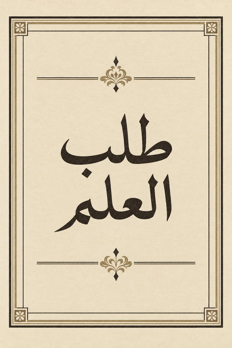
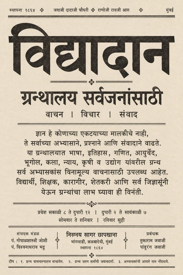
Both turned a calligraphic hand into a book type for classics and scripture; in a multilingual edition, let an unframed Devanagari page with its apparatus face a rule-framed Naskh page.
Mix them and make something Bulaq Naskh Book Printing Nirnaya Sagar Devanagari Typography
01
What each style brings
Each part of the design comes from the style with the stronger say in it, and each style gives at least two.
Bulaq (Amiriyya) Naskh Book Printing Nirnaya Sagar Devanagari Typography (Bombay Metal Type)
- Type from Nirnaya Sagar Devanagari Typography
- Colour from Bulaq Naskh Book Printing
- Form from Bulaq Naskh Book Printing
- Composition from Bulaq Naskh Book Printing
- Surface from Nirnaya Sagar Devanagari Typography
02
The type
Open fonts standing in for each style’s own type, which is often hand-drawn or commercial.
Display · Nirnaya Sagar Devanagari Typography
Atlas
Yatra One, standing in for Nirnaya-sagar Pica No. 1, the basis of Monotype's 12 pt Devanagari, and the Nirnaya-sagar pica struck from Ranoji Raoji Aru's punches that Tilak's Kesari used
Text · Bulaq Naskh Book Printing
The page of the Arabic printed book as Egypt's state press at Bulaq shaped it from 1822: justified blocks of black Naskh type on pale paper, often boxed in a ruled frame, with an ornamental headpiece on the opening page, headings set larger or in a second script such as Nastaʿlīq, and almost no pictures. It printed army manuals, laws, textbooks, translated science, the Arabic classics and the official gazette. Calligraphers drew its later types, Mirza Sanglakh and then Muhammad Jaʿfar, whose 1905–06 body type was the basis of the 1924 Qur'an and lives on as Khaled Hosny's Amiri.
Libre Caslon Text; Bulaq Naskh Book Printing used Bulaq (Amiriyya) Naskh body type, 1905–06, drawn by the calligrapher Muhammad Jaʿfar Bey and Bulaq Naskh and Nastaʿlīq types by the Persian calligrapher Mirza Sanglakh, made for Muhammad Ali's press
03
The colours
The ground and leading colours come from Bulaq Naskh Book Printing, with a counter-accent from Nirnaya Sagar Devanagari Typography. The ink reads on the ground at 4.5:1 or more.
Bulaq (Amiriyya) Naskh Book Printing Nirnaya Sagar Devanagari Typography (Bombay Metal Type)
-
#efe6cfground · 39% -
#171411ink · 15% -
#7a5236accent · 20% -
#a08a62accent · 15% -
#cdbb93accent · 11%
As CSS
:root {
  --ground: #efe6cf;
  --ink: #171411;
  --accent-1: #7a5236;
  --accent-2: #a08a62;
  --accent-3: #cdbb93;
  --font-display: "Yatra One", cursive;
  --font-text: "Libre Caslon Text", serif;
}
Use it with care
Bulaq (Amiriyya) Naskh Book Printing: The press also set the Qur'an (the 1924 Cairo edition) and hadith collections such as the Sultaniyya Sahih al-Bukhari, and Bulaq-style Naskh and Amiri are still used for Qur'anic and religious text, so never crop, mirror or distort Qur'anic verses or the names of God and the Prophet, use them as texture, or put them on floors, footwear or throwaway packaging. Set Arabic right to left with correct contextual shaping, have every word read by a fluent reader, never fill a layout with pseudo-Arabic, and never present a generated page as a historical Bulaq imprint.
Nirnaya Sagar Devanagari Typography (Bombay Metal Type): Much of the press's output is scripture and ritual text, from the Vedas with their accents to Purāṇas, stotras and the almanac that fixes the dates of rites and festivals, so never use mantras, verses or divine names as texture, crop, mirror or garble them, or put them on floors, footwear or throwaway goods. Have every Sanskrit, Marathi or Hindi word set with correct conjuncts and read by a fluent reader, since image models invent pseudo-Devanagari with broken headlines and impossible ligatures, never present a generated page as a Nirnaya Sagar imprint, and credit the founder and his punch-cutter Ranoji Aru as well as the pandit editors.
04
The two styles
05
More combinations
With Bulaq Naskh Book Printing
- Neoclassical Book Typography Pairs well · In an Arabic–Latin edition, face a justified, rule-framed Naskh page with a centred transitional or Didone page; both make type, rules and margins the only luxury.
- Song–Ming Woodblock Book Typography (Songti / Mincho) Contrasts · Both turned a calligraphic hand into a type for long texts inside ruled frames, but Song–Ming squared the brush into equal vertical cells while Bulaq kept the joined, horizontal flow of Naskh; let a bilingual book show each logic in its own frame.
- Contemporary Arabic & Dual-Script Type Design Pairs well · Set long reading text in an Amiri-style calligraphic Naskh and use a low-contrast contemporary Arabic sans for headings, captions and screens, so each register does one job.
- Islamic Geometric & Calligraphic Tradition Pairs well · For a ceremonial edition, crown a plain Bulaq text page with one illuminated headpiece or geometric title frame from the manuscript tradition, and keep the text block itself sober.
- Cairo–Beirut Arab Modernist Book & Periodical Design Pairs well · Wrap a sober, justified Naskh text block in a hand-lettered, illustrated cover printed in flat offset colour, so the inside reads as a classic and the outside as a modern Arab book.
- Urdu Katib Lithography Contrasts · Urdu kept the calligrapher's hand by lithographing it while Bulaq set Naskh in movable type; choose deliberately between a written page and a set one, or run set Naskh body text under a hand-written headline.
- Machine-Age Simplified Arabic Type Contrasts · The full calligraphic repertoire it gave up: a Bulaq-style Naskh title over simplified body text shows exactly what was traded for speed and economy.
With Nirnaya Sagar Devanagari Typography
- Urdu Katib Lithography Contrasts · Urdu kept the katib's hand on the litho stone because type could not hold Nastaʿlīq, while Javaji took a lithographed almanac into metal type; choose a written page or a set one deliberately.
- Indian Calendar & Bazaar Art Pairs well · For a devotional book, put one chromolithographed god picture from the Bombay presses opposite a black, typeset text page, and keep the type itself free of colour.
- Tibetan Woodblock Print Culture (Pecha & Prayer Flags) Contrasts · Set against the carved, oblong pecha page, it shows what cast metal type did to an Indic script: repeatable sorts, sizes and tiers of commentary instead of one carved block per page.
- Song–Ming Woodblock Book Typography (Songti / Mincho) Contrasts · Song–Ming squares each character into an equal cell inside a ruled woodblock frame; Nirnaya Sagar hangs syllables of varying width from a continuous headline in an unframed metal-type block.
- Victorian Letterpress & Wood Type Pairs well · Front a sober Sanskrit text block with a centred English title page in mixed jobbing faces and ornamental dashes, as the Kāvyamālā volumes did.