Style combination · Pairs well
Contemporary Arabic × Ottoman Tughra
Keep hand-drawn calligraphy for the mark itself and set the running text in a well-made contemporary Arabic typeface with a matched Latin companion, instead of imitating Dîvânî in body text.
Mix them and make something Contemporary Arabic Ottoman Tughra
01
What each style brings
Each part of the design comes from the style with the stronger say in it, and each style gives at least two.
Contemporary Arabic & Dual-Script Type Design Ottoman Tughra & Dîvânî Chancery Calligraphy
- Type from Ottoman Tughra
- Colour from Contemporary Arabic
- Form from Ottoman Tughra
- Composition from Ottoman Tughra
- Surface from Contemporary Arabic
02
The type
Open fonts standing in for each style’s own type, which is often hand-drawn or commercial.
Display · Ottoman Tughra
Public
Cinzel, standing in for Celî dîvânî, the monumental form for panels and inscriptions, mastered by the leading dîvânî calligraphers such as Sâmi Efendi and Kâmil Akdik; after the 1928 alphabet reform it lived on in a few celî dîvânî panels by famous calligraphers of the last generation, and dîvânî is still taught in Cairo
Text · Contemporary Arabic
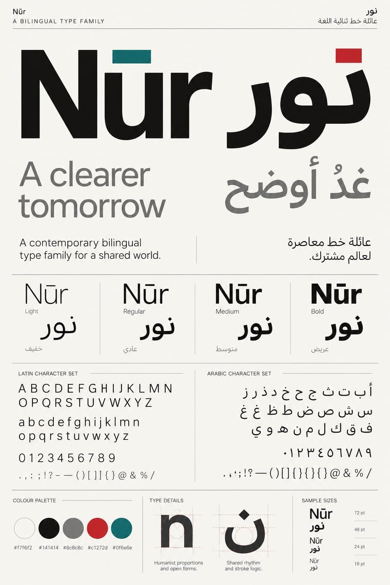
A twenty-first-century type culture that redraws Arabic as a family matched to a Latin companion in weight, proportion and contrast, so the two scripts can share a page, screen or sign as equals. The Khatt Foundation's Typographic Matchmaking (2007) did much to launch it, and foundries such as 29LT and TPTQ Arabic carried it forward. It favours low-contrast Kufi- and Naskh-derived forms, a firm horizontal baseline and mirrored grids for identities, wayfinding and interfaces.
Fira Sans; Contemporary Arabic used Frutiger Arabic and Helvetica Arabic and 29LT UA Neo B and UA Neo N
03
The colours
The ground and leading colours come from Contemporary Arabic, with a counter-accent from Ottoman Tughra. The ink reads on the ground at 4.5:1 or more.
Contemporary Arabic & Dual-Script Type Design Ottoman Tughra & Dîvânî Chancery Calligraphy
-
#f7f6f2ground · 36% -
#141414ink · 14% -
#c1272daccent · 18% -
#2e4ea6accent · 14% -
#0f6e6eaccent · 10% -
#bf9a52accent · 8%
As CSS
:root {
  --ground: #f7f6f2;
  --ink: #141414;
  --accent-1: #c1272d;
  --accent-2: #2e4ea6;
  --accent-3: #0f6e6e;
  --accent-4: #bf9a52;
  --font-display: "Cinzel", serif;
  --font-text: "Fira Sans", sans-serif;
}
Use it with care
Contemporary Arabic & Dual-Script Type Design: Arabic must be set with correct contextual shaping and right-to-left direction; disconnected or reversed letters are a common and offensive error. Have every Arabic word checked by a fluent reader, avoid setting Qur'anic verses or the names of God and the Prophet as decorative texture, and commission or credit Arabic type designers rather than deriving Arabic glyphs from a Latin font.
Ottoman Tughra & Dîvânî Chancery Calligraphy: A tughra is the personal mark of one sovereign and spells his name with a prayer for victory: do not redraw a historical sultan's tughra as a brand logo, product stamp or decorative texture, do not present a new design as a historical one, and never fill the form with invented pseudo-Arabic. The calligraphy behind the tughra and Dîvânî, hüsn-i hat, is a living craft passed on through apprenticeship (UNESCO Representative List, 2021), so commission a hattat for a new tughra and have every word read by a fluent reader of Ottoman Turkish. The tughra is also a sign of Ottoman rule: where that rule is remembered as conquest, as in parts of the Balkans, Greece, Armenia and the Arab world, or is invoked by nationalist politics, it can read as a claim to that rule, so check how the audience will read it. The tughra form is also used for sacred texts, such as Qur'anic verses, hadith and the names of the founders of Sufi orders, and Popov showed a 'tughra of Allah' in Kazan; such compositions follow the parent tradition's rules: never crop, distort or mirror them, and keep them off floors, footwear and throwaway surfaces.
04
The two styles
05
More combinations
With Contemporary Arabic
- Corporate Identity Modernism Pairs well · Roll a matched Arabic–Latin family through a standards manual so both scripts carry the identity with equal authority.
- Urdu Katib Lithography Contrasts · The katib's stacked Nastaʿlīq cascade is everything a screen-optimised Arabic sans gives up; quote it where warmth and history matter more than efficiency.
- International Typographic Style Pairs well · Use a strict, mirrored grid and a neutral sans so Arabic and Latin columns align in rhythm and weight.
- Machine-Age Simplified Arabic Type Pairs well · Its digital successor: dual-script families pair Arabic with a matched Latin while keeping the firm baseline, even colour and reduced stacking that simplification made familiar. 29LT's UA Neo (2013), detached revivals of Khattar's Unified Arabic, is where the two touch.
- Post-Binary Typography (Bye Bye Binary and Inclusive French Type) Contrasts · Both extend a typeface's character set for a language need, but dual-script design matches two scripts for neutral, institutional legibility, while post-binary type invents new characters within one script and keeps them visible as a political statement.
- Early Turkish Republican Graphic Design Contrasts · Turkey replaced Arabic letters with Latin in 1928, and Emin Barın carried calligraphic habits into the new script; contemporary dual-script type design keeps both scripts and matches them as equals. Compare the two to show replacement against coexistence.
- Bulaq (Amiriyya) Naskh Book Printing Pairs well · Set long reading text in an Amiri-style calligraphic Naskh and use a low-contrast contemporary Arabic sans for headings, captions and screens, so each register does one job.
- Arab Independent Comics (Samandal, TokTok, Lab619, Skefkef) Contrasts · Both set Arabic beside Latin, but that type culture matches the two scripts in font families on rational, mirrored grids, while these anthologies letter both scripts by hand, one story at a time, and mirror whole pages so that the reader turns the magazine round with the script.
With Ottoman Tughra
- Kamon (Japanese Family Crests) Contrasts · Kamon are compact, symmetric roundels of plants and objects in one flat colour, the tughra a sprawling, asymmetric word-mark; both show how one owned mark can travel across documents, cloth, objects and buildings.
- Corporate Identity Modernism Pairs well · Treat the tughra as an early counterpart of the corporate mark: one owned sign carried across decrees, coins, seals, gates and stamps. Borrow corporate modernism's discipline of application, but draw a new Arabic-script mark with a calligrapher rather than reducing a historical tughra to a logo.
- Early Turkish Republican Graphic Design Contrasts · The end of the sultanate in 1922 retired the tughra (its last on stamps that year), and the Republic replaced Arabic script with the Latin alphabet in 1928; its hand-lettered Latin posters are the deliberate opposite of the chancery's sultanic calligraphy.
- European Heraldry Contrasts · Both mark a sovereign's identity and authority, but heraldry does it with charges and tinctures on a shield and the tughra with the ruler's name alone; compare them to decide whether an identity should be pictured or written.
- Square Kufic (Bannāʾī) Contrasts · Square Kufic binds Arabic letters to a square grid of straight strokes; the tughra frees them into sweeping loops and tall shafts. Use the grid for a modular, tiled emblem and the tughra for a single flourishing signature.
- Islamic Geometric & Calligraphic Tradition Contrasts · The parent tradition repeats girih and arabesque edge to edge across a whole surface; the tughra concentrates the same calligraphy and illumination into one owned mark on an empty sheet. Choose the tughra when a design needs a single emblem, and the parent when it needs a field.
- Chinese Calligraphy & Seal Carving (Shufa & Zhuanke) Contrasts · The tughra makes a ruler's written name the giant emblem of a document; the Chinese seal keeps the name small, square and red beside the writing, so decide whether the signature is the picture or the counterweight.