Style combination · Contrasts
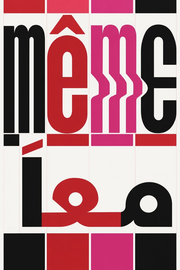
Contemporary Arabic × Post-Binary Typography
Both extend a typeface's character set for a language need, but dual-script design matches two scripts for neutral, institutional legibility, while post-binary type invents new characters within one script and keeps them visible as a political statement.
Mix them and make something Contemporary Arabic Post-Binary Typography
01
What each style brings
Each part of the design comes from the style with the stronger say in it, and each style gives at least two.
Contemporary Arabic & Dual-Script Type Design Post-Binary Typography (Bye Bye Binary and Inclusive French Type)
- Type from Post-Binary Typography
- Colour from Contemporary Arabic
- Form from Contemporary Arabic
- Composition from Contemporary Arabic
- Surface from Post-Binary Typography
02
The type
Open fonts standing in for each style’s own type, which is often hand-drawn or commercial.
Display · Post-Binary Typography
Tomorrow
Jost, standing in for BBB Poppins TN (Eugénie Bidaut and Camille Circlude, 2022), after Jonny Pinhorn's Poppins
Text · Contemporary Arabic
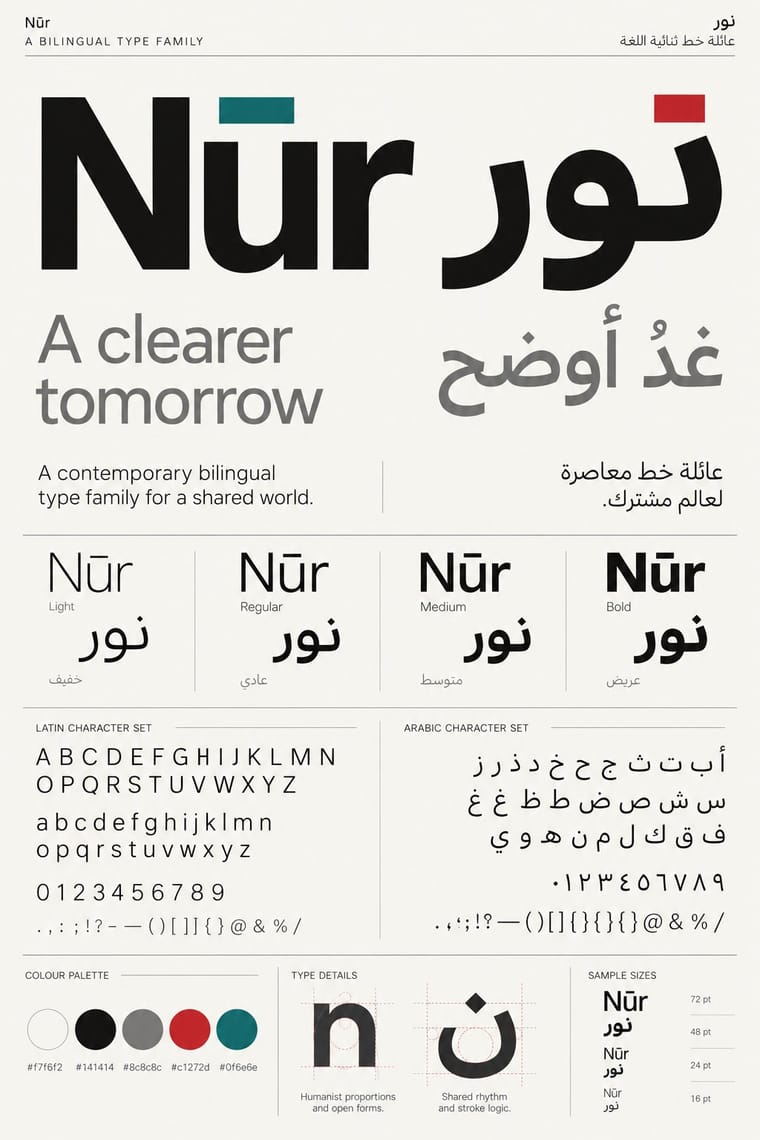
A twenty-first-century type culture that redraws Arabic as a family matched to a Latin companion in weight, proportion and contrast, so the two scripts can share a page, screen or sign as equals. The Khatt Foundation's Typographic Matchmaking (2007) did much to launch it, and foundries such as 29LT and TPTQ Arabic carried it forward. It favours low-contrast Kufi- and Naskh-derived forms, a firm horizontal baseline and mirrored grids for identities, wayfinding and interfaces.
Fira Sans; Contemporary Arabic used Frutiger Arabic and Helvetica Arabic and 29LT UA Neo B and UA Neo N
03
The colours
The ground and leading colours come from Contemporary Arabic, with a counter-accent from Post-Binary Typography. The ink reads on the ground at 4.5:1 or more.
Contemporary Arabic & Dual-Script Type Design Post-Binary Typography (Bye Bye Binary and Inclusive French Type)
-
#f7f6f2ground · 36% -
#141414ink · 14% -
#c1272daccent · 18% -
#d42a7faccent · 14% -
#0f6e6eaccent · 10% -
#ee5d63accent · 8%
As CSS
:root {
  --ground: #f7f6f2;
  --ink: #141414;
  --accent-1: #c1272d;
  --accent-2: #d42a7f;
  --accent-3: #0f6e6e;
  --accent-4: #ee5d63;
  --font-display: "Jost", sans-serif;
  --font-text: "Fira Sans", sans-serif;
}
Use it with care
Contemporary Arabic & Dual-Script Type Design: Arabic must be set with correct contextual shaping and right-to-left direction; disconnected or reversed letters are a common and offensive error. Have every Arabic word checked by a fluent reader, avoid setting Qur'anic verses or the names of God and the Prophet as decorative texture, and commission or credit Arabic type designers rather than deriving Arabic glyphs from a Latin font.
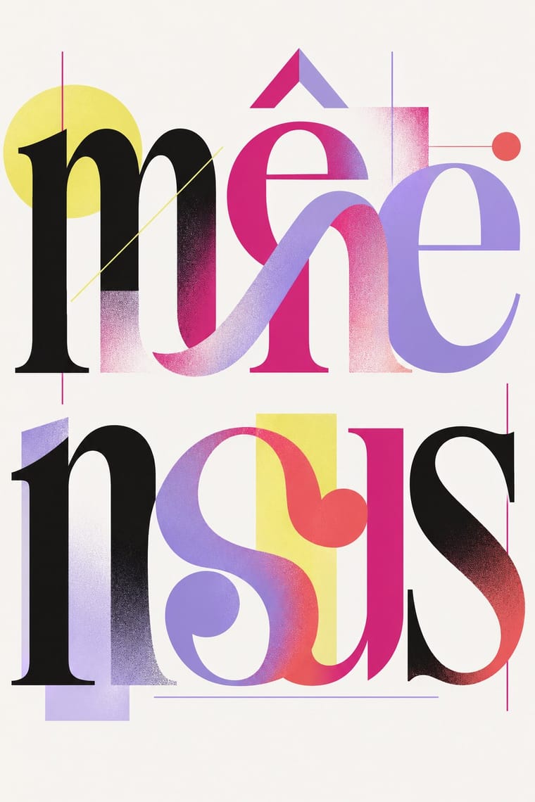
Post-Binary Typography (Bye Bye Binary and Inclusive French Type): This is the living practice of a queer, trans and non-binary community and of named designers, most of them active: do not use the glyphs as decorative 'Pride' texture or for brand campaigns that ignore the people they were made for; follow the CUTE that comes with the fonts: credit and link the designers, keep the files complete, give on its sliding scale (€300 to €1,000 for a cultural institution) and respect its answer to companies that want an inclusive image to pinkwash: 'Look elsewhere'; and never attribute a generated poster or font to the collective or prompt an image model with its members' names. Image models invent fake ligatures and misspell French, so set real inclusive words in the actual fonts and have them checked by people who use them. Type the median-dot forms and let the OpenType features display the glyphs, rather than pasting QUNI's Private Use Area characters, which screen readers cannot voice meaningfully and which turn into blanks or wrong signs when copied or shown in another font. In France, inclusive writing with the point médian is proscribed in schools by circular (2021) and a Senate bill sought to ban it more widely (2023), so check before setting official French public documents this way.
04
The two styles
05
More combinations
With Contemporary Arabic
- Corporate Identity Modernism Pairs well · Roll a matched Arabic–Latin family through a standards manual so both scripts carry the identity with equal authority.
- Urdu Katib Lithography Contrasts · The katib's stacked Nastaʿlīq cascade is everything a screen-optimised Arabic sans gives up; quote it where warmth and history matter more than efficiency.
- International Typographic Style Pairs well · Use a strict, mirrored grid and a neutral sans so Arabic and Latin columns align in rhythm and weight.
- Machine-Age Simplified Arabic Type Pairs well · Its digital successor: dual-script families pair Arabic with a matched Latin while keeping the firm baseline, even colour and reduced stacking that simplification made familiar. 29LT's UA Neo (2013), detached revivals of Khattar's Unified Arabic, is where the two touch.
- Ottoman Tughra & Dîvânî Chancery Calligraphy Pairs well · Keep hand-drawn calligraphy for the mark itself and set the running text in a well-made contemporary Arabic typeface with a matched Latin companion, instead of imitating Dîvânî in body text.
- Early Turkish Republican Graphic Design Contrasts · Turkey replaced Arabic letters with Latin in 1928, and Emin Barın carried calligraphic habits into the new script; contemporary dual-script type design keeps both scripts and matches them as equals. Compare the two to show replacement against coexistence.
- Bulaq (Amiriyya) Naskh Book Printing Pairs well · Set long reading text in an Amiri-style calligraphic Naskh and use a low-contrast contemporary Arabic sans for headings, captions and screens, so each register does one job.
- Arab Independent Comics (Samandal, TokTok, Lab619, Skefkef) Contrasts · Both set Arabic beside Latin, but that type culture matches the two scripts in font families on rational, mirrored grids, while these anthologies letter both scripts by hand, one story at a time, and mirror whole pages so that the reader turns the magazine round with the script.
With Post-Binary Typography
- Emigre & Early Digital Type Pairs well · Both are type-led laboratories that publish their own magazine as a showcase for their fonts. In Zone Mixte (2022) êkhô studio chose BBB Baskervvol with Baskerville's erasure of Sarah Eaves in mind, the story Zuzana Licko honoured in Mrs Eaves (1996); set a Baskervvol text in an Emigre-style specimen spread to join the two foundry experiments.
- Risograph & Indie Print Culture Pairs well · Fanzines, programmes and short-run posters carry much of the practice, such as Hannah Beaudeux's risograph-printed La tendresse des murs (2025), set with Enby Gertrude; print a post-binary text in one or two riso inks to keep it cheap and communal.
- Acid Graphics / New Ugly Pairs well · The collective's banners share Acid Graphics' blackletter, spiky stars, gradients and chrome-like lettering; borrow that repertoire for a manifesto banner or flyer, but keep the post-binary glyph legible as the subject rather than the surface effect.
- Phototype Expressive Typography (Lubalin & U&lc) Contrasts · Both make new meaning by interlocking letters into ligatures, but Lubalin's phototype ligatures are tight-set display wit for headlines and logotypes, while post-binary ligatures carry gender inside the word, in running French text as well as on banners; choose Lubalin for a witty headline, post-binary glyphs when the grammar of the word is the message.
- ACT UP & Gran Fury AIDS Activist Graphics Contrasts · Both are queer activist graphics, but Gran Fury borrowed advertising's photographs and slogans and kept standard letters (Futura, Gill Sans), while post-binary type leaves the picture ordinary and changes the alphabet. Choose Gran Fury for a public accusation, post-binary glyphs when the words themselves must include everyone.
- Out-of-Square Hangul Typography Pairs well · Both redesign the structure of letters for a social idea: Ahn Sang-soo freed Hangul syllables from the square, post-binary type frees French word endings from the gender binary. Pair them when a project is about how a script could be otherwise.