Style combination · Contrasts
Bulaq Naskh Book Printing × Song–Ming Woodblock Book Typography
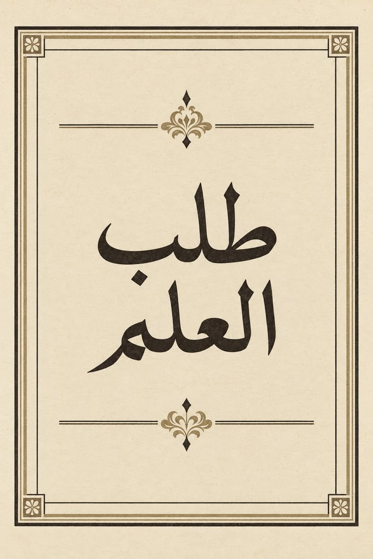
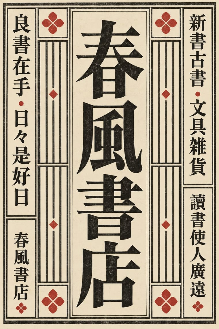
Both turned a calligraphic hand into a type for long texts inside ruled frames, but Song–Ming squared the brush into equal vertical cells while Bulaq kept the joined, horizontal flow of Naskh; let a bilingual book show each logic in its own frame.
Mix them and make something Bulaq Naskh Book Printing Song–Ming Woodblock Book Typography
01
What each style brings
Each part of the design comes from the style with the stronger say in it, and each style gives at least two.
Bulaq (Amiriyya) Naskh Book Printing Song–Ming Woodblock Book Typography (Songti / Mincho)
- Type from Song–Ming Woodblock Book Typography
-
Bulaq Naskh Book Printing avoids rotated & vertical setting: this is where the two pull against each other, which is the point of the contrast.
- Colour from Bulaq Naskh Book Printing
- Form from Song–Ming Woodblock Book Typography
- Composition from Bulaq Naskh Book Printing
- Surface from Song–Ming Woodblock Book Typography
02
The type
Open fonts standing in for each style’s own type, which is often hand-drawn or commercial.
Display · Song–Ming Woodblock Book Typography
Public
Shippori Mincho, standing in for Song block-cut regular script after Ouyang Xun, Yan Zhenqing and Liu Gongquan
Text · Bulaq Naskh Book Printing
The page of the Arabic printed book as Egypt's state press at Bulaq shaped it from 1822: justified blocks of black Naskh type on pale paper, often boxed in a ruled frame, with an ornamental headpiece on the opening page, headings set larger or in a second script such as Nastaʿlīq, and almost no pictures. It printed army manuals, laws, textbooks, translated science, the Arabic classics and the official gazette. Calligraphers drew its later types, Mirza Sanglakh and then Muhammad Jaʿfar, whose 1905–06 body type was the basis of the 1924 Qur'an and lives on as Khaled Hosny's Amiri.
Libre Caslon Text; Bulaq Naskh Book Printing used Bulaq (Amiriyya) Naskh body type, 1905–06, drawn by the calligrapher Muhammad Jaʿfar Bey and Bulaq Naskh and Nastaʿlīq types by the Persian calligrapher Mirza Sanglakh, made for Muhammad Ali's press
03
The colours
The ground and leading colours come from Bulaq Naskh Book Printing, with a counter-accent from Song–Ming Woodblock Book Typography. The ink reads on the ground at 4.5:1 or more.
Bulaq (Amiriyya) Naskh Book Printing Song–Ming Woodblock Book Typography (Songti / Mincho)
-
#efe6cfground · 36% -
#171411ink · 14% -
#7a5236accent · 18% -
#b5342baccent · 14% -
#cdbb93accent · 10% -
#2e3d5caccent · 8%
As CSS
:root {
  --ground: #efe6cf;
  --ink: #171411;
  --accent-1: #7a5236;
  --accent-2: #b5342b;
  --accent-3: #cdbb93;
  --accent-4: #2e3d5c;
  --font-display: "Shippori Mincho", serif;
  --font-text: "Libre Caslon Text", serif;
}
Use it with care
Bulaq (Amiriyya) Naskh Book Printing: The press also set the Qur'an (the 1924 Cairo edition) and hadith collections such as the Sultaniyya Sahih al-Bukhari, and Bulaq-style Naskh and Amiri are still used for Qur'anic and religious text, so never crop, mirror or distort Qur'anic verses or the names of God and the Prophet, use them as texture, or put them on floors, footwear or throwaway packaging. Set Arabic right to left with correct contextual shaping, have every word read by a fluent reader, never fill a layout with pseudo-Arabic, and never present a generated page as a historical Bulaq imprint.
Song–Ming Woodblock Book Typography (Songti / Mincho): Have any Chinese, Japanese or Korean text set and proofread by a fluent reader: Song, Mincho and Myeongjo fonts draw some characters differently for each locale, and pseudo-characters, mirrored glyphs or random hanzi used as texture read as nonsense or worse. Pages of Buddhist sutras and other scripture carry devotional text; do not crop them into decoration.
04
The two styles
05
More combinations
With Bulaq Naskh Book Printing
- Neoclassical Book Typography Pairs well · In an Arabic–Latin edition, face a justified, rule-framed Naskh page with a centred transitional or Didone page; both make type, rules and margins the only luxury.
- Contemporary Arabic & Dual-Script Type Design Pairs well · Set long reading text in an Amiri-style calligraphic Naskh and use a low-contrast contemporary Arabic sans for headings, captions and screens, so each register does one job.
- Islamic Geometric & Calligraphic Tradition Pairs well · For a ceremonial edition, crown a plain Bulaq text page with one illuminated headpiece or geometric title frame from the manuscript tradition, and keep the text block itself sober.
- Cairo–Beirut Arab Modernist Book & Periodical Design Pairs well · Wrap a sober, justified Naskh text block in a hand-lettered, illustrated cover printed in flat offset colour, so the inside reads as a classic and the outside as a modern Arab book.
- Urdu Katib Lithography Contrasts · Urdu kept the calligrapher's hand by lithographing it while Bulaq set Naskh in movable type; choose deliberately between a written page and a set one, or run set Naskh body text under a hand-written headline.
- Machine-Age Simplified Arabic Type Contrasts · The full calligraphic repertoire it gave up: a Bulaq-style Naskh title over simplified body text shows exactly what was traded for speed and economy.
- Nirnaya Sagar Devanagari Typography (Bombay Metal Type) Pairs well · Both turned a calligraphic hand into a book type for classics and scripture; in a multilingual edition, let an unframed Devanagari page with its apparatus face a rule-framed Naskh page.
With Song–Ming Woodblock Book Typography
- Dazibao (Big-Character Posters) Contrasts · The big-character poster is the hand-brushed, crowded, personal opposite of the quiet official printed page; set one against the other to weigh public urgency against canonical calm.
- Urdu Katib Lithography Contrasts · Urdu turned down type to keep the calligrapher's hand while Song–Ming printing depersonalised the brush for the block cutter; choose deliberately between a written page and a cut one.
- Out-of-Square Hangul Typography Contrasts · Ahn Sang-soo's typeface broke exactly the equal square that Myeongjo keeps; run Myeongjo body text under out-of-square headings to stage tradition against experiment.
- Chaekgeori & Minhwa Screen Painting Pairs well · Chaekgeori screens paint stacks of the scholar's books; pair a painted bookcase grid with real ruled, framed Myeongjo text pages for a Korean scholarly identity.
- Japanese Postwar Modernism Pairs well · The postwar school set Mincho beside gothic and Latin sans; use a vertical Mincho column beside a flat colour field to give a modern grid a literary voice.
- Renaissance Book Typography Pairs well · Its Western counterpart: both fix one justified text block in a proportioned page with deep margins, so set a Ming face and a Garalde side by side in a bilingual book and let each keep its own grid.
- Ten Bamboo Studio Colour Woodblock (Douban & Gonghua) Pairs well · The same Nanjing book trade cut both: put a ruled Song-style text page opposite a graded colour leaf, as an album or a book with plates.
- Republican Chinese Book Cover Design (Lu Xun & Tao Yuanqing) Contrasts · The ruled woodblock page and Songti type that the new covers left behind; set a Song-type text block against a drawn, off-centre cover title to show old book and new.
All 18 combinations with Song–Ming Woodblock Book Typography