Style combination · Pairs well
Contemporary Arabic × Corporate Identity Modernism
Roll a matched Arabic–Latin family through a standards manual so both scripts carry the identity with equal authority.
Mix them and make something Contemporary Arabic Corporate Identity Modernism
01
What each style brings
Each part of the design comes from the style with the stronger say in it, and each style gives at least two.
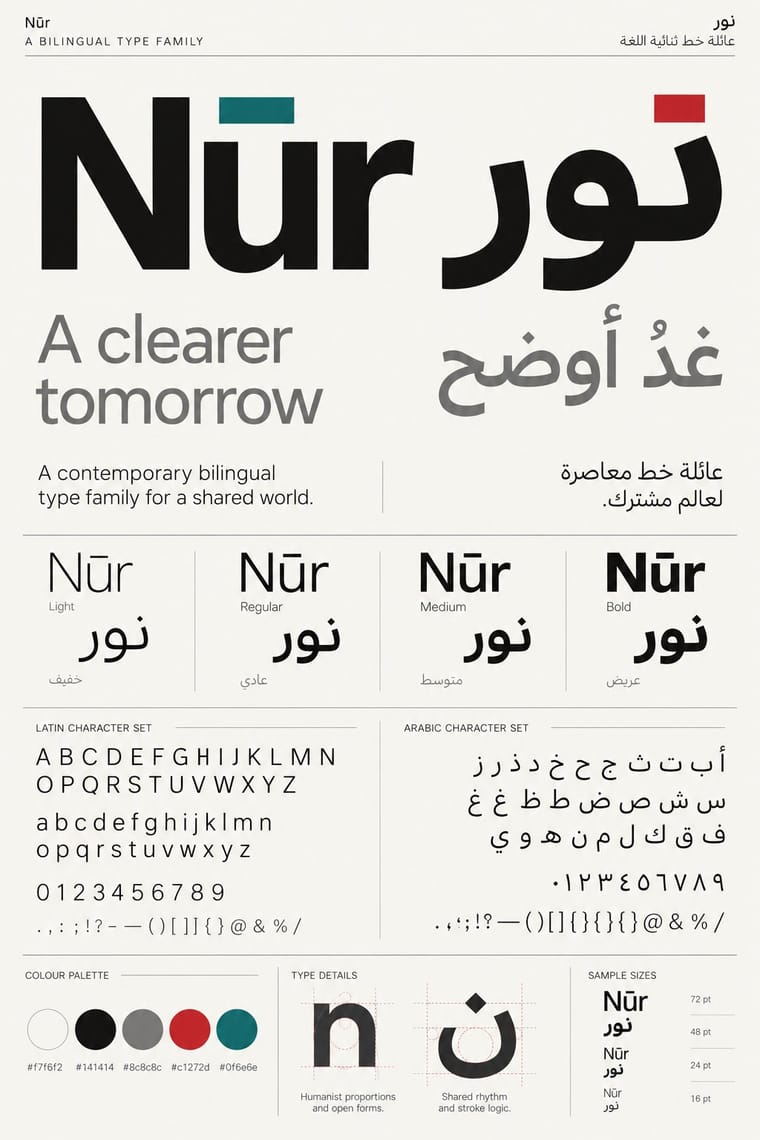
Contemporary Arabic & Dual-Script Type Design Corporate Identity Modernism
- Type from Contemporary Arabic
- Colour from Corporate Identity Modernism
- Form from Corporate Identity Modernism
- Composition from Corporate Identity Modernism
- Surface from Contemporary Arabic
02
The type
Open fonts standing in for each style’s own type, which is often hand-drawn or commercial.
Display · Contemporary Arabic
Grid
Fira Sans, standing in for Frutiger Arabic and Helvetica Arabic (Nadine Chahine)
Text · Corporate Identity Modernism
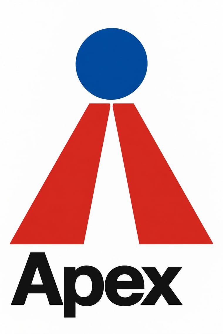
Modernist reduction applied to corporate communication. A company's whole public face (trademark, logotype, stationery, packaging, vehicles and signage) was unified by an abstract symbol, a single typeface and one colour, all policed by a graphic standards manual. Pioneered by Paul Rand, Chermayeff & Geismar, Unimark and Lippincott & Margulies, it made the reductive mark and the grid the visual language of multinational business and government.
Inter; Corporate Identity Modernism used Helvetica and Univers
03
The colours
The ground and leading colours come from Corporate Identity Modernism, with a counter-accent from Contemporary Arabic. The ink reads on the ground at 4.5:1 or more.
Contemporary Arabic & Dual-Script Type Design Corporate Identity Modernism
-
#ffffffground · 36% -
#111111ink · 14% -
#d7261eaccent · 18% -
#0a4fa0accent · 14% -
#0f6e6eaccent · 10% -
#a4a9adaccent · 8%
As CSS
:root {
  --ground: #ffffff;
  --ink: #111111;
  --accent-1: #d7261e;
  --accent-2: #0a4fa0;
  --accent-3: #0f6e6e;
  --accent-4: #a4a9ad;
  --font-display: "Fira Sans", sans-serif;
  --font-text: "Inter", sans-serif;
}
Use it with care
Contemporary Arabic & Dual-Script Type Design: Arabic must be set with correct contextual shaping and right-to-left direction; disconnected or reversed letters are a common and offensive error. Have every Arabic word checked by a fluent reader, avoid setting Qur'anic verses or the names of God and the Prophet as decorative texture, and commission or credit Arabic type designers rather than deriving Arabic glyphs from a Latin font.
04
The two styles
05
More combinations
With Contemporary Arabic
- Urdu Katib Lithography Contrasts · The katib's stacked Nastaʿlīq cascade is everything a screen-optimised Arabic sans gives up; quote it where warmth and history matter more than efficiency.
- International Typographic Style Pairs well · Use a strict, mirrored grid and a neutral sans so Arabic and Latin columns align in rhythm and weight.
- Machine-Age Simplified Arabic Type Pairs well · Its digital successor: dual-script families pair Arabic with a matched Latin while keeping the firm baseline, even colour and reduced stacking that simplification made familiar. 29LT's UA Neo (2013), detached revivals of Khattar's Unified Arabic, is where the two touch.
- Ottoman Tughra & Dîvânî Chancery Calligraphy Pairs well · Keep hand-drawn calligraphy for the mark itself and set the running text in a well-made contemporary Arabic typeface with a matched Latin companion, instead of imitating Dîvânî in body text.
- Post-Binary Typography (Bye Bye Binary and Inclusive French Type) Contrasts · Both extend a typeface's character set for a language need, but dual-script design matches two scripts for neutral, institutional legibility, while post-binary type invents new characters within one script and keeps them visible as a political statement.
- Early Turkish Republican Graphic Design Contrasts · Turkey replaced Arabic letters with Latin in 1928, and Emin Barın carried calligraphic habits into the new script; contemporary dual-script type design keeps both scripts and matches them as equals. Compare the two to show replacement against coexistence.
- Bulaq (Amiriyya) Naskh Book Printing Pairs well · Set long reading text in an Amiri-style calligraphic Naskh and use a low-contrast contemporary Arabic sans for headings, captions and screens, so each register does one job.
- Arab Independent Comics (Samandal, TokTok, Lab619, Skefkef) Contrasts · Both set Arabic beside Latin, but that type culture matches the two scripts in font families on rational, mirrored grids, while these anthologies letter both scripts by hand, one story at a time, and mirror whole pages so that the reader turns the magazine round with the script.
With Corporate Identity Modernism
- Corporate Memphis Contrasts · Its successor trades abstract authority for rubbery friendliness; compare the two to decide how institutional or human a brand should feel.
- Generative & Dynamic Identities Pairs well · Keep the manual's mark, colour and grid as constants and let generative rules vary one parameter, so the system still reads as one company.
- Flat Design Pairs well · Flat UI inherits these reductive marks; reuse their clear-space and colour-code discipline when scaling icons across screens.
- Punk & DIY Zine Contrasts · Punk's ransom-note lettering is the anti-manual; one torn, xeroxed element against a corporate grid reads instantly as critique.
- Plakatstil / Sachplakat Pairs well · Its brand-name-plus-object formula prefigures logo-led identity; pair it with a modernist grid for confident product campaigns.
- Risograph & Indie Print Culture Contrasts · Exact Pantone-matched corporate colour is the opposite of riso's drifting inks; use the contrast to signal independence.
- Milanese Industrial Modernism (Olivetti, Pirelli, Studio Boggeri) Contrasts · American corporate identity policed one mark through a manual, while Milan let artists vary the language; compare the two when deciding how strict a brand system should be.
- European Heraldry Pairs well · A coat of arms already is an identity defined by a specification rather than one drawing, applied to seals, banners, buildings and documents; Finnish municipal arms of the 1950s show how its flat two-tincture discipline reads as a modern mark, so use blazon-like rules to write a logo that can be redrawn without losing itself.