Style combination · Contrasts
Arab Independent Comics × Contemporary Arabic
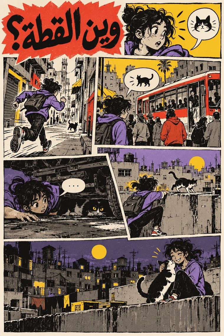
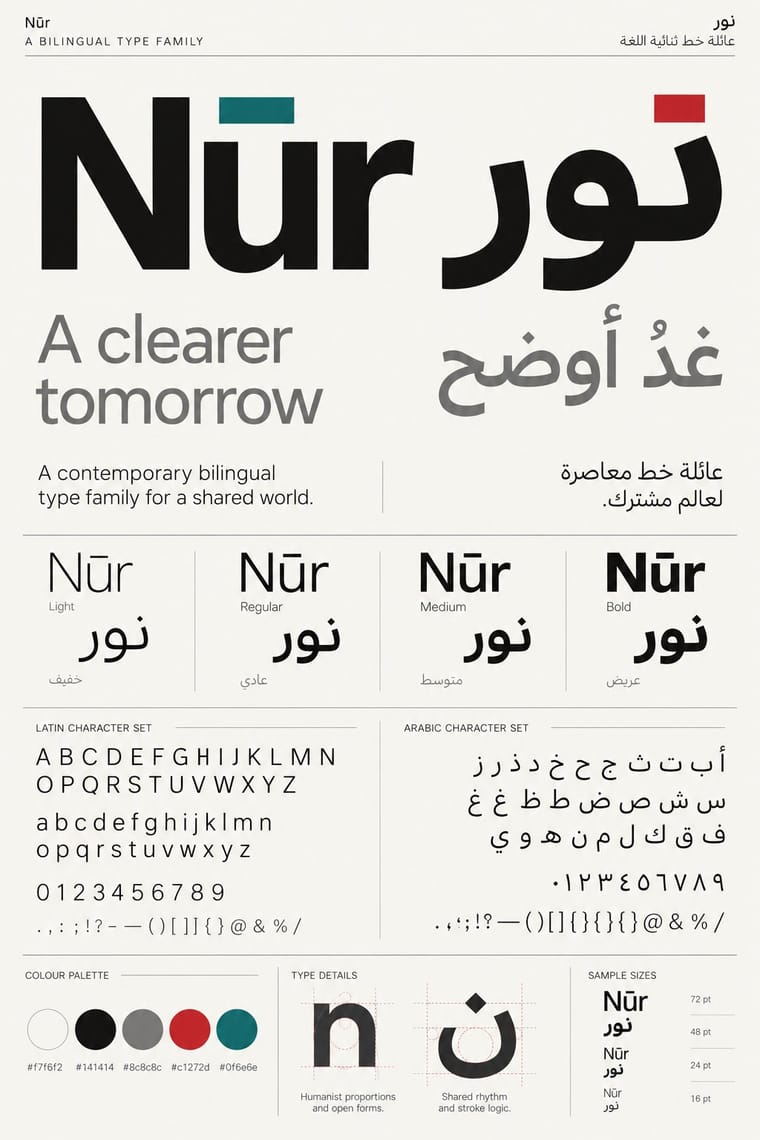
Both set Arabic beside Latin, but that type culture matches the two scripts in font families on rational, mirrored grids, while these anthologies letter both scripts by hand, one story at a time, and mirror whole pages so that the reader turns the magazine round with the script.
Mix them and make something Arab Independent Comics Contemporary Arabic
01
What each style brings
Each part of the design comes from the style with the stronger say in it, and each style gives at least two.
Arab Independent Comics (Samandal, TokTok, Lab619, Skefkef) Contemporary Arabic & Dual-Script Type Design
- Type from Contemporary Arabic
- Colour from Contemporary Arabic
- Form from Arab Independent Comics
- Composition from Arab Independent Comics
- Surface from Arab Independent Comics
-
Contemporary Arabic avoids painterly brushwork: this is where the two pull against each other, which is the point of the contrast.
02
The type
Open fonts standing in for each style’s own type, which is often hand-drawn or commercial.
Display · Contemporary Arabic
Grid
Fira Sans, standing in for Frutiger Arabic and Helvetica Arabic (Nadine Chahine)
Text · Arab Independent Comics
Adult comics magazines edited by Arab artists' collectives since 2007, at times with a ministry grant or an NGO partner: Samandal in Beirut, TokTok in Cairo, Lab619 in Tunis and Skefkef in Casablanca. Each issue gathers many hands and no house style, from grubby brush caricature to fine-art pages, much of it in black ink. Balloons mostly speak street dialect, not classical Arabic, and Samandal ran Arabic right to left beside French and English left to right. Satire aims at police, sect, sex and religion; two comics deemed blasphemous cost Samandal's editors a conviction and fines in 2015.
Schibsted Grotesk; Arab Independent Comics used Hand-lettered colloquial Arabic balloons and Hand-lettered Latin-script balloons
03
The colours
The ground and leading colours come from Contemporary Arabic, with a counter-accent from Arab Independent Comics. The ink reads on the ground at 4.5:1 or more.
Arab Independent Comics (Samandal, TokTok, Lab619, Skefkef) Contemporary Arabic & Dual-Script Type Design
-
#f7f6f2ground · 36% -
#141414ink · 14% -
#c1272daccent · 18% -
#f0c419accent · 14% -
#0f6e6eaccent · 10% -
#8c8c8caccent · 8%
As CSS
:root {
  --ground: #f7f6f2;
  --ink: #141414;
  --accent-1: #c1272d;
  --accent-2: #f0c419;
  --accent-3: #0f6e6e;
  --accent-4: #8c8c8c;
  --font-display: "Fira Sans", sans-serif;
  --font-text: "Schibsted Grotesk", sans-serif;
}
Use it with care
Arab Independent Comics (Samandal, TokTok, Lab619, Skefkef): These are living, named artists working under real censorship: Samandal's editors were prosecuted and fined over two comics, and an Egyptian cartoonist was arrested in January 2016, so never attribute invented political or religious satire to a real artist or collective, and never ask an image model for their work by name. Draw the contemporary city life these artists draw, not Orientalist shorthand: no camels, veiled women, sheikhs or gunmen as stand-ins for 'Arab', and no pseudo-Arabic squiggles. Have every line of dialect Arabic, Darija or Amazigh written or checked by a fluent speaker; if no fluent reader can check it, leave the balloons empty or letter them in Latin script only. Do not borrow the religious and sectarian jokes as edgy decoration outside the communities that made them.
Contemporary Arabic & Dual-Script Type Design: Arabic must be set with correct contextual shaping and right-to-left direction; disconnected or reversed letters are a common and offensive error. Have every Arabic word checked by a fluent reader, avoid setting Qur'anic verses or the names of God and the Prophet as decorative texture, and commission or credit Arabic type designers rather than deriving Arabic glyphs from a Latin font.
04
The two styles
05
More combinations
With Arab Independent Comics
- Story Manga (Postwar Japanese Comics) Contrasts · Manga is one codified visual language read right to left. The new wave of Arab comics counts it among its sources, beside European comics and American cartoons, and some artists build a style on it (Hanan al-Kararji, who drew the Cairo graphic novel 18 Days, calls hers 'a blend of manga and Arabness'), but these anthologies set it beside brush caricature and fine-art pages, and may run both reading directions in one issue.
- Risograph & Indie Print Culture Pairs well · Samandal printed Topia (2017) by Risograph, and Lab619 planned its ninth issue in a 2017 residency, to be printed by Risograph and bound by hand; add two or three translucent riso inks to a black-ink anthology for its cover or centrefold, but keep the dialect lettering and the many hands.
- American Four-Colour Comic Book (Golden to Bronze Age) Contrasts · TokTok's Andeel called superhero culture foreign: no genre industry, no ruled grid of four-colour panels and no single drawing code, but adult, local stories in whatever hand and dialect each artist brings.
- Egyptian Revolutionary Street Art (Mohamed Mahmoud Murals) Pairs well · The same Cairo moment on paper and on walls: TokTok appeared two weeks before 25 January 2011, and many of these artists mix caricature, illustration, comics and graffiti. Carry a wall's sardonic caricature and slogan into a sequence of panels.
- Lebanese Civil War Party Poster Contrasts · The party posters glorified martyrs and leaders; Lena Merhej said Samandal refused to write about the war, 'a subject that exasperates us', and turned instead to religion, politics and sex, with irony rather than tribute.
- Arab Children's Comic Magazines (Samir to Majid) Contrasts · The adult, black-ink, dialect satire of Samandal and TokTok answers these mostly state-backed children's weeklies: set one raw independent strip against a bright magazine page to show the break.
- Turkish Weekly Humour Magazines (Gırgır to Uykusuz) Contrasts · Both are collectives' magazines that satirise power in street dialect and have been taken to court for it. The Arab magazines are small art-comics anthologies with no house style and no topical cover; the Turkish weeklies were mass newsstand titles built around one cover caricature of the week's news.
- L'Association and French Alternative Comics Pairs well · A younger many-handed small-press scene that also prints mostly in black ink; one of its Beirut titles won Angoulême's alternative comics prize in 2019. Pair the French book design with its dialect lettering and Risograph colour.
With Contemporary Arabic
- Corporate Identity Modernism Pairs well · Roll a matched Arabic–Latin family through a standards manual so both scripts carry the identity with equal authority.
- Urdu Katib Lithography Contrasts · The katib's stacked Nastaʿlīq cascade is everything a screen-optimised Arabic sans gives up; quote it where warmth and history matter more than efficiency.
- International Typographic Style Pairs well · Use a strict, mirrored grid and a neutral sans so Arabic and Latin columns align in rhythm and weight.
- Machine-Age Simplified Arabic Type Pairs well · Its digital successor: dual-script families pair Arabic with a matched Latin while keeping the firm baseline, even colour and reduced stacking that simplification made familiar. 29LT's UA Neo (2013), detached revivals of Khattar's Unified Arabic, is where the two touch.
- Ottoman Tughra & Dîvânî Chancery Calligraphy Pairs well · Keep hand-drawn calligraphy for the mark itself and set the running text in a well-made contemporary Arabic typeface with a matched Latin companion, instead of imitating Dîvânî in body text.
- Post-Binary Typography (Bye Bye Binary and Inclusive French Type) Contrasts · Both extend a typeface's character set for a language need, but dual-script design matches two scripts for neutral, institutional legibility, while post-binary type invents new characters within one script and keeps them visible as a political statement.
- Early Turkish Republican Graphic Design Contrasts · Turkey replaced Arabic letters with Latin in 1928, and Emin Barın carried calligraphic habits into the new script; contemporary dual-script type design keeps both scripts and matches them as equals. Compare the two to show replacement against coexistence.
- Bulaq (Amiriyya) Naskh Book Printing Pairs well · Set long reading text in an Amiri-style calligraphic Naskh and use a low-contrast contemporary Arabic sans for headings, captions and screens, so each register does one job.