Rational modernism · 1894–1899 · Western Europe
Beggarstaffs Poster (Nicholson & Pryde)
Also known as Beggarstaffs, Beggarstaff Brothers, Cut-paper silhouette poster
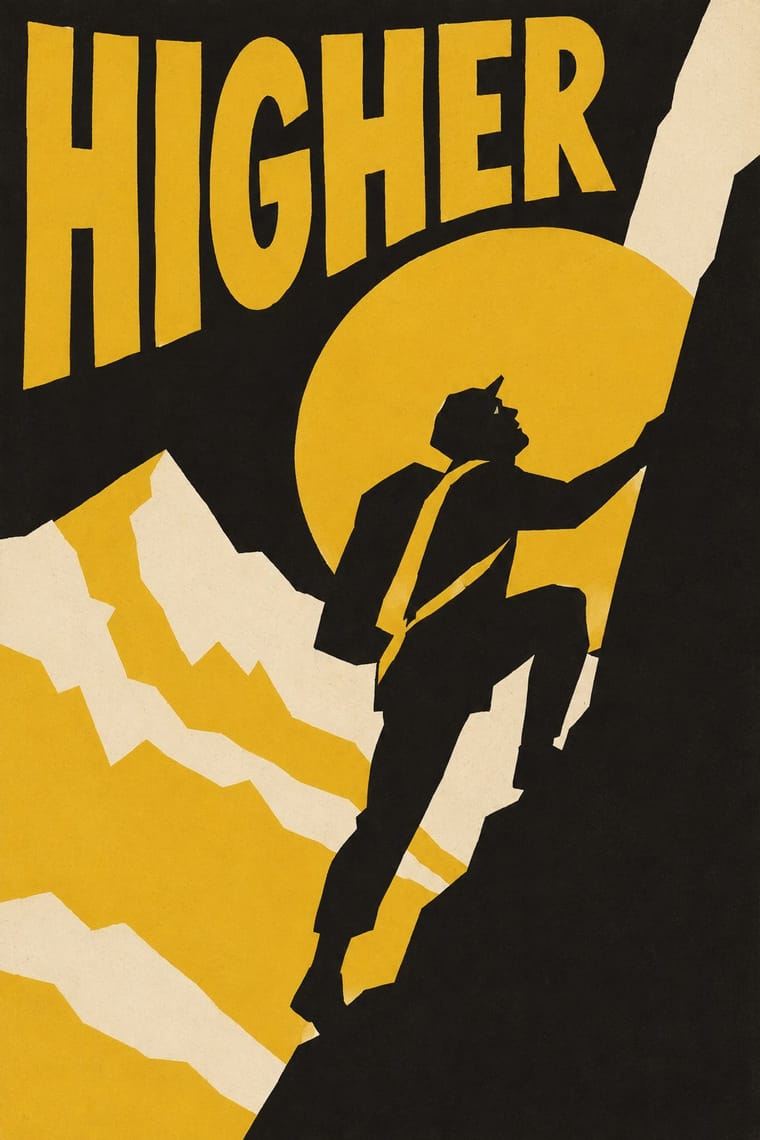
Posters designed by William Nicholson and James Pryde under the pseudonym J. & W. Beggarstaff: shapes cut from paper and shifted about a board until the silhouette worked, then executed by stencil (Hamlet was stencilled on brown wrapping paper, with details added by hand) in a few flat colours. Figures are left partly incomplete for the viewer to finish. Unlike the later Plakatstil, a commercial system of silhouette and plain lettering, this was a cut-paper collage method made by a studio of two; few designs were printed and they were too avant-garde for the advertisers of the day.
Make something in this style Get advice in this style Mix it with another style
01
How it works
- Compose by cutting and moving paper shapes on a board until the silhouette reads.
- Reduce every figure to a flat mass and leave part of it unsaid for the viewer to complete.
- Limit the palette to two or three flat colours, as black and yellow alone.
- Draw the lettering plainly and fit it into the silhouette.
- Reject line, floral ornament and tonal gradation; let masses carry the poster.
London, England
02
Its design choices
From Stylogeny’s vocabulary of design choices: defining choices make the style, characteristic ones are usual, occasional ones turn up now and then.
- Layout & composition
- Space & hierarchy
- Typography
- Form & shape
- Surface & texture
- Ornament
- Medium & production
- Tone & intent
- Avoids
- Floral & vegetal, Abundant decoration, Whiplash line, Biomorphic curves, Horror vacui, Gloss & highlights, Gradients, Straight photography
Palette
-
#1c1b19 -
#e8b923 -
#b8a07e -
#f1e8d4 -
#7a4a2b
Typefaces
-
Hand-drawn poster lettering
-
Plain Victorian sans-serif capitals
Known for
-
Hamlet (1894), for W. S. Hardy's company
-
Kassama Corn Flour (1894), in black and yellow
-
Harper's Magazine
1895
-
Cinderella
1895
-
Rowntree's Elect Cocoa
1896
-
Don Quixote (1895), a design for Henry Irving, never printed
03
Make something in this style
Say what you need, and Stylogeny’s image studio draws it from Beggarstaffs Poster (Nicholson & Pryde)’s design choices and checks it against them. It takes about a minute, and you get a link to share.
04
Where it comes from, and what it’s close to
Before it
The style it grew out of, and the styles it borrowed from.
Nothing earlier is recorded: in the atlas it is a starting point.
After it
The styles that grew out of it.
No later style in the atlas grew out of it yet.
Alike in its design choices
Styles that make many of the same choices, related or not, besides those above.
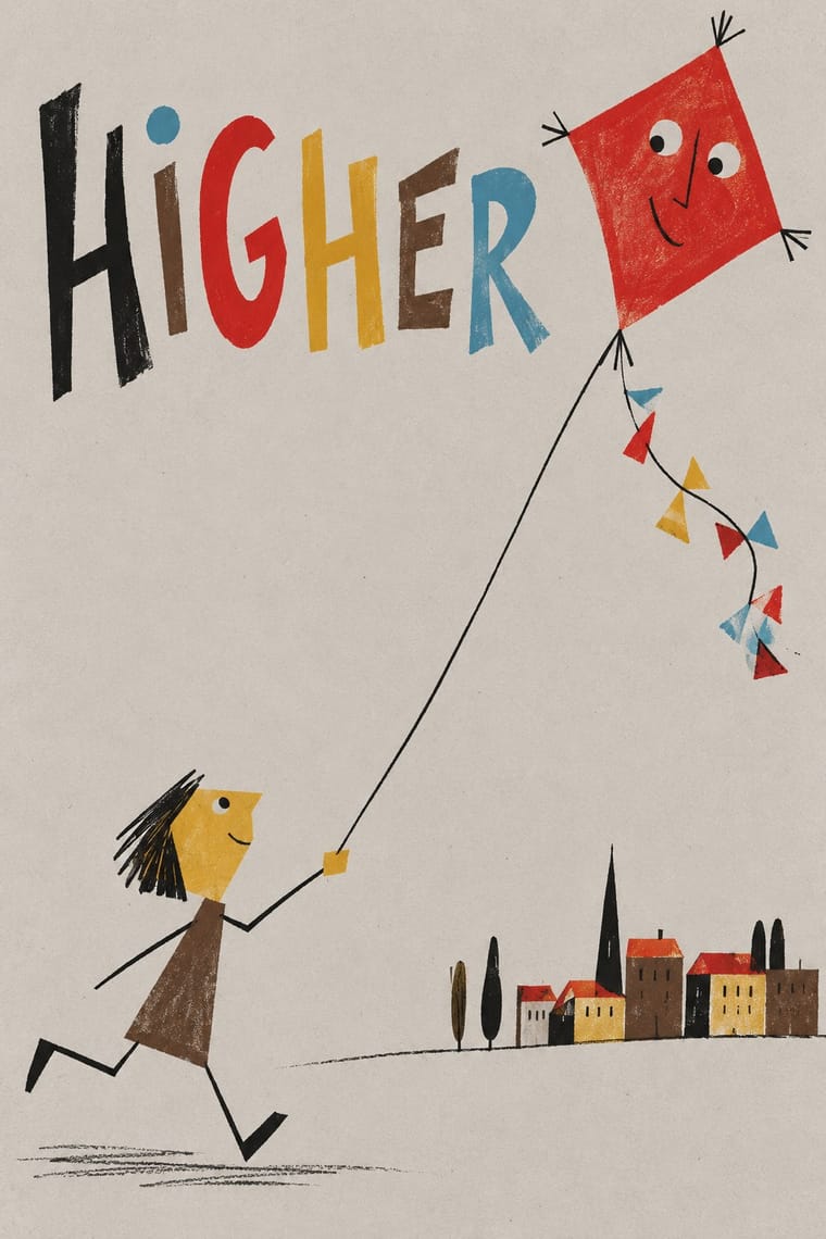
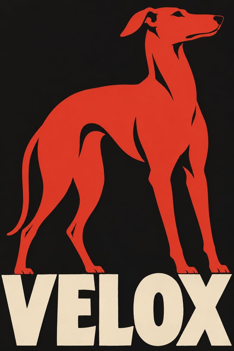
05
Often taken for
Beggarstaffs Poster has no real works recorded yet, so these are its nearest styles by its choices alone, with the choices that tell them apart.
-
Belle Époque Lithographic Poster
2 of Belle Époque Lithographic Poster’s 6 real works fit Beggarstaffs Poster’s choices better than their own: Tournée du Chat Noir avec Rodolphe Salis and A Gaiety Girl.
Choices that tell Beggarstaffs Poster and Belle Époque Lithographic Poster apart Choice Beggarstaffs Poster Belle Époque Lithographic Poster Collage & layering defining — Gradients avoids occasional Ornament-free defining — Whiplash line avoids occasional Non-representational occasional avoids No shared descent in the atlas: they reached these choices separately.
-
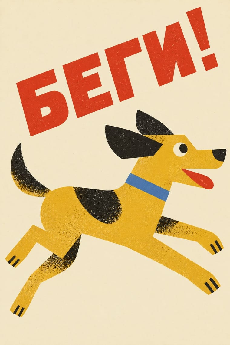
ROSTA Windows
1 of ROSTA Windows’s 5 real works fits Beggarstaffs Poster’s choices better than its own: For the First Time We Greet 1st May with a Hammer, Not…
Choices that tell Beggarstaffs Poster and ROSTA Windows apart Choice Beggarstaffs Poster ROSTA Windows Collage & layering defining — Comic & cartoon — defining Single focal point defining occasional Framed panels — defining Dynamic asymmetry characteristic — No shared descent in the atlas: they reached these choices separately.
-
American Mid-Century Modernism
1 of American Mid-Century Modernism’s 5 real works fits Beggarstaffs Poster’s choices better than its own: Poster for the film The Man with the Golden Arm…
Choices that tell Beggarstaffs Poster and American Mid-Century Modernism apart Choice Beggarstaffs Poster American Mid-Century Modernism Ornament-free defining — Biomorphic curves avoids characteristic All caps characteristic — Photomontage — characteristic Restrained accents — characteristic No shared descent in the atlas: they reached these choices separately.
-
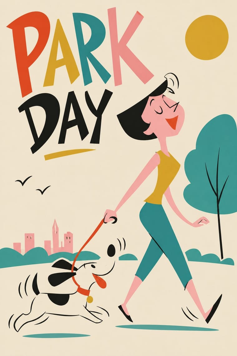
UPA & Cartoon Modern
UPA & Cartoon Modern is one of Beggarstaffs Poster’s nearest styles by choices; no real work of either fits the other better.
Choices that tell Beggarstaffs Poster and UPA apart Choice Beggarstaffs Poster UPA Collage & layering defining — Comic & cartoon — defining Limited spot colours defining occasional Biomorphic curves avoids occasional Paper & letterpress bite characteristic — No shared descent in the atlas: they reached these choices separately.
— means the choice isn’t among the style’s recorded choices. Critics recorded each work’s choices with the styles’ descriptions in view, so this shows whether the descriptions hold together, not proof that they are right.
06
Combine it with
Styles Beggarstaffs Poster (Nicholson & Pryde) pairs well with or plays against, from the research. Each is worked out as a combination: which style gives the type, the colours and the forms.
- Belle Époque Lithographic Poster Contrasts · Lithographic tone and drawn line against flat cut shapes.
- Art Nouveau Contrasts · Its curving floral line is the opposite of cut masses; set side by side to show how much a poster can drop.
- Plakatstil / Sachplakat Pairs well · Bernhard and Hohlwein later made the flat silhouette and plain lettering a commercial system; Plakatstil is a later descendant, not a source.
07
Sources
- https://en.wikipedia.org/wiki/Beggarstaffs
- https://www.cam.ac.uk/stories/beggarstaffs
- https://beggarstaffs.com/catalogue/hamlet/
- Philip B. Meggs & Alston W. Purvis, Meggs' History of Graphic Design
How Stylogeny researches and checks a style: where the facts come from.