Style combination · Pairs well
Flat Design × Japonisme
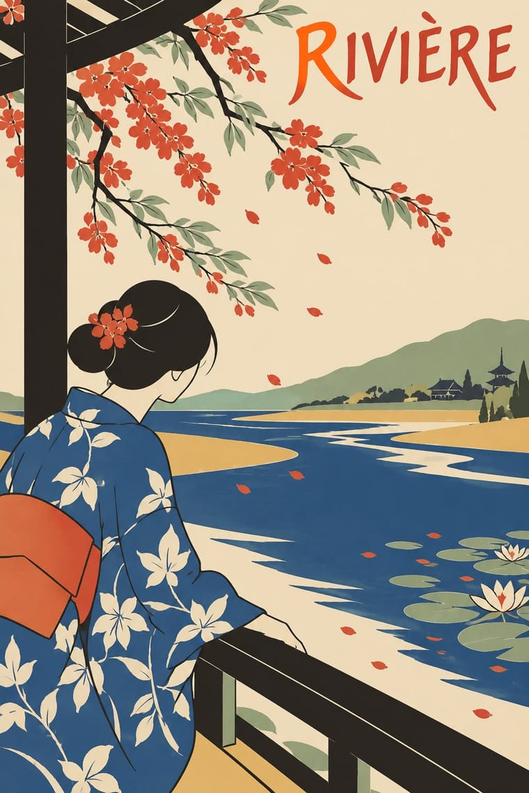
Borrow ukiyo-e cropping and diagonals to make flat vector illustrations feel composed rather than centred and static.
01
What each style brings
Each part of the design comes from the style with the stronger say in it, and each style gives at least two.
Flat Design Japonisme
- Type from Flat Design
- Colour from Flat Design
- Form from Flat Design
- Composition from Japonisme
- Surface from Japonisme
02
The type
Open fonts standing in for each style’s own type, which is often hand-drawn or commercial.
Text · Japonisme
The Western absorption of Japanese woodblock prints, textiles and crafts after Japan reopened to trade in the 1850s. Artists and designers borrowed ukiyo-e's flat colour, bold contours, off-centre and cropped compositions, high viewpoints and crest-like emblems; these devices dissolved academic perspective and set the visual grammar of the modern poster and of Art Nouveau.
Hanken Grotesk; Japonisme used Auriol and Brush-drawn display lettering imitating Japanese calligraphy
03
The colours
The ground and leading colours come from Flat Design, with a counter-accent from Japonisme. The ink reads on the ground at 4.5:1 or more.
Flat Design Japonisme
-
#ecf0f1ground · 36% -
#2c3e50ink · 14% -
#f1c40faccent · 18% -
#c8452caccent · 14% -
#d9b26faccent · 10% -
#3498dbaccent · 8%
As CSS
:root {
  --ground: #ecf0f1;
  --ink: #2c3e50;
  --accent-1: #f1c40f;
  --accent-2: #c8452c;
  --accent-3: #d9b26f;
  --accent-4: #3498db;
  --font-display: "Inter", sans-serif;
  --font-text: "Hanken Grotesk", sans-serif;
}
04
The two styles

05
More combinations
With Flat Design
- Skeuomorphic UI Contrasts · Its direct predecessor and foil: one realistic, textured object on an otherwise flat screen becomes an instant focal point.
- Japanese Postwar Modernism Pairs well · Add the emblematic circles and calm colour fields of Japanese postwar posters to give flat screens a stronger focal image.
- Victorian Letterpress & Wood Type Contrasts · Ornamented wood type and dense rules show everything flat design removed; quote one decorative headline to warm a sterile interface.
- Isotype Pictorial Statistics Pairs well · Borrow Isotype's rows of identical counting pictograms to turn a flat icon set into honest, readable data graphics.
- Indie Pixel Art Revival Contrasts · Resolution-independent vector flatness against a deliberately coarse grid lit with glows and depth.
- Arts & Crafts Movement Contrasts · Borrow one engraved border or initial to give a flat interface a crafted, editorial moment against its vector minimalism.
- WPA Silkscreen Posters Pairs well · Its flat layered shapes translate directly to vector; use the national-park look for warm, civic flat illustration.
- Munich 1972 Olympic Design (Otl Aicher) Pairs well · Flat icon families descend from these round-headed figures; borrow a single stroke width (which, as Holt shows, the 1972 figures only approximate, since a limb built from an orthogonal and a 45-degree segment cannot keep one thickness) and the 0, 45 and 90-degree rule to keep a screen icon set coherent.
With Japonisme
- Japanese Postwar Modernism Pairs well · Combine Japonisme's cropped figures with postwar Japanese emblem-and-field posters to bridge two centuries of East–West exchange.
- Ma & Wabi-sabi Aesthetics Pairs well · Add wabi-sabi's emptiness and natural texture to push Japonisme's asymmetry toward quieter, more contemplative layouts.
- Victorian Letterpress & Wood Type Contrasts · Against a stacked, many-faced Victorian bill, a single cropped motif in an empty field reads as calm sophistication.
- Simplicissimus Satirical Style (Munich) Pairs well · Heine drew on Japanese woodcuts: add japonisme's cropped asymmetry and silhouetted figures against blank grounds to give a caricature more air and bite.
- Ukiyo-e Woodblock Prints Pairs well · Its direct European heir: combine ukiyo-e cropping and flat colour with Western display lettering for a Japonisme poster.
- Tiki Pop (Polynesian Pop) Contrasts · Both are Western absorptions of another culture's art, but Japonisme learned formal lessons (flat colour, cropping, asymmetry) while tiki took the sacred figures themselves as mascots; borrow a way of composing, not a god.
- Victorian Colour Toy Books (Evans, Crane, Caldecott and Greenaway) Pairs well · Crane's flattened planes and outlines owe much to Japanese prints; push the flatness further for a more graphic page.
- Rinpa & Saga-bon Contrasts · Japonisme learned Japan mostly from woodblock prints, with keylines and flat colour on paper, though Kōrin reached Louis Gonse and Siegfried Bing in the 1880s through Hōitsu's Kōrin hyakuzu, and Gonse's L'Art japonais (1883) ranked him among the best decorative artists; borrow Rinpa's open gold ground and repeated plant motif to give a Japonist layout more space and shine.