Style combination · Pairs well
Japonisme × Victorian Colour Toy Books
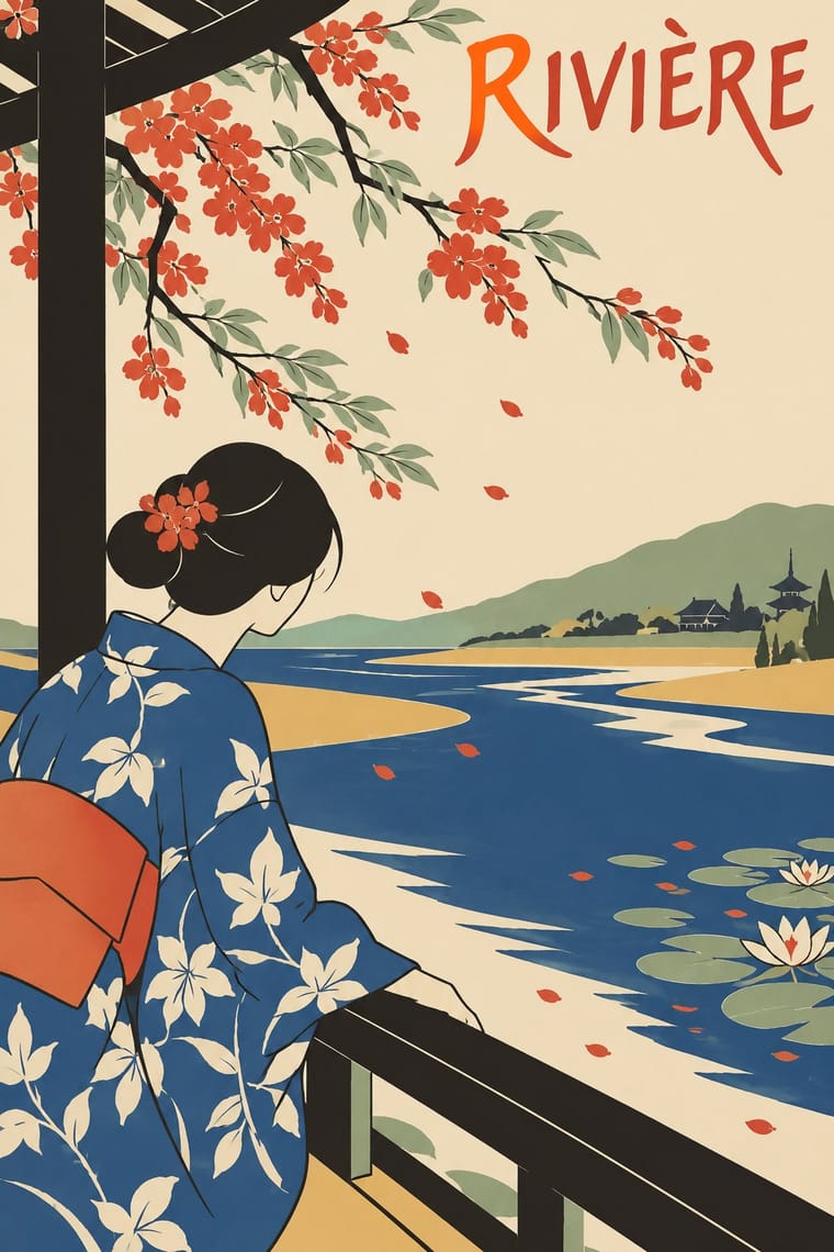
Crane's flattened planes and outlines owe much to Japanese prints; push the flatness further for a more graphic page.
Mix them and make something Japonisme Victorian Colour Toy Books
01
What each style brings
Each part of the design comes from the style with the stronger say in it, and each style gives at least two.
Japonisme Victorian Colour Toy Books (Evans, Crane, Caldecott and Greenaway)
- Type from Japonisme
- Colour from Victorian Colour Toy Books
- Form from Japonisme
- Composition from Japonisme
- Surface from Victorian Colour Toy Books
02
The type
Open fonts standing in for each style’s own type, which is often hand-drawn or commercial.
Display · Japonisme
Rose
Poiret One, standing in for Auriol (George Auriol, G. Peignot et Fils, 1901)
Text · Victorian Colour Toy Books
Mass-printed children's picture books in which a black key block and flat colour blocks (generally up to a dozen, as few as four), printed by Edmund Evans from wood, carried pictures that dominated short texts. The illustrators Walter Crane (flat tints and sharp outlines, influenced by Japanese colour prints), Randolph Caldecott (loose, comic movement) and Kate Greenaway (dainty colours and invented late-18th-century and Regency costume) gave the format three distinct hands under one genome; image.comic belongs to Caldecott only.
EB Garamond; Victorian Colour Toy Books used Hand-lettered titles and verses and Wood-engraved display lettering
03
The colours
The ground and leading colours come from Victorian Colour Toy Books, with a counter-accent from Japonisme. The ink reads on the ground at 4.5:1 or more.
Japonisme Victorian Colour Toy Books (Evans, Crane, Caldecott and Greenaway)
-
#f1e6ccground · 36% -
#2b2622ink · 14% -
#e0a93baccent · 18% -
#c8452caccent · 14% -
#d9b26faccent · 10% -
#4f7ea6accent · 8%
As CSS
:root {
  --ground: #f1e6cc;
  --ink: #2b2622;
  --accent-1: #e0a93b;
  --accent-2: #c8452c;
  --accent-3: #d9b26f;
  --accent-4: #4f7ea6;
  --font-display: "Poiret One", sans-serif;
  --font-text: "EB Garamond", serif;
}
04
The two styles
05
More combinations
With Japonisme
- Japanese Postwar Modernism Pairs well · Combine Japonisme's cropped figures with postwar Japanese emblem-and-field posters to bridge two centuries of East–West exchange.
- Ma & Wabi-sabi Aesthetics Pairs well · Add wabi-sabi's emptiness and natural texture to push Japonisme's asymmetry toward quieter, more contemplative layouts.
- Flat Design Pairs well · Borrow ukiyo-e cropping and diagonals to make flat vector illustrations feel composed rather than centred and static.
- Victorian Letterpress & Wood Type Contrasts · Against a stacked, many-faced Victorian bill, a single cropped motif in an empty field reads as calm sophistication.
- Simplicissimus Satirical Style (Munich) Pairs well · Heine drew on Japanese woodcuts: add japonisme's cropped asymmetry and silhouetted figures against blank grounds to give a caricature more air and bite.
- Ukiyo-e Woodblock Prints Pairs well · Its direct European heir: combine ukiyo-e cropping and flat colour with Western display lettering for a Japonisme poster.
- Tiki Pop (Polynesian Pop) Contrasts · Both are Western absorptions of another culture's art, but Japonisme learned formal lessons (flat colour, cropping, asymmetry) while tiki took the sacred figures themselves as mascots; borrow a way of composing, not a god.
- Rinpa & Saga-bon Contrasts · Japonisme learned Japan mostly from woodblock prints, with keylines and flat colour on paper, though Kōrin reached Louis Gonse and Siegfried Bing in the 1880s through Hōitsu's Kōrin hyakuzu, and Gonse's L'Art japonais (1883) ranked him among the best decorative artists; borrow Rinpa's open gold ground and repeated plant motif to give a Japonist layout more space and shine.
With Victorian Colour Toy Books
- Polish Information Picture Book (Dwie Siostry) Pairs well · Both put flat printed colour and picture-led narrative first; carry the toy-book key-block approach into a modern picture book.
- Victorian Letterpress & Wood Type Contrasts · Its black-letter-dense, type-and-ornament jobbing page is the opposite of a picture-led page; combine them by hanging a wood-type title over a flat colour picture.
- Arts & Crafts Movement Pairs well · Share borders and craft ideals; add Morris-style foliage frames to toy-book colour blocks for a gentler, heirloom storybook.
- Nordic Fairy-Tale and Troll Illustration (Werenskiold, Kittelsen, Bauer) Contrasts · Both are children's picture books of the same era, but the toy book's bright flat key-block colour and nursery cheer stand against this dusky, modelled and uncanny northern mood.