Style combination · Contrasts
American Traditional Tattoo Flash × International Typographic Style
Rational grid and sans-serif against sentimental, hand-lettered emblems: one flash motif on a Swiss layout makes a sharp contrast.
Mix them and make something American Traditional Tattoo Flash International Typographic Style
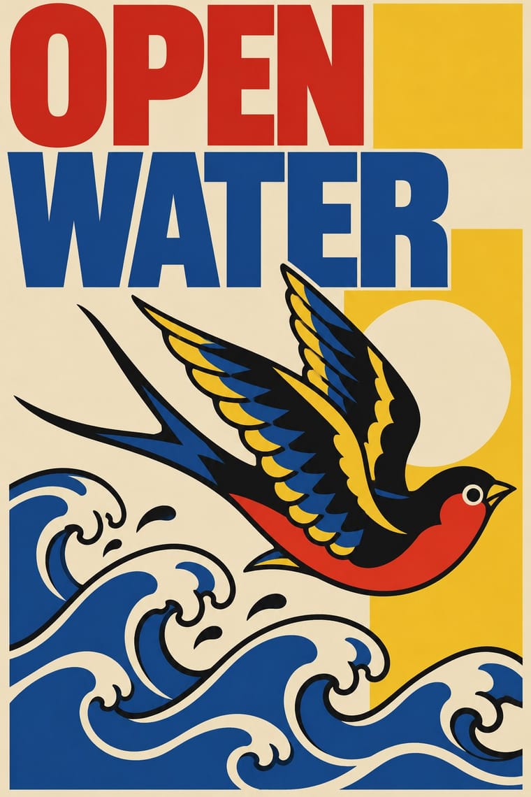
01
What each style brings
Each part of the design comes from the style with the stronger say in it, and each style gives at least two.
American Traditional Tattoo Flash International Typographic Style
- Type from International Typographic Style
-
American Traditional Tattoo Flash avoids grotesque & neo-grotesque: this is where the two pull against each other, which is the point of the contrast.
- Colour from American Traditional Tattoo Flash
- Form from American Traditional Tattoo Flash
- Composition from International Typographic Style
- Surface from American Traditional Tattoo Flash
02
The type
Open fonts standing in for each style’s own type, which is often hand-drawn or commercial.
Text · American Traditional Tattoo Flash
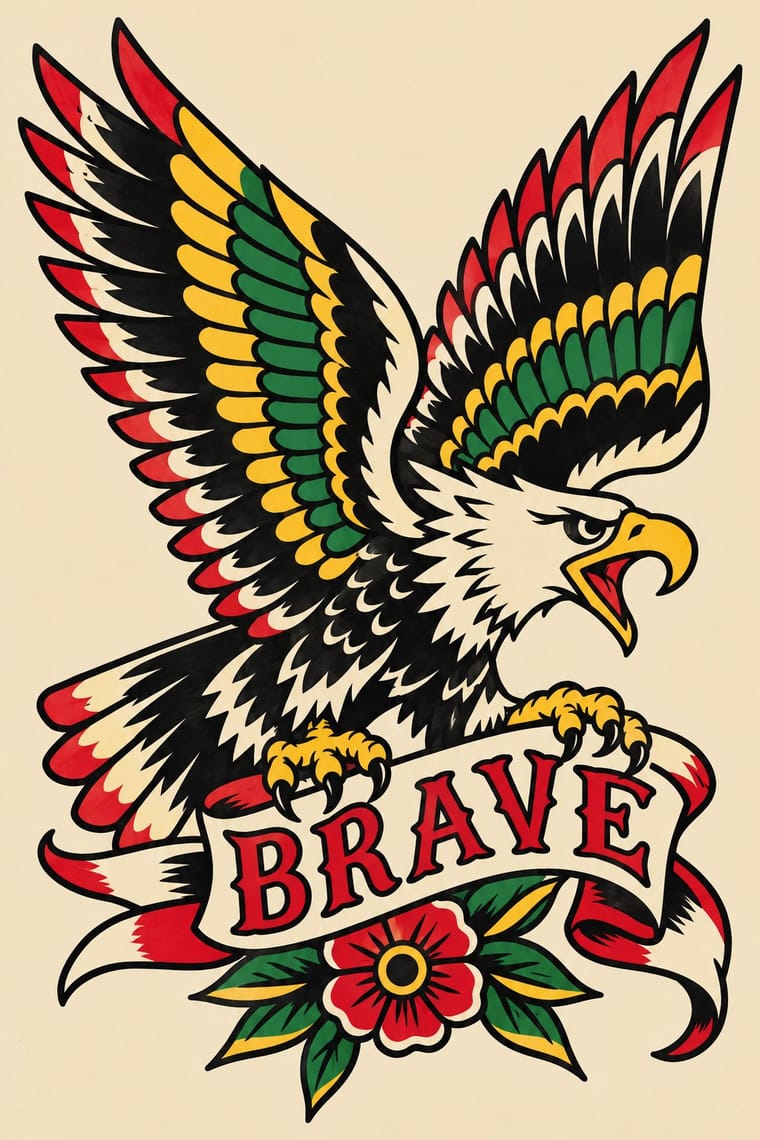
The stock designs of twentieth-century American tattoo shops: eagles, anchors, swallows, roses, hearts, daggers, panthers, skulls, ships, pin-ups and nautical stars, each drawn as an isolated emblem with a bold black outline, black shading and a few saturated flat colours (mainly red, yellow and green) chosen to stay legible on skin for a lifetime. Painted or printed on sheets and hung on shop walls, the designs carry vows, luck and service memories, and the look now travels far beyond the tattoo shop.
Libre Caslon Text; American Traditional Tattoo Flash used Script names and mottoes lettered in ribbon banners and Shaded and drop-shadowed block capitals in the sign writer's manner
03
The colours
The ground and leading colours come from American Traditional Tattoo Flash, with a counter-accent from International Typographic Style. The ink reads on the ground at 4.5:1 or more.
American Traditional Tattoo Flash International Typographic Style
-
#f1e4c8ground · 36% -
#111111ink · 14% -
#f2c12eaccent · 18% -
#e1251baccent · 14% -
#1f4e9caccent · 10% -
#1f7a3aaccent · 8%
As CSS
:root {
  --ground: #f1e4c8;
  --ink: #111111;
  --accent-1: #f2c12e;
  --accent-2: #e1251b;
  --accent-3: #1f4e9c;
  --accent-4: #1f7a3a;
  --font-display: "Inter Tight", sans-serif;
  --font-text: "Libre Caslon Text", serif;
}
Use it with care
American Traditional Tattoo Flash: Tattoo flash is the working craft of a living community of tattooers, who still trade, copy and repaint the old sheets by their own customs, and Sailor Jerry Ltd holds the commercial rights to Collins's letters, art and flash: draw new designs in the idiom rather than lifting a named artist's flash for branding or merchandise. Period sheets also include caricatures of other peoples, exoticised hula girls and geishas, and wartime jingoism; leave those out when quoting the style.
04
The two styles

05
More combinations
With American Traditional Tattoo Flash
- Hand-Painted Signage & Vernacular Lettering Pairs well · Both are sign-painter crafts of the same shopfront streets; pair flash emblems with brushed shop lettering for a whole storefront.
- Ukiyo-e Woodblock Prints Pairs well · Japanese prints and tattoo art fed Collins and Hardy; borrow waves and dragons but keep the bold American outline.
- American Four-Colour Comic Book (Golden to Bronze Age) Pairs well · Shares heavy black line and flat primaries; comic panels add story where flash keeps one emblem.
- Skateboard Deck Graphics Pairs well · Both use bold outline and flat limited colour on a single emblem; borrow the flash sheet's emblematic symmetry, but keep the deck's comic humour.
With International Typographic Style
- Art Nouveau Contrasts · Ornamental curves against an orthogonal grid make a strong deliberate tension.
- Brutalist Web Design Pairs well · Strip the grid to raw HTML defaults to get a rawer, contemporary take on Swiss honesty.
- Psychedelic Poster Contrasts · Its exact opposite on legibility; borrow one swirling element to break a too-cold Swiss layout.
- Japanese Postwar Modernism Pairs well · Add Japanese restraint and emblematic colour fields to the grid for warmth without losing order.
- Graffiti & Hip-Hop Graphics Contrasts · Put a single tag or throw-up over a strict Swiss grid to stage the clash between institutional order and a street voice.
- Pop Art Graphics Contrasts · Set one loud appropriated Pop image inside a strict grid with a neutral grotesque so the irony reads as deliberate rather than chaotic.
- Italian Painted Film Poster (Rome Studios) Contrasts · Grid, restraint and photographic objectivity are the opposite of a crowded painted montage.
- East German (DDR) Poster and Gebrauchsgrafik Pairs well · Shares the rational sans and plain ground; add DDR hand-drawn imagery to warm a Swiss layout.