Style combination · Contrasts
Psychedelic Poster × International Typographic Style
Its exact opposite on legibility; borrow one swirling element to break a too-cold Swiss layout.
Its exact opposite on legibility; one melting, shape-filling word can loosen an otherwise rigid Swiss layout.
Mix them and make something Psychedelic Poster International Typographic Style
01
What each style brings
Each part of the design comes from the style with the stronger say in it, and each style gives at least two.
Psychedelic Poster International Typographic Style
- Type from International Typographic Style
-
Psychedelic Poster avoids grotesque & neo-grotesque: this is where the two pull against each other, which is the point of the contrast.
- Colour from International Typographic Style
- Form from Psychedelic Poster
-
International Typographic Style avoids abundant decoration: this is where the two pull against each other, which is the point of the contrast.
- Composition from Psychedelic Poster
-
International Typographic Style avoids horror vacui: this is where the two pull against each other, which is the point of the contrast.
- Surface from Psychedelic Poster
02
The type
Open fonts standing in for each style’s own type, which is often hand-drawn or commercial.
Text · Psychedelic Poster
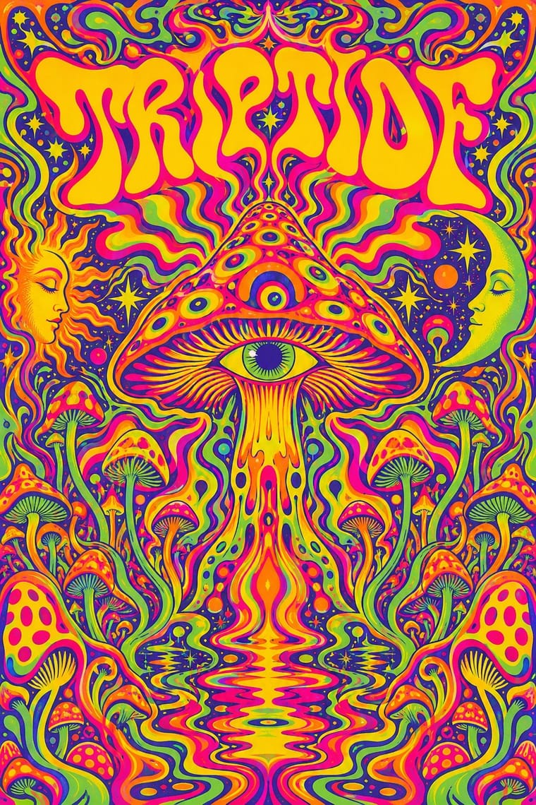
The concert-poster language of the 1960s counterculture, born in San Francisco's Fillmore and Avalon ballrooms and echoed in London's underground press. Hand-drawn letters melt and swell to fill whole shapes, Art Nouveau and Vienna Secession curves are revived at hallucinatory intensity, and vibrating complementary or fluorescent colours make reading a slow, immersive act.
Special Elite; Psychedelic Poster used Hand-drawn melting lettering after Alfred Roller and Victorian wood-type and Tuscan display faces
03
The colours
The ground and leading colours come from International Typographic Style, with a counter-accent from Psychedelic Poster. The ink reads on the ground at 4.5:1 or more.
Psychedelic Poster International Typographic Style
-
#f2f0e9ground · 36% -
#111111ink · 14% -
#e1251baccent · 18% -
#ff6a13accent · 14% -
#1f4e9caccent · 10% -
#e4007caccent · 8%
As CSS
:root {
  --ground: #f2f0e9;
  --ink: #111111;
  --accent-1: #e1251b;
  --accent-2: #ff6a13;
  --accent-3: #1f4e9c;
  --accent-4: #e4007c;
  --font-display: "Inter Tight", sans-serif;
  --font-text: "Special Elite", monospace;
}
04
The two styles

05
More combinations
With Psychedelic Poster
- Rave & Acid House Graphics Pairs well · Carry the vibrating fluorescent palette into rave-style chrome and airbrush to signal the 1960s-to-1990s lineage on purpose.
- Angura Theatre Poster Pairs well · Tokyo's angura theatre posters met psychedelia halfway; swap Art Nouveau curls for collaged Japanese ephemera and ukiyo-e waves while keeping the fluorescent silkscreen inks.
- Minimalist Graphic Design Contrasts · Set a single dense psychedelic panel in a field of white space for maximum shock and a clear focal point.
- Art Nouveau Pairs well · Borrow Art Nouveau's framing borders and flowing hair, then push the colour to fluorescent clash for an instant 1967 look.
- Hand-Painted Bollywood Poster Pairs well · 1970s Hindi film titles already flirted with psychedelic lettering; fuse the two for swirling, glowing title logos.
- Screenprinted Gig & Alt-Movie Poster Pairs well · The 1960s Fillmore and Avalon posters are its ancestor; borrow one swelling, shape-filling title from them, but keep the band, date and venue line readable.
- Underground Comix Pairs well · Take the cover from the ballroom poster, with its clashing flat inks and melting letters, and keep the hatched black-and-white panels inside, as Zap did with Moscoso and Griffin.
- Hipgnosis Photographic Concept Sleeve Contrasts · Same Pink Floyd scene, opposite answer: Hipgnosis's 1969 Royal Festival Hall poster is still a psychedelic dreamscape collage, but by Atom Heart Mother the band wanted 'something plain' and got a cow. Swap melting hand-lettering and vibrating colour for one calm photograph and almost no type.
With International Typographic Style
- Art Nouveau Contrasts · Ornamental curves against an orthogonal grid make a strong deliberate tension.
- Brutalist Web Design Pairs well · Strip the grid to raw HTML defaults to get a rawer, contemporary take on Swiss honesty.
- Japanese Postwar Modernism Pairs well · Add Japanese restraint and emblematic colour fields to the grid for warmth without losing order.
- American Traditional Tattoo Flash Contrasts · Rational grid and sans-serif against sentimental, hand-lettered emblems: one flash motif on a Swiss layout makes a sharp contrast.
- Graffiti & Hip-Hop Graphics Contrasts · Put a single tag or throw-up over a strict Swiss grid to stage the clash between institutional order and a street voice.
- Pop Art Graphics Contrasts · Set one loud appropriated Pop image inside a strict grid with a neutral grotesque so the irony reads as deliberate rather than chaotic.
- Italian Painted Film Poster (Rome Studios) Contrasts · Grid, restraint and photographic objectivity are the opposite of a crowded painted montage.
- East German (DDR) Poster and Gebrauchsgrafik Pairs well · Shares the rational sans and plain ground; add DDR hand-drawn imagery to warm a Swiss layout.